The Evolution of Adobe Design: Branding, Apps, and the Creative Empire
How Adobe evolved its branding and app design from PostScript and desktop publishing to Creative Cloud, Firefly, and a more systemized design future.

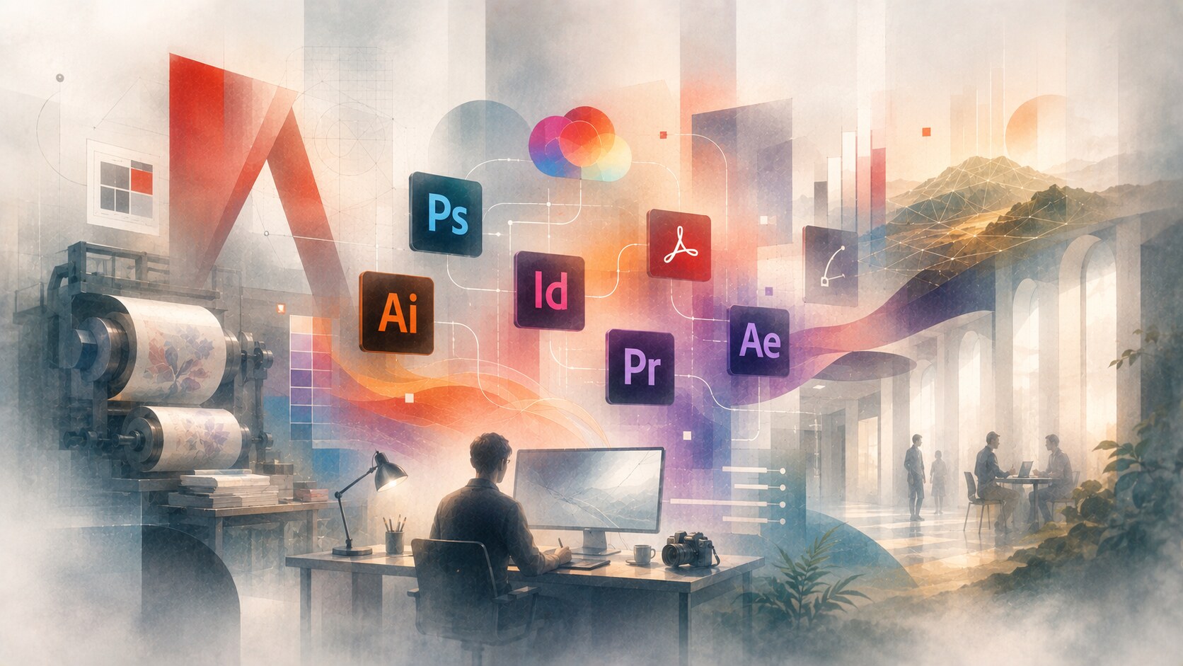
How Adobe evolved its branding and app design from PostScript and desktop publishing to Creative Cloud, Firefly, and a more systemized design future.
Adobe is one of those rare companies whose products became part of the language of design itself.
People do not only use Adobe software. They say Photoshop, Illustrator, PDF, Premiere, Acrobat, InDesign, or After Effects almost as if they were categories rather than products.
That is why Adobe’s design history is more interesting than a normal software rebrand story. It is not only about one logo or one interface cleanup. It is about how a company moved from print technology and desktop publishing into a global product ecosystem that now spans creativity, documents, enterprise experience systems, and AI-assisted workflows.
This article sits naturally beside The Evolution of Yahoo Design, Email Design Systems and Marketing Email Campaigns, and LEGO Brand Design Evolution.
“Adobe’s biggest design achievement was not making one iconic app. It was making a large software empire still feel legible as one brand family.”

Adobe was founded in 1982 by John Warnock and Charles Geschke, both coming out of Xerox PARC. The company’s early power came from technology, especially PostScript, but its visual identity also mattered from the start.
One of the best hidden facts in Adobe history is that the original logo was designed by Marva Warnock, John Warnock’s wife. That is significant because the company did not launch with some generic tech mark. It launched with a strong stylized A that stayed conceptually alive for decades.
The earliest Adobe era was shaped by:
This is one reason Adobe aged differently from many software companies of the 1980s. It never looked like a toy startup. It looked like infrastructure for professionals.

Before Adobe became the company of endless app tiles, it became essential because of PostScript.
The Computer History Museum describes PostScript as the digital printing press that helped transform publishing. Adobe’s own print-engine history also traces the line clearly: PostScript launched Adobe into a leadership role in graphic arts, and PDF later extended that influence into document exchange and production.
This phase mattered visually because Adobe’s early identity was tied to reliability and professional output. The company’s brand did not yet need to be emotionally broad. It needed to signal:
That created a different kind of software brand than Apple or Microsoft. Adobe was less about the whole computer experience and more about the professional pipeline that creative and publishing work depended on.
The deeper shift came when Adobe’s applications started becoming more recognizable than the corporation itself.
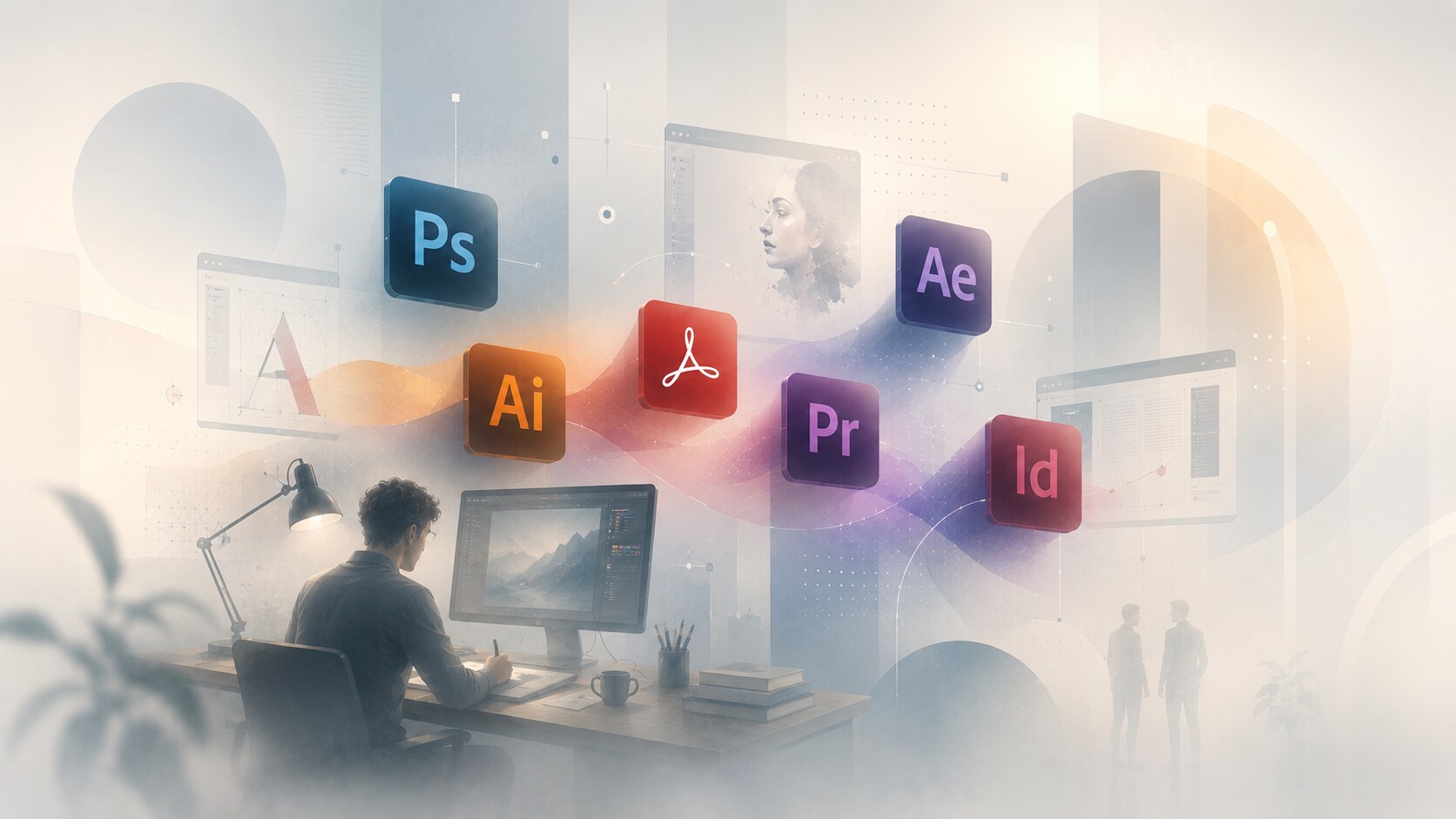
Photoshop, Illustrator, Acrobat, Premiere, After Effects, and later InDesign made the company’s brand much more visible in daily creative work. This created a new challenge:
Adobe was no longer only one company mark. It was a family of famous tools with different personalities.
That was a strength and a danger.
It was a strength because individual apps could dominate their categories. It was a danger because the family could become visually fragmented or confusing.
One hidden Adobe truth is that many users became loyal first to one app, not to Adobe as a whole. The brand had to keep turning product familiarity into ecosystem loyalty.
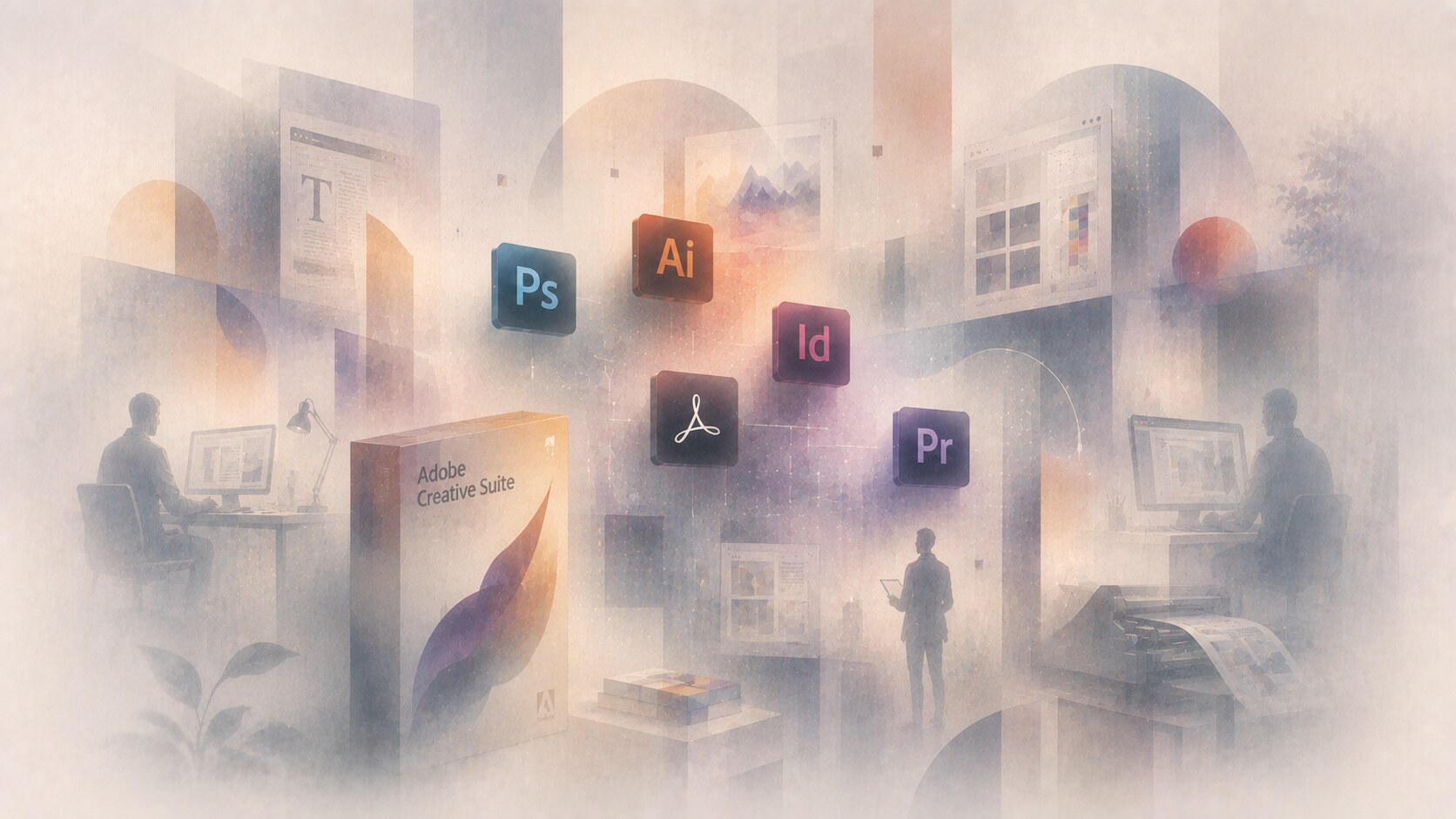
The Creative Suite era was one of Adobe’s most important brand decisions because it gave customers a clearer map of the ecosystem.
Before that, Adobe could still feel like a cluster of strong tools. With Creative Suite, it felt more like a deliberate creative environment.
This mattered in both business and visual terms:
The boxed-software period also gave Adobe some of its most memorable product packaging. The apps still had their own personalities, but they were increasingly being read together.
Because it taught customers to think in workflows rather than isolated purchases.
As the portfolio grew, visual consistency sometimes struggled to keep up. The family was powerful, but not always elegantly organized.
Few Adobe shifts were more strategically important or more emotionally controversial than Creative Cloud.
From a company point of view, it was brilliant. The subscription model created recurring revenue, faster updates, tighter ecosystem control, and a more unified product platform.
From a user point of view, the reaction was much more mixed. Many creatives disliked losing the old ownership model and felt trapped by the subscription shift.
That is why Creative Cloud deserves to be called a painful success. It was one of Adobe’s smartest long-term moves and one of its most resented short-term ones.
It also changed the design challenge. Once products lived inside a cloud-branded family, Adobe had to make the ecosystem feel coherent at a much larger scale.

The major formal cleanup came in 2020. Adobe’s own brand post by Sonja Hernandez explains the logic very clearly.
Adobe moved to:
This was one of Adobe’s most successful design decisions in years because it improved portfolio readability instead of chasing novelty for its own sake.
Hernandez’s author page is also useful context. She leads Adobe’s Brand and Icons design teams, which means this phase was strongly shaped from inside the company, not by one public external-agency moment.
Because the portfolio had become too large to navigate by habit alone. The system needed to become easier to scan, classify, and remember.
Adobe explicitly optimized the product colors for accessibility. That sounds small, but in a giant app ecosystem, color confusion becomes a real navigation problem.
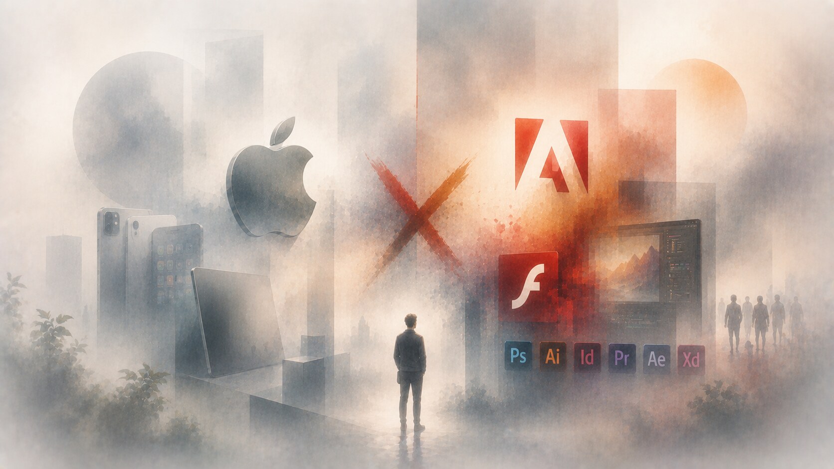
If you ask why Steve Jobs did not like some of Adobe’s steps, the answer really centers on Flash.
In his April 29, 2010 public letter Thoughts on Flash, summarized widely at the time, Jobs attacked Flash as unreliable, power-hungry, closed, poorly suited to touch devices, and too focused on cross-platform abstraction instead of native Apple experiences.
The sharpest strategic criticism was not only technical. Jobs argued that Adobe’s goal was helping developers write cross-platform apps rather than the best iPhone or iPad apps. In other words, he saw Adobe as putting an extra layer between Apple and the user experience.
This became one of Adobe’s most painful brand chapters because Flash had once been culturally central on the web. Then it became a symbol of the wrong technical era.
Because it showed that a dominant platform tool can become a design liability when the whole interface environment changes.
Adobe has had an unusually high number of durable wins:
But the company also had obvious painful moments:
This is important because Adobe’s design evolution is not only a story of refinement. It is also a story of reinvention under pressure.
“Adobe usually wins when it turns complexity into a usable system. It struggles when the system starts feeling heavier than the work itself.”
Adobe’s current scale helps explain why its brand had to become more systemized.
| Signal | Figure | Why it matters |
|---|---|---|
| FY2025 revenue | $23.769 billion | Adobe is far beyond a niche creative-tools company |
| Firefly generations by December 10, 2025 | 29+ billion | AI is now part of Adobe’s core identity story |
| PDFs in circulation | 3 trillion | Acrobat and PDF remain one of Adobe’s deepest cultural infrastructures |
| Adobe AI adoption claim | 99% of Fortune 100 use Adobe’s AI | the brand now speaks to enterprise scale, not only to designers |
The table shows the key shift clearly. Adobe still belongs to creative professionals, but it now also speaks to marketers, enterprises, document workflows, and AI pipelines.

Adobe’s 2026 announcements make the next direction fairly clear.
The company is pushing toward:
Its March 16, 2026 partnership announcement with NVIDIA framed this as the next generation of Firefly models and agentic creative workflows. Its June 18, 2026 product announcement pushed the same idea further: one assistant, many Adobe tools, more orchestration, less manual hopping between steps.
That means Adobe’s future design challenge is subtle but serious.
If the company becomes too invisible behind AI orchestration, the apps may lose some of their distinct identity. If it stays too app-siloed, it risks looking less fluid than the workflows people increasingly expect.
Adobe began as a serious technology company with a strong logo and a printing revolution.
It became a software empire through iconic apps. It became a business machine through Creative Cloud. It cleaned up its visual language through the 2020 brand system. And now it is trying to become an AI-driven workflow environment without losing the authority that made its classic tools matter.
That is why Adobe remains such a strong case study. Its evolution is not only about taste. It is about how a design brand survives while the meaning of design work keeps changing.
News, insights, case studies, and more from the rausr team — straight to your inbox.
Send us your brief, your wildest idea, or just a hello. We’ll season it with curiosity and serve back something fresh, cooked with care.