The Evolution of Amazon Design: The Quiet Machine Behind the Smile
From a scrappy bookstore site to a global retail operating system: how Amazon’s brand and interface evolved, who shaped the logo, why the UI stayed “plain,” and ...


From a scrappy bookstore site to a global retail operating system: how Amazon’s brand and interface evolved, who shaped the logo, why the UI stayed “plain,” and ...
Amazon is one of the most influential design systems on earth, but it rarely gets discussed like one. It doesn’t look like a design company. It looks like a machine.
That’s the point.
This article is part of our series on how big brands evolve through product, interface, and identity decisions (see The Evolution of Google Design and The Evolution of Facebook’s Design).
“Amazon’s design is not “minimal.” It’s instrumental.”

Amazon’s earliest branding story is famous because it’s so unglamorous: the company reportedly started with the name Cadabra (as in “abracadabra”), then dropped it after the word was misheard as “cadaver.”
The switch to Amazon was strategic:
Even the founding metaphor was a brand decision: not “a bookstore,” but a place that can become anything.
Amazon didn’t win early by looking premium. It won by looking reliable enough and moving faster than everyone else.

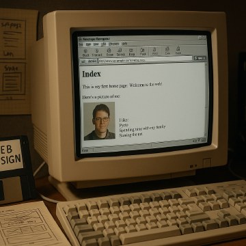
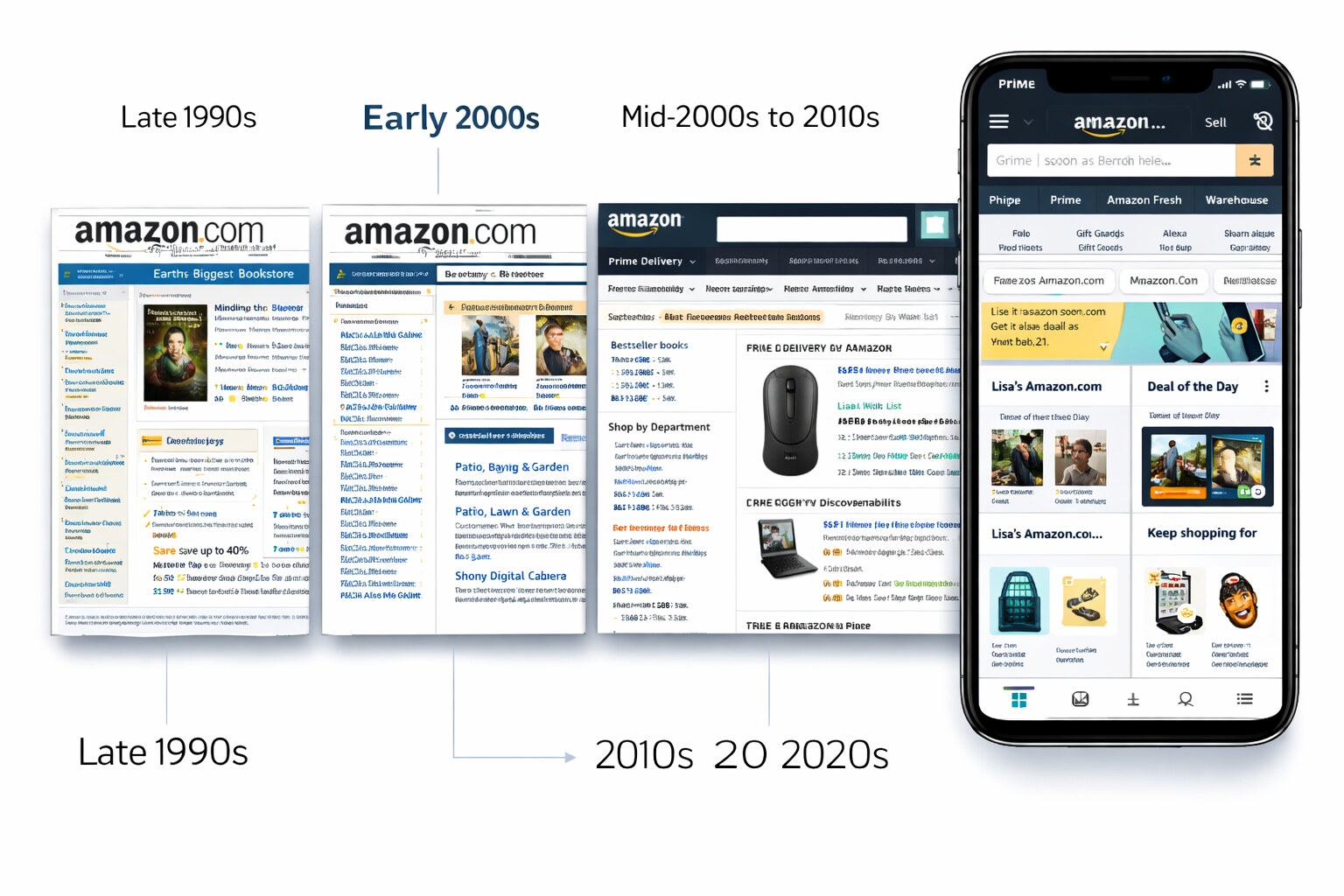
Early Amazon design fit the era:
In early e-commerce, trust signals mattered more than visual polish: clear prices, clear shipping, clear returns, clear contact info.
This shaped Amazon’s long-running design instinct: clarity beats decoration when money is involved.
The modern Amazon logo — the smile/arrow from A to Z — is widely associated with the year 2000 and is commonly attributed to the branding agency Turner Duckworth.
Amazon’s earliest logos and site visuals were closer to “startup production design” than iconic brand craft. Much of that early work was done internally and through contractors, and it’s not consistently credited in public sources the way later identity work is.
That’s a pattern you’ll see repeatedly in Amazon’s story: the most important design decisions are often not “a redesign,” but thousands of small interface and policy choices shipped by product teams.
What makes it strong isn’t “cleverness.” It’s that it compresses multiple messages into one simple element:
And it scales: on a box, on an app icon, in a favicon, on a warehouse sign.

The early interface is built around proof and certainty:
As categories expand, the design priority becomes navigation and search:
Prime turns logistics into interface: delivery promises become a first-class UI element, and the product page increasingly reads like a checklist that removes doubt.
The “All” menu patterns, persistent cart, and app-centric shopping behaviors become the default. Visually, it still looks plain — but structurally it’s a constantly evolving decision engine.
People sometimes call Amazon “ugly” or “stuck in 2008.” But the deeper explanation is more interesting: Amazon behaves like a company that treats UI as a measurable machine.
Key design traits that stayed consistent across years:
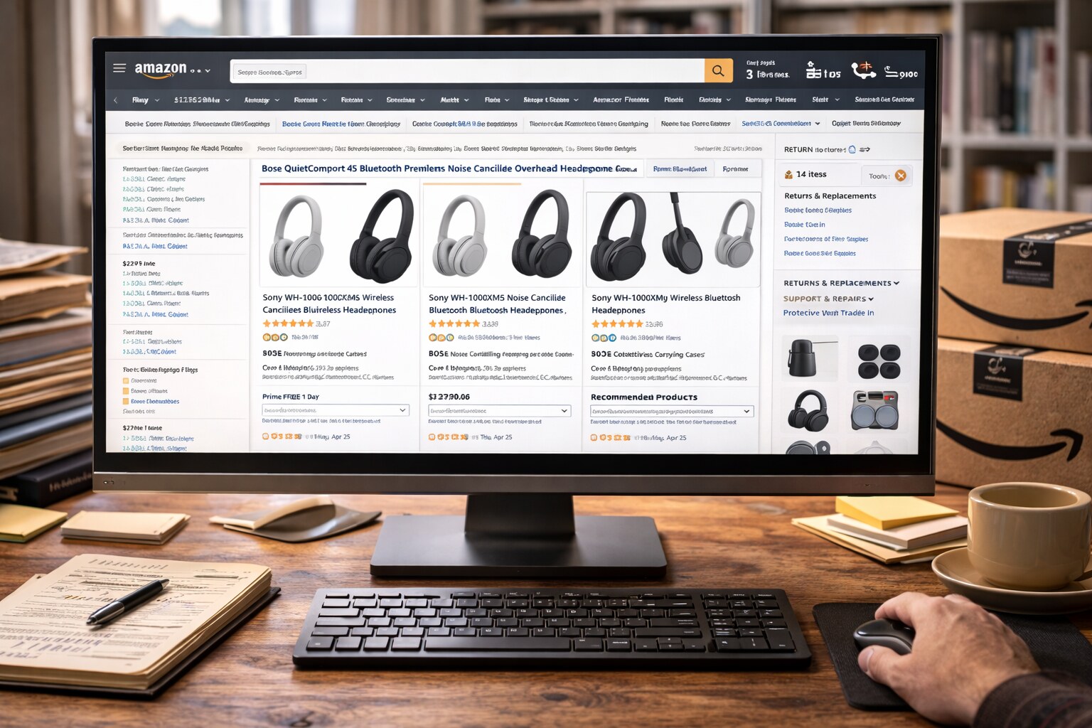
Amazon pages are information-dense because the user job is rarely “admire.” It’s:
Dense UI reduces scrolling, increases scanability, and keeps alternatives visible.
A plain layout does something psychologically useful: it looks like infrastructure, not a campaign.
That’s a quiet form of credibility: “This is a store that will still exist next year.”
On commerce pages, speed is not an engineering detail — it’s part of UX trust: fast pages feel safer, more stable, and less risky.
This is one reason Amazon historically avoids heavy visual effects on the critical path.
Under-discussed constraint: an interface that serves billions of requests learns to prefer predictable rendering over trendy animation.
You noticed something real: Amazon’s cart is designed as a persistent gravity well.
In many shopping UIs, the cart is “a destination.” In Amazon, it’s closer to “a state you are in.”
Patterns that create the “no escape” feeling:
“The cart isn’t just storage. It’s a commitment device.”
This is classic conversion design: reduce the number of exits that don’t serve the user’s main job right now.
Is it ethical? Depends on how it’s used. There’s a real line between:

Amazon’s famous internal practices shaped its external design:
Teams write a press release and a FAQ before building. This forces:
Even if you never see that document, the UI inherits the discipline: it’s designed to fulfill a promise, not to express a mood.
Amazon is known for relentless experimentation:
The result is a UI that can feel “assembled.” Because it is — from what wins.

The logo isn’t just identity — it’s logistics branding. The box becomes a moving billboard, and the smile makes it human.
Prime is one of the strongest “micro-brands” in modern commerce: it turns delivery speed into a simple symbol you can scan in milliseconds.
Amazon’s review UI (ratings distribution, verified purchase indicators, helpful votes) became a template copied across the web. It’s not just content — it’s a decision interface.
One action, always present, always visually prioritized: buying is never a treasure hunt.

Amazon is not one product. It’s an empire:
The brand architecture often feels like a family of cousins, not one coherent system.
When ads visually blur into “real results,” trust erodes. Even if conversion goes up today, long-term credibility can go down.
A dense interface can cross a threshold where the user stops scanning and starts bouncing. This is the hidden cost of “more modules always wins.”
Heavy experimentation can create a new kind of UX debt: users don’t know where anything lives anymore.
If users feel the UI is unpredictable, they compensate with caution — which can erase the conversion gains you were trying to win.
Yes — and it’s one of the most interesting open questions in brand design. The opportunity isn’t to make Amazon “prettier.” It’s to make it coherent across surfaces while keeping the conversion machine intact.
A realistic modern concept would:
In other words: build a design system that’s as rigorous as Amazon’s logistics.
“Amazon’s next design era won’t be a redesign. It will be a standardization.”

Amazon’s interface stayed “simple” for the same reason warehouses look simple: the goal is throughput, reliability, and predictable outcomes.
If you want to understand Amazon design, don’t start with colors. Start with the question Amazon optimized for:
How do we remove doubt fast enough that a purchase feels obvious?
If you want a broader look at how giant companies standardize design at scale, read Pixel Perfect Decisions: The Design Process Inside Big Tech.
News, insights, case studies, and more from the rausr team — straight to your inbox.
Send us your brief, your wildest idea, or just a hello. We’ll season it with curiosity and serve back something fresh, cooked with care.