The Evolution of Facebook’s Design: From Blue Boxes to Minimal White Space
Facebook has been redesigned many times — but each shift tells us something about design, strategy, and even society. Here’s how it all happened.

Facebook has been redesigned many times — but each shift tells us something about design, strategy, and even society. Here’s how it all happened.
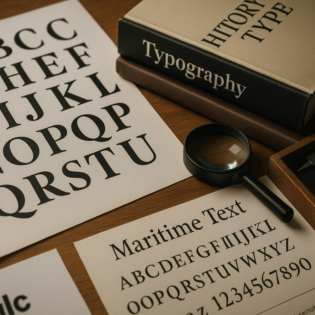
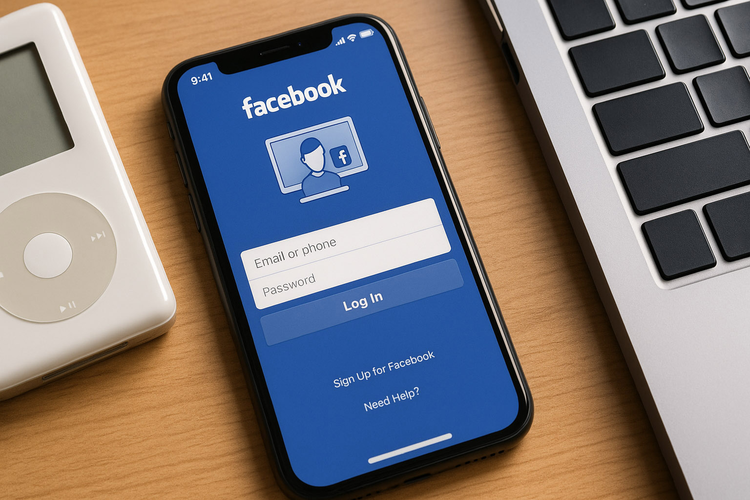
In the beginning, Facebook’s design was raw. College-only. Blue header, serif fonts, small profile pictures, and a utilitarian layout. This was design by necessity — built by engineers for engineers. The now-iconic “Facebook blue” was allegedly chosen because Mark Zuckerberg is red-green colorblind, and blue was the color he saw best.
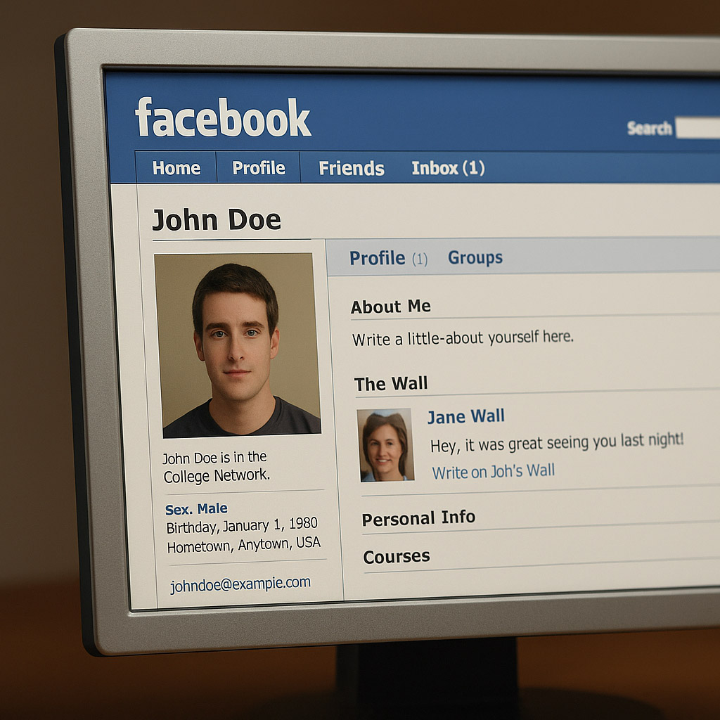
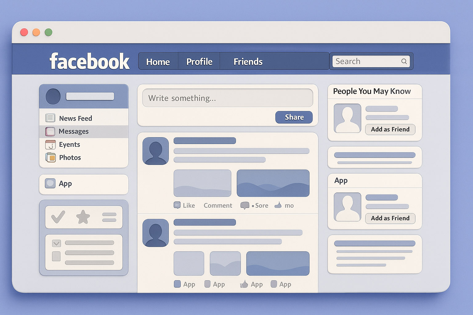
This was the heyday of the boxy UI. News Feed, launched in 2006, started organizing activity chronologically — a major design leap. Tabs, rounded corners, sidebars, and tons of gradients followed.
“It was messy, but customizable — a sign of the Web 2.0 spirit.”
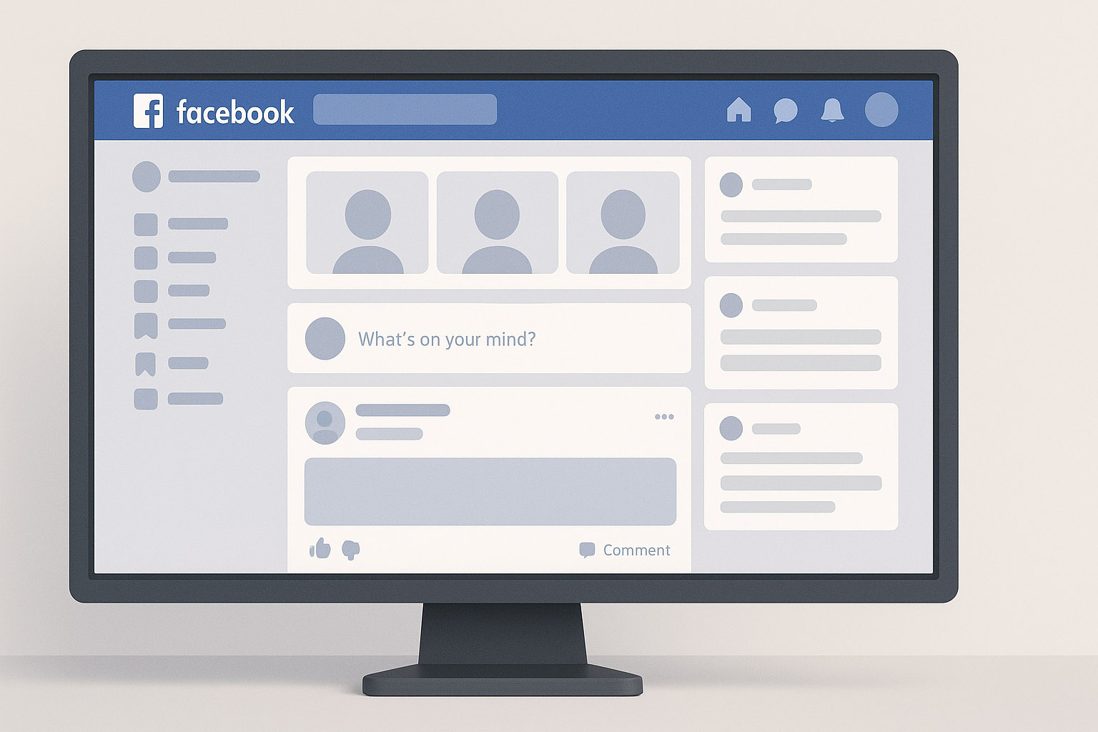
Flat design took over the industry, and Facebook followed.
Facebook now felt more like an OS than a website. Responsive design was introduced. Internal design systems like Origami Studio were developed to prototype these changes, built in-house by Facebook’s design team.
Facebook began to prioritize mobile-first design. Performance, readability, and touch-optimized interactions became key.
They started testing UI changes live in different regions — a practice they still use. Facebook has entire “dark launch” teams that release features to 1% of users to observe behavior before global rollout.
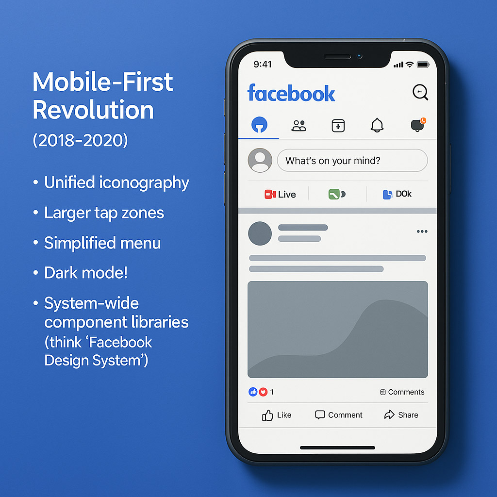
The FB5 update introduced:
It made Facebook feel less cluttered, more like a community app. Designers like Julie Zhuo (ex-VP of Product Design) had long pushed for simplification and empathy in product decisions.
User feedback? Mixed. Some praised the clarity, others missed the density.
From a blue dorm-room website to a multi-billion-user platform, Facebook’s design reflects shifts in tech, society, and even power. Each redesign wasn’t just about pixels — it was about steering behavior, building habits, and reacting to criticism.
“I’ve always thought about that design this way: it wasn’t always beautiful — but it was always strategic.”

News, insights, case studies, and more from the rausr team — straight to your inbox.
Send us your brief, your wildest idea, or just a hello. We’ll season it with curiosity and serve back something fresh, cooked with care.