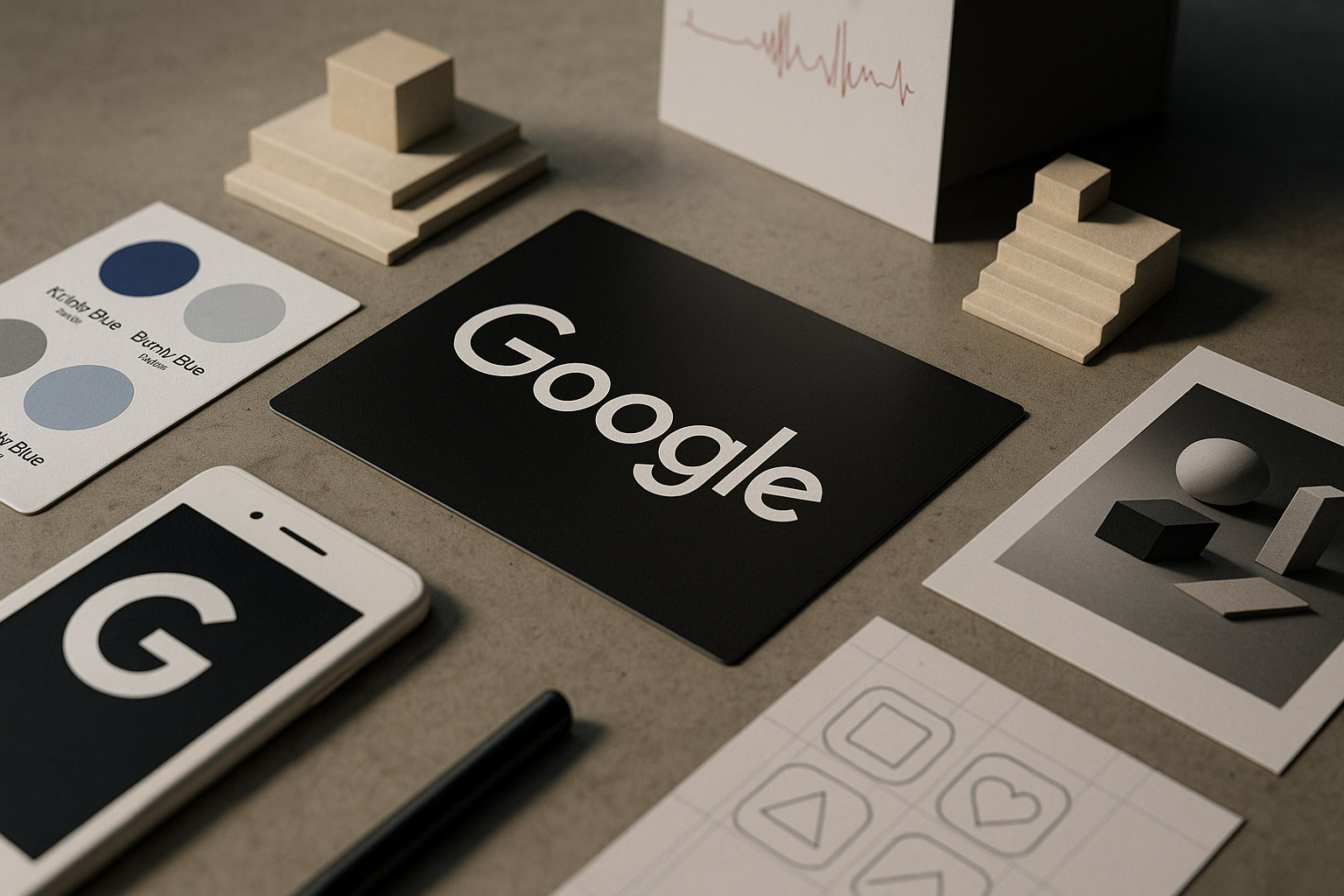
The Evolution of Google Design: From Chaos to Clarity
How Google transformed from an engineer‑driven, visually chaotic startup into one of the world’s most influential design powerhouses.

How Google transformed from an engineer‑driven, visually chaotic startup into one of the world’s most influential design powerhouses.
When Google launched in 1998, its design was almost accidental — a quirky, minimalist result of two engineers, Larry Page and Sergey Brin, who were not designers at all. Today, Google is one of the world’s most influential design forces, shaping mobile interfaces, global systems, and accessibility standards.
This is the story of how Google evolved from visual chaos to Material Design, Material You, and a unified design culture that changed the tech landscape.
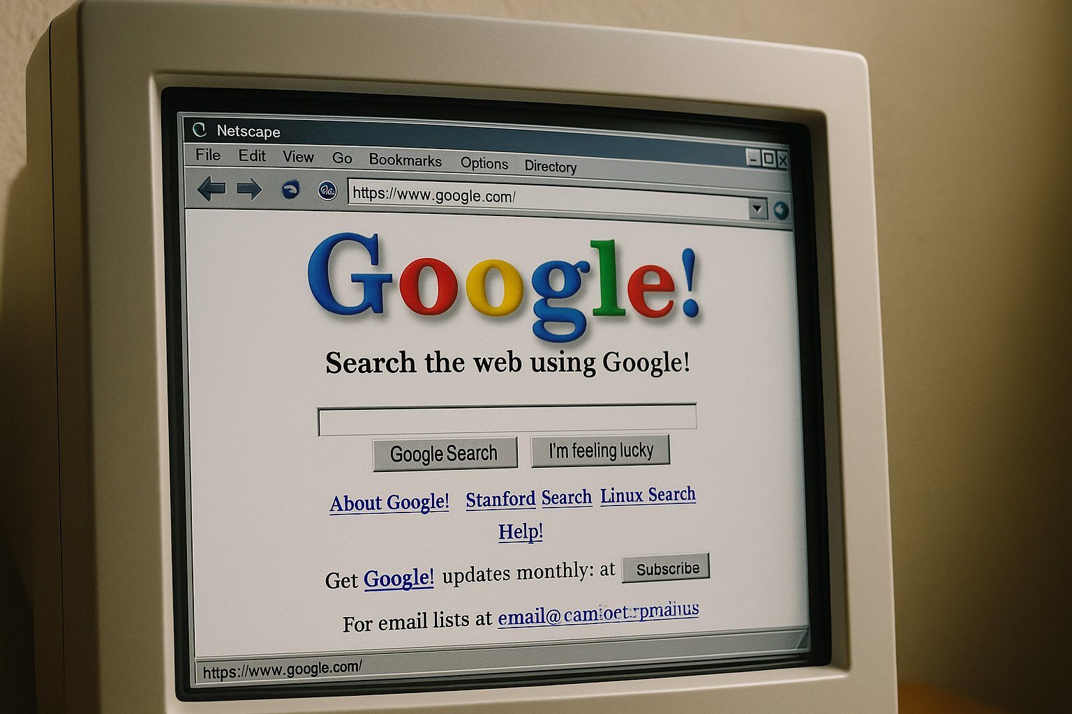
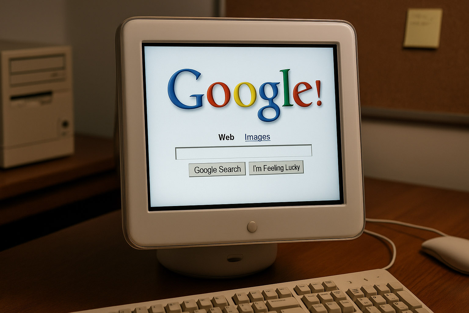
Google’s first visual identity wasn’t crafted — it was improvised.
Created in GIMP by Sergey Brin. Using:
The minimalist homepage happened only because Larry and Sergey didn’t know enough HTML to make a complex layout.
Google added an exclamation mark (!) in 1998 simply to mimic Yahoo! — “the successful kids on the block.
Typography was inconsistent, spacing was messy, and color choices were random. But the search engine was fast — and that mattered more than design.
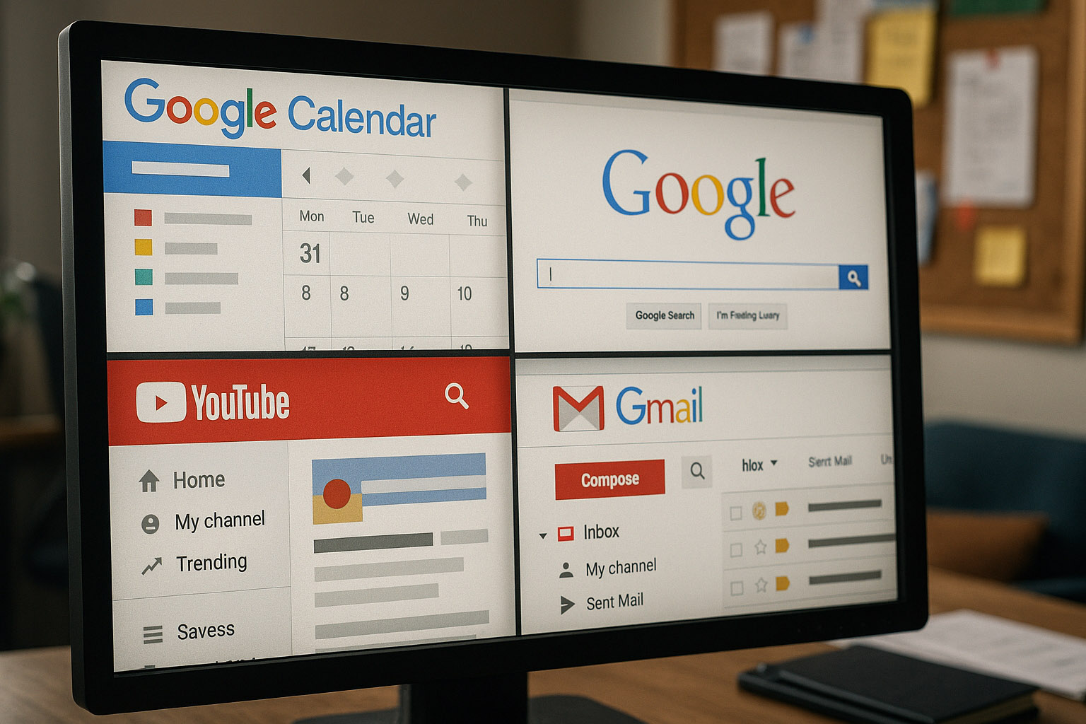
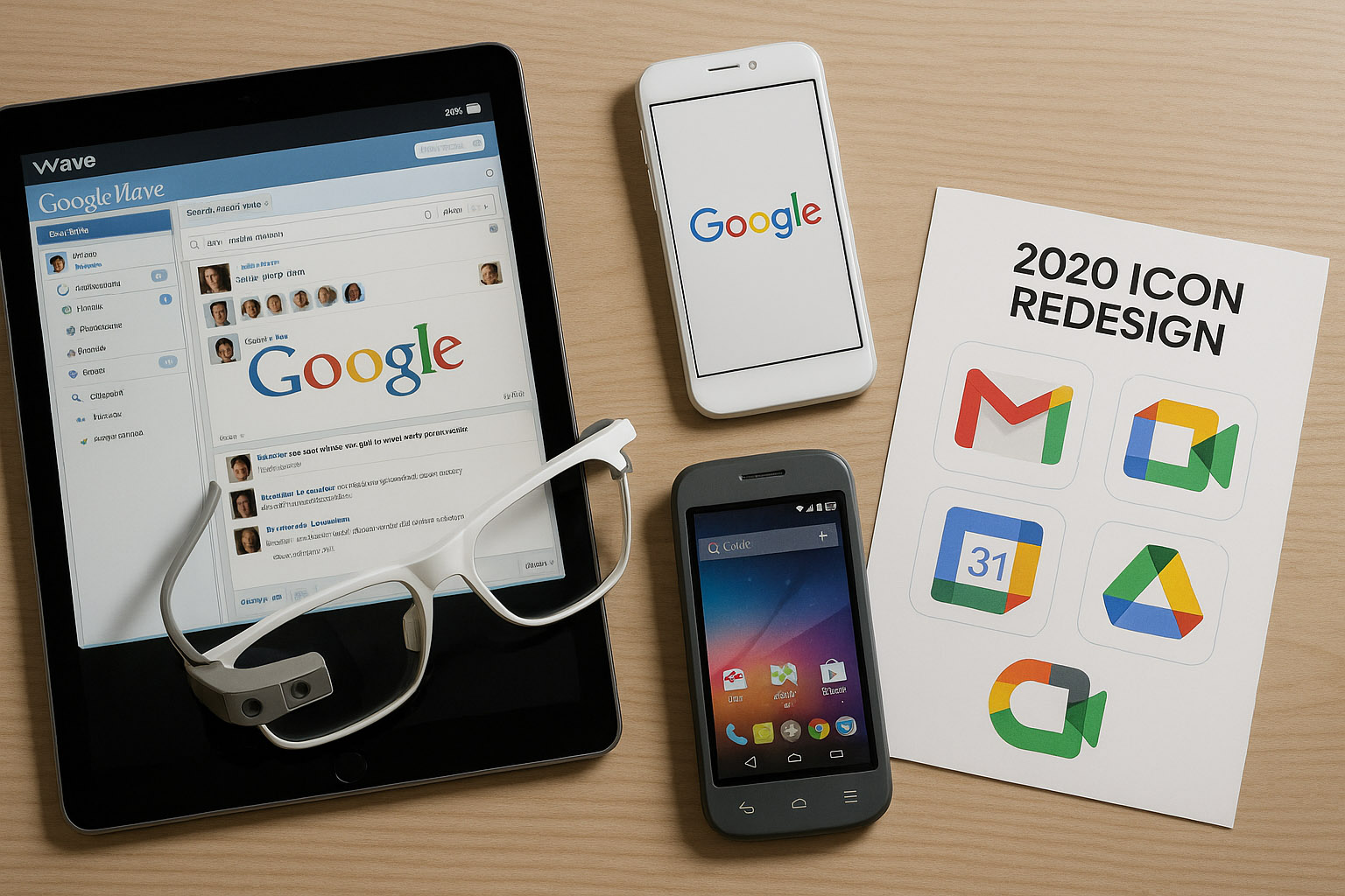
As Google expanded, dozens of teams created dozens of unrelated visual languages. Gmail, Calendar, Maps, YouTube, Android — all looked like products from different companies.
Teams moved fast but independently. There were:
One of Google’s early UX leads, Jon Wiley, pushed for clarity in Search results and established early UX
But true unification was still years away.
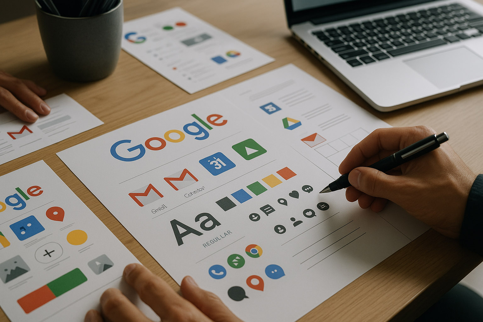
When Larry Page returned as CEO in 2011, he demanded a unified design strategy:
“Make Google look like one company.”
Led by:
Goals:
Kennedy didn’t redesign everything — it aligned everything. This laid the foundation for what came next.
In 2010, Google hired Matias Duarte — designer of Palm webOS, one of the most beautiful mobile OS designs ever. His mission: bring coherence, taste, and feeling to Google’s products.
Material Design was a turning point. For the first time, Google wasn’t catching up — it was leading.
Material Design was a complete system — visual rules, UX rules, motion rules, and developer documentation.
Material’s shadows were based on real physical light experiments in a custom-built studio using paper prototypes.
Google realized Material had become too rigid — everything risked looking “too Google.”
Material Theming allowed:
It decentralized design while still keeping a unified foundation.
Material You (Material Design 3) transformed UI into something personal and emotional.
It shaped:
Material You’s color algorithms were tested in over 2,000 real homes to ensure correct color harmony under real lighting.

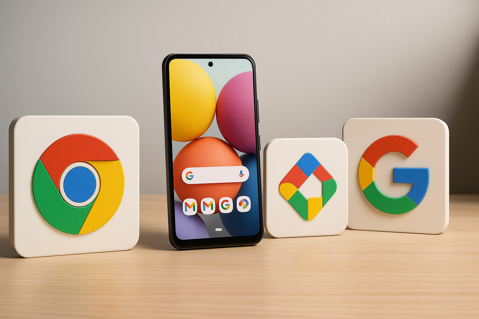
The most widely adopted design system in the world.
Lightweight, clean, invisible UI.
Incremental improvements that never disrupt users.
Modern, consistent, expressive.
Efficient, standard-setting productivity interfaces.
Controversial but unifying across all products.
Brilliant concept, impossible UX.
Beautiful visuals, but ignored social behavior.
Unified but harder to distinguish for many users.
A visual mess — arguably the most inconsistent system in tech history.
Ahead of its time, but socially awkward and visually unusual.
Architect of Material Design.
Transformed Google Search through UX clarity.
Humanized Google hardware aesthetics.
Leader of Project Kennedy unification.
Directed major visual identity restructures.
Advanced UX research & human‑centered studies.
Google began with:
It evolved into:
“The evolution of Google design is a story of growth — from colorful chaos to systematic elegance, powered by visionaries who believed design should be both functional and beautiful.”

News, insights, case studies, and more from the rausr team — straight to your inbox.
Send us your brief, your wildest idea, or just a hello. We’ll season it with curiosity and serve back something fresh, cooked with care.