The Evolution of Instagram Design: From Filters to Frameworks
Visual and UX transformation of Instagram, from its humble beginnings as a photo filter app to a global design powerhouse.

Visual and UX transformation of Instagram, from its humble beginnings as a photo filter app to a global design powerhouse.
Instagram’s journey from a simple photo-sharing app to a global social powerhouse is not just a story of features and followers, but also of design. Over more than a decade, Instagram’s visual language has evolved dramatically—reflecting shifts in technology, user expectations, and design culture itself. This is a look behind the screens at the choices, challenges, and creative minds that shaped Instagram’s identity.
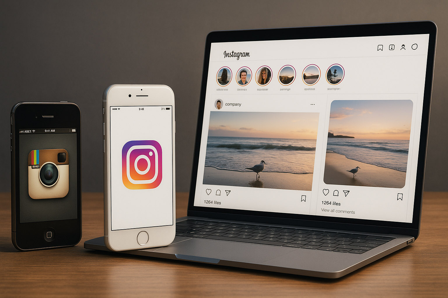
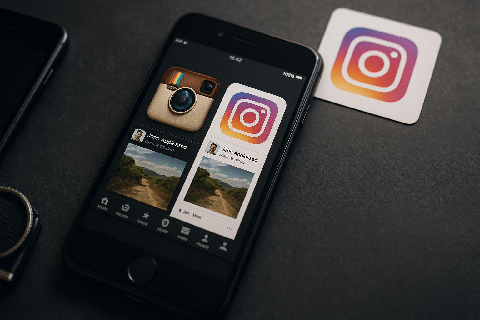
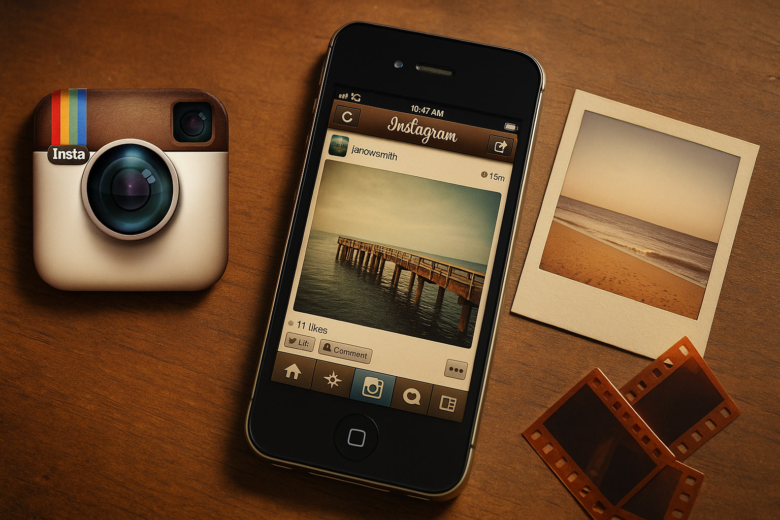
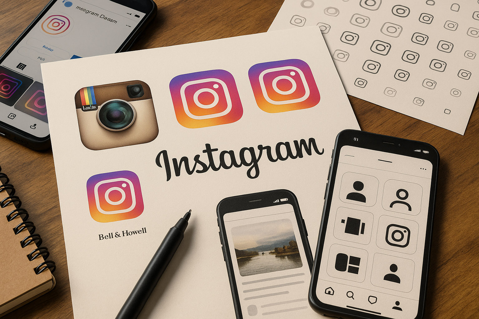
When Instagram launched in October 2010, the world was still in love with skeuomorphic design. The original logo, created by co-founder Kevin Systrom, was a literal homage to a vintage Polaroid camera. The app’s interface mirrored the tactile reality of analog photography: textured buttons, glossy surfaces, and the now-iconic square photo format.
Instagram’s first designer, Tim Van Damme, joined in 2011 and refined the visual language, but the focus remained on making digital photos feel tangible and “real.” Filters like X-Pro II and Earlybird became instant classics, and the app’s brown-and-beige palette evoked nostalgia for physical film. The UI was playful and ornamental, with borders, drop shadows, and a sense of digital materiality.
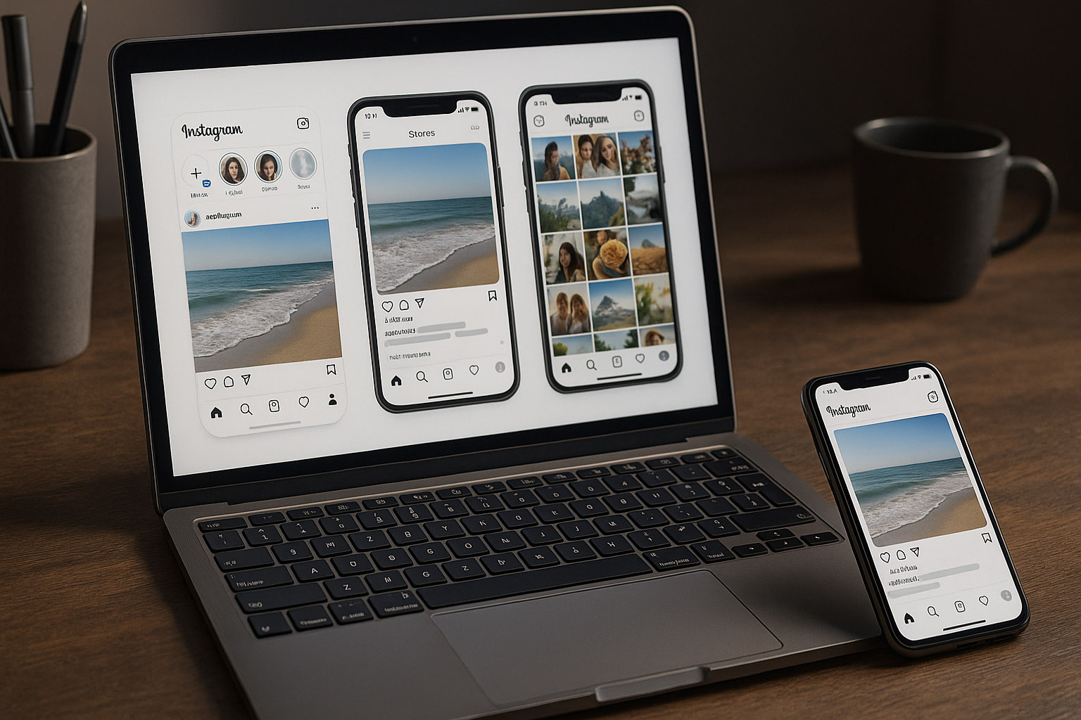
As iOS 7 ushered in the era of flat design in 2013, Instagram followed suit. The app’s look was overhauled to embrace simplicity and clarity: gone were the textures and shadows, replaced by crisp lines, bold icons, and whitespace. The square format endured, but the interface became more neutral, letting user content shine.
Luke Woods, Instagram’s Head of Design at the time, led the transition. The challenge was to modernize without losing the brand’s warmth. The new design language was lighter, faster, and more adaptable—laying the groundwork for future features like Stories and Explore.
Instagram’s explosive growth brought unique UX challenges. As the app expanded from photos to videos, messaging, shopping, and more, the design team faced a constant balancing act: how to add functionality without overwhelming users?
Notably, the introduction of Stories in 2016—Instagram’s answer to Snapchat—required a radical rethink of navigation and visual hierarchy. The team prototyped dozens of variations, striving for a seamless, “thumb-friendly” flow. The Explore tab evolved from a static grid to a dynamic, algorithm-driven discovery engine, demanding new approaches to layout and interaction.
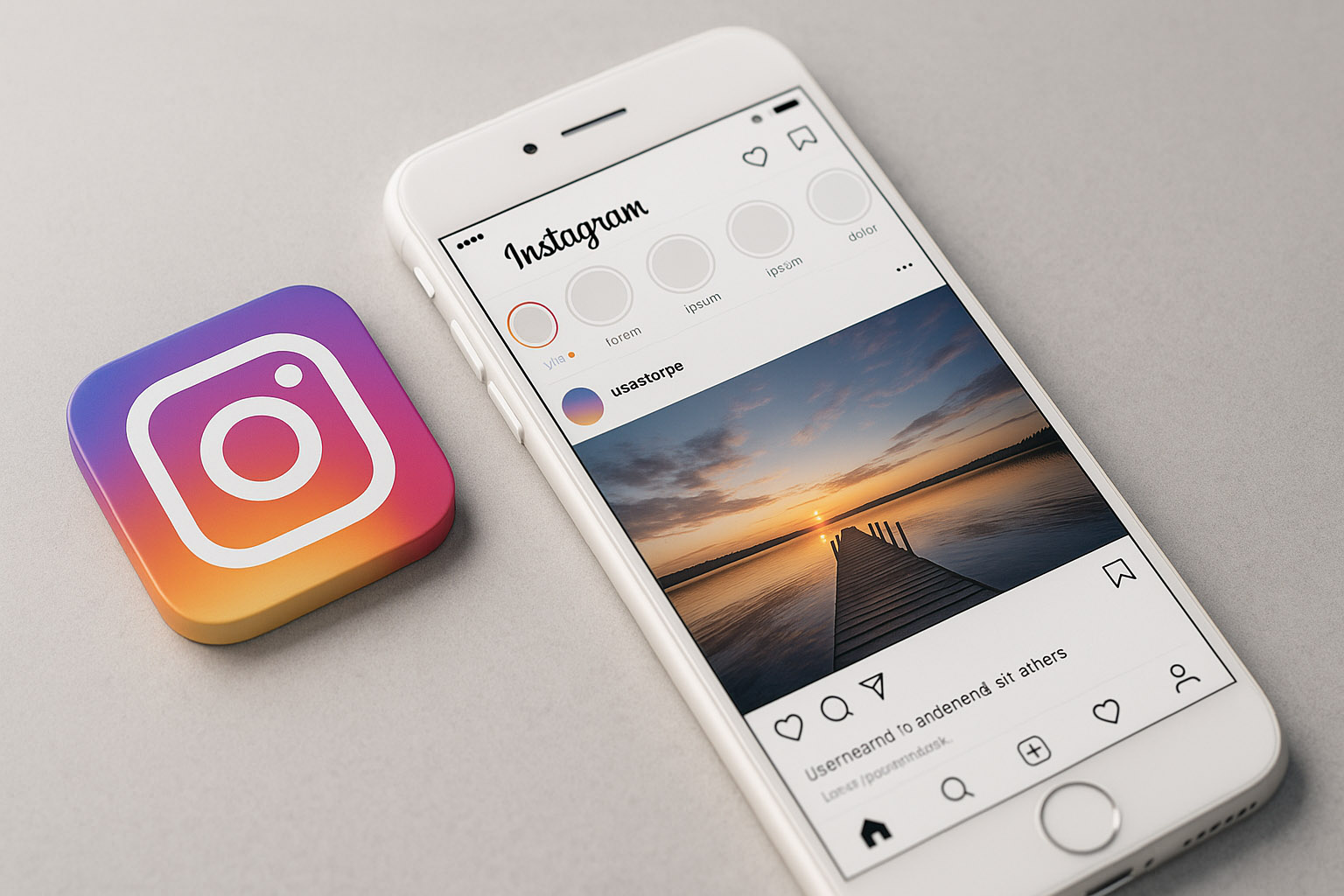
In May 2016, Instagram unveiled its most controversial change: a new logo and complete visual refresh. Gone was the realistic camera icon, replaced by a minimalist glyph set against a vibrant pink-orange-purple gradient. The redesign, led by Ian Spalter (then Head of Design), aimed to reflect Instagram’s transformation “from a place to share filtered photos, to a diverse community of interests.”
The UI became even more stripped-back, with bold black-and-white elements and a focus on content. While initial reactions were mixed—some users mourned the “old” Instagram—the new identity proved resilient, adaptable, and instantly recognizable. The gradient became a visual shorthand for the brand, influencing everything from marketing to in-app animations.
Instagram’s design team has always punched above its weight. Early on, the company relied heavily on a small, tight-knit group of designers and engineers. As Instagram scaled, it built a dedicated design culture—one that prized prototyping, iteration, and close collaboration with engineering.
Notably, Instagram’s design team has included industry leaders like Luke Woods, Ian Spalter, and Cameron Pan, as well as alumni from agencies such as Mackey Saturday (who refined the wordmark) and the in-house Instagram Design team. The team’s process often involved rapid, high-fidelity prototyping and user testing, with an emphasis on global accessibility and performance.

Instagram’s design journey is a microcosm of the broader evolution of digital products—from skeuomorphic nostalgia to minimalist, scalable frameworks. Its visual identity has become a cultural touchstone, influencing not just apps, but how we share and see the world.
“The story of Instagram design isn’t over. As the platform continues to evolve—embracing AR, new forms of media, and global communities—its design team faces new challenges. But one thing remains constant: a relentless focus on making the complex feel simple, and the digital feel human.”


News, insights, case studies, and more from the rausr team — straight to your inbox.
Send us your brief, your wildest idea, or just a hello. We’ll season it with curiosity and serve back something fresh, cooked with care.