LEGO Brand Design Evolution: From Wooden Toys to a Global System of Play
How LEGO evolved its logo, packaging, minifigures, retail spaces, and wider brand design from a small Danish workshop into one of the world’s clearest visual systems.

How LEGO evolved its logo, packaging, minifigures, retail spaces, and wider brand design from a small Danish workshop into one of the world’s clearest visual systems.
Many brands become famous through one symbol or one breakthrough product.
LEGO is more interesting than that.
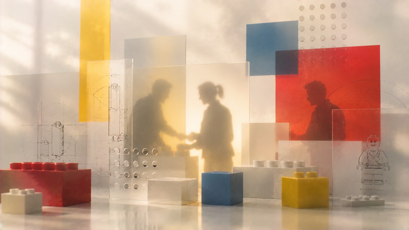
Its strength was built through a whole system where product design, logo evolution, packaging, instruction graphics, minifigures, store design, architecture, and brand tone all started speaking the same language.
That is why LEGO is worth studying as a design case. It shows how a company can grow for decades without losing its visual center. Official LEGO history still points back to 1932, to Ole Kirk Kristiansen, and to the principle that “only the best is good enough.” That phrase sounds simple, but in design terms it became a long-term discipline rather than a slogan.
This article sits naturally beside IKEA Design Evolution, Trend Cycles in Graphic Design, and The Process Behind Iconic Logo Design.
“LEGO’s real masterpiece is not a single object. It is the fact that the object, the box, the logo, the store, and the story all still feel like one family.”
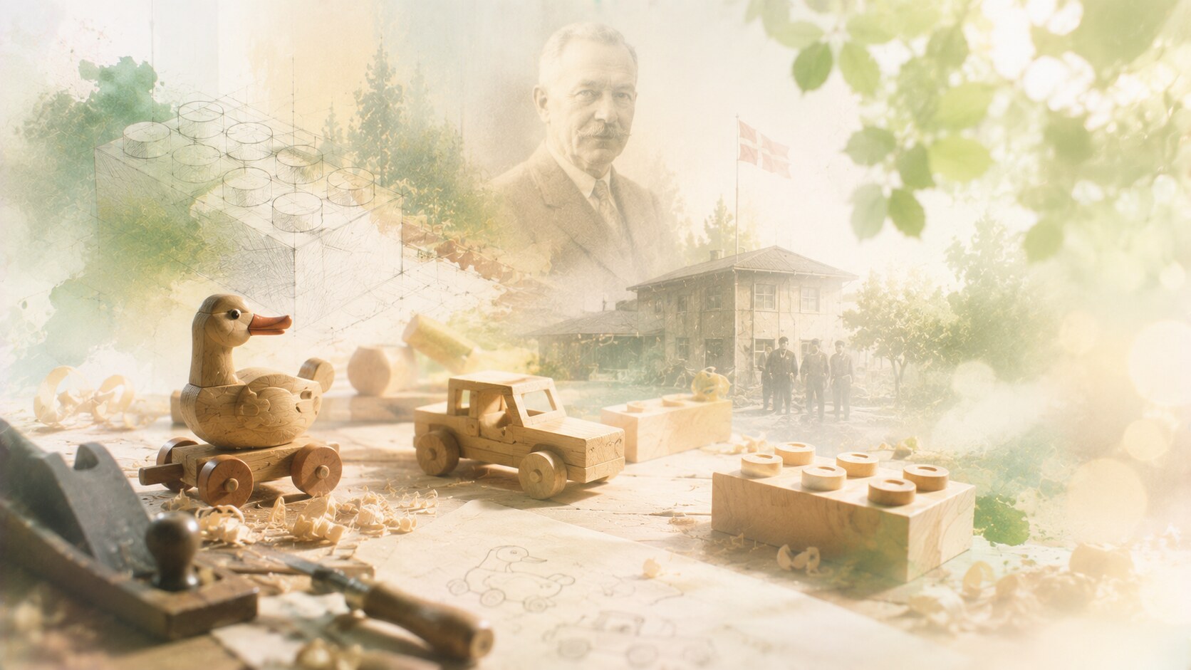
LEGO began in Billund as a carpentry business, which matters more than it may seem. The company did not start with branding theory or toy-world glamour. It started with making real objects carefully, under economic pressure, with a strong belief in quality.
That origin explains a lot of what came later. Even before the brick era, the company was already learning how to connect usefulness with imagination. The early years were not visually polished in the way people now associate with the brand, but they created the cultural base:
This is one hidden truth behind LEGO’s later success. The famous modern visual system came much later. The discipline came first.

The decisive leap came when LEGO moved from making separate toys to building a connected system. Official company history still highlights the 1958 version of the brick and its interlocking tube principle as the foundation that remained stable for decades.
That changed everything. Suddenly LEGO was no longer selling isolated products. It was selling compatibility, expansion, and confidence. One small set could talk to a bigger one. A product bought years later could still make an older one more valuable.
This made LEGO different from many toy brands. It was not mainly selling a finished fantasy. It was selling a framework that could keep generating new fantasies.
One of LEGO’s quiet design superpowers is that the brick works as both product and interface. Children do not need a long explanation. They understand the system with their hands.
There was also a risk in this strength. A system this successful can become conservative. The company has to keep inventing without damaging compatibility, which is one of the hardest design balances in consumer products.
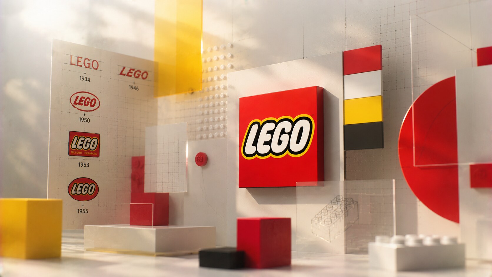
The LEGO logo passed through several versions before arriving at the familiar red field with white letters, yellow outline, and black shadow. That final logic works because it is extremely direct. It does not whisper. It performs.
On a toy shelf, subtlety is rarely the winner. LEGO needed a mark that could survive distance, clutter, motion, and international retail environments. The result was one of the clearest brand signatures in consumer design.
What is interesting is that the logo feels playful without being soft. It has energy, but it is still tightly controlled. The proportions are stable, the contrast is high, and the color field is unmistakable. In other words, it behaves less like a childish doodle and more like a very disciplined badge for play.
The wrong path here would have been trend-chasing. If LEGO had repeatedly flattened, softened, or stylized the logo to follow every design wave, it would likely have weakened one of its strongest long-term assets.
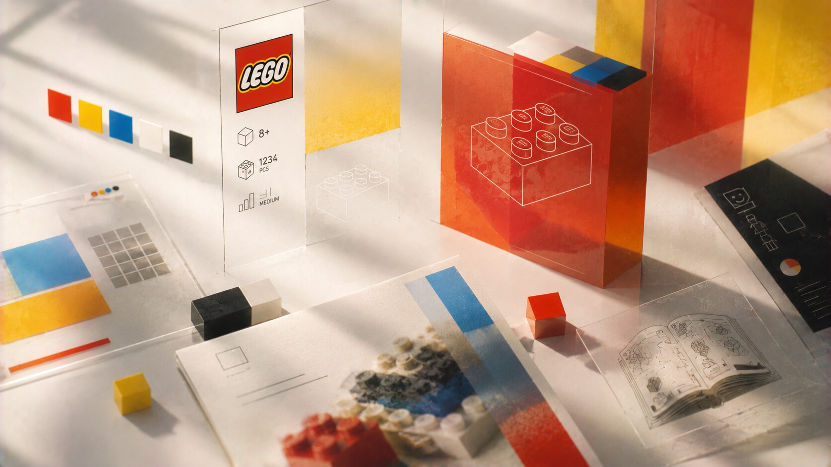
Packaging is one of LEGO’s most underrated design disciplines.
The box has to answer many questions at once. What is this set? What age is it for? How difficult is it? Is it a display object, a child’s play set, or a licensed collector item? LEGO became unusually good at making these layers readable without turning the box into noise.
Its packaging evolution brought several things into balance:
Instruction manuals matter just as much. This is where LEGO’s graphic design discipline becomes very visible. The manuals had to make building feel possible, not hard and scary complicated. They are one of the company’s best examples of information design serving emotion. If the steps feel clear, the set feels smarter.
At times, very franchise-heavy packaging can make the external entertainment property louder than the LEGO system itself. That may help a short-term sale, but it can weaken the brand’s own design grammar if pushed too far.

If the brick created logic, the minifigure created attachment.
The modern LEGO minifigure, strongly associated with Jens Nygaard Knudsen, gave the company a much more emotional design tool. Now the system could carry humor, identity, professions, worlds, and stories in a much more immediate way.
This was a major shift. LEGO was no longer only a construction brand. It was becoming a narrative brand.
The brilliance of the minifigure is that it stayed standardized enough to keep coherence, but expressive enough to invite endless variation. That is a rare design achievement. Too much standardization becomes cold. Too much variation becomes chaos. LEGO found the middle.
“The brick made LEGO expandable. The minifigure made it lovable.”
One hidden reason this mattered so much: the minifigure allowed LEGO to move more confidently into cities, castles, space, licensed worlds, and later adult nostalgia, without changing the core physical language.
Some brands can explain their design history through one famous external creative director. LEGO is not really one of them.
The central names matter, of course:
But LEGO’s bigger success came from protecting a strong internal design culture over time. The company behaves less like a brand that occasionally buys design from outside, and more like a company that absorbs partners into an already clear logic.
That does not mean external collaborators did not matter. In architecture and spatial branding, for example, Bjarke Ingels Group became very relevant through LEGO House and the wider Billund context. But even there, the collaboration worked because the external work translated LEGO’s own modular thinking instead of replacing it.
This is one reason LEGO still feels coherent across so many product families. The authorship is distributed, but the design grammar stays recognizable.
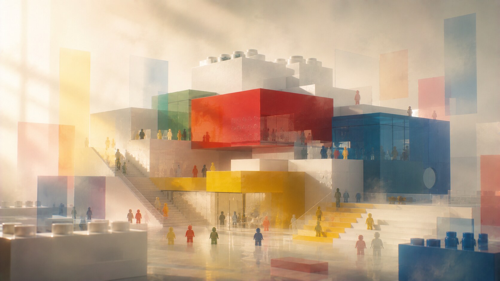
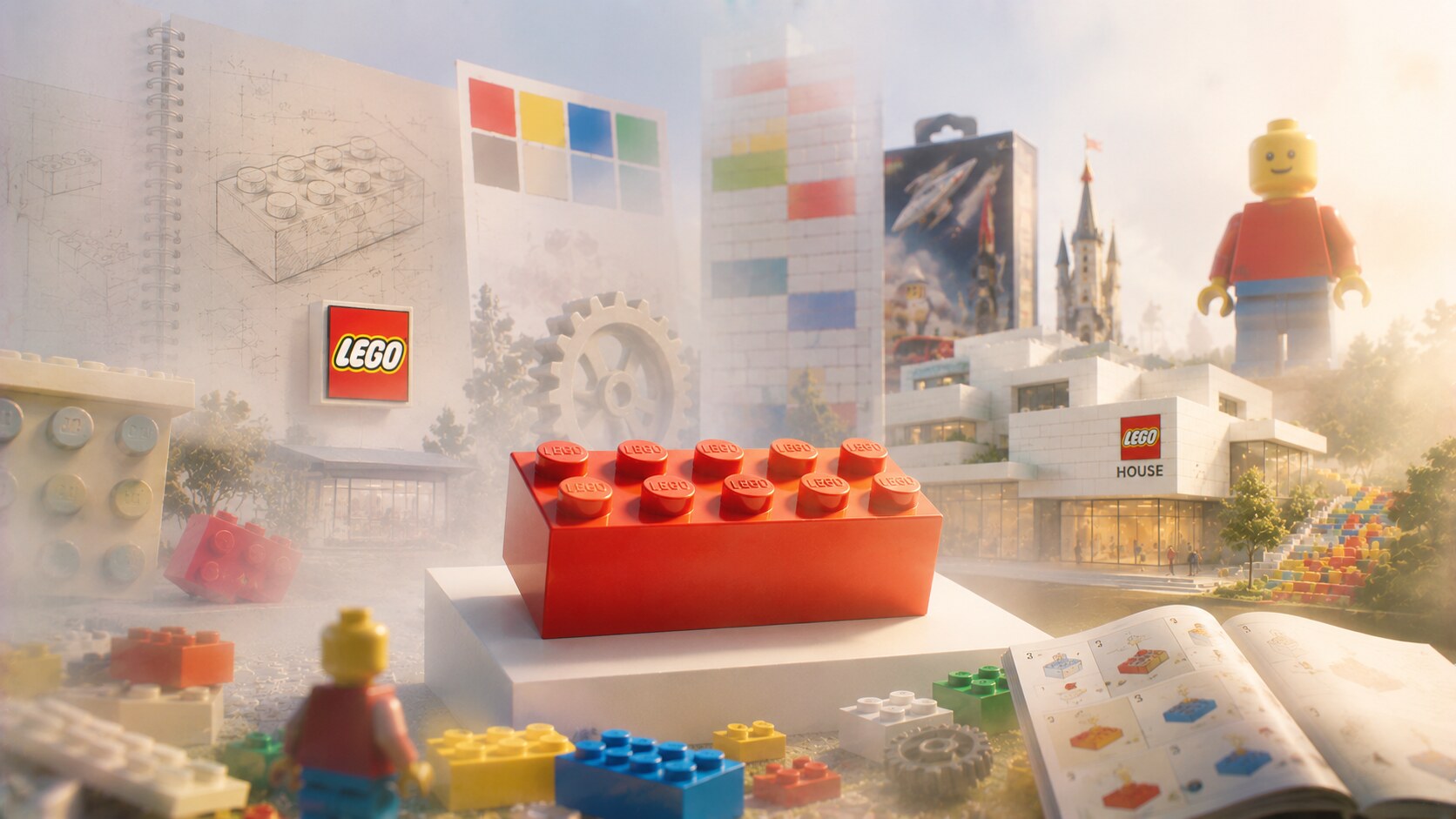
LEGO became far stronger once its environments started behaving like enlarged versions of the product itself.
Retail design, experience spaces, and especially LEGO House in Billund made the brand architectural. LEGO House openly presents itself as the “Home of the Brick,” and that phrase is useful because it describes exactly what the place does. It makes the brand’s values visible in space.
The success of this phase came from clear translation:
This is where LEGO moved beyond packaging and product into something closer to total design.
The obvious idea behind LEGO House, making a building feel like stacked bricks, sounds easy only after somebody makes it work elegantly. In practice, obvious brand architecture is usually very hard to do without becoming theme-park kitsch.

Not every chapter in LEGO’s growth was equally clean. The brand has had enormous successes, but also recurring tensions.
| Era or move | What worked | What became problematic |
|---|---|---|
| System brick era | Compatibility built long-term trust | Innovation had to stay inside a strict framework |
| Minifigure expansion | Added affection and storytelling | Character culture could overshadow pure building |
| Licensing era | Opened huge new audiences | External franchises could become louder than LEGO itself |
| Adult collector focus | Expanded cultural prestige and margins | Risk of higher complexity, price pressure, and collector fatigue |
| Spatial branding and LEGO House | Made the brand immersive and memorable | Could drift into spectacle if not connected back to product culture |
The pattern is surprisingly consistent. LEGO usually succeeds when it adds layers on top of the brick logic. It becomes weaker when the layer tries to replace the logic.
That is also the best simple way to read its design history.
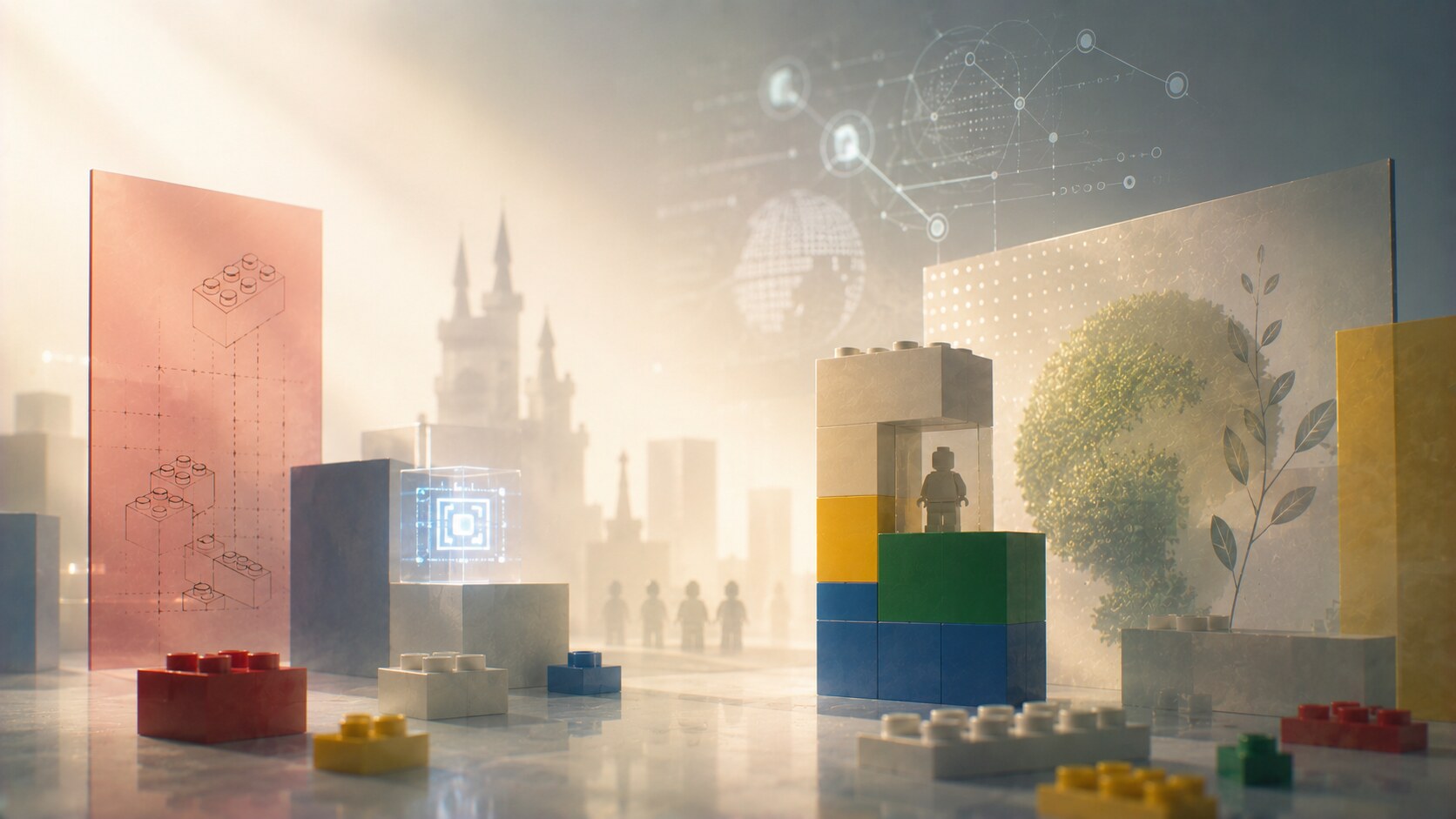
Today LEGO operates across children’s sets, collector editions, films, digital experiences, education, fan communities, and branded spaces. That range is a strength, but it also raises the design challenge.
The company has to balance several pressures at once:
This is why LEGO’s next chapter will probably not depend on a radical visual reinvention. It will depend on whether the company can keep translating the old design intelligence into new contexts.
The hidden lesson here is useful far beyond toys. Great brands do not survive by looking new every year. They survive by proving that their core logic still works in new conditions.
LEGO’s evolution is not the story of constant visual revolution. It is the story of a company that kept building outward while protecting a strong center.
The logo became clearer. The packaging became smarter. The minifigure made the brand warmer. The stores and LEGO House made it spatial. The digital era made the system more hybrid.
But the central promise stayed visible: build, combine, imagine, repeat.
That is why LEGO remains one of the clearest examples of long-term brand design done properly. It did not only create famous products. It created a design language that still scales without losing its identity.
News, insights, case studies, and more from the rausr team — straight to your inbox.
Send us your brief, your wildest idea, or just a hello. We’ll season it with curiosity and serve back something fresh, cooked with care.