The Evolution of NVIDIA Branding: From Gaming GPUs to the AI Giant
How NVIDIA evolved from a 1993 visual-computing startup into one of the world's most powerful AI brands, and how its identity, product systems and design decisions shaped that story.

How NVIDIA evolved from a 1993 visual-computing startup into one of the world's most powerful AI brands, and how its identity, product systems and design decisions shaped that story.
NVIDIA is one of the strangest brand stories in modern technology.
It started as a company for 3D graphics and gaming. Then it became a GPU company. Then a CUDA company. Then an RTX company. Then, almost suddenly to the public, it became one of the central companies of the AI age.
But visually, the brand did not change as dramatically as the business.
The green eye stayed. The wordmark stayed controlled. The tone stayed technical, confident, and slightly futuristic.
That is why NVIDIA is a useful design case. The company did not win by constantly rebranding itself into every new trend. It kept a strong visual core and let the meaning around that core grow.
This article sits naturally beside The Evolution of Adobe Branding and App Design, The Evolution of Google Design, and Branding Codes That Stick.
“NVIDIA’s best brand move was keeping the same eye while teaching the world that the eye was no longer only looking at graphics. It was looking at computing itself.”

NVIDIA was founded on April 5, 1993 by Jensen Huang, Chris Malachowsky, and Curtis Priem.
The official company timeline describes the original belief clearly: the PC would become a device for consumers to enjoy games and multimedia. Today that sounds obvious. In 1993, it was a bet.
At the time, the graphics-chip market was crowded and unstable. NVIDIA’s own history says there were a little more than two dozen graphics-chip companies when it started, and that number grew to around 70 three years later. By 2006, NVIDIA says it was the only independent company from that group still operating.
That fact explains the brand’s tone.
NVIDIA never looked like a casual consumer startup. It looked like a company trying to survive a technical war.
Early brand signals were built around:
The company name itself comes from the idea of vision and envy. Many logo-history summaries connect it to the Latin word invidia, meaning envy, which makes the eye mark feel less random than it first appears.
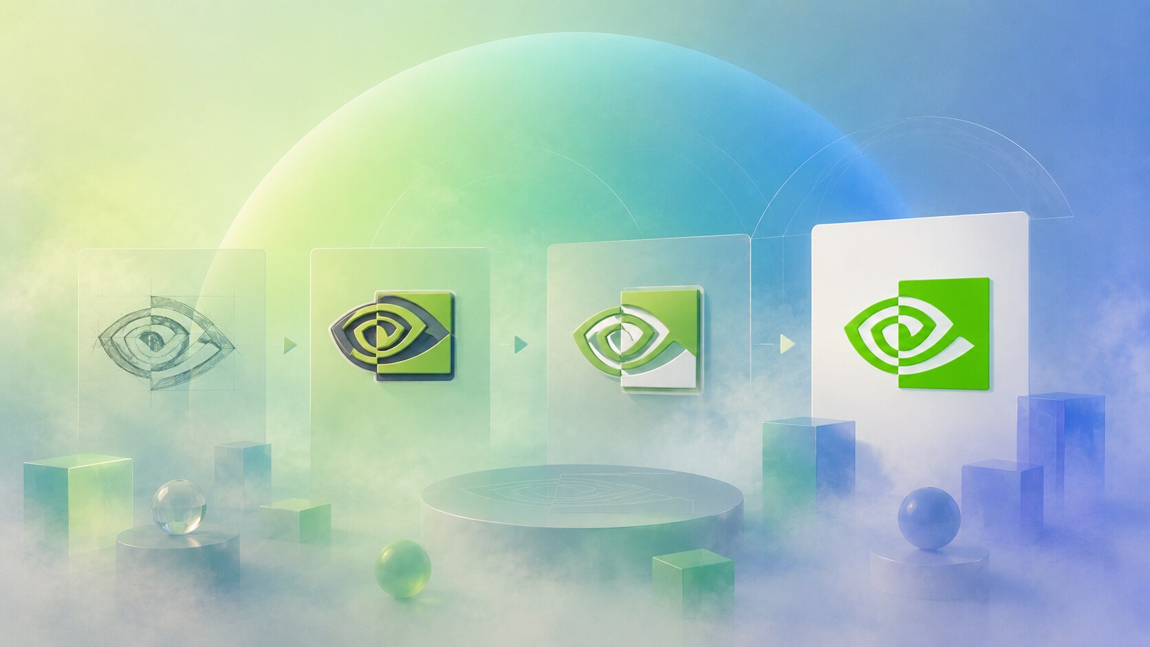
The NVIDIA logo is not a typical semiconductor mark.
It does not show a chip. It does not show a wire. It does not show a letter monogram only.
It shows an eye.
That was unusually strong because the company’s original territory was visual computing. The eye could carry many meanings at once:
The early logo used a more complex eye form and a different typographic style, including the old nVIDIA capitalization. The later 2006-era identity made the system cleaner: stronger green, a clearer eye, and an all-caps wordmark that felt more like a serious platform company than a 1990s graphics-card brand.
Public sources do not point to one famous outside agency behind the original NVIDIA identity. The safest reading is that the core branding grew from internal company decisions and later internal brand governance, rather than one publicly celebrated studio story.
That is not a weakness.
Some technology brands are built less like fashion identities and more like engineering symbols that slowly accumulate meaning.
NVIDIA’s official brand guidelines are strict about not separating the eye mark and wordmark, not changing proportions, not using retired marks, and not putting the logo on busy backgrounds. That tells us the company sees consistency as a serious strategic asset.
Every giant technology story needs a painful early lesson.
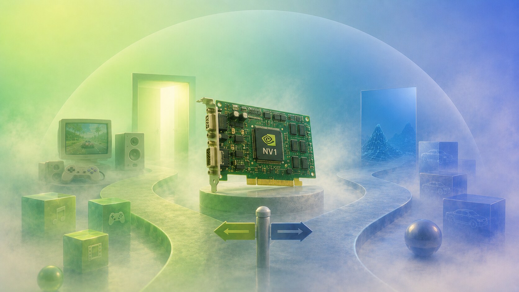
For NVIDIA, one of those lessons was NV1, the company’s first product, launched in the mid-1990s through the Diamond Edge 3D card. It was ambitious because it combined 2D graphics, 3D graphics, audio, and game-controller support.
But ambition was not enough.
The market moved toward Microsoft Direct3D and triangle-based 3D graphics, while NV1’s approach was tied to quadratic texture mapping. That made the product historically interesting, but commercially difficult.
This was a blind path because it looked like a complete multimedia future, but the standardization of the market went another way.
The brand lesson is clear:
NVIDIA survived because it learned quickly. The later RIVA 128 and TNT products moved the company closer to what the PC graphics market actually needed.
NV1 is a useful reminder that futuristic branding can become fragile when the technical bet underneath it is wrong.

The real consumer-brand breakthrough came with GeForce.
In 1999, NVIDIA introduced the GeForce 256 and popularized the idea of the GPU, the graphics processing unit. That word was more than a technical label. It became a category-making branding move.
Suddenly NVIDIA was not only one supplier of graphics chips. It was helping define what the product category should be called.
GeForce worked because it combined:
The green brand color became especially important during this period. In gaming hardware, color became almost tribal. NVIDIA green, AMD red, and later many RGB ecosystems turned component buying into identity buying.
That matters in graphic design because GeForce packaging, driver screens, case badges, and partner cards made the brand visible in many places where the physical GPU itself was hidden.
One hidden strength of NVIDIA branding is that it often appears as a performance seal on someone else’s product: laptops, workstations, graphics cards, cloud machines, and game trailers. That makes the brand behave like both ingredient and hero.

CUDA, introduced in 2006, may be NVIDIA’s most important strategic design decision, even though it was not a visual identity project.
It changed what the brand meant.
Before CUDA, NVIDIA was mainly understood through images, games, pixels, and frames per second. After CUDA, the company could speak to scientists, researchers, developers, simulation teams, and later AI labs.
This created a deeper brand transformation:
NVIDIA’s current official timeline says more than 3.8 million developers now create applications for accelerated computing, and more than 35,000 companies use NVIDIA AI technologies. That did not happen from a logo change. It happened because the platform changed the meaning of the logo.
CUDA is one of the best examples of invisible branding. Most normal consumers did not care about it at first, but it gave NVIDIA the developer gravity that later made the AI era possible.

The public story changed dramatically after AI workloads began proving how powerful GPUs could be.
NVIDIA’s timeline points to 2012, when GPUs powered the AlexNet neural-network breakthrough. In the years after that, the company moved from gaming and professional visualization into data centers, AI training, inference, robotics, automotive systems, and what Jensen Huang now often frames as accelerated computing infrastructure.
This is where the branding becomes almost strange.
The same green eye that once belonged to graphics cards now appears on:
The financial scale also changed the brand meaning. NVIDIA’s fiscal 2026 annual report listed $215.9 billion in revenue, up 65% year over year, with data-center demand leading the growth. The company also reported $130.4 billion in operating income.
That is why NVIDIA now feels less like a component brand and more like infrastructure for the AI economy.
Jensen Huang’s black leather jacket became an unofficial brand asset. It is not in the logo guidelines, but visually it works like a human extension of the company’s keynote identity: consistent, recognizable, and slightly theatrical.

It would be wrong to say NVIDIA left graphics behind.
RTX, introduced in 2018, made real-time ray tracing a mainstream brand idea. That was important because it gave NVIDIA a strong visual story even as AI became the financial engine.
RTX branding worked because it was easy to demonstrate:
Omniverse was another ambitious step. It positioned NVIDIA around digital twins, simulation, collaboration, robotics, and industrial 3D worlds. The brand language around it was big and future-facing.
But this is also where a blind-path risk appears. The metaverse wave cooled publicly after its peak hype, and anything using that language had to be reframed around more concrete industrial value. NVIDIA handled that better than many companies because Omniverse could move toward simulation and robotics, not only virtual-world fantasy.
The danger for NVIDIA is not looking too old. The danger is making every future platform sound inevitable before the market has understood why it needs it.
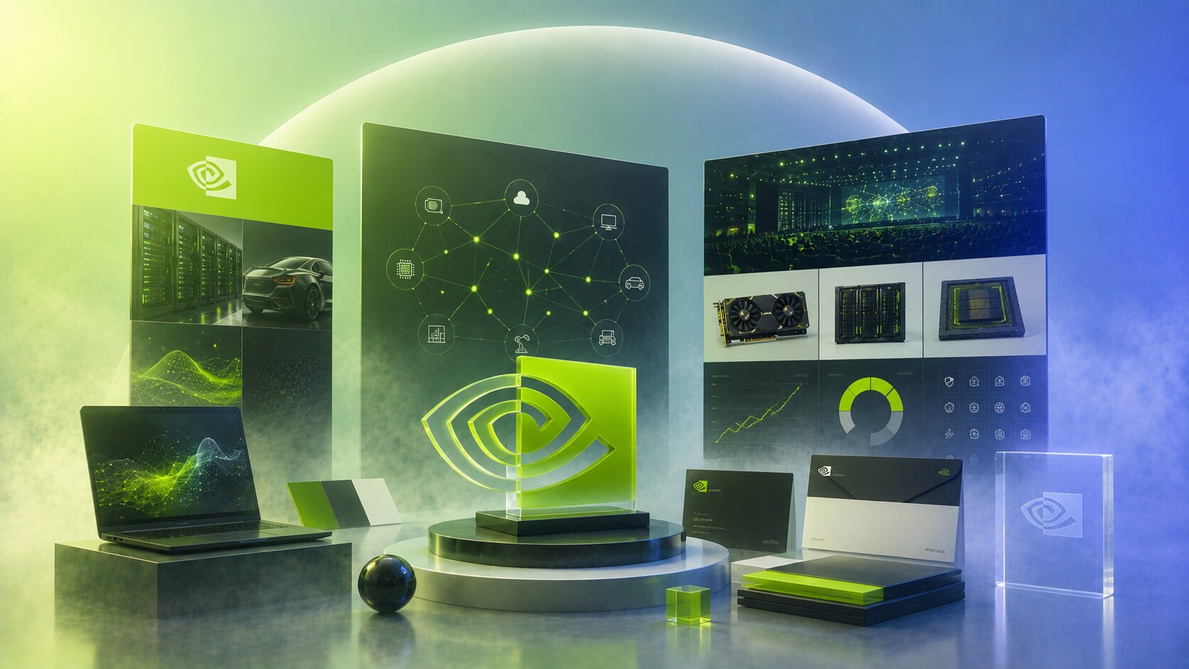
Today NVIDIA’s design language is less playful than many consumer-tech brands.
It is built from a few durable codes:
The official logo guidelines say the logo is the primary brand identifier and give strict rules around color, size, contrast, clear space, misuse, fan art, imitation, and retired branding. That kind of document is not glamorous, but it is how global brand control actually works.
NVIDIA also has a special challenge because many people encounter the brand through partners:
So the identity has to survive outside NVIDIA-owned surfaces. That is why consistency matters so much.
NVIDIA’s brand strength is not only that people know the logo. It is that the logo often signals hidden capability inside another product.

The story becomes clear when seen as phases:
| Era | Design or brand move | Result |
|---|---|---|
| 1993-1996 | visual-computing startup with an eye concept | strong idea, unstable market |
| 1995 | NV1 multimedia bet | ambitious but technically misaligned |
| 1997-1999 | RIVA and GeForce | performance identity becomes credible |
| 2006 | CUDA and cleaner logo system | brand shifts toward platform computing |
| 2012 | AlexNet AI acceleration | old graphics strength becomes AI advantage |
| 2018 | RTX | visual excellence becomes easy to demonstrate again |
| 2020s | data center and Blackwell systems | NVIDIA becomes an AI infrastructure brand |
The successful decisions were not only graphic.
They were structural:
The weak paths were also structural:
The future NVIDIA brand will probably move in three directions at once.
It will stay a gamer brand through GeForce. It will stay a creator and visualization brand through RTX. But above all, it will become more of an infrastructure brand for AI factories, robotics, scientific computing, and national-scale compute.
That means the green eye has a new job.
It no longer only says “better graphics.” It says “the machine behind the future is probably running here.”
The funny part of NVIDIA’s brand evolution is that the logo did not need to become more artificial-intelligence-looking. The eye already looked like a symbol of perception, so the AI era made the old idea feel newly accurate.
NVIDIA began as a risky graphics startup.
It survived a wrong early product path, became a gaming-performance brand, turned GPUs into a computing platform, made CUDA a developer moat, used RTX to keep visual leadership alive, and then became one of the central brands of the AI economy.
The design lesson is simple but difficult:
NVIDIA’s green eye lasted because it was broad enough to carry graphics, vision, simulation, intelligence, and infrastructure.
That is rare. Most tech logos age when the company changes. NVIDIA’s logo became more useful because the company changed.
News, insights, case studies, and more from the rausr team — straight to your inbox.
Send us your brief, your wildest idea, or just a hello. We’ll season it with curiosity and serve back something fresh, cooked with care.