When people talk about Spotify, they usually talk about:
- algorithms
- playlists
- payouts
But behind all that is a remarkably specific design story:
how a tiny Swedish startup built a desktop app that felt faster than piracy — and then slowly turned it into an ambient, cross-platform listening layer that lives in phones, TVs, cars, consoles, and even fridges.
This article looks at:
- where Spotify began and why it started in Sweden
- how Spotify’s UI and UX shifted from “power user player” to “invisible background service”
- which platforms Spotify truly owns vs. just distributes to
- the less talked about trade-offs and missteps along the way
Where Spotify Began
Spotify began in Stockholm, Sweden, in the mid‑2000s. Founders Daniel Ek and Martin Lorentzon were surrounded by:
- exploding broadband adoption
- a strong engineering scene
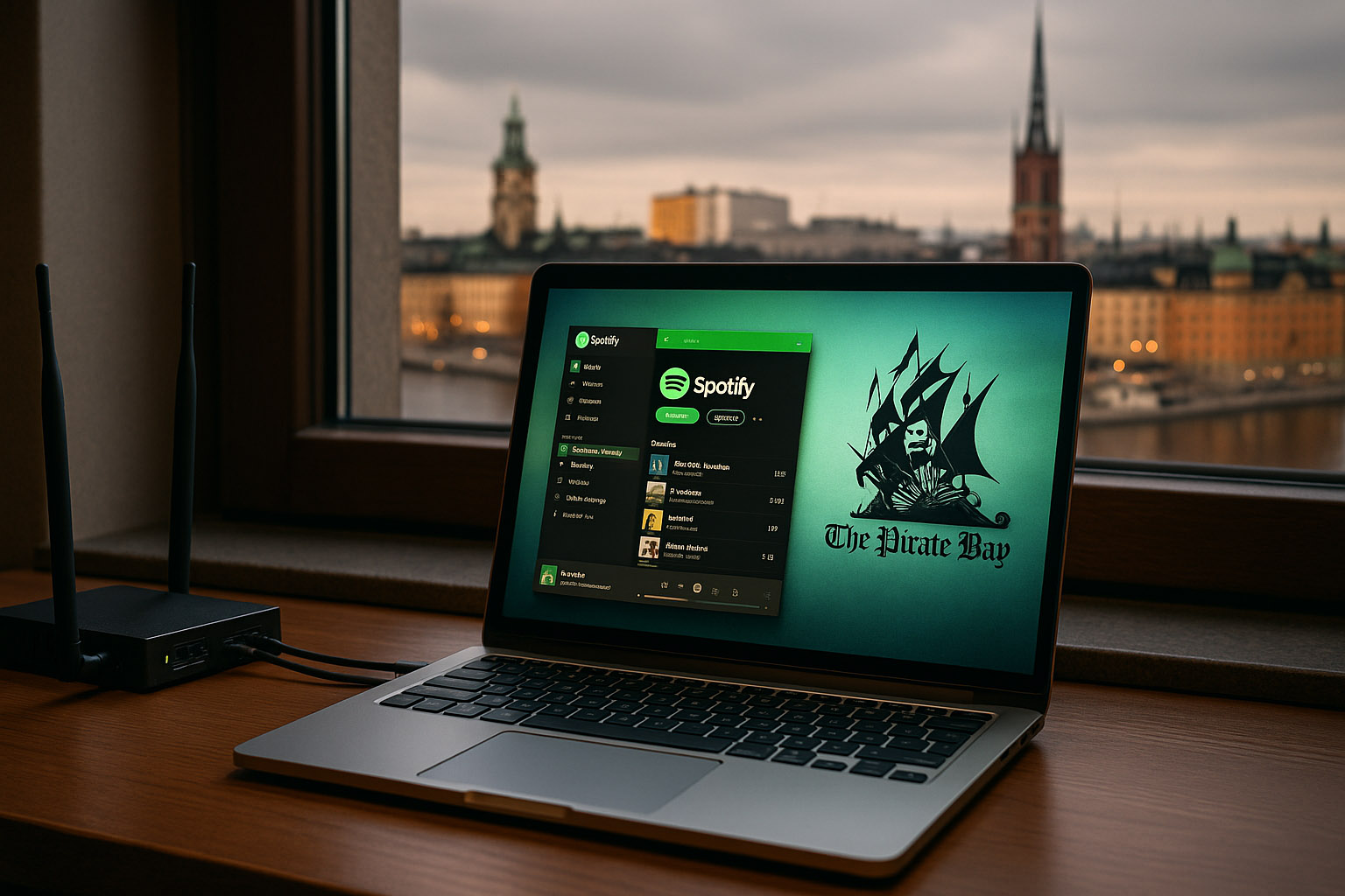
- and one of the world’s highest rates of music piracy (hello, The Pirate Bay)
The core design brief, although rarely phrased like this publicly, was simple:
Make something so fast and frictionless
that it feels better than downloading illegally.
Early UX priorities
- Speed over everything – local caching, peer‑to‑peer streaming, and a native desktop stack were chosen because a web player would have felt too slow for 2006–2008.
- Keyboard-driven control – the early Windows client behaved more like Winamp or iTunes than a website.
- No physical player – unlike Apple’s iPod ecosystem, Spotify skipped hardware and went purely digital, betting that your existing laptop and later phone would be “the player”.
Even the now-familiar Spotify green started as a slightly harsh, neon accent — partly to stand out against the dark, desaturated UI of other media players at the time.
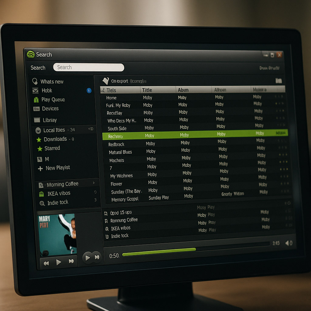
The first widely known Spotify experience was desktop-only and invite‑based.
What the UI looked and felt like
- Left sidebar with:
- search
- playlists
- friends / social
- Center pane with dense track lists, small typography, and visible metadata
- Bottom bar with transport controls, volume, and artwork
It looked like a mash‑up of iTunes, MSN, and a torrent client — in a good way.
Key UX decisions:
- Streaming felt instant – tracks started in a fraction of a second. Design supported this with minimal transitions and instant feedback.
- Social was built-in, not bolted on – playlists were easy to share, collaborative playlists felt like MSN-era group chats for music.
- Offline mode without hardware – instead of a dedicated device, you could mark playlists for offline; the desktop app blurred local files and streamed tracks in one view.
At this stage, Spotify’s design target was heavy computer users in Europe, not yet a “global mainstream phone app”.
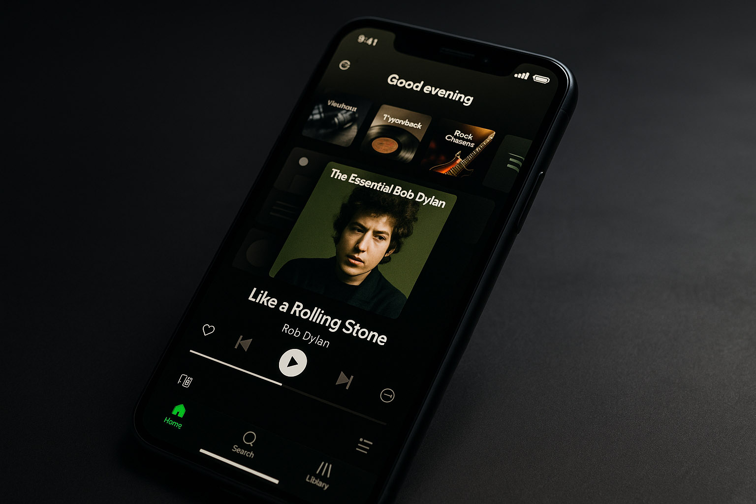
The Mobile Shift: From Player to Companion (2011–2015)
As iOS and Android matured, Spotify’s real challenge became clear:
How do you shrink a dense, power‑user desktop UI into a thumb‑driven, distraction‑heavy phone?
Major design shifts
- Navigation moved from sidebar lists to tab bars and drawers.
- Artwork got bigger, buttons became fewer.
- Typography became more legible, and spacing increased.
- The brand’s green softened and dark backgrounds turned into a signature dark theme that made album covers pop.
Where the UX was targeted
- On-the-go listening – commute, gym, walking, studying.
- One-handed use – reachable controls at the bottom, swipe gestures for queue and library.
- “Lean-back” behavior – instead of picking every song, users were nudged toward Radio, Discover Weekly, and curated playlists.
Under the hood, this was a strategic design pivot:
Spotify’s value shifted from being your library to being your DJ.
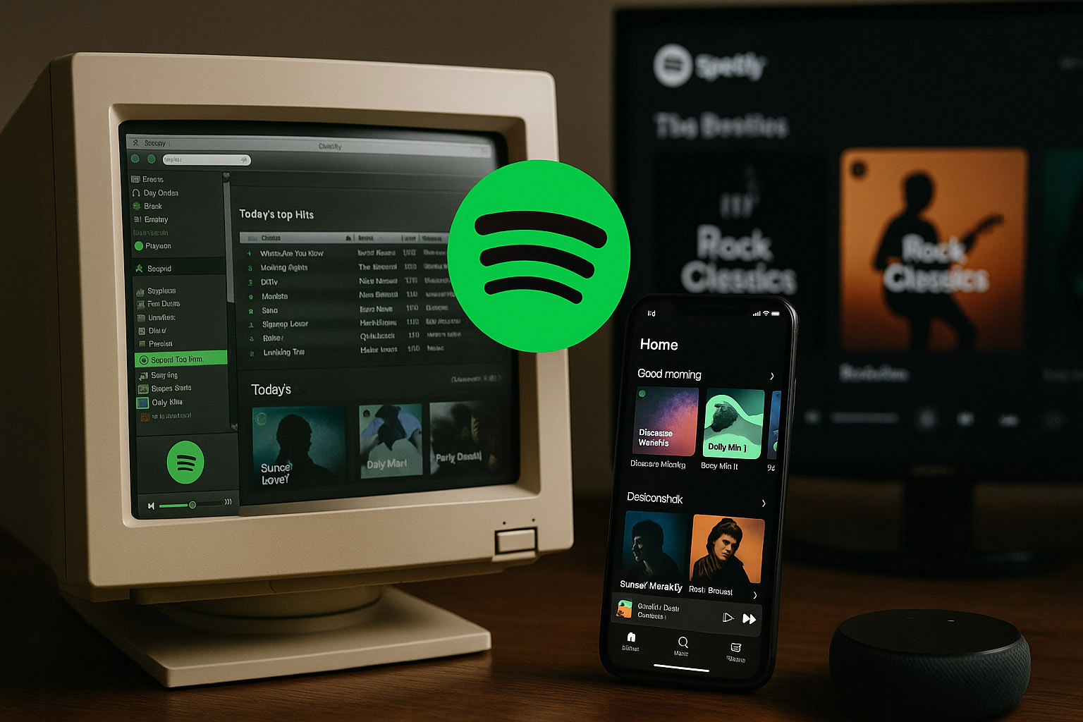
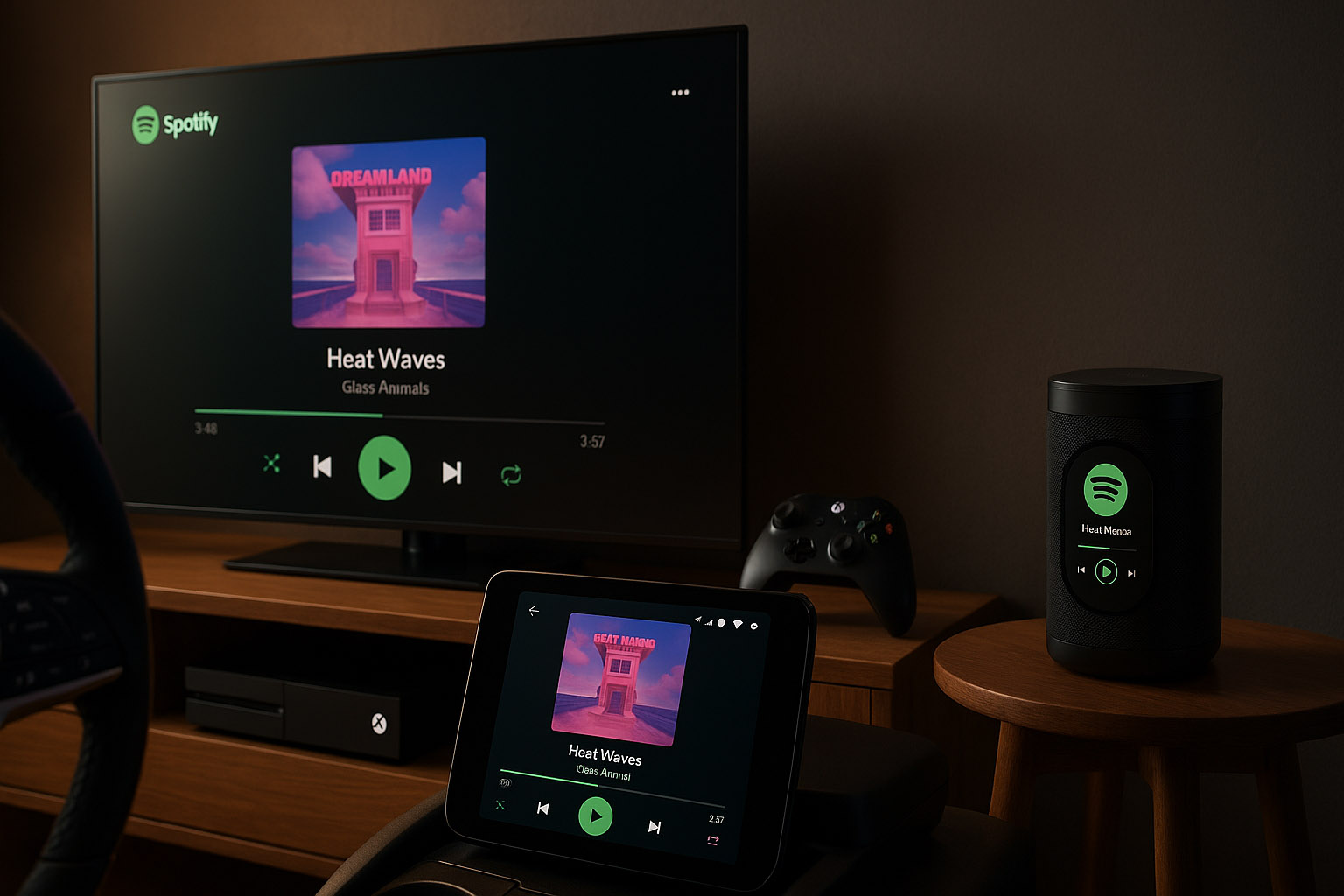
Ambient Everywhere: TVs, Cars, Consoles, Speakers (2015–2020)
Once mobile stabilized, Spotify design had a new goal:
Make Spotify feel like one continuous session,
no matter which device actually outputs the sound.
This is where Spotify Connect and platform distribution became crucial.
- Own apps on:
- iOS, Android
- Windows, macOS, Linux (community-supported)
- Web player in modern browsers
- Client apps or integrations on:
- Smart TVs (Samsung, LG, Android TV, etc.)
- Game consoles (PlayStation, Xbox)
- Smart speakers and displays (Sonos, Google, Amazon, etc.)
- Car systems (Android Auto, CarPlay, embedded OEM integrations)
Spotify doesn’t own most of this hardware — but its design language travels:
- consistent dark backgrounds and green highlights
- familiar play, queue, and heart / plus interactions
- similar Now Playing layouts, adapted for distance and glanceability
The invisible handoff
- Start listening on your phone, hand off to TV or speaker.
- The “device picker” becomes a subtle but central UI component.
- The phone becomes a remote — Spotify’s true “hardware” is the screen you already own.
In contrast to old-school physical players, there’s no flagship Spotify device.
The short-lived Car Thing accessory was an experiment, not a platform shift — and it was eventually discontinued.
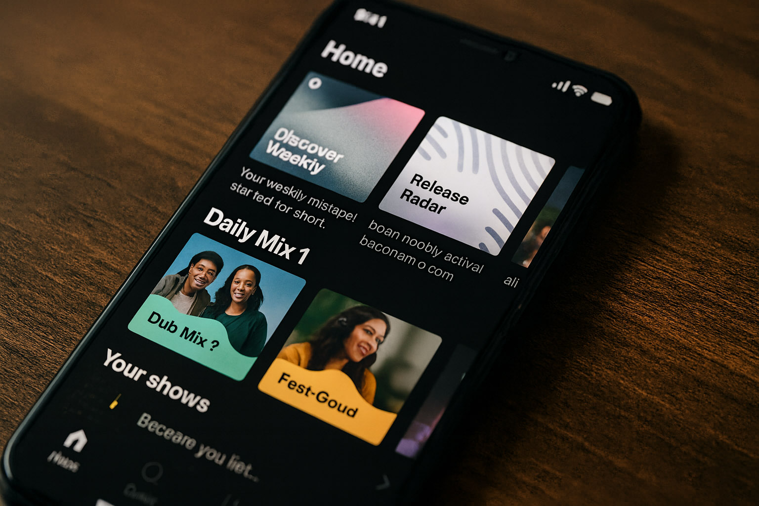
From Lists to Journeys: Personalization as Interface (2015–2023)
Another major evolution wasn’t visual first — it was algorithmic, and the UI followed.
Key personalization features:
- Discover Weekly and Release Radar playlists
- Daily Mixes and mood/genre-based rows
- Home feed sections tuned to habits (“Made for You”, “Your shows”, “Because you listened to…”)
Design-wise, this meant:
- The home screen turned into a stack of personalized shelves, different for almost every user.
- The distinction between “library” and “feed” blurred — your experience became a recommendation engine with a UI on top.
- Tiles, cards, and rows replaced simple, neutral lists of albums.
The Not-So-Great Parts of Spotify’s Design Story
For all its polish, Spotify’s evolution also includes controversial design decisions and UX friction.
1. When podcasts started eating the music app
As Spotify invested heavily in podcasts and spoken audio, the UI began to:
- mix songs and episodes in search results
- push podcast rows onto music-heavy home screens
- highlight exclusive shows with aggressive promotion slots
Many long-time users felt the core experience — “open app, play music fast” — became:
- noisier
- less predictable
- more like a media platform than a focused player
2. Algorithmic opacity
Features like:
- autoplay after albums end
- endless personalized mixes
- multi-source recommendations
…made the experience pleasantly effortless, but also:
- hard to control intentionally
- confusing for users who expect albums to stop when they’re done
- tricky for those who care about listening habits and privacy
Design-wise, the UI rarely surfaces why you’re seeing a particular recommendation.
3. UI volatility and experiments everywhere
Spotify runs constant A/B tests across markets:
- button shapes and labels
- shuffle vs. play emphasis
- layout of the Now Playing screen
Result:
- some users feel like their UI changes without warning
- tutorials and guides become outdated quickly
- the mental model of “where things live” is less stable than in older players
Under-the-Radar Design Details and Trivia
- Early versions used a peer‑to‑peer architecture to reduce server load; the UI didn’t expose this, but users felt it as “why is this so fast compared to other streams?”.
- The company maintains a dedicated Spotify Design site where they publish internal case studies — including failures and not‑shipped directions, something many platforms never share.
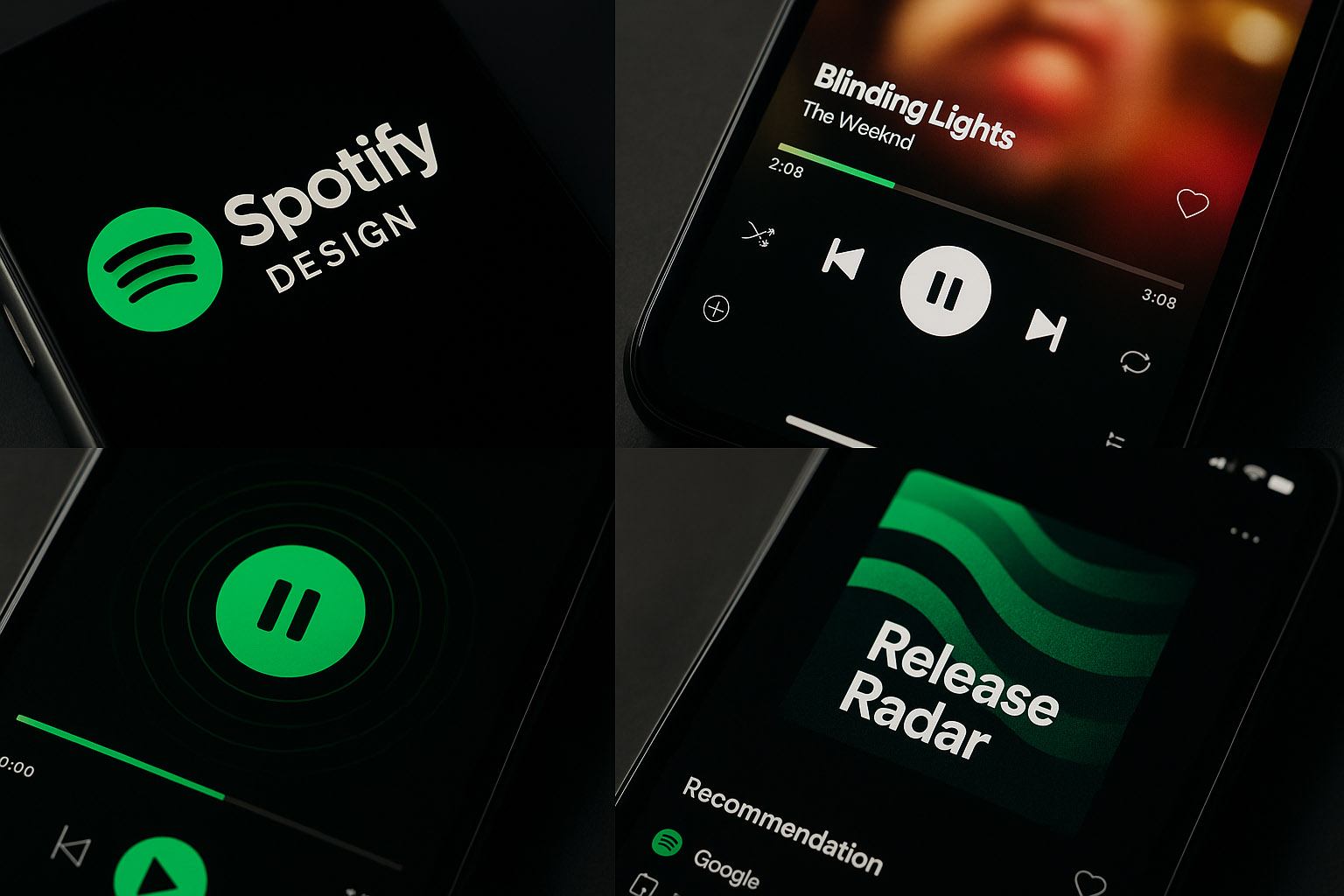
- Spotify’s green has been tweaked multiple times to work better on OLED screens and in dark mode, balancing vibrancy with readability.
- The app uses subtle micro-animations on play/pause, like pulsing waves or animated progress, to make an otherwise static dark UI feel alive without being distracting.
- Canvas (looped visual clips) was controversial internally and externally — some teams worried it would turn songs into mini TikToks, but it also opened a new visual layer for artists.
Today: A Layer, Not Just an App
In its current state, Spotify isn’t just a “music player”:
- it’s a multi-platform service that runs on hardware it doesn’t own
- it optimizes for ongoing sessions, not discrete plays
- it treats design as a way to gently nudge behavior:
- from albums to playlists
- from local libraries to algorithmic feeds
- from owning music to renting access
Summary: What Spotify’s Design Evolution Teaches Us
Where it began
- A Swedish desktop app, built to feel faster than piracy.
- No physical player, just clever software on hardware people already owned.
Where it is now
- An ambient listening layer on phones, TVs, consoles, and cars.
- A design system tuned for personalization, dark environments, and constant recommendations.
The trade-offs
- ✅ Frictionless, cross-device listening with strong personalization.
- ✅ Consistent visual language across many platforms they don’t control.
- ❌ Opaque algorithms and a sometimes noisy home experience.
- ❌ Music-first users feeling overshadowed by podcasts and promotions.