The Evolution of Twitter Design: From SMS Utility to X
How Twitter started, who shaped its earliest look, why the bird became one of the web's best symbols, which UX steps mattered most, where the design succeeded and even more

How Twitter started, who shaped its earliest look, why the bird became one of the web's best symbols, which UX steps mattered most, where the design succeeded and even more
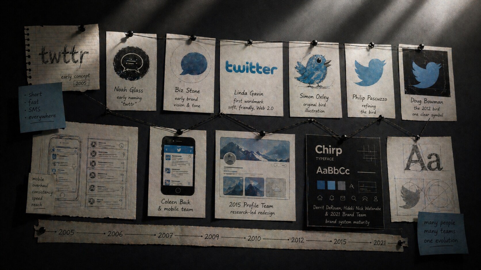
Twitter began as a tiny messaging idea inside Odeo, a podcast company that needed a new direction after Apple moved into podcasts. Jack Dorsey proposed a short status system built around SMS behavior, Noah Glass helped push the idea forward and is widely credited with the early name “twttr,” and the first famous message was still rough enough to read like a prototype: “just setting up my twttr.”
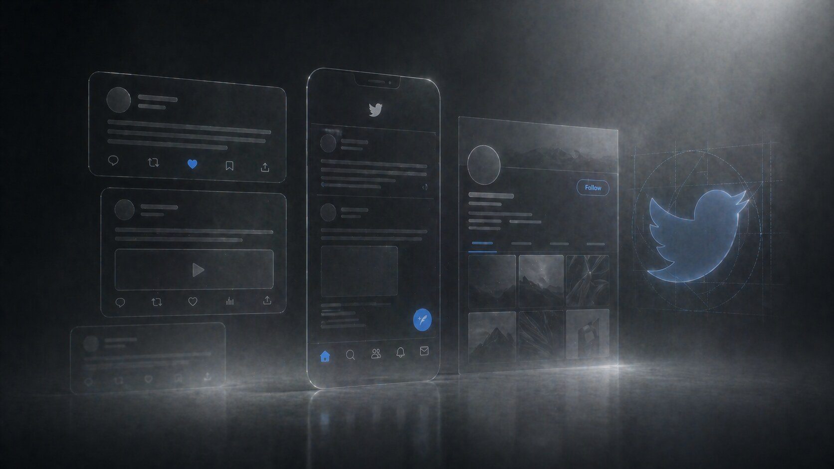
What makes Twitter’s design story interesting is that it was never only about looks. It was about compression. How much interface can you remove before the stream stops making sense? How do you make fast public conversation feel simple, visible, and addictive at once?
This article continues our platform-evolution series. For close neighbors, read The Evolution of Facebook Design, The Evolution of Instagram Design, and The Evolution of YouTube Design.
“Twitter’s best design idea was not the bird. It was the decision to make public conversation feel immediate.”

The earliest Twitter logic was not “build a rich social network.” It was closer to:
That matters because the product DNA shaped the design DNA. Twitter did not begin like Facebook, which was profile-heavy from the start. It began like a lightweight transmission system. The interface had to serve the message, not the other way around.
The original limitation of short posts was not just a quirky rule. It was a structural design constraint born from SMS culture, and that forced unusual clarity very early. Every part of the experience had to support speed: compose, post, read, scan, move on.
One of Twitter’s hidden advantages was that its original design problem was already sharp. Many products start too broad. Twitter started narrow enough to become legible fast.

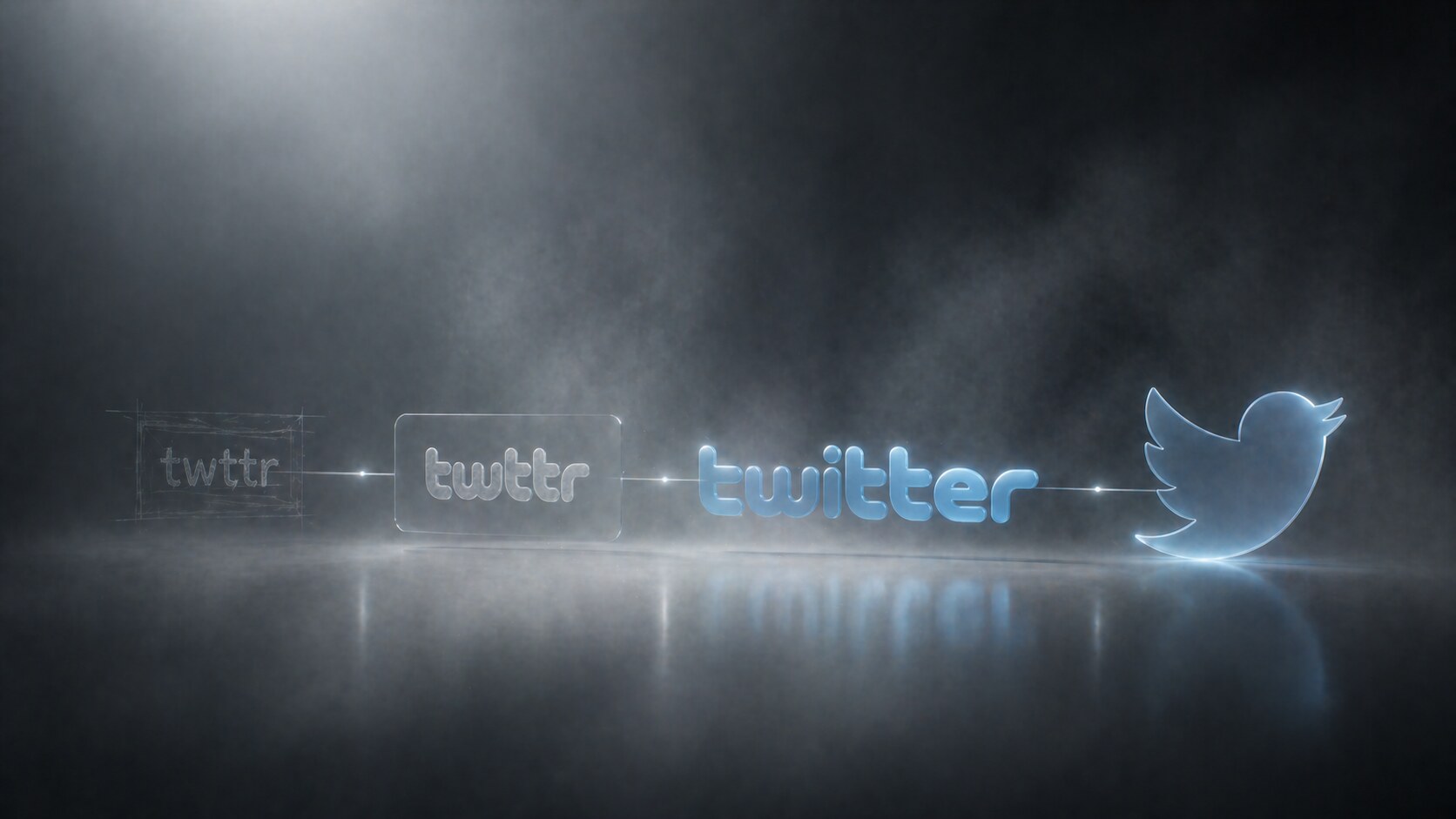
Before the polished blue identity, there were rougher internal logo experiments and naming ideas that felt very mid-2000s startup. The final shift from “twttr” to “Twitter” made the product feel less coded and more social.
The first public identity was a bubbly blue wordmark, commonly credited to Linda Gavin. It looked soft, friendly, and almost toy-like. In retrospect, it was very Web 2.0:
This was not a timeless identity, but it was useful. The product was technically strange for new users, so the visual language needed to reduce intimidation. The early logo did exactly that.
Soon after, the company used a bird illustration created by Simon Oxley. That asset was not originally built as an exclusive trademark, which later forced Twitter to develop more proprietary versions. Still, that small purchase became one of the most important visual shortcuts in internet history.
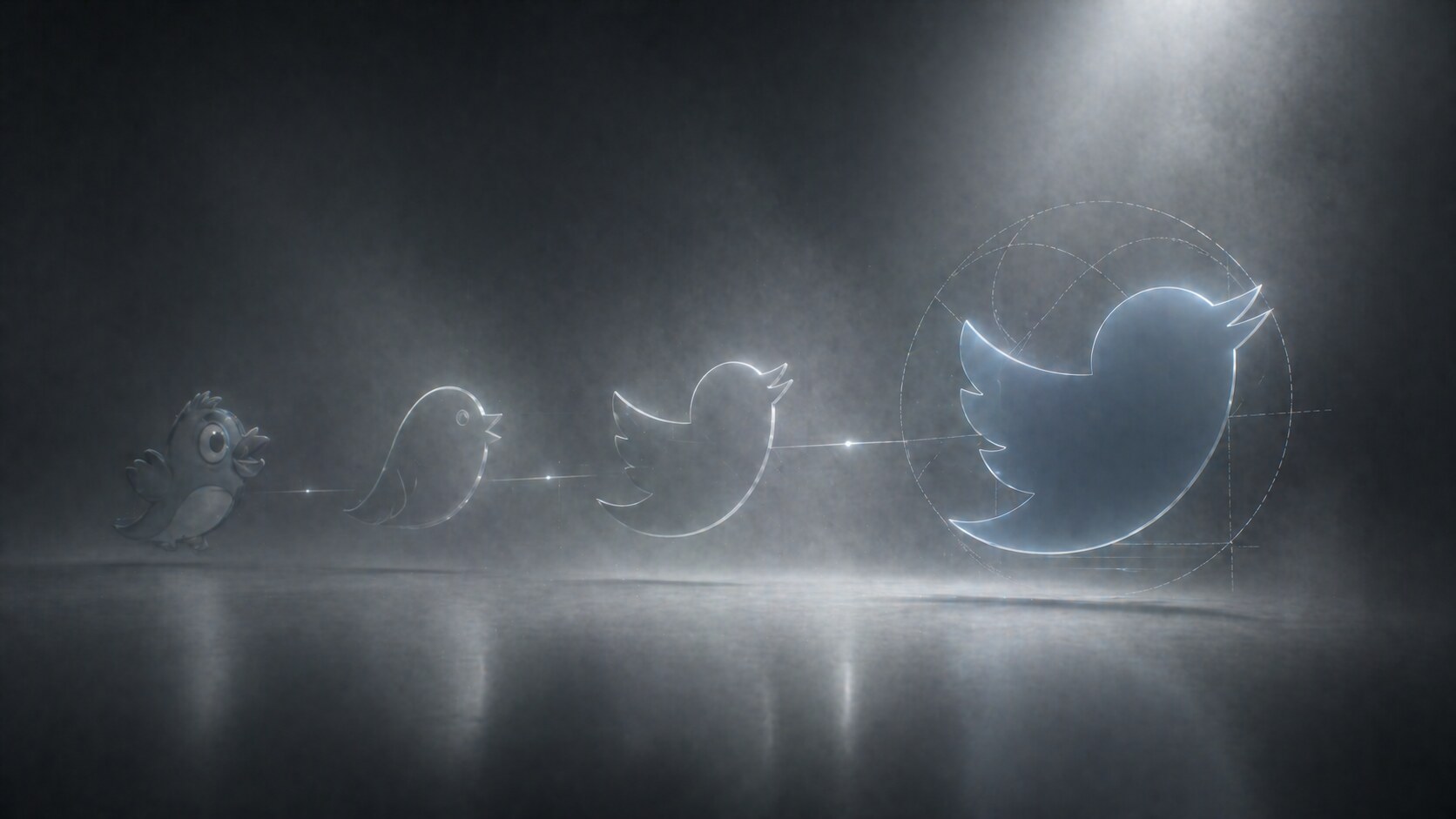
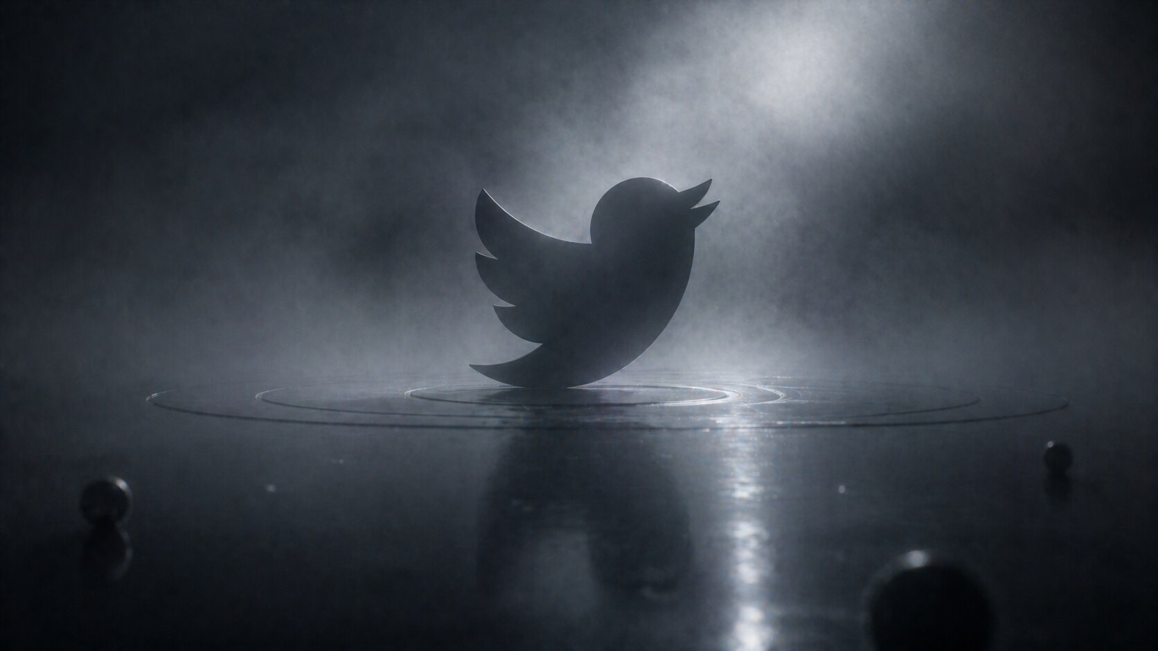
The bird is where Twitter stopped looking like a startup website and started looking like a platform.
The visual evolution is roughly this:
The most important names behind this phase were:
When Doug Bowman introduced the simplified 2012 mark, the company described it as a symbol built from overlapping circles and positioned it as pure geometry rather than a mascot.
“Twitter is the bird, the bird is Twitter.”
That move was larger than logo cleanup. It meant Twitter believed it had enough cultural recognition to drop the name and let the symbol do the work. That was a major maturity signal, and it worked.
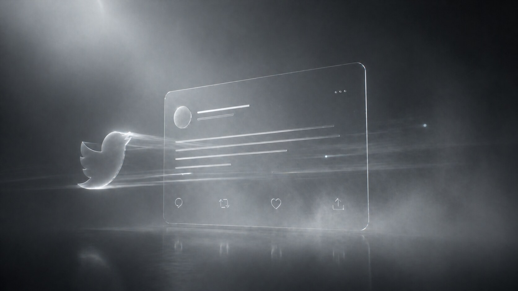
If the bird was the branding breakthrough, the 2010 web redesign was the product breakthrough.
Twitter’s engineering team described that release as a major rebuild in JavaScript with a strong focus on performance, extensibility, and easier navigation. More importantly for users, it changed the experience from a fairly plain stream into a richer interaction surface.
What became stronger in this phase:
This was one of Twitter’s most important UX steps because it made the service feel less like a simple status page and more like a live information network. Around the same period, homepage experiments also pushed search and trending topics into higher visibility, which helped explain the platform to people who were not yet signed in.
That was a very smart UI decision. Twitter had a discovery problem. The product only made sense once you saw the stream moving. So the interface started exposing the stream itself as the pitch.
If you want the broader design context for this era of tech simplification, continue with The Evolution of Google Design and Design Ups and Downs of Apple macOS.
Twitter made many small changes, but a few were structurally important.
In 2012, Twitter openly described experiments around tweet interaction design. Reply, favorite, retweet, expand, and media actions became clearer and more consistently exposed. That sounds small, but it standardized the grammar of the product.
Before that, Twitter often felt like a stream you watched. After that, it felt like a stream you could work with.
The 2012 mobile web overhaul was one of Twitter’s most underrated design achievements. The team had to support very small screens, weak browsers, slow networks, and even users without JavaScript. They reported smaller pages, fewer requests, and better consistency with the main product.
That is important because Twitter won partly by being available everywhere, not only on premium devices. Good mobile design here was not trend-chasing. It was infrastructure.
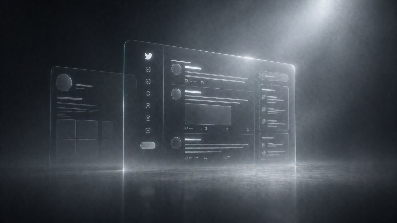
In 2015, Twitter’s design team treated the profile as the “front door” to identity on the platform. Research led them to surface more content, improve the visual hierarchy, and keep navigation accessible while scrolling. They also learned that users wanted photos fast, and that some larger action buttons were distracting from the core follow action.
That is strong product design: not guessing, but testing the mental model and removing what competes with the main job.
Twitter’s 2021 brand refresh, including the Chirp typeface and work with Atelier Irradie, showed a company that finally wanted an expressive design system beyond the bird itself. Chirp balanced sharpness and irregularity well. It gave Twitter a more authored voice.
The irony is that this happened relatively late, after the product was already culturally iconic.
Twitter often looked visually simple because the complexity was moved into behavior: ranking, replies, media expansion, trends, follow logic, and moderation layers.
Unlike some platforms, Twitter’s design history is spread across founders, product teams, and a few visible creative leads rather than one single design hero.
The key figures most worth knowing are:
Not always highlighted enough, but important in the earliest conceptual phase. He is widely credited with the early naming direction around “twttr.”
Part co-founder, part early creative force. Stone helped shape the product’s tone and visual friendliness in the early years.
Commonly credited with the first public wordmark. That first identity was not iconic forever, but it softened the product at the exact moment it needed approachability.
Creator of the bird illustration Twitter first adopted. Even though that asset had to be moved beyond later, it set the emotional direction.
Helped refine the bird during the transition away from the stock-art origin and toward a more usable logo.
One of the most visible design leaders in Twitter’s history. His name is closely attached to the 2012 bird era and to the idea that Twitter should be represented by one clear symbol.
Important in the mobile web overhaul that pushed consistency and performance across lower-end devices, not only flagship phones.
That work was openly documented as a research-led redesign, involving collaborators across design, research, motion, and product. It is one of the clearest examples of mature Twitter UX process.
These names matter because they pushed Twitter beyond “the bird plus default product UI” into a broader expressive identity system with Chirp and more deliberate art direction.
Twitter got many things right, and some of them became industry defaults.
One of the strongest symbols the web ever produced. Friendly, compact, memorable, and perfectly fitted for app icons, embeds, watermarks, and cultural shorthand.
Twitter turned the feed into a place for live witnessing. That is different from a private social feed. The design framed the timeline as public theater and public utility at the same time.
Not all of these started as formal top-down interface inventions, but Twitter made them legible and mainstream. Design helped turn strange user behavior into platform language.
The 2010 homepage changes made Twitter more understandable to outsiders. Search and trends told new users, “there is a living public layer here.”
Twitter’s compose experience stayed relatively fast for years. That matters more than people admit. Fast composition is one reason the platform became the default place for reactions during breaking events.
“The strongest Twitter redesigns did not decorate the stream. They clarified why the stream mattered.”
Twitter also made repeated mistakes, and several of them were not visual mistakes first. They were product-clarity mistakes.
Twitter always struggled a bit with what it wanted to be:
That ambiguity was powerful, but it also created interface drift. Tabs, labels, priorities, and recommendation logic often changed faster than users could build stable habits.
For years, Twitter made sense fastest to journalists, technologists, fandoms, and heavy internet users. Many mainstream users still found it noisy or hard to shape.
Rebranding Twitter to X on July 23, 2023 removed one of the most valuable brand symbols in digital history. From a pure naming-and-iconography perspective, this was a loss of clarity.
The old Twitter brand carried:
X is bolder, but also colder and more generic. It may fit a future “everything app” ambition better, but it is weaker as a single-purpose social symbol.
When verification and paid status became more visibly entangled, interface trust became harder to read at a glance. A symbol that once said one thing started saying several things.
Longer posts, subscriptions, audio/video calling, hiring tools, AI layers, creator monetization, and video surfaces all extend the platform. But every added layer increases the risk that the product loses its original elegance: open, fast, public posting.
Twitter’s deepest design risk was never “ugly UI.” It was semantic overload: too many meanings attached to one feed.

As of April 30, 2026, the product direction visible in X’s official company posts and current help documentation points toward a broader platform rather than a narrower social network.
Officially documented direction includes:
This suggests a future built around three parallel ambitions:
The timeline becomes less pure-text and more mixed media: clips, live reactions, long video, and creator surfaces.
Messaging, calling, hiring, creator monetization, and AI assistance push the product away from “microblog” and toward a platform utility bundle.
This is the boldest vision and also the hardest one. It can work only if the product keeps one strong center of gravity. Without that, expansion becomes clutter.
The central open question is simple: can X add layers without destroying the speed and public immediacy that made Twitter matter?
For the wider question of how large companies standardize products while still shipping fast, this connects naturally with Pixel Perfect Decisions: The Design Process Inside Big Tech.

The evolution of Twitter design is not the story of a company becoming prettier over time. It is the story of a company repeatedly trying to compress public communication into faster and clearer forms.
At its best, Twitter design made the world feel one refresh away. At its worst, X design risks becoming too broad, too layered, and too semantically heavy for that original magic.
The future probably depends on whether X can hold onto one principle from the old Twitter years: make the interface feel lighter than the amount of culture moving through it.

News, insights, case studies, and more from the rausr team — straight to your inbox.
Send us your brief, your wildest idea, or just a hello. We’ll season it with curiosity and serve back something fresh, cooked with care.