YouTube is one of those products that became so normal that people forget how strange it once was.
Today it feels like infrastructure. In 2005, it felt like a lucky hack:
a place where low-resolution clips loaded inside a browser, comments were messy, ratings used stars, and almost nobody knew that “online video” would soon become the central language of the internet.
This article is part of our series on how large digital products evolve through interface decisions, brand shifts, and timing. If you want the wider platform context too, continue with The Evolution of Google Design, The Evolution of Facebook Design, and The Evolution of Amazon Design.
“YouTube did not win because its first design was beautiful. It won because it removed friction at exactly the right historical moment.”

How YouTube started
YouTube was founded in 2005 by Chad Hurley, Steve Chen, and Jawed Karim, all of whom had PayPal connections. The founding mix mattered:
- Hurley brought a product-and-visual-design background
- Chen and Karim brought engineering depth
- all three understood the value of making a web product feel easy before it felt polished
The service launched in beta in May 2005, raised funding in November 2005, and went public more broadly later that year. By 2006, it was already growing so quickly that Google acquired it.
The earliest product framing was simple: upload, tag, share, embed, and watch video without making people think too hard.
One under-discussed point: YouTube appeared in a perfect technical window:
- broadband was becoming normal
- digital cameras and camera phones were spreading
- Flash video made browser playback practical
- blogs and MySpace-era web culture rewarded easy embedding
That combination mattered as much as the interface itself.
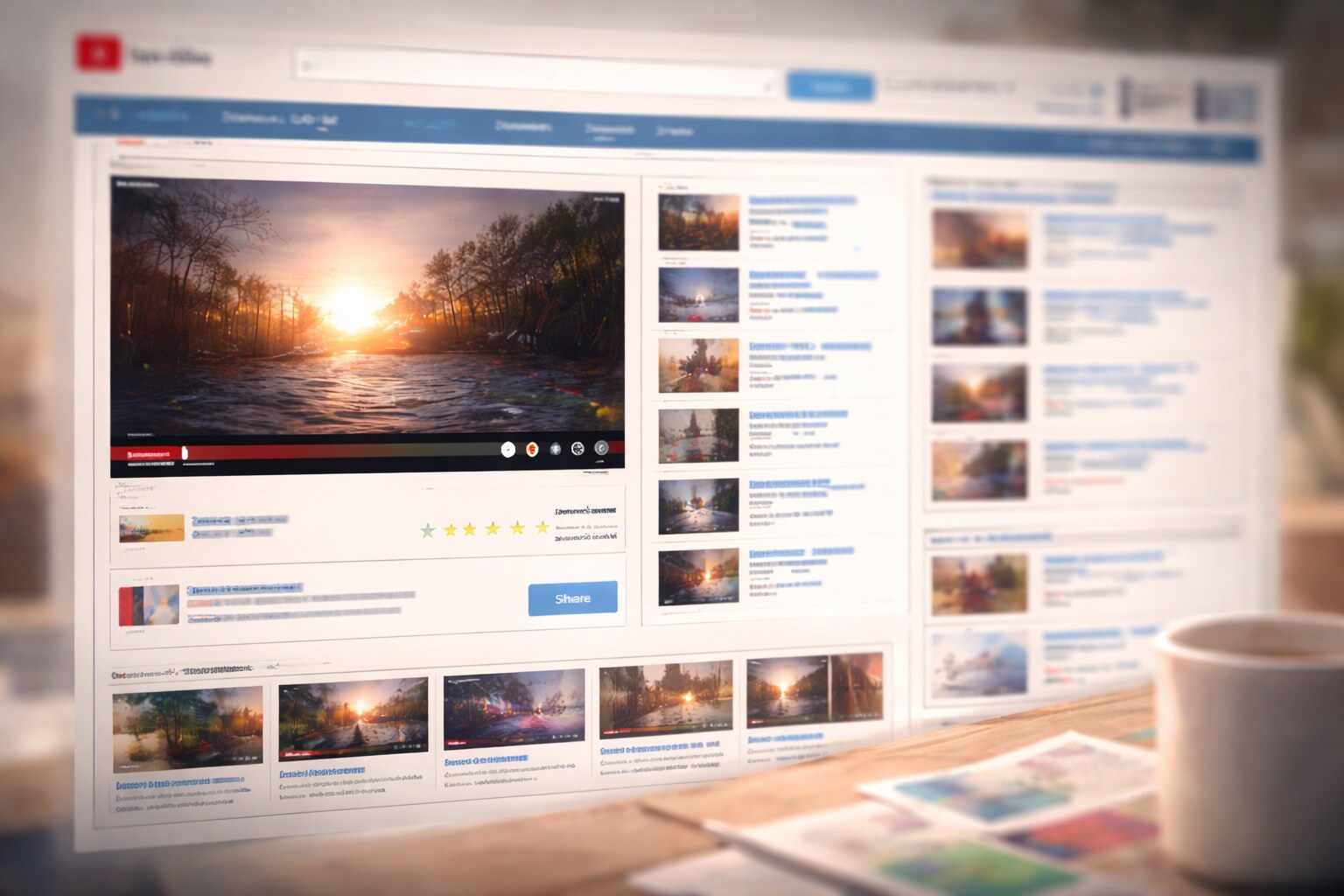
The first design
Plain, awkward, and exactly right for the job
Early YouTube was not elegant in a luxury-product sense. It looked like a very 2000s web utility:
- light backgrounds
- blue links
- rounded content boxes
- small thumbnails
- a lot of metadata
- a player that felt secondary to the surrounding page furniture
The original watch page was crowded, but its priorities were surprisingly smart:
- the video was easy to play
- the title, tags, and uploader were visible
- related videos kept you moving
- comments made the page feel alive
- the embed/share logic made every clip portable
This was not “minimal design.” It was circulation design. The point was not to admire a clean interface. The point was to move video from one person to the next as fast as possible.
An important unknown-to-most-people detail: according to YouTube’s 20th-anniversary material, the original logo inspiration came from everyday California visuals like CalTrain signage and TV Guide.
Who was behind the first look?
Early YouTube appears to have been founder-led, especially on the visual side
Public credit for the very first YouTube interface is thinner than people expect. There is no famous, clearly documented agency story behind the original product in the way there is for some later tech rebrands.
What is more defensible is this:
- Chad Hurley had a design background and is strongly associated with the early brand/look
- the earliest product and identity work appears to have been largely internal
- many specific early UI decisions were likely made in a startup-style blur between product, engineering, and visual preference rather than a formal design department
That actually fits the product. YouTube did not begin as a polished “brand system.” It began as a working tool that happened to become culture.
Why YouTube became huge so fast
Timing, distribution, and low friction beat polish
There are many reasons YouTube exploded, but five stand above the rest.
1. It made video easier than sending files around
Before YouTube, sharing video often meant awkward downloads, codecs, attachments, or custom hosting. YouTube normalized:
- upload once
- share a link
- or paste an embed
That was a massive UX win.
2. It fit the web people already had
YouTube worked with blogs, forums, MySpace pages, and early social internet habits. It didn’t ask users to adopt a new ecosystem first.
3. It understood amateur energy
A lot of successful early web products were too obsessed with looking “professional.” YouTube was loose enough to let weird internet culture flourish.
4. It rewarded rabbit holes
Related videos, search, tags, and homepage recommendations gradually turned YouTube from a hosting site into a behavior loop.
5. Google gave it scale
The Google acquisition gave YouTube infrastructure, distribution, and room to survive the cost of becoming the default video layer of the internet.

The funny early internet years
YouTube’s design history is also meme history.
The platform grew in a period when the web still felt chaotic, playful, and slightly stupid in the best possible way. That meant the interface had to support not only “content” but internet nonsense:
- Me at the zoo as the first upload
- lip-sync clips, awkward vlogs, and webcam confessionals
- viral oddities like Numa Numa, Charlie bit my finger, and Chocolate Rain
- the rise of the Rickroll, which is partly a cultural story about clickable thumbnails, embedding, and trust
These moments were funny, but they also taught YouTube what its product really was:
not a video library, but a behavior machine for attention, identity, and repeat viewing.
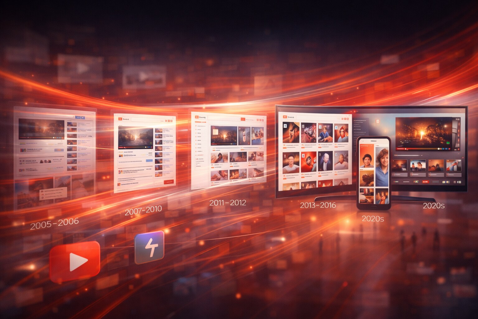
A quick design timeline
The service changed in stages, not one clean redesign
2005-2006: the raw web-video utility phase
The UI is basic, social, and messy. The product is about upload-and-share, not professional media strategy.
2007-2010: scaling and standardizing
As creators, copyright systems, monetization, and categories expand, the interface becomes more structured. The product starts shifting from “clip site” to “video platform.”
2011: homepage redesign
YouTube publicly reframed the homepage around three forces: your subscriptions, your social graph, and recommendations. This was a major product move because it pushed YouTube closer to a personalized media environment, not just search + video pages.
2011-2012: channels redesign
The big channels push mattered because YouTube wanted creators and brands to feel more like destinations. This was a step away from random clip culture and toward professional publishing.
It also introduced one of YouTube’s recurring tensions:
should the platform feel like a neutral container, or should every creator have more visual identity and control?
2013-2016: cleaner structure, stronger creator economy
The UI becomes more card-based, more grid-based, and more scalable across devices. Thumbnails get even more important. Creator behavior starts adapting to the interface itself: titles, faces, reaction shots, and visual hooks become a design language of survival.
2017: the major logo and Material refresh
This is the most visible modern rebrand.
YouTube introduced:
- the standalone play-button icon
- a cleaner wordmark system
- a more flexible brand for small screens
- a Material Design-based product cleanup across desktop and mobile
Public reporting around this refresh credits a mix of YouTube’s internal design team and external partners including Saffron, Letterjuice, and URW++. Compared with the early years, this is where YouTube starts behaving like a mature brand system.
2020s: Shorts, TV, and ambient video
The platform keeps stretching:
- vertical video through Shorts
- stronger TV and living-room usage
- more recommendation-led discovery
- more AI-assisted tooling, dubbing, and creator workflows
At this stage, YouTube is no longer just a website or app. It is a multi-format video operating system.
The best design moves
Some YouTube choices were bigger than they first looked.
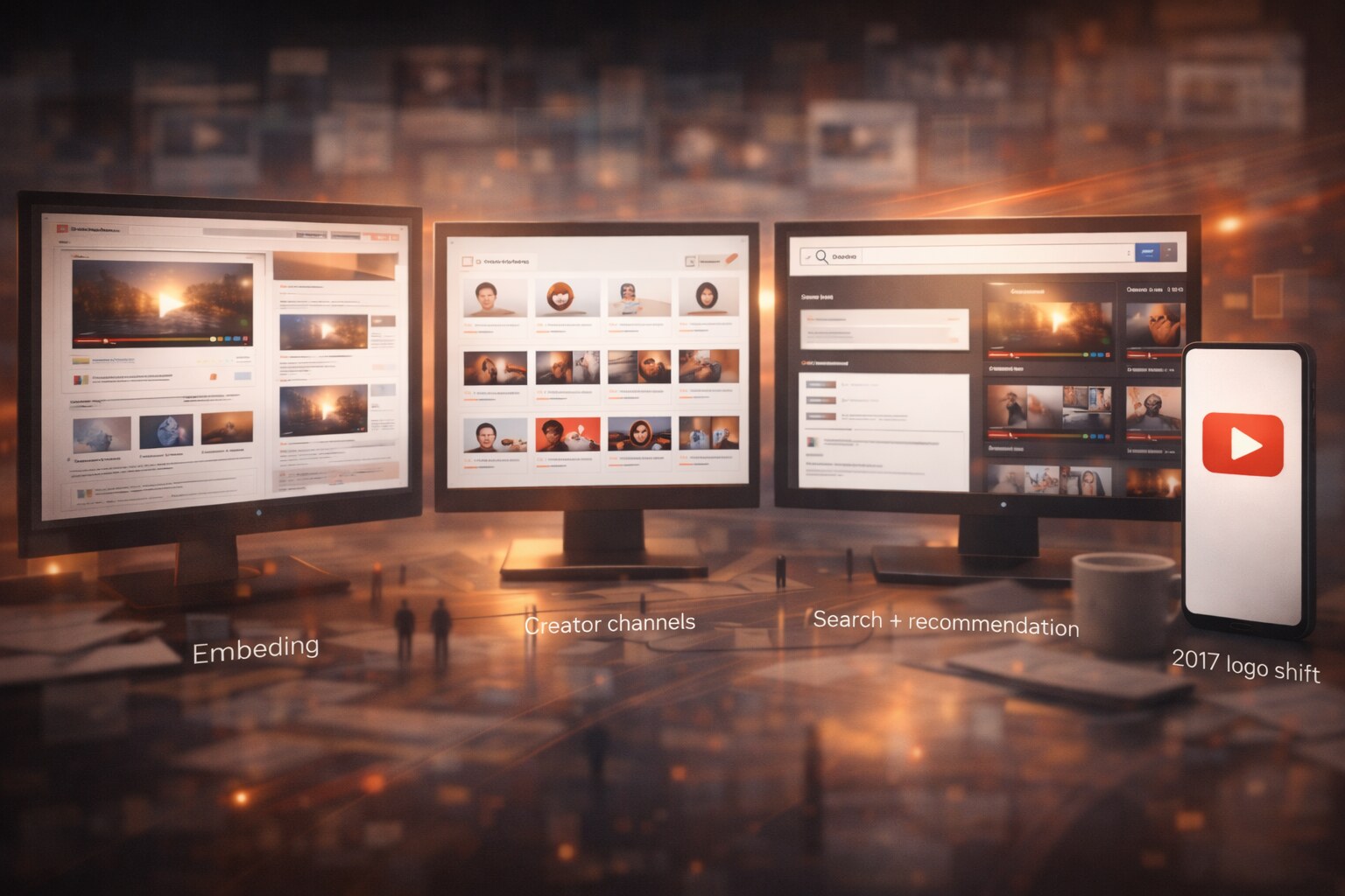
Embedding
Embedding was one of the most consequential interface decisions in internet history. It let YouTube spread far beyond its own homepage and taught the web to treat video as portable.
The creator page/channel model
This helped transform one-off uploaders into repeat publishers.
Search + recommendation together
Most platforms are strong at one or the other. YouTube became powerful because users could arrive with intent or drift with curiosity.
The 2017 logo shift
This was not just cosmetic. It solved a real scale problem: the old wordmark structure was less flexible in a mobile-first world.
The bad moments and wrong paths
YouTube’s story is not a clean line upward.
Google+ era friction
One of the clearest misreads was forcing parts of YouTube’s identity and comments into the Google+ logic. It felt imposed, politically tone-deaf to creator culture, and unnecessary.
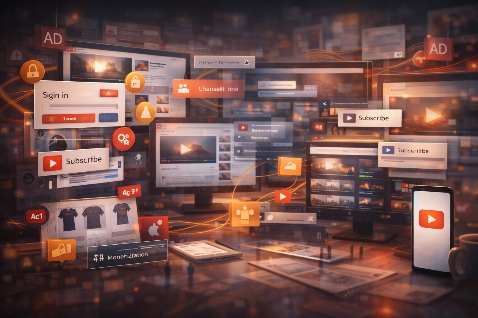
Interface inflation around creators and ads
As the business matured, the screen got more crowded:
- more prompts
- more ad surfaces
- more subscription nudges
- more merchandising and monetization modules
Some of this is rational business design. Some of it undeniably made the product feel heavier.
YouTube’s most mocked cultural moments happened when the platform tried too hard to summarize itself from above. That exposed a recurring issue: a platform this large often understands analytics better than culture.
Shorts risk
Shorts helped YouTube respond to TikTok, but it also risks flattening the service into the same fast-scroll logic used everywhere else. The danger is not competition. The danger is sameness.
The less-known details
Here are a few details that usually get left out:
- The original product did not begin with today’s polished “video platform” identity. It was much closer to a loose internet utility.
- Public documentation of the earliest design authorship is surprisingly thin; the early interface was less a formal design system than a founder-era product shell.
- YouTube’s 2025 anniversary material tied the first logo inspiration to ordinary local references, not some grand strategic branding myth.
- The V&A Museum’s 2026 preservation work reconstructed the 2006 watch page with YouTube staff involvement, which says a lot about how historically significant even “ugly” early web interfaces have become.
Where YouTube may go next
The future of YouTube design is probably less about one dramatic visual redesign and more about three strategic directions.
1. TV-first YouTube
YouTube increasingly behaves like a living-room platform, not just a phone app. That means larger type, stronger remote-based navigation, and a clearer split between lean-back watching and active searching.
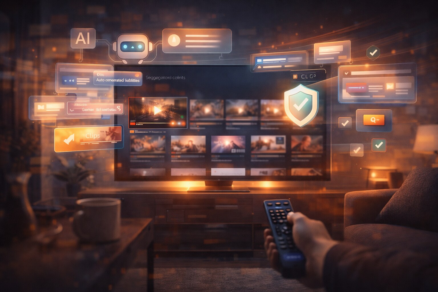
2. AI-assisted viewing and creation
Expect more:
- automatic dubbing
- summaries and clip extraction
- creator workflow tools
- recommendation explanations, or at least stronger contextual cues
3. More interface pressure around trust
The harder problem is no longer just discovery. It is trust:
- what is real?
- what is synthetic?
- what is spam?
- what deserves recommendation?
The next major YouTube redesign may be less about “looking new” and more about making credibility visible.
Conclusion
YouTube did not become dominant because it started with the best-looking interface. It became dominant because it solved distribution, playback, and sharing before everyone else understood how large those problems were.
Its design evolution tells a bigger story about the internet:
- from messy upload culture
- to creator economies
- to algorithmic media feeds
- to a future where video, TV, AI, and search are no longer separate products
The most important thing about YouTube’s design is that it kept changing without losing its core job:
make video easy to enter, easy to continue, and very hard to leave.