From Sketch to Symbol: The Process Behind Iconic Logo Design
What it really takes to create a logo that becomes a billion-dollar brand mark — from idea to global visibility.
What it really takes to create a logo that becomes a billion-dollar brand mark — from idea to global visibility.
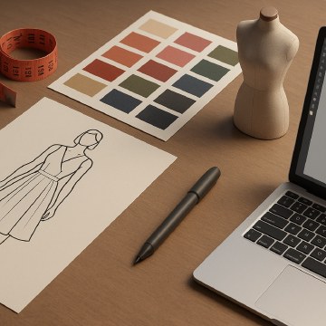
Before there’s a logo, there’s a hunch. A vision. A brand that doesn’t even exist yet — just a name and an ambition.
Logo design starts with understanding the brand’s soul: its mission, audience, values, competitors, tone of voice, and future vision. Without this foundation, a logo is just decoration.
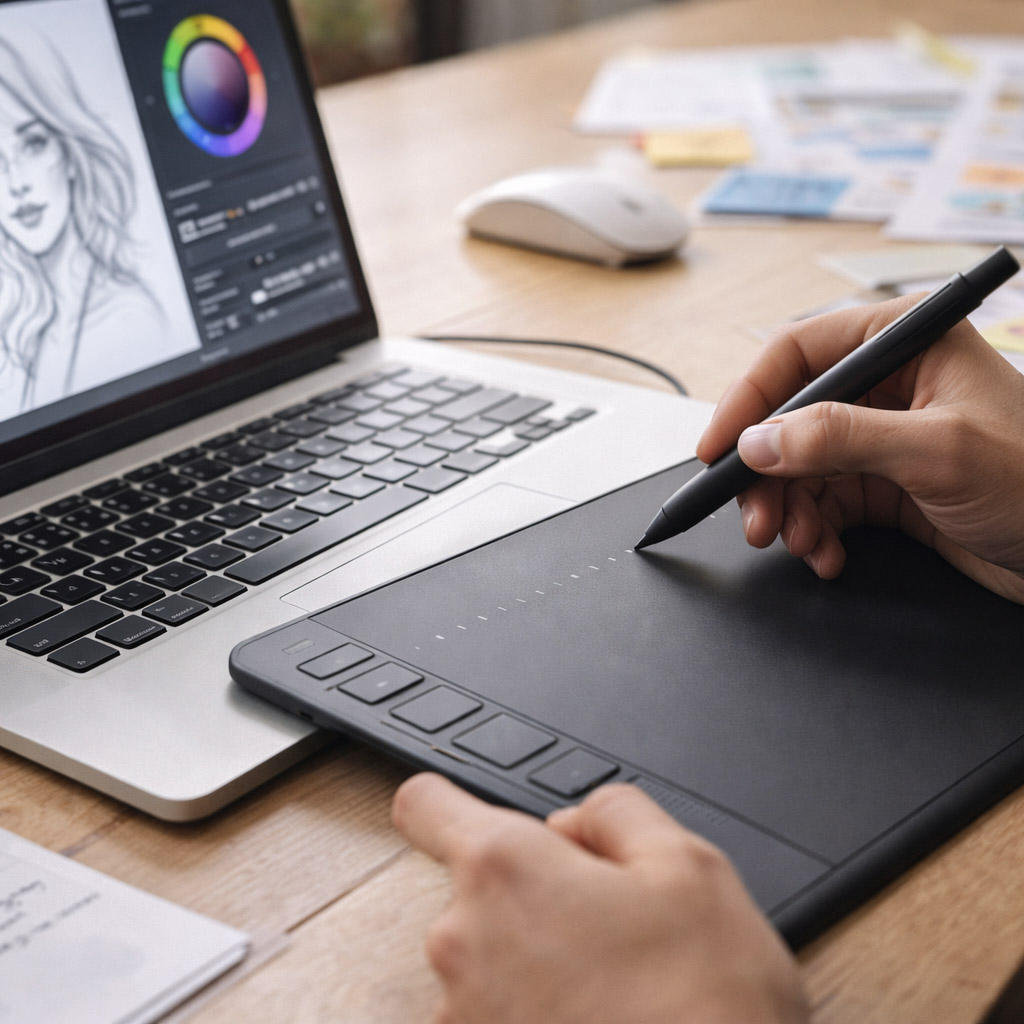
Moodboards, word maps, trend research, and tons of sketching begin the journey. Designers explore shapes, metaphors, and typographic directions long before a final path is chosen.
This phase translates intangible brand attributes into visual ideas:
This is where you create design territories: three to five distinct visual directions that get narrowed down.
With client feedback, one direction is chosen and refined across many rounds. Key considerations include:
Expect 10 to 50+ iterations before a logo reaches its final shape.
Once the form is locked, the visual system is developed:
Designers often collaborate with motion artists and UI teams at this stage.
Before it’s official, a logo is tested across:
This reveals flaws early — like poor contrast, bad kerning, or awkward ratios.
The final logo goes through a client board or executive sign-off. In large companies, this includes legal, brand, marketing, and regional leads.
Once approved, designers prepare a full brand toolkit:
Depending on scope:
“If you want some help with your logo design, let us know.”
Timeframe? Anywhere from 2 weeks to 6+ months depending on brand size, revisions, and alignment.
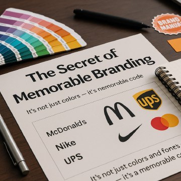
An iconic logo is more than “just a mark.” It’s the result of strategy, experimentation, craft, and systems thinking — compressed into a few strokes or letters.
From napkin sketch to Super Bowl ad, a logo is a tool of recognition that carries trust, power, and emotion across every medium.
“And behind every perfect curve or type tweak is a designer obsessing over every pixel so that you never have to think about it.”
News, insights, case studies, and more from the rausr team — straight to your inbox.
Send us your brief, your wildest idea, or just a hello. We’ll season it with curiosity and serve back something fresh, cooked with care.