The Story of Meal Packaging Design: From Tin Cans to QR Codes
How modern meal packaging evolved from storage and shelf life into speed, delivery, sustainability, and a new kind of graphic design interface.

How modern meal packaging evolved from storage and shelf life into speed, delivery, sustainability, and a new kind of graphic design interface.
Modern meals are designed for a fast-paced world: commutes, back-to-back meetings, delivery apps, microwaves, and narrow “eat now” windows. Behind the scenes, the infrastructure that makes this seamless is packaging.
If you’re interested in the branding layer behind packaging choices, also see Successful Branding Codes: Target First, Aesthetics Second and Branding Codes That Stick: Usability Beats Perfection — and for fast-food identity history, Best Meal Company Logos: What Makes Them So Appetizing?.
Packaging isn’t just a container. It’s a promise: safe, hot (or cold), recognizable, and ready on your schedule.
“Food packaging evolved from “how do we store this?” to “how do we keep this reliable at speed?””
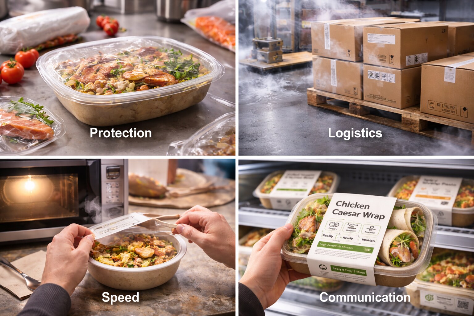
Tracing packaging through time reveals that the biggest changes aren’t aesthetic — they’re functional. Meal packaging gradually took on four critical roles:
Fast food and convenience culture didn’t just increase packaging volume. They trained consumers to expect predictable outcomes from a meal — even on the move.
While the “front of pack” received most design attention, the back of pack became a standardized template driven by scanning and regulation: barcodes, nutrition tables, and ingredient lists established consistent zones and hierarchy.
The earliest “modern” meal packaging focused on preservation:
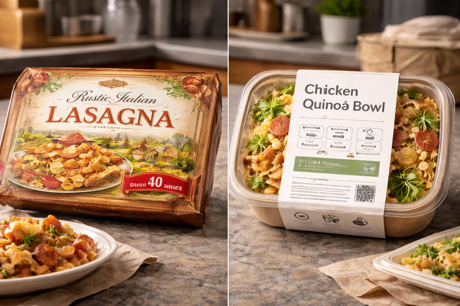
Graphic design at this stage resembled posters: ornate typography, seals, claims (“pure,” “guaranteed”), and literal illustrations. The goal was less about “brand vibe” and more: make strangers trust food they didn’t see prepared.
Freezers and cold-chain logistics transformed packaging into a cooking interface: packages needed to explain:
This accelerated the classic appetite-photo era: big hero shots, strong contrasts, “serving suggestion” styling, and clear flavors. The package became a substitute for aroma.
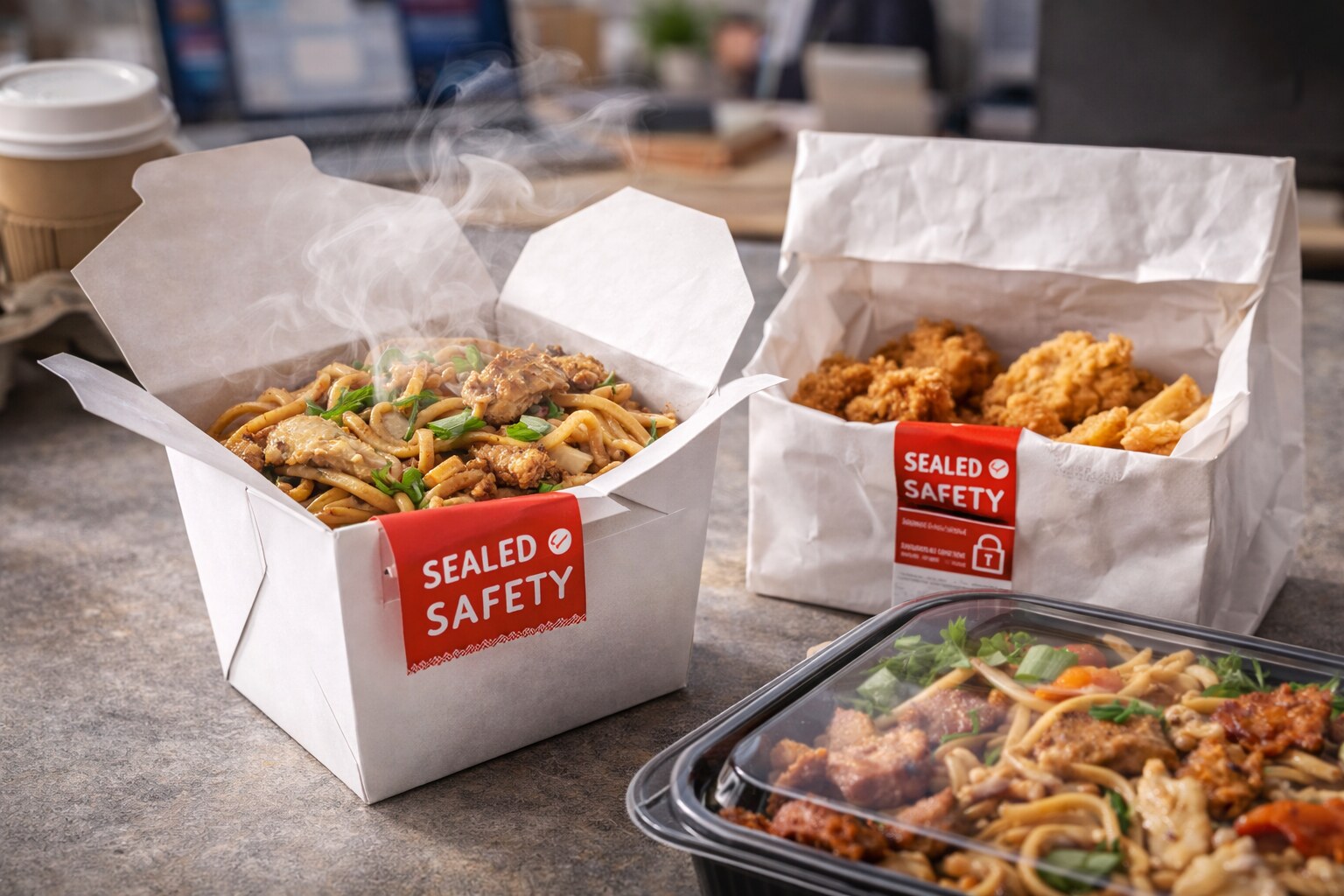
Fast food made one thing clear: meals must remain usable while on the move.
Packaging had to manage:
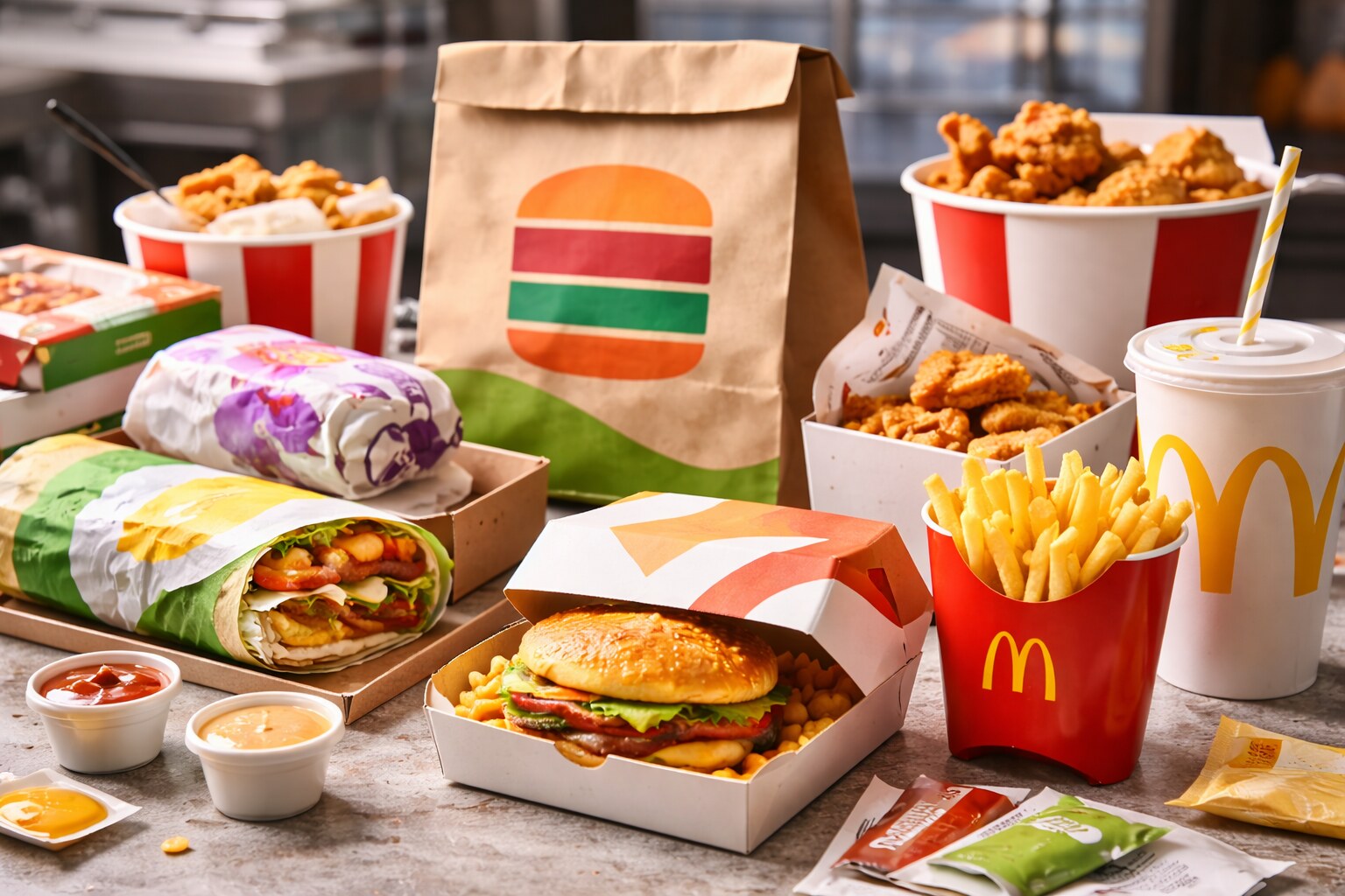
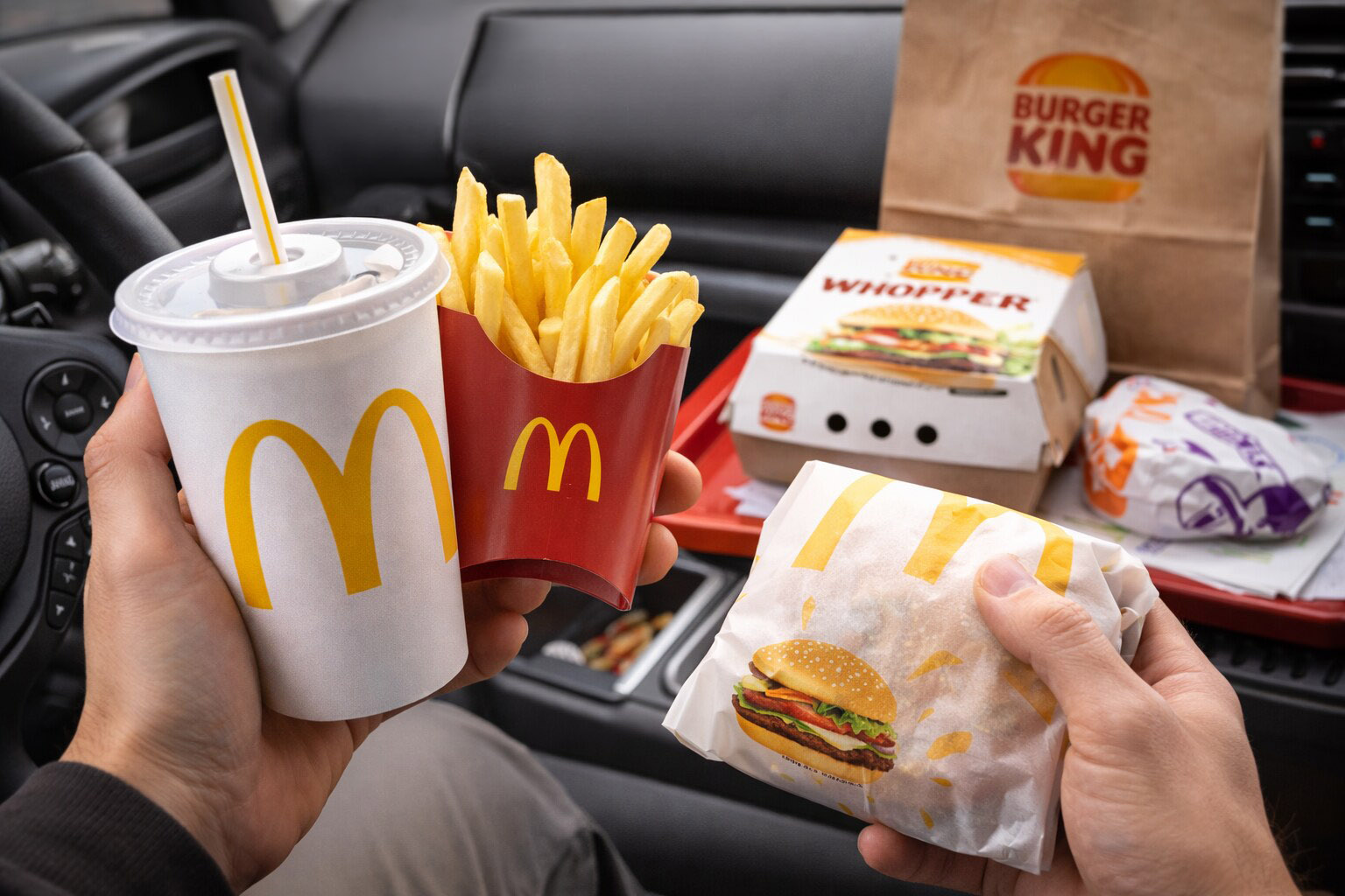
Fast food packaging systems became iconic: early “design systems” in the wild — cups, wraps, clamshells, bags, napkins, trays — all speaking one brand language at high speed.
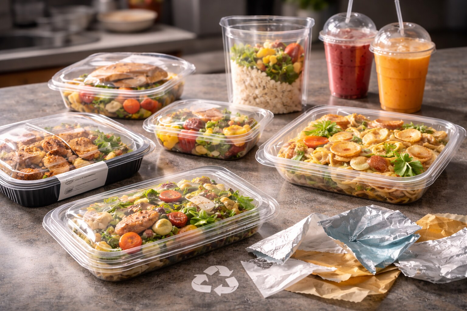
Plastics dominated meal packaging for practical reasons:
But the downside is many high-performance packs are multi-material: thin laminated layers or paper/plastic hybrids with coatings and adhesives. These enhance shelf life — but often hinder recycling.
If a package feels “premium,” that can be a materials illusion: gloss, stiffness, and smooth coatings signal quality. When brands shift to fiber or rougher papers, the product can feel cheaper even if the food is identical.
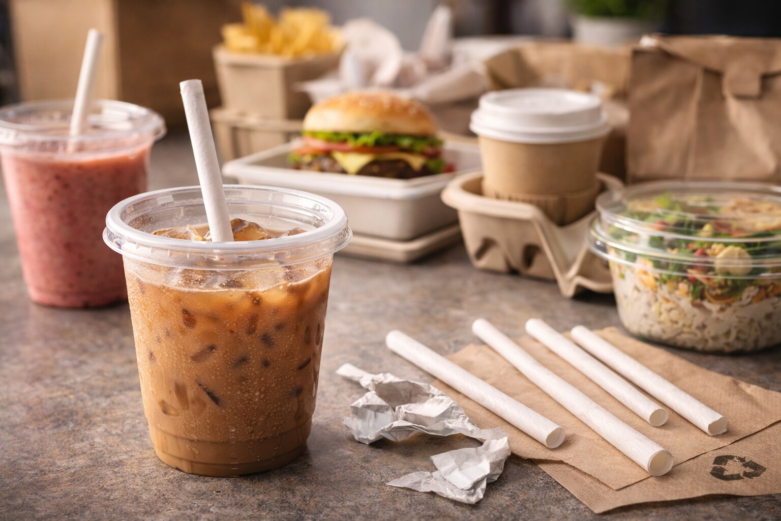
Delivery platforms changed the design brief. It’s no longer just “looks good on shelf.” It must also:
This pushes graphic design toward clarity and redundancy: labels, item names, allergens, heat instructions, tamper seals, and “this is yours” signals.
Most think the story is “plastic bad → paper good.” The reality is more complex:
Packaging shifted from single-material forms to engineered composites because food is chemically aggressive: grease, salt, acidity, moisture, temperature swings, and oxygen sensitivity all attack materials differently.
The “straw moment” became famous because it’s tangible: people could feel the shift. Paper straws often soften, split, or taste different — which reads as “lower quality.”
But from a systems perspective, the straw was a proxy for a larger packaging rewrite:
The uncomfortable insight for designers: sustainable materials change the sensory brand. Texture, stiffness, sound, even how light reflects on a lid — all shape perceived quality.
So the sustainability era raised a new question: How do we maintain trust and appetite signals when materials feel less “perfect”?
Previously, packaging graphics were closer to advertising: big slogans, mascots, rich illustrations, and strong brand theater.
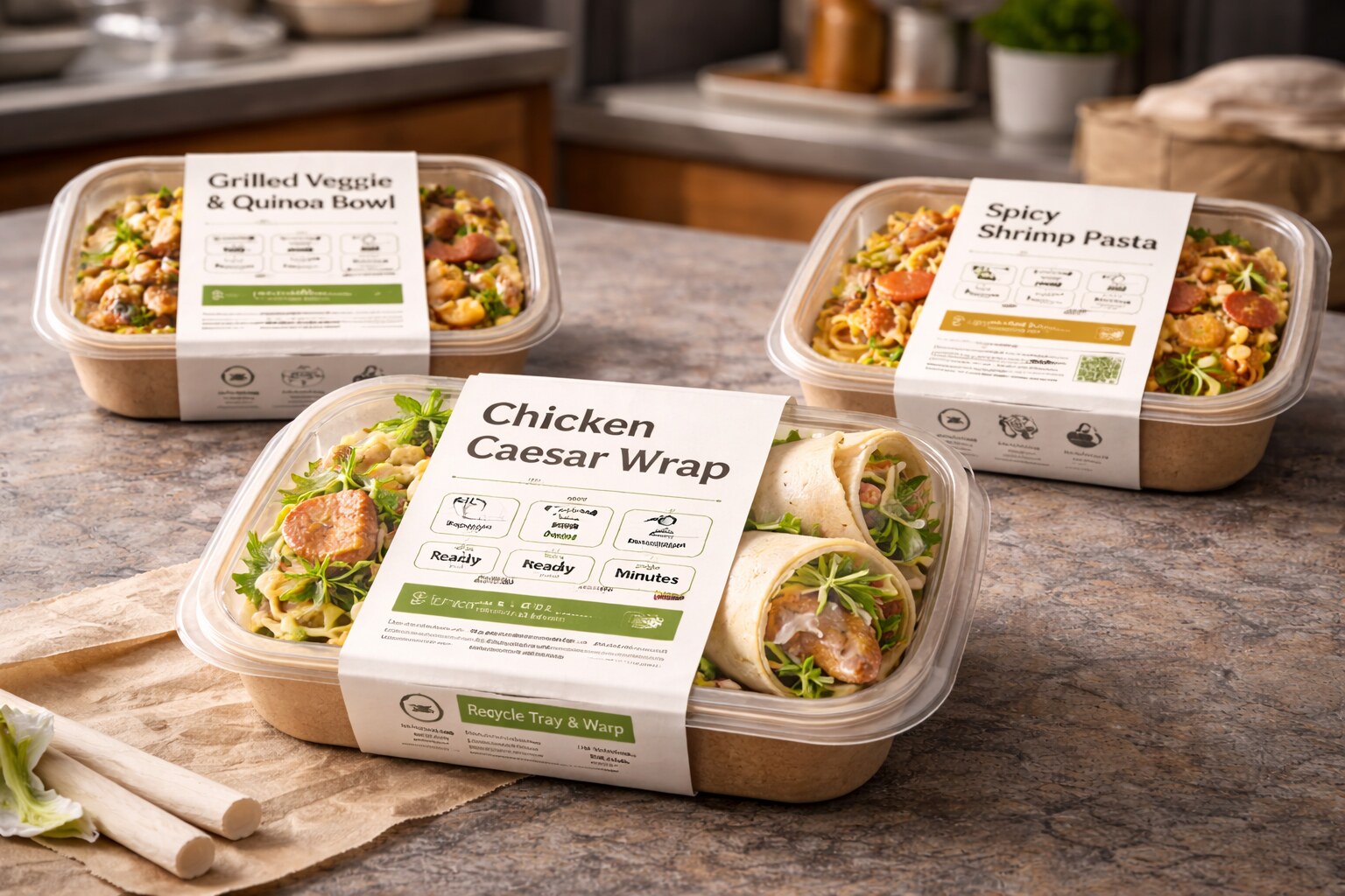
Now, for many meal categories, packaging is also a UI: it must answer practical questions immediately:
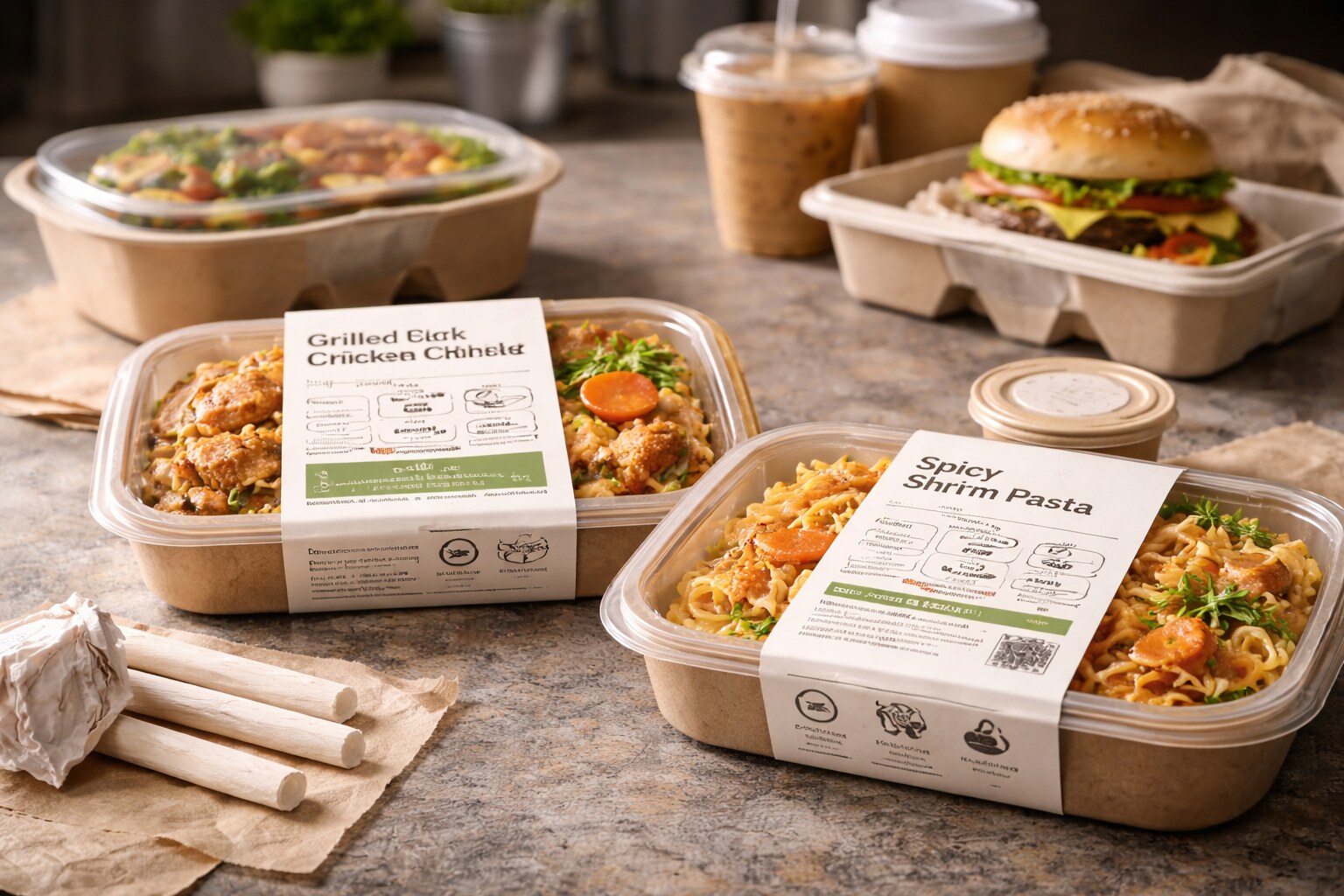
The modern “clean” packaging look isn’t just aesthetics — it’s operational. Simpler layouts reduce errors across variants (flavors, sizes, languages) and make it easier to run fast packaging changes without redesigning everything.
Packaging is becoming clickable. Not always literally (NFC), but behaviorally: QR codes, tracking, sourcing pages, recycling instructions, freshness guidance, and updates.
Done well, it reduces clutter and boosts transparency. Done poorly, it becomes: “scan to find information that should have been printed.”
Try this hierarchy test: if someone sees the pack for two seconds, can they answer:
Then add the “sustainability reality” layer:
The story of meal packaging isn’t just about materials. It’s about how society changed: more speed, more mobility, more delivery, more regulation, more climate pressure.
Packaging adapted. And graphic design followed.
In the next era, the brands that win won’t be those with the prettiest packs. They’ll be the ones whose packaging system delivers: trust, speed, and clarity — without pretending sustainability is just a color palette.
News, insights, case studies, and more from the rausr team — straight to your inbox.
Send us your brief, your wildest idea, or just a hello. We’ll season it with curiosity and serve back something fresh, cooked with care.