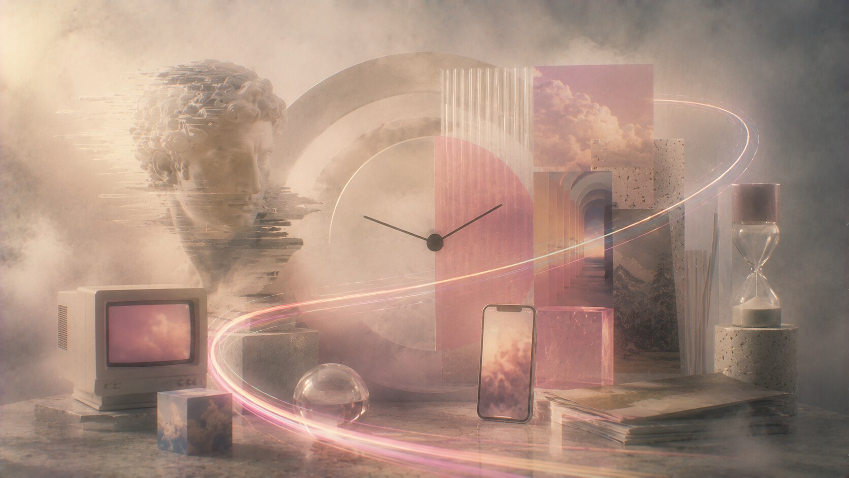
Graphic Design Trends: Why Design Styles Always Come Back
Why old visual trends keep returning in graphic design, how retro becomes new again, and how brands can respond to trend cycles without losing their identity.

Why old visual trends keep returning in graphic design, how retro becomes new again, and how brands can respond to trend cycles without losing their identity.
One of the strangest things about visual culture is that it keeps pretending to move forward while secretly looking backward all the time.
We see it everywhere:
Graphic design behaves in the same way.
What looked old becomes fresh. What looked embarrassing becomes collectible. What looked dated becomes “aesthetic.” Then, after another cycle, the revival itself becomes tired and the search begins again.
That is why trend cycles matter. Not because designers should chase them, but because brands and visual culture are always being pulled by them. Even companies that claim to stand outside trends usually respond to them in some smaller way: a type choice, a color temperature, a packaging update, a texture, a softened icon, a retro callback, a slight return of ornament.
This article sits naturally beside Stay Normal: Why Consistency Beats Trends in Graphic Design, When Being Trendy Backfires, and TikTok Typography Trends.
“Design trends do not really die. They go quiet, wait for distance, then return wearing a different explanation.”
The main reason old trends return is not mystery. It is distance.
When enough time passes, people stop feeling the full cultural weight of the original moment. What remains are the most visible, memorable, or emotionally attractive parts:
That means a younger generation does not inherit the past as lived reality. It inherits it as visual material.
This is why a design language that once felt cheap, tacky, or overused can return as fresh. The generation reviving it often did not suffer through the boring average version of that era. It sees only the distilled highlights.
That is true in graphic design too. Designers often revive not the historical whole, but a selective memory:
One hidden reason revivals feel exciting is that they combine novelty and familiarity at the same time. The eye gets something recognizable, but the context makes it feel new again.
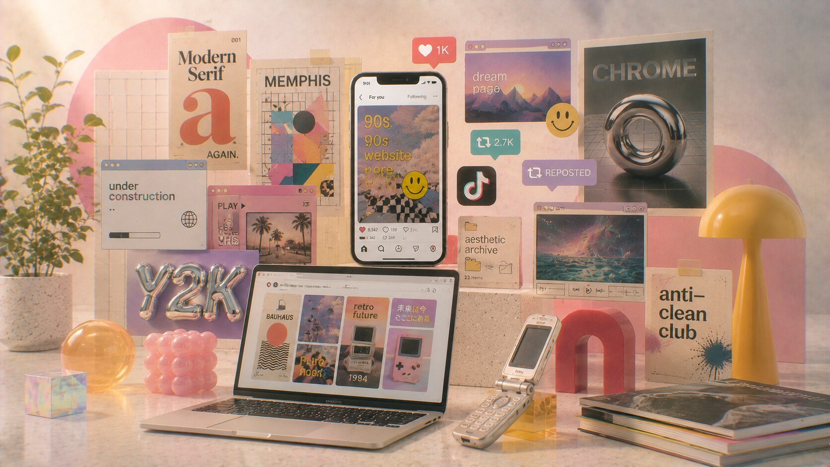
Trend cycles are not new. What changed is their speed.
Before digital platforms, revivals moved slower through subcultures, magazines, boutiques, music scenes, and physical references. Now a visual style can be rediscovered, clipped, memed, reposted, aestheticized, and normalized globally within weeks.
That creates a strange condition:
This is why contemporary design culture often feels temporally mixed. On one screen you can see:
all competing at once.
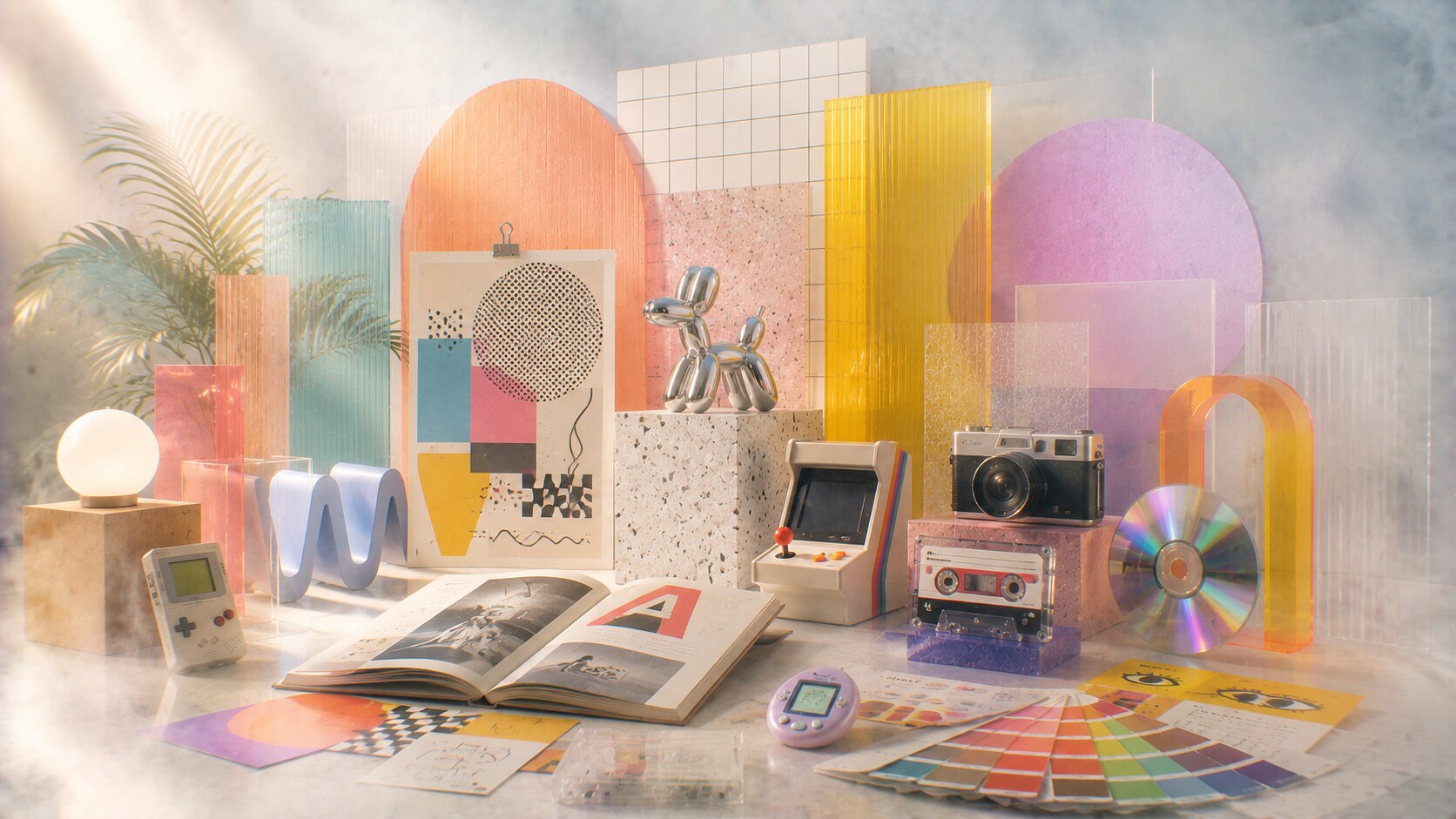
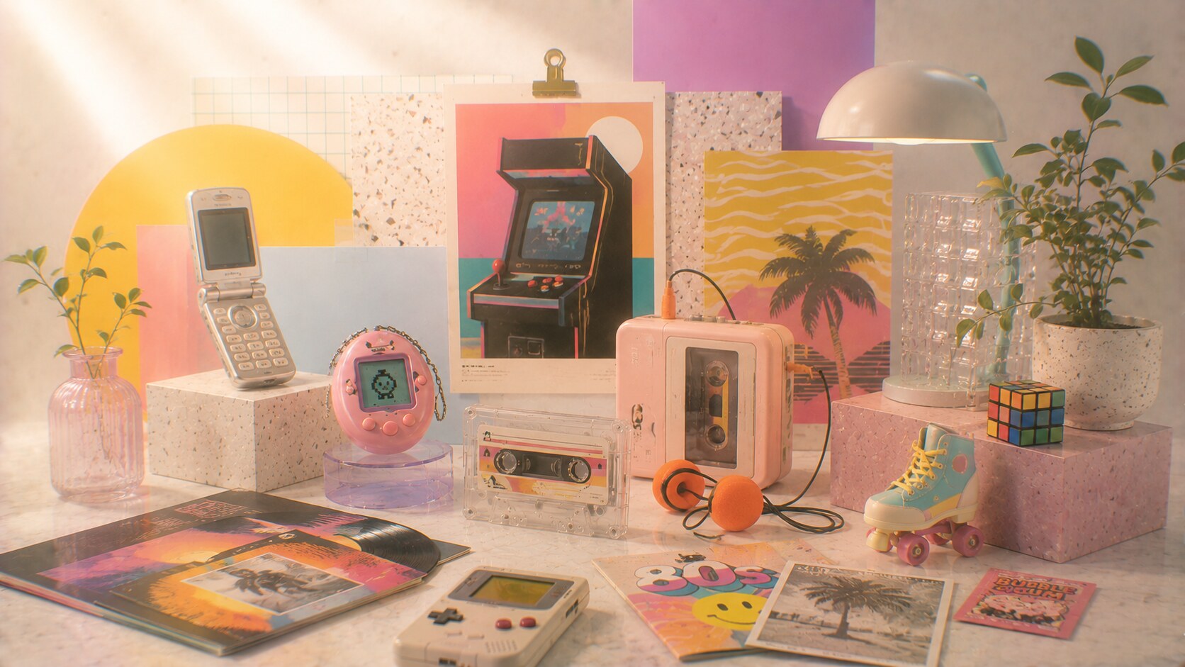
The return of things like flip phones, Tamagotchi, retro gaming stations, and cassette tapes is useful here because it shows the same pattern outside graphic design. Many of these things are not returning because they are objectively more efficient. They are returning because they offer symbolic difference from the current default.
That is exactly how graphic trends work.
“When the present feels too smooth, the past starts looking textured.”
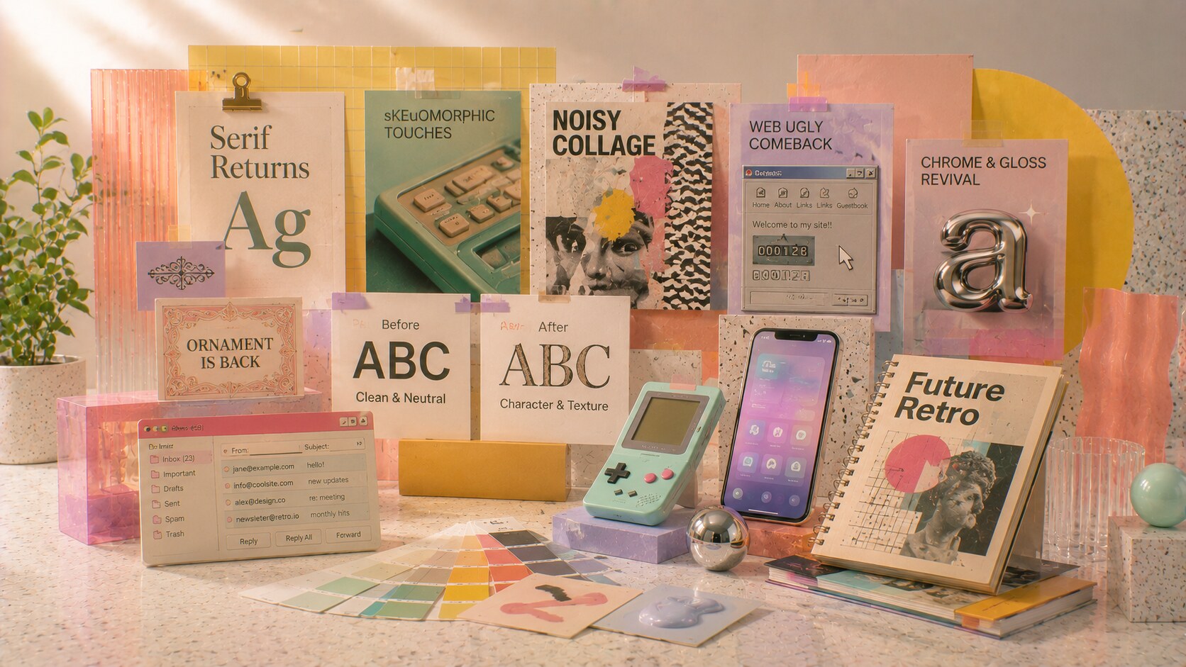
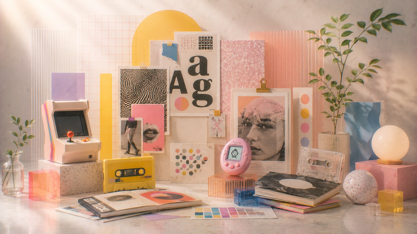
Some design families keep reappearing more than others.
A few of the most visible cycles include:
These returns are rarely exact copies. They are usually filtered through the present.
A revived serif today does not mean nineteenth-century typography returns untouched. A revived web-ugly style is still made with current tools, current irony, and current audience awareness. A retro interface revival is often cleaner and more self-conscious than the original interface ever was.
That is why revival is better understood as reinterpretation, not simple repetition.
Fun fact: a lot of what people call “retro” in graphic design is really edited retro. The original eras were usually messier, more inconsistent, and less curated than the revived versions suggest.
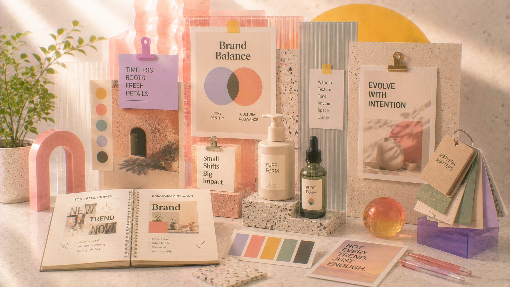
This is where the conversation gets more practical.
If a brand ignores all cultural change, it risks feeling frozen. If a brand chases every new visual wave, it risks feeling weak, anxious, and forgettable.
The better path is usually somewhere between those two extremes.
Brands often need only a small amount of trend reflection:
That kind of adjustment lets the identity breathe without forcing it to perform a complete personality transplant.
This is especially important because brand memory works differently from trend excitement. A trend wants quick attention. A brand needs durable recognition.
That is why your earlier conclusion about not chasing trends is still right. Trend cycles are real, but they should not become the skeleton of the identity.
“A healthy brand does not cosplay every new decade. It absorbs just enough of the moment to stay alive.”
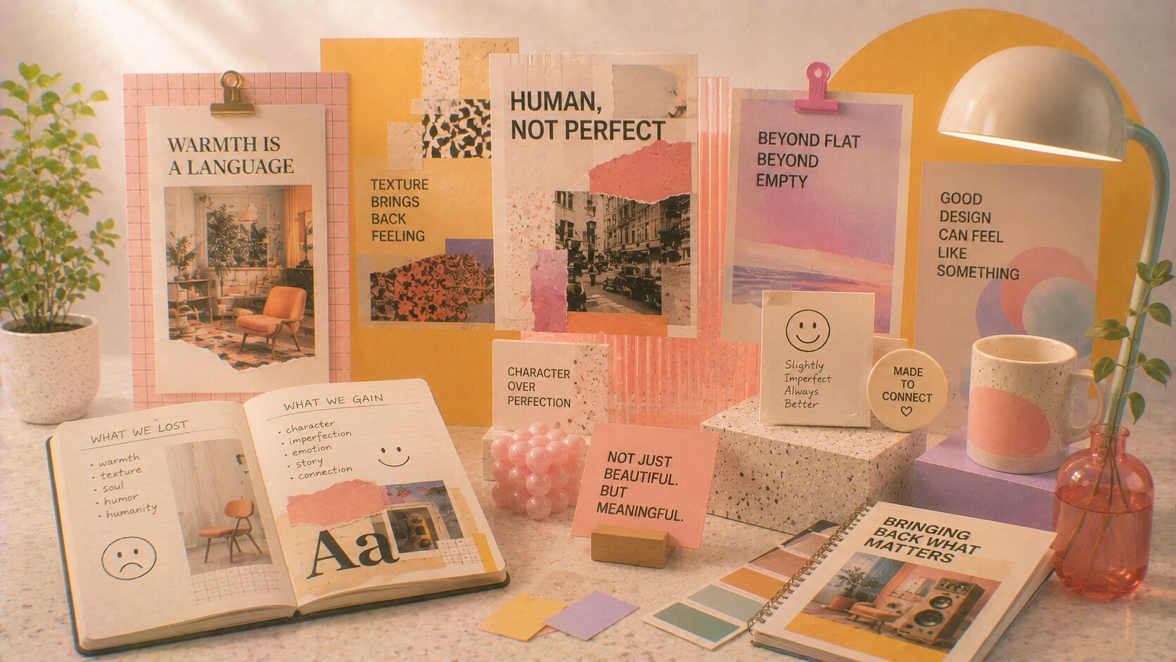
Not every revival is shallow nostalgia.
Sometimes a visual return happens because the present developed a real weakness.
For example:
In those moments, older visual languages bring back something missing:
That is why some retro waves feel genuinely useful. They are not only repeating the past. They are correcting the present.
One of the less obvious reasons for retro returns is emotional fatigue. People do not only get tired of bad design. They also get tired of too much efficient design.
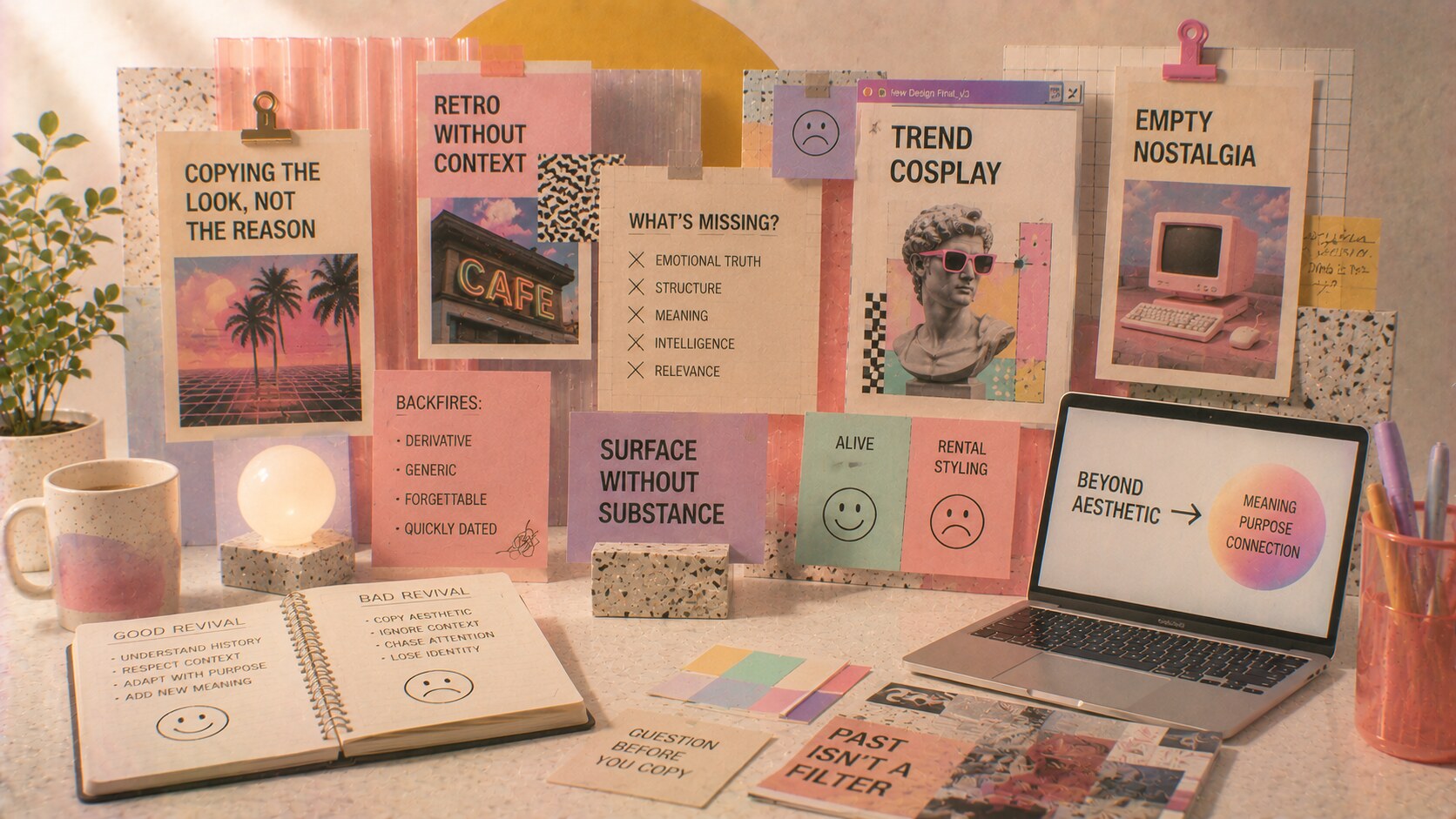
This is the part designers often know but clients often forget.
A revival fails when it copies the costume but not the logic behind it.
That leads to work that looks:
This is why some comebacks feel alive and others feel like rental styling.
The same problem appears when brands see a visual movement getting attention and rush to imitate it too literally. Instead of reflecting on why that older language returned, they only copy its surface effects.
That is where trend cycles backfire.
The design may look current for a short moment, but it quickly becomes:
“The danger is not that old styles come back. The danger is that they come back without their original intelligence.”

Trend cycles are useful when treated as evidence.
They tell you:
That is valuable. Blind copying is not.
A stronger approach is:
This makes the work more intelligent. It also protects the brand from becoming a shallow timestamp.
Hidden practical truth: if you cannot explain why a revived style helps the message, the audience, or the brand position, you probably do not need it.
The next phase of graphic design will probably not be one clean dominant style.
It will likely be:
That means designers will need stronger judgment, not just faster reference hunting.
If AI makes style imitation easier, then the real value shifts even more toward:
In other words, trend cycles are not going away. They are becoming more available, more compressed, and more tempting.
That makes discipline more important, not less.
“The future of trend cycles is not endless novelty. It is faster recycling with higher pressure to know what is actually worth reviving.”
Trend cycles in graphic design are not proof that culture has run out of ideas. They are proof that people keep needing a counterweight to whatever the present has overproduced.
When minimalism becomes too cold, texture returns. When polish becomes too safe, roughness returns. When digital surfaces become too abstract, tactility returns.
That cycle will keep repeating.
The important lesson is not “never look back.” It is “do not mistake revival for wisdom.”
Brands do need to reflect changing visual culture sometimes, but the smartest version is usually light, deliberate, and controlled. A little touch can keep the system alive. Full surrender usually makes it weaker.
That is why the real skill is not predicting the next trend. It is knowing what to borrow, what to ignore, and what your brand should stay strong enough to outlast.


News, insights, case studies, and more from the rausr team — straight to your inbox.
Send us your brief, your wildest idea, or just a hello. We’ll season it with curiosity and serve back something fresh, cooked with care.