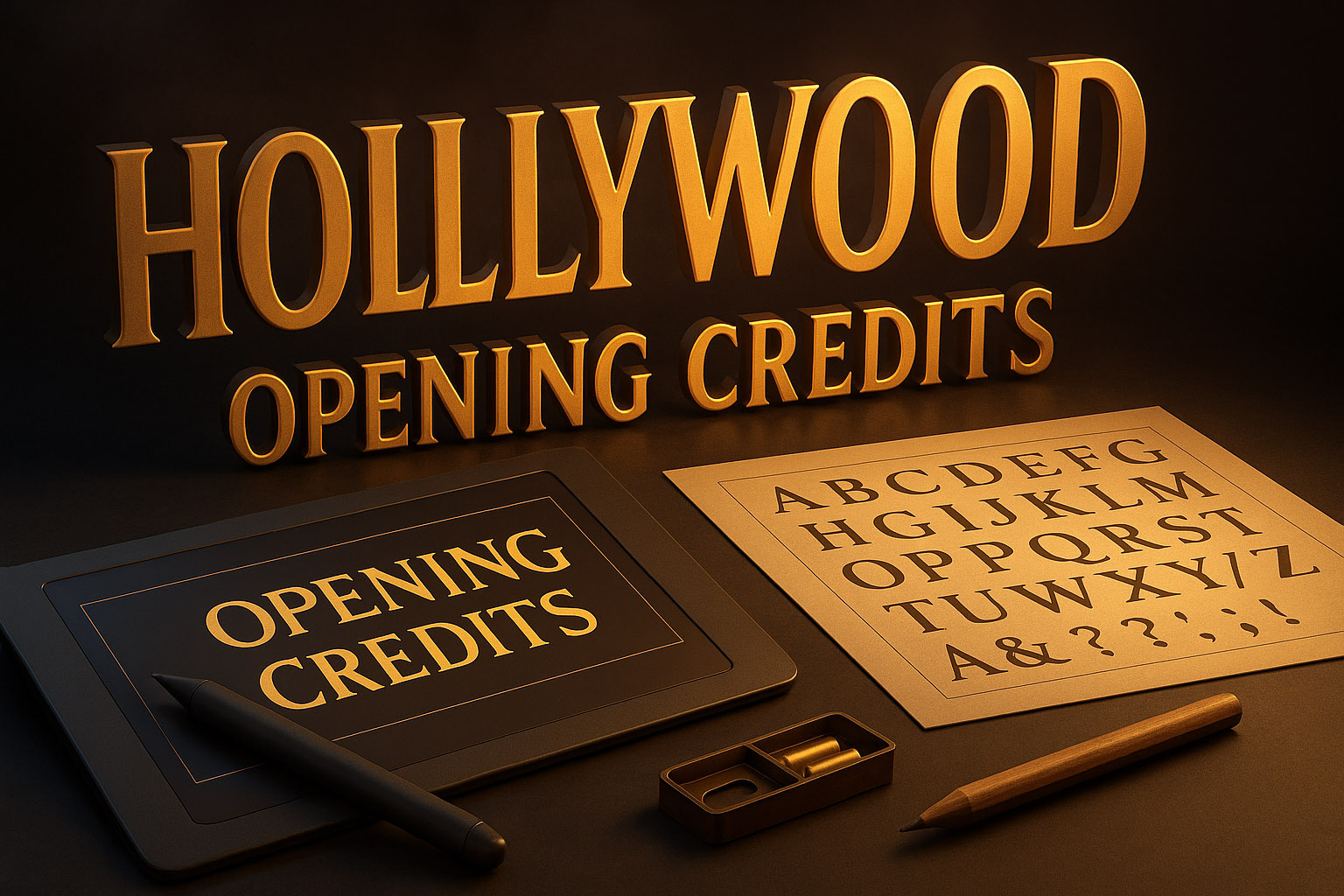
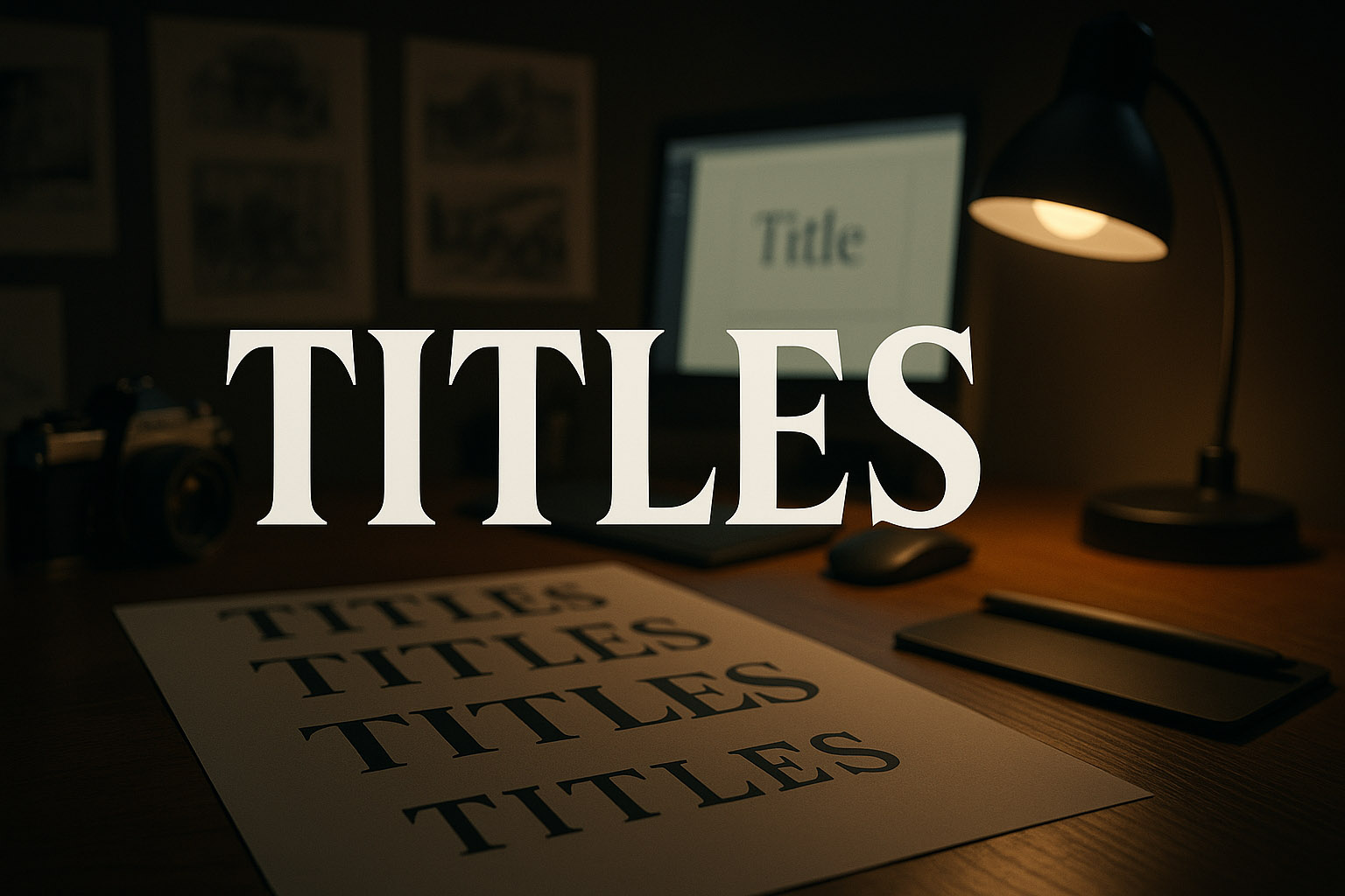
Typography in Lights: The Design Behind Hollywood's Opening Credits
Behind the bold letters and cinematic fades: the process, people, and tools that bring movie typography to life.

Behind the bold letters and cinematic fades: the process, people, and tools that bring movie typography to life.
From the sweeping serif of Dune to the gritty neon of Drive, typography in film isn’t just a detail — it’s a character. Opening credits, closing titles, and on-screen text set tone, era, and emotion before a single line is spoken.
But what goes into designing these iconic cinematic moments? This article dives into the world of Hollywood typography — the studios, designers, tools, and budgets that give shape to film identity.
Specialized design studios and motion design artists lead this niche creative space. Top players include:
Freelance motion designers and typographers often contribute as well, especially on indie or international productions.
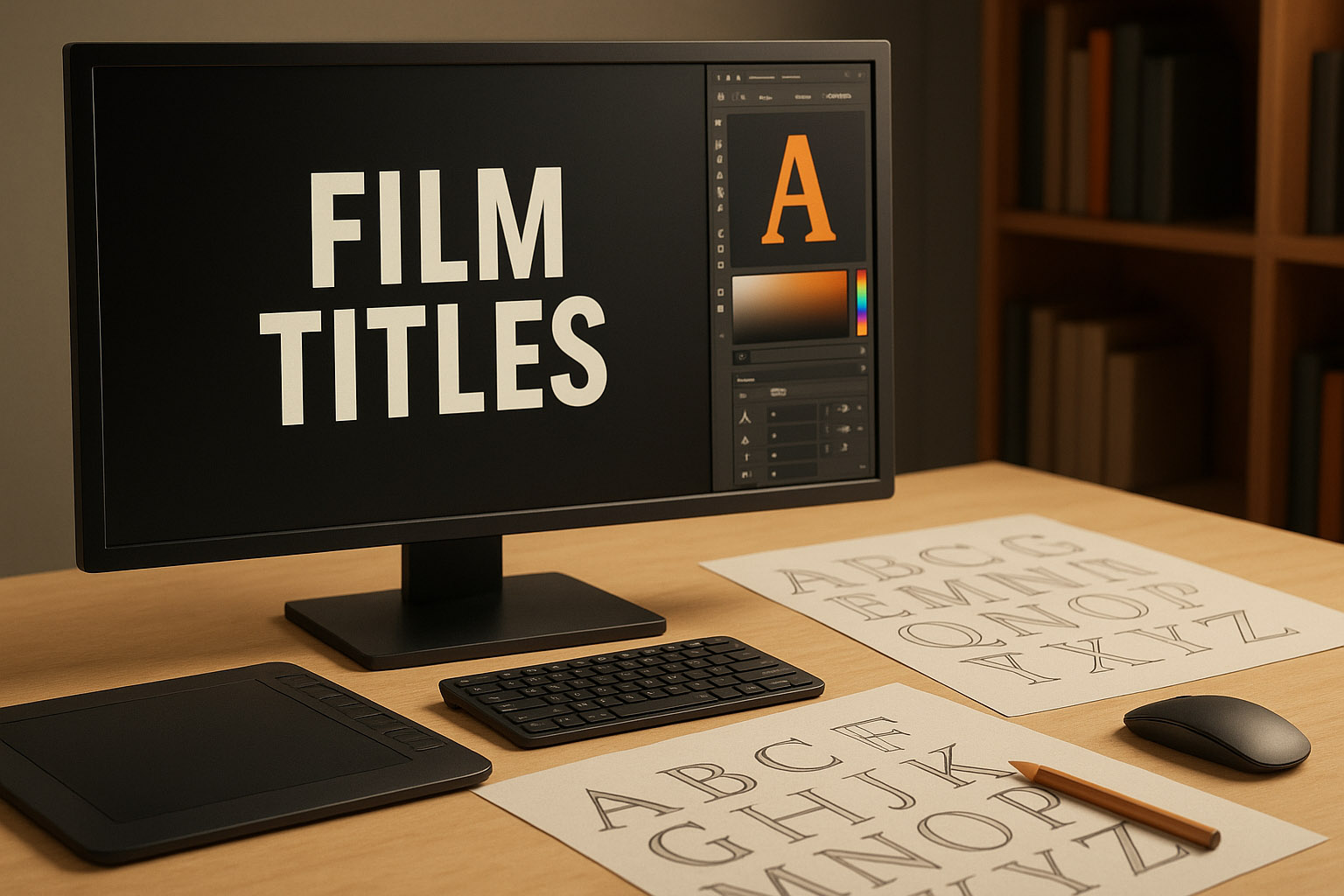
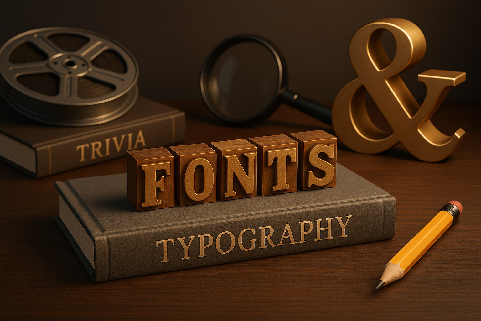
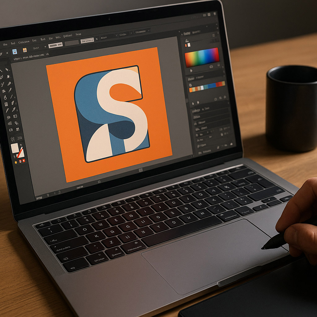
Designers use a mix of software, typically:
Typography is either:
Designers consider:
Everything is tested in context: over footage, in motion, and with sound.
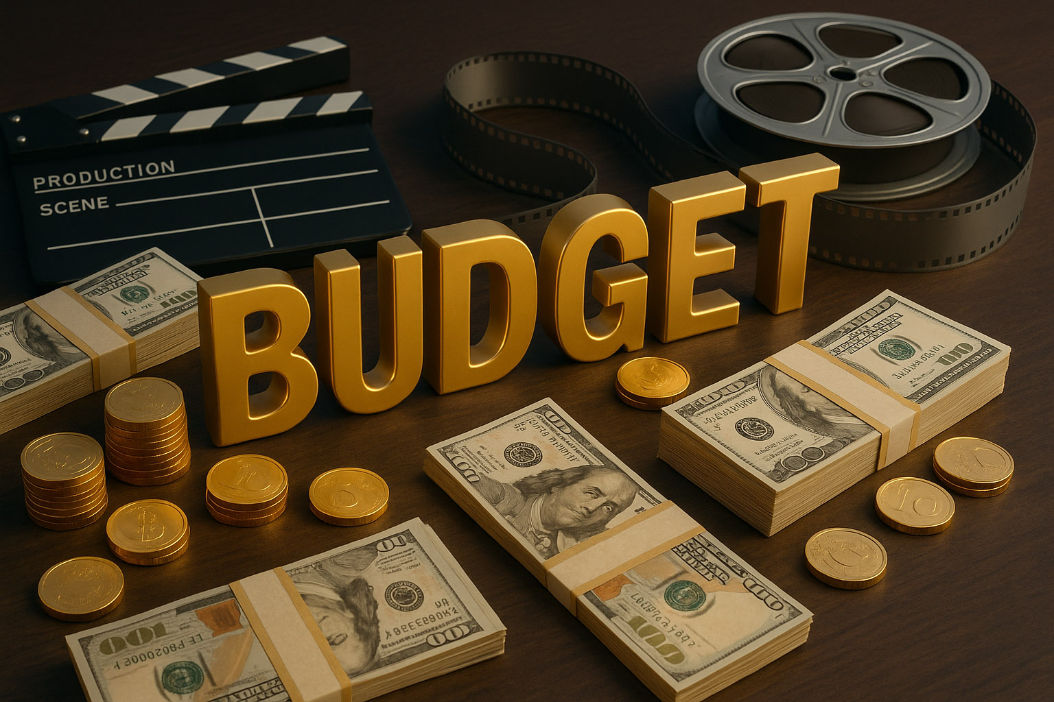
First-class film title sequences can range dramatically in cost:
The budget typically includes:
Some studios sign NDA-bound retainers with major production companies, making costs and processes tightly guarded.
Typography in Hollywood isn’t just window dressing. It’s a blend of graphic design, motion artistry, storytelling, and cinematic timing — shaped by the same ambition that drives blockbuster films.
“Whether subtle or iconic, these letters become part of pop culture. And behind each serif and swipe lies a team of artists crafting moments that will last long after the credits roll.”
News, insights, case studies, and more from the rausr team — straight to your inbox.
Send us your brief, your wildest idea, or just a hello. We’ll season it with curiosity and serve back something fresh, cooked with care.