University Exhibition Stand Design: How to Recruit and Be Remembered
How to design a portable university exhibition stand that attracts prospective students, starts honest conversations and remains memorable throughout a recruitment roadshow.

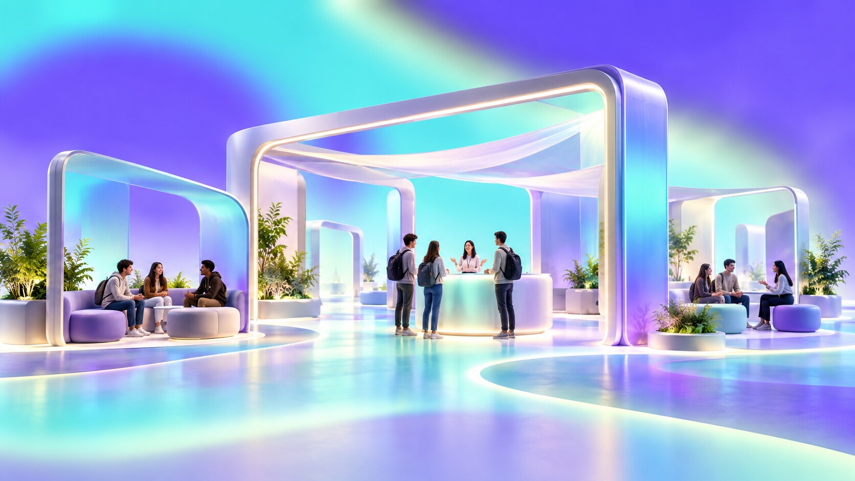
How to design a portable university exhibition stand that attracts prospective students, starts honest conversations and remains memorable throughout a recruitment roadshow.
Choosing a university is a strange purchasing decision. It can involve years of life, a new city, major expense, new friendships and a career direction, yet the first physical contact may be a six-metre stand inside a noisy hall.
That stand cannot reproduce a campus. It can, however, give a student a believable preview of how the university thinks, communicates and welcomes people. If it feels confusing, corporate or indifferent, the institution may feel the same. If it feels clear, open and genuinely useful, the student has a reason to continue the relationship.
The challenge is not simply attracting teenagers with bright colors, free food or a game. Those devices may create traffic, but recruitment requires a second step: turning attention into confidence. The strongest stand combines visual distinction, a small memorable experience and access to people who can answer real questions without sounding like a brochure.
This article develops ideas from The Best Exhibition Stand Is the One That Stops People and adds a recruitment perspective to Designing a Powerful Exhibition Stand on a Very Low Budget.
“The stand should not try to explain the whole university. It should make the right student want the next conversation.”
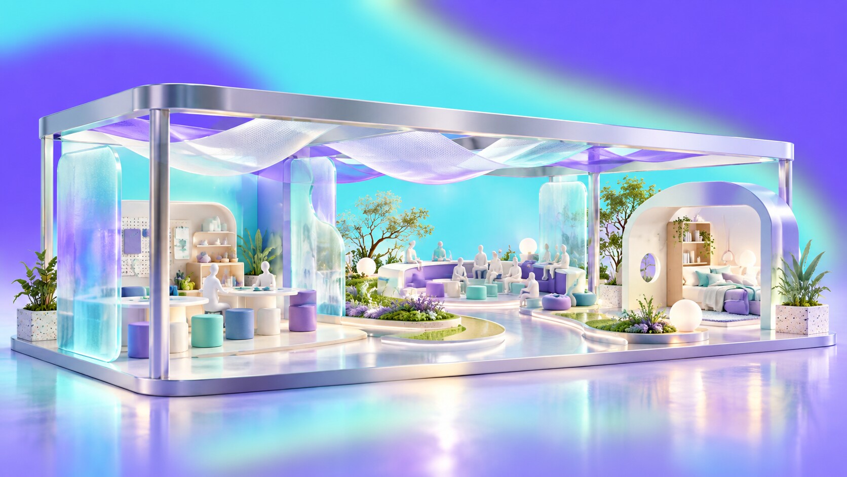
University stands often lead with rankings, awards and a large campus photograph. These signals can reassure parents and support credibility, but they rarely answer the most personal question: Can I imagine myself there?
The UCAS 2025 end-of-cycle survey shows how practical the choice can be. Applicants could select several influences, so these percentages are not intended to total 100%. Among respondents, 51% selected location, 33% teaching facilities, another 33% staff and teaching quality, and 28% social life or activities. Graduate employment outcomes were selected by 21%. No single stand can prove all of these, but the hierarchy is useful: daily experience matters at least as much as abstract prestige.
The design should therefore reveal a specific place and way of studying. Show a real workshop, studio, laboratory or seminar in use. Explain where students live, how they travel and what support looks like. Replace generic pictures of smiling groups with evidence that belongs only to this institution.
A good test is simple. If another university could replace the logo without changing the stand, the concept is too generic.

Young visitors do not automatically stop at the loudest booth. They scan for subjects, places, possibilities and signs that entering will not become an awkward sales conversation. Strong design helps them notice the stand, but the promise must quickly become relevant.
The first view should answer three questions:
Use one recognizable brand color, one large message and one visible action. Course names or broad study areas should be easier to find than institutional slogans. Keep the front open and let the visitor understand the social rules from the aisle.
QS reported that 38% of students in its 2023 International Student Survey considered university fairs one of their most useful research sources. That is a meaningful role, but it also means most information will come from other places. The stand should connect to the larger journey through a useful saved-course link, open-day booking, conversation or follow-up, not attempt to compress the entire prospectus onto walls.
Useful design detail: A visible activity reduces social risk. A student can approach a demonstration, object or question wall without first deciding whether to begin a formal conversation.

A memory point should express something true about the university. An art school can run a small live print activity. An engineering faculty can let visitors operate a mechanism. A media program can create a short sound or camera experience. A health course can demonstrate a practical diagnostic tool with proper supervision.
The action works when it gives the visitor a tiny experience of the discipline. It fails when the activity could advertise a bank, telecom company or energy drink just as easily.
The Syrup Room used this logic for Arts University Bournemouth. Its modular UCAS stand included a live tote-bag printing area where visitors could personalize a bag with AUB graphics. The output became both an activity and a portable reminder. The connection was credible because making and graphic experimentation already belong to an arts university.
Food can work in a similar way, but it should be a welcome rather than the concept. A regional specialty can introduce the city. Coffee can make a longer conversation comfortable. Free sweets may produce a queue of people who remember only the sweets. Food also introduces allergies, hygiene, waste, storage and venue restrictions, so its practical cost is larger than the purchase price.
“A giveaway carries memory only when the visitor remembers why they received it.”

Prospective students expect official representatives to present the university positively. Current students can answer a different class of question: What surprised you? Is the workload manageable? What is the city like on a normal week? Was it easy to make friends? What would you do differently?
In a 2024 Student Room survey of 734 prospective undergraduates, 59% selected student ambassadors at open days as a trusted source of university information. That does not mean placing any student behind a counter will work. Ambassadors need preparation, breaks, clear referral routes and permission to answer honestly.
The spatial design should support these conversations. Avoid a defensive line of staff behind a long counter. Mix one admissions specialist, current students from different subjects and, where possible, somebody who understands finance, accessibility or accommodation. Use name labels that show course and year rather than only job titles.
A useful stand creates several conversation depths: quick questions at the edge, a course discussion near a display and a quieter seat for sensitive topics. Not every student wants to speak publicly about cost, disability support or uncertainty.
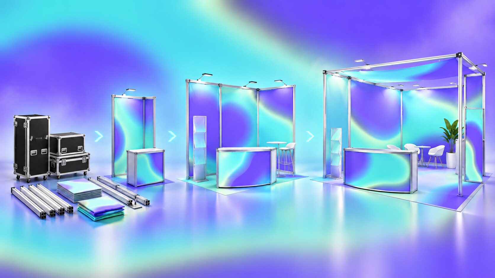
A university stand may visit many cities during one recruitment cycle. Floor areas, open sides, height limits, loading access and setup times change. A beautiful custom structure that works only in one 6 x 4 metre space becomes an expensive logistics problem.
Modular aluminium systems such as T3, OCTANORM, beMatrix or compatible rental frameworks are usually the rational base. The important design work is not hiding the system at any cost. It is creating a branded kit that can become several clear layouts.
Plan at least three configurations:
Use replaceable textile graphics, protected screens, lockable transport cases and standardized cable positions. Give every part an ID and packing location. Test assembly with the actual recruitment team, not only professional installers. A system is not truly portable if nobody can understand it after the designer leaves.
The University of Bolton’s public 2025 case study offers a useful scale reference: its 24 m2 stand used reusable beMatrix and Key Clamp components, was designed for a one-day build and recorded 32 total crew build hours. Those numbers are more informative than a render because they reveal the operational design.
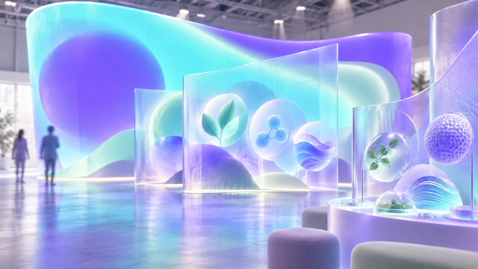
At long distance, visitors need the university name, a strong color or shape and perhaps a location cue. At middle distance, they need course families and one meaningful reason to care. At close distance, they can use detailed screens, printed cards, QR links and conversations.
Keep these layers separate. A common wrong turn is shrinking the whole prospectus onto a back wall. The result is technically comprehensive and practically unreadable.
The visual system should also survive photography and travel. Avoid thin type, pale contrast and details that disappear under exhibition lighting. Design screen content for short glances, not as a website placed vertically. Include captions and avoid making audio the only way to understand an interaction.
Accessibility is part of recruitment, not a later compliance check. Counters need usable heights, circulation needs turning room, text needs contrast and important information needs alternatives. A stand that speaks about belonging while physically excluding visitors creates a particularly strong negative memory.
For more detail on portable structure, materials and graphic hierarchy, continue with How to Start With Exhibition Design.
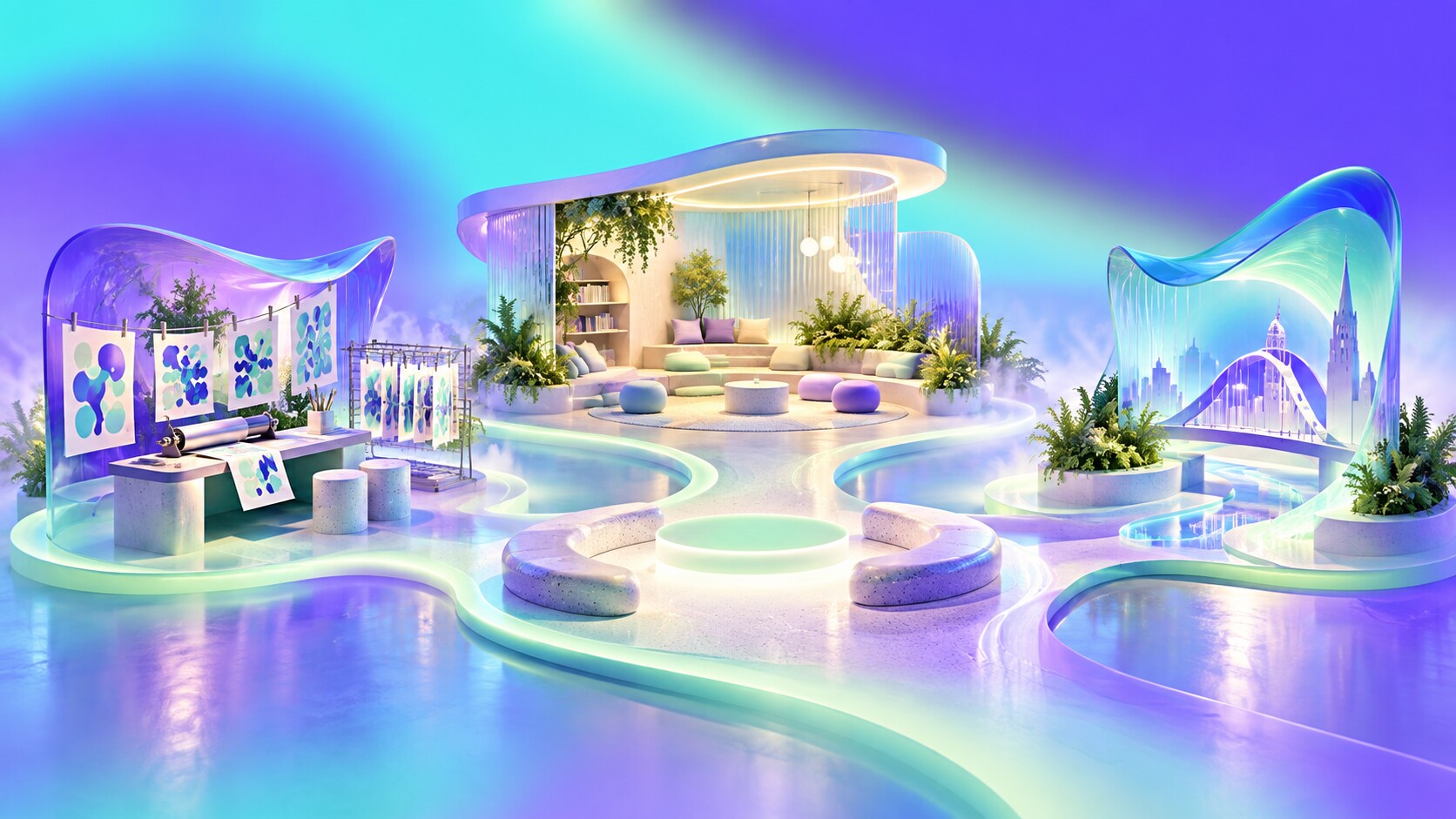
Arts University Bournemouth made creative participation visible through live printing. The University of Northampton used a different strategy for its Waterside campus: Parker Design created a visitor experience with a full-size student-bedroom recreation, transport information and campus-life content, then translated that world into a mobile 6 x 2 metre UCAS stand and smaller display kits.
The Northampton idea worked because accommodation and location are not secondary concerns. They are part of the decision. A realistic room gives scale to an anxious question that glossy architecture photography cannot answer.
For the University of Sussex, Chimney Design extended an existing campaign into a bright UCAS stand using Brighton references and a deckchair. The local character helped connect university and city, while the same visual language continued into open-day materials.
These cases use different techniques, but their successful logic is similar:
The stand is not asked to perform magic. It makes one important part of the university easier to imagine.
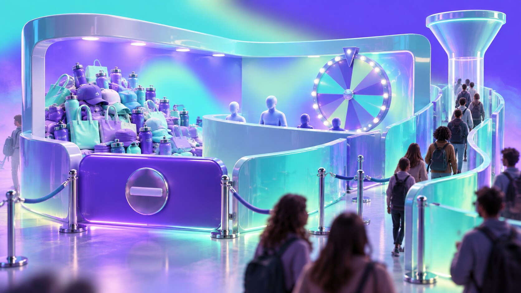
A spinning prize wheel may create a queue. That does not prove that students understood the university or moved closer to applying. Free merchandise can produce thousands of scans from visitors who wanted a bottle rather than a course conversation.
Common wrong turns include:
Measurement should follow the recruitment journey. Count useful conversations, course interests, open-day bookings and consented follow-up, then observe what happens later. Which event contacts attended an open day, began an application or returned with a specific question? Raw footfall rewards gimmicks; progression rewards relevance.
There is also a quieter failure: looking expensive but unapproachable. A polished reception counter, dark enclosed meeting room and staff using laptops can make a university appear selective in the wrong way. Prospective students should not need confidence before approaching the place that claims it will help them build confidence.
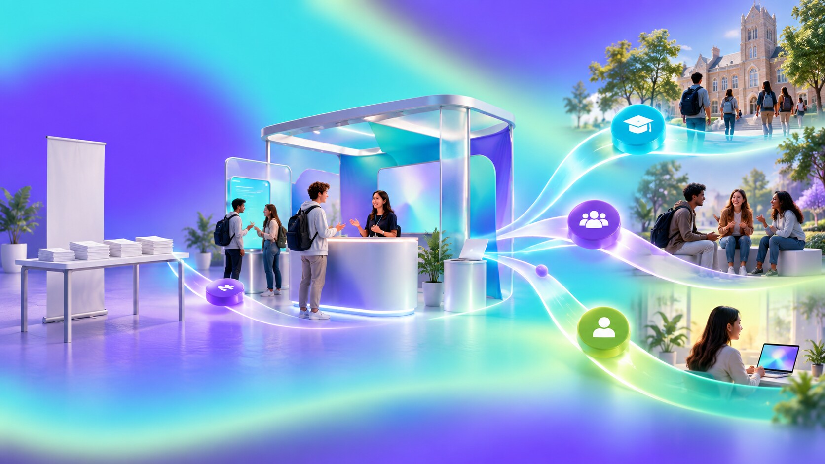
University recruitment stands once depended heavily on prospectuses, banners and staff repeating standard information. The website moved much of that content online. Contemporary stands are becoming places for comparison, experience and reassurance rather than storage for printed facts.
| Period | Main stand role | Typical limitation |
|---|---|---|
| Past | distribute prospectuses and answer basic questions | generic tables and information overload |
| Present | express culture and start peer conversations | interactions can become shallow spectacle |
| Near future | connect live experience with personal follow-up | privacy and excessive data capture require care |
The next step is not covering every surface with screens. It is continuity. A student interested in architecture should leave with architecture information, an appropriate open-day route and a way to speak with a current student, not the same general email sent to everybody.
Digital tools can save a course list, book a visit or send an accessible version of the material. Lightweight augmented reality may help reveal facilities that cannot travel. Remote academic or student connections may support smaller events. None of these should replace the human reason for attending.
Physical fairs also matter because campus visits cost time and money. UCAS found that 79% of its surveyed 2025 applicants attended an in-person open day and 96% of those attendees found it useful, but 42% paid for the visit themselves. A travelling stand can offer an early, lower-cost filter before a student decides which campuses are worth visiting.
The continued value of physical contact in a digital decision journey is explored more broadly in The Future of Exhibitions: Why Real-World Networking Still Wins.
The most successful university stand will remain a compact promise: this is who we are, this is how studying here may feel, and here is a real person who can help you decide whether it fits. Fun can open the door. Good design can make the place recognizable. Honest human contact is what gives the memory a future.

News, insights, case studies, and more from the rausr team — straight to your inbox.
Send us your brief, your wildest idea, or just a hello. We’ll season it with curiosity and serve back something fresh, cooked with care.