UX&UI in the Early Days: Web Design in the 80s and 90s
Before Figma, Sketch, or even CSS — how did designers approach UX and interface design on early websites? Tools, processes, and pioneers who shaped the web’s visual beginnings.

Before Figma, Sketch, or even CSS — how did designers approach UX and interface design on early websites? Tools, processes, and pioneers who shaped the web’s visual beginnings.
In the early days of the internet, user experience wasn’t a defined discipline — but that didn’t mean it didn’t exist. Designers and developers still had to think about usability, hierarchy, and layout — just without the luxury of modern tools or standards.
This is Part 1. Continue with Part 2: UX&UI After the Early Days: Web Design from the Late 90s to 2010.
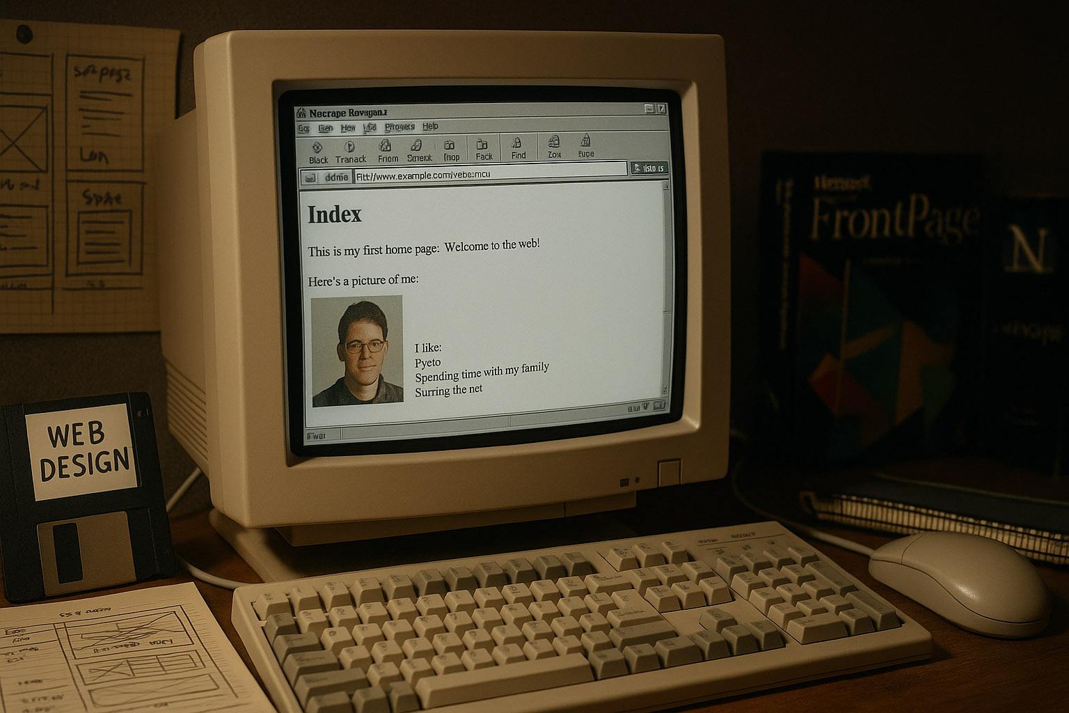
“yes, www in medieval times…”
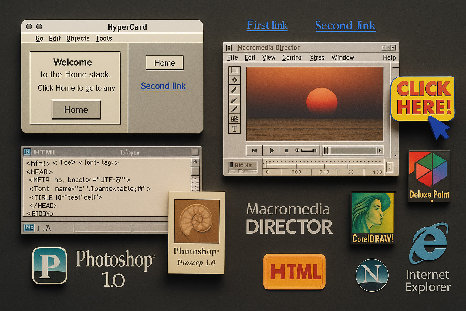
HyperCard (1987): Made by Apple, it allowed creators to build interactive “stacks” of cards. Steve Jobs famously saw it as “programming for the rest of us.” HyperCard was a precursor to hyperlink-based navigation and influenced the thinking behind early web browsing.
Photoshop 1.0 (1990): Released for Macintosh. Designers used it to create graphics and export bitmap buttons or banners. While not a layout tool, it became a core part of the web designer’s toolkit in the absence of UI-specific software.
Macromedia Director (1993): A favorite among multimedia creators. Though not web-native, it shaped the thinking behind animations and interactions, and many early Flash designers got their start here.
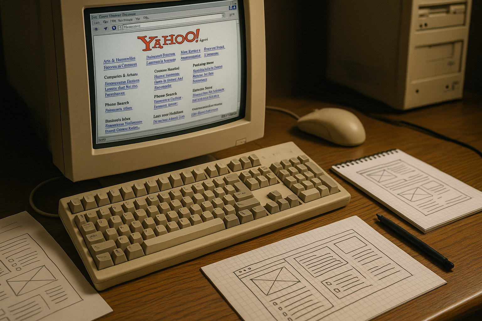
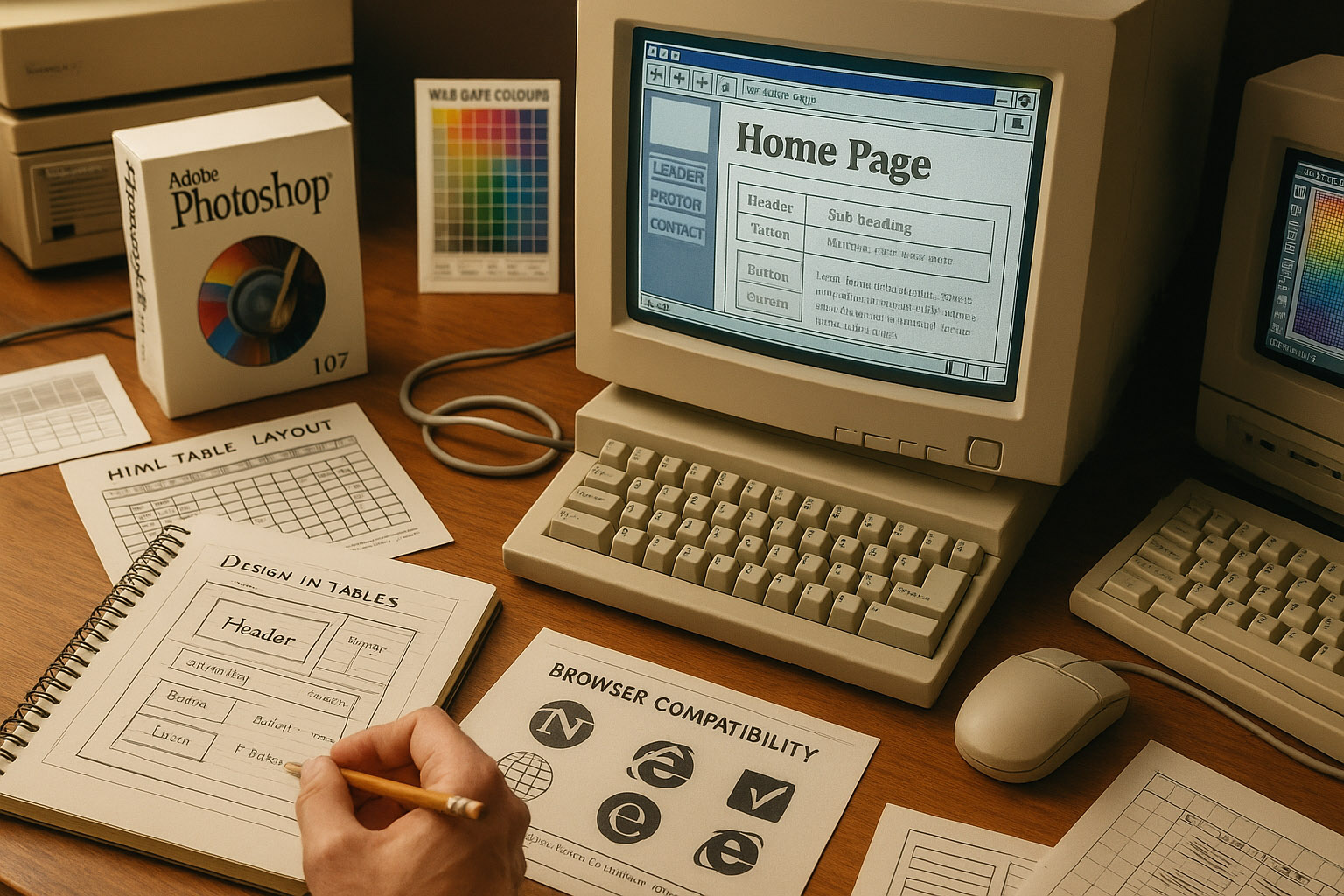
HTML 1.0 + Notepad: Web pages were coded manually. No CSS meant that every visual element was inline. Fonts, colors, and layout depended on HTML tables, <font> tags, and bgcolor attributes.
Deluxe Paint and CorelDRAW: Popular in the early 90s for pixel-based UI elements and icons, especially among PC users before Photoshop gained dominance.
Browser Wars: Netscape vs. Internet Explorer defined how designers coded — many had to write multiple versions of HTML to satisfy different rendering engines.
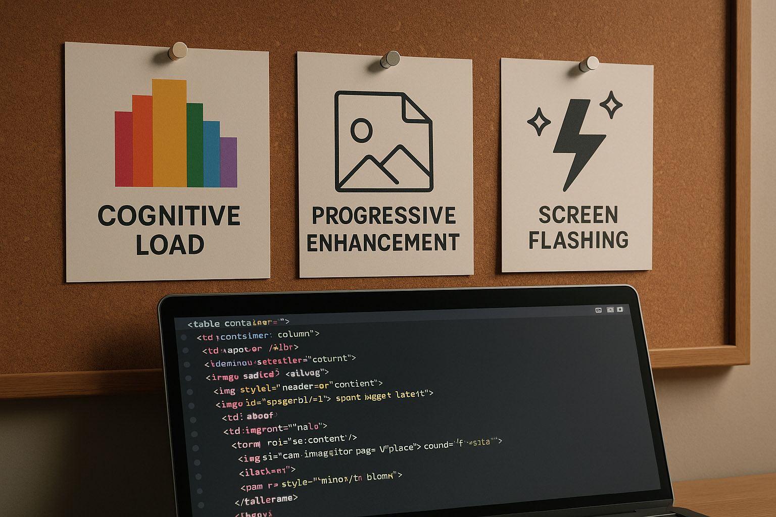
Design in the 90s was constrained by hardware and bandwidth. CRT monitors with resolutions of 640×480 or 800×600 were standard, meaning screen real estate was extremely limited.
Designing in Tables: Sites were built with nested HTML tables. Spacer GIFs were used to control alignment — literally 1px transparent images to “push” content.
Button States: Before :hover was supported, designers created separate image files for default and hover states and swapped them using JavaScript.
Browser Compatibility: Designers had to test websites in Netscape Navigator, Internet Explorer, and Mosaic. Each browser rendered HTML differently.
Wireframing with Pen and Paper: Since tools like Sketch or Figma didn’t exist, early web designers often started with pencil sketches on graph paper. These wireframes were then translated into HTML manually, making the design process deeply intertwined with code.
Pixel Perfection Meant Literal Pixels: Designers used pixel rulers and made decisions pixel by pixel. Anti-aliasing was limited, so typography and icons were often created at specific pixel sizes to avoid blurriness.
Color Choices: Designers were limited by the 216-color “web-safe” palette. Anything outside that could appear differently on different monitors. This heavily influenced aesthetic choices — bright, clashing colors weren’t just stylistic, they were reliable.
David Siegel: Introduced design thinking to a developer-centric web. His book was a manifesto for creativity in a world of gray backgrounds and Times New Roman.
Jef Raskin: Advocated for humane interfaces and influenced not just Mac UI but also the foundational principles of user-centered design.
Jakob Nielsen: Published “10 Usability Heuristics” — many of which are still relevant. His work pushed the importance of UX before the term was mainstream.
Hillman Curtis: A pioneer of web motion design in the Flash era. While more active in the early 2000s, his thinking grew from the constraints of the 90s.
April Greiman: A pioneer in integrating digital tools into design, she influenced early screen-based aesthetics with her experimentation in pixel art and typography. Though more active in the broader digital design world, her philosophy shaped the graphic flavor of early web pages.
Tim Berners-Lee: While not a “designer” in the traditional sense, his creation of the World Wide Web inherently involved UX thinking — from link structures to page navigation, he laid the cognitive and navigational foundation.
Early browsers couldn’t center text. Designers manually spaced characters to simulate alignment.
HTML forms had no layout tools. Designers used tables and invisible borders to make fields align.
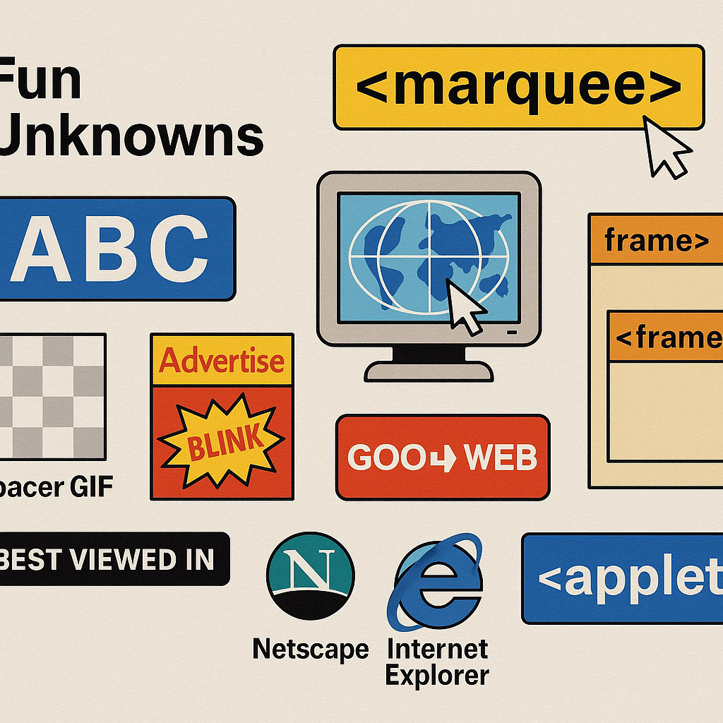
The “Marquee” and “Blink” tags in Netscape were experiments in creating visual rhythm — now deprecated but once widely used for attention.
Some early websites used server-side image maps because HTML had no client-side image mapping yet. These required server processing just to detect where on an image a user clicked.
Many sites used frame-based layouts (HTML <frameset> and <frame>), allowing persistent navigation or ads — though these were hard to bookmark or share, and accessibility was poor.
Websites often included “Best viewed in…” labels — encouraging users to switch browsers or screen resolutions, a sign of just how unpredictable rendering was.
Java applets were briefly used to deliver interactive content before JavaScript matured, although performance was clunky and they were eventually phased out.
While crude, 80s and 90s web design laid the philosophical groundwork for UX/UI. Tools were hacked. Browsers were unpredictable. But the intent — to guide users, communicate clearly, and build engaging experiences — was there from the start.
“Try to imagine the users’ faces if they saw today’s modern page back then…”

News, insights, case studies, and more from the rausr team — straight to your inbox.
Send us your brief, your wildest idea, or just a hello. We’ll season it with curiosity and serve back something fresh, cooked with care.