When Being Trendy Backfires: The Hidden Risk of Over-Styled Branding
Why following design trends too closely can dilute your brand identity and waste your marketing budget.

Why following design trends too closely can dilute your brand identity and waste your marketing budget.
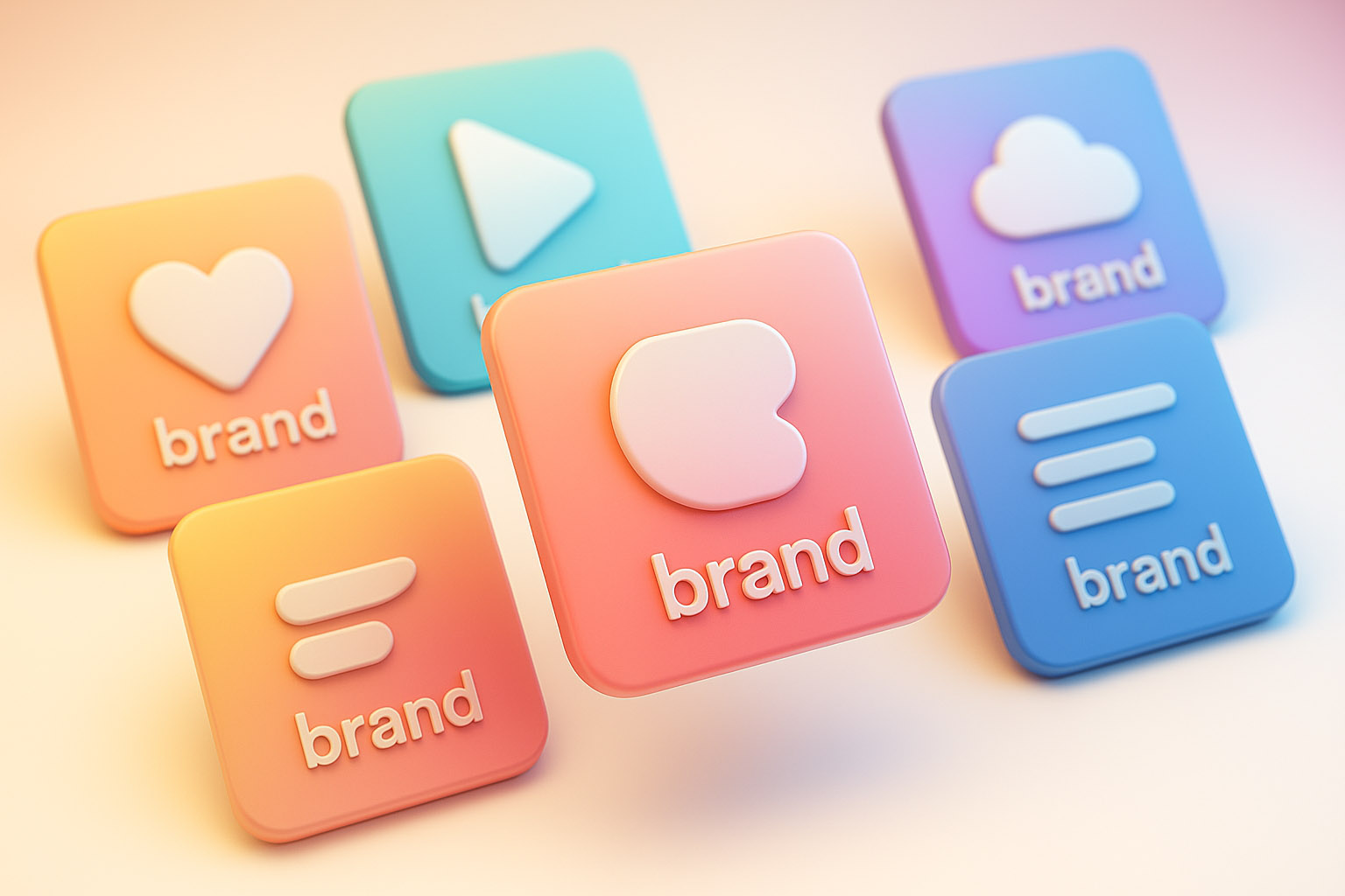
In an effort to look “modern,” many brands jump on the latest design trends: glassy gradients, minimalist sans-serifs, millennial pinks, vaporwave blurs, lowercase everything. It looks clean, slick, and current.
These trends come in waves — think of neubrutalism with its raw, blocky aesthetics, or glassmorphism’s frosted glass effect that dominated UI design for a while. Each cycle promises freshness but often ends up saturating the market with similar-looking brands.
But it also looks exactly like everyone else.
That’s the problem.
“By chasing these cyclical fads, brands risk losing their unique voice and blending into a sea of sameness. The challenge is that trends are designed to be widely adopted, which inherently diminishes distinctiveness over time.”


Branding is about recognition. But if your brand communication is too trendy, you risk blending in — especially within your own category.
Imagine:
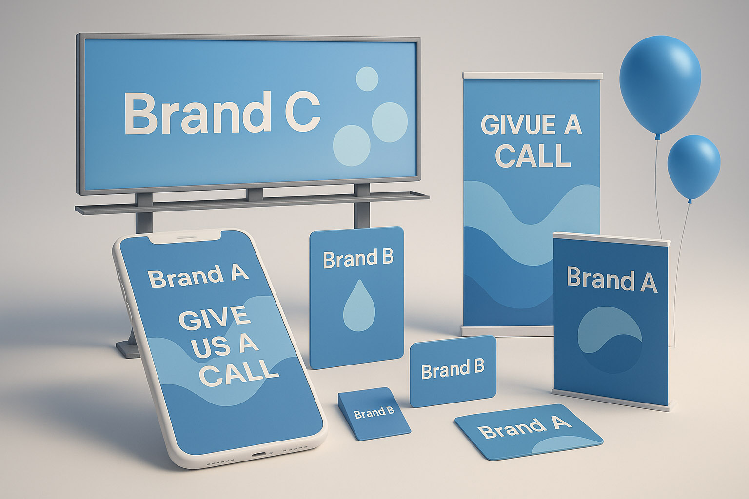
Customers can’t tell you apart. And worse — they don’t remember you.
Research supports this: a study by the Ehrenberg-Bass Institute found that brands with visually distinctive assets are 60% more likely to be recalled by consumers. When brands look too similar, that advantage evaporates.
Another side effect: your ads might be accidentally promoting your competition.
If your campaign looks just like your competitors’…
For example, in the telecom industry, many companies use similar blue-and-white color schemes and minimalist icons. This has led to ads that feel interchangeable, making it difficult for customers to distinguish between providers and inadvertently benefiting competitors.
It feels safe to follow trends. It means fewer arguments with clients. Fewer creative risks. Faster design approval.
But safe doesn’t mean smart.
Trendy design without strategic thought leads to:
One notable case is Gap’s 2010 logo redesign. They shifted to a trendy, minimalist look that was widely criticized for losing the brand’s heritage and distinctiveness. The backlash forced them to revert to their classic logo within a week, illustrating the risk of abandoning brand identity for trendiness.
And in performance marketing? That’s expensive.

The goal isn’t to look “cool.”
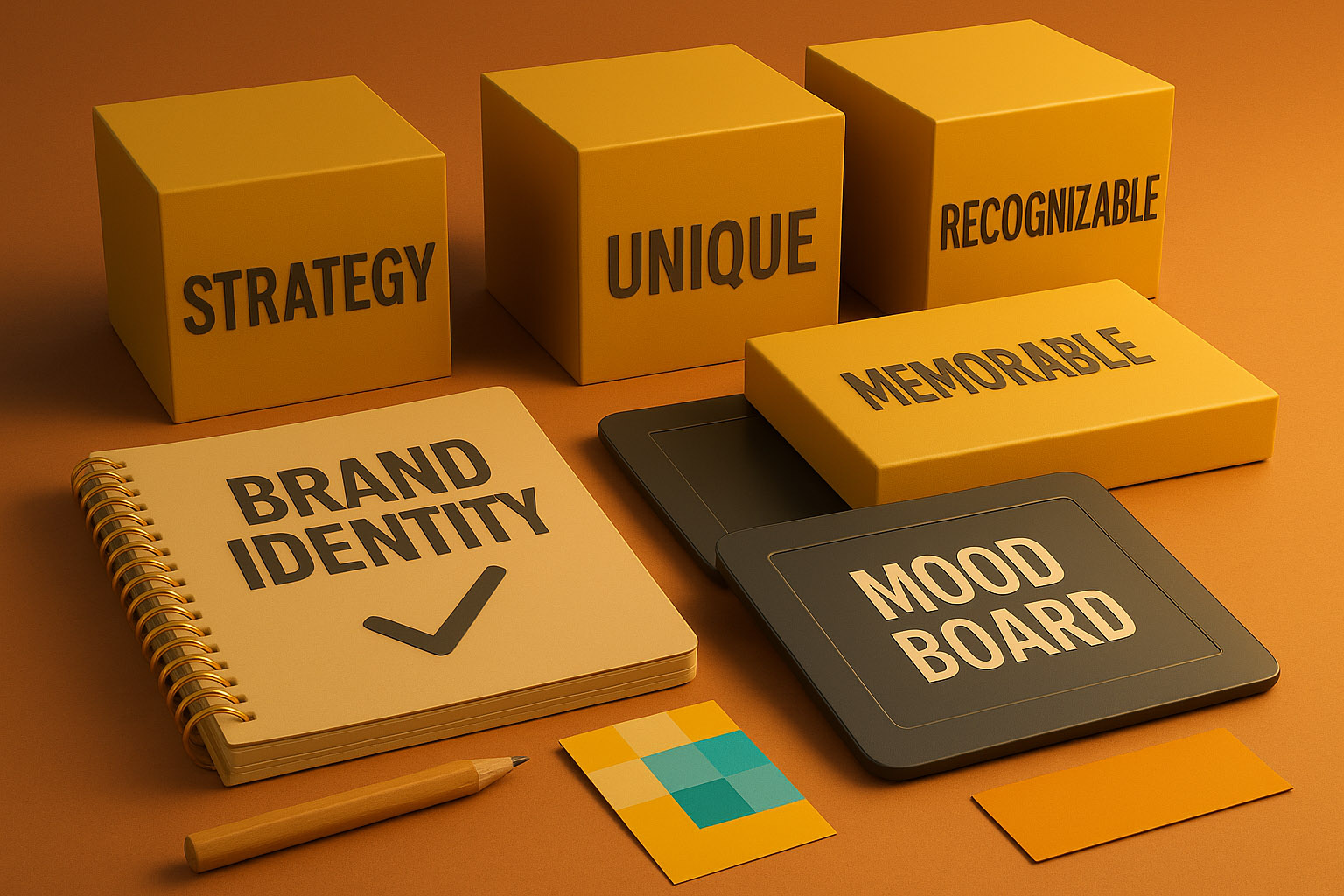
The goal is to be recognizable, trusted, and unique.
Being trendy might look good short-term, but it’s a long-term liability.
In crowded categories, visual sameness is brand suicide. Don’t water down your identity by chasing every new aesthetic wave.
Instead, invest in purposeful design that reflects your brand’s true essence. Challenge yourself to stand out thoughtfully, not just stylishly.
“Guys, ask yourself — are you building a brand that lasts, or just following the latest fad? The answer could define your future success.”

News, insights, case studies, and more from the rausr team — straight to your inbox.
Send us your brief, your wildest idea, or just a hello. We’ll season it with curiosity and serve back something fresh, cooked with care.