When Comparing Your Design Work Online Kills Creativity: How to Escape the Loop
Why nonstop comparison with other designers can damage confidence and originality, when it can still help, and how to build a healthier creative practice.


Why nonstop comparison with other designers can damage confidence and originality, when it can still help, and how to build a healthier creative practice.
A designer finishes a project and feels good.
The hierarchy works. The typography finally has rhythm. The presentation says what it needs to say. After several uncertain days, the work feels complete.
Then the designer opens a feed.
Within seconds there is a sharper identity, a smoother animation, a stranger typeface, a bigger studio case study, and someone younger apparently doing all of it faster. The finished project has not changed, yet the feeling around it has.
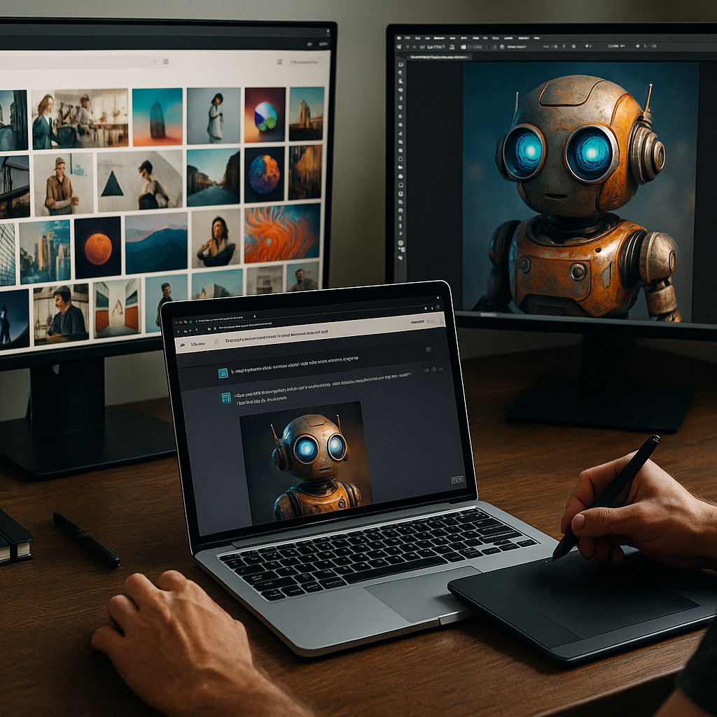
This is one of the quiet problems of contemporary graphic design: not simply too much content, but too much excellent work placed beside our own work without context. We could call it shared design density. It is not a clinical term. It describes the extraordinary amount of polished visual output a designer can absorb in a very short time.
Comparison itself is old. The scale, speed, and measurement of it are new.
This article continues ideas from Where Creativity Is Born, Does Time or Volume Shape Design Taste?, and Beginner vs Professional Graphic Designer.
“The feed shows finished work without showing the rejected ideas, ordinary Tuesdays, quiet months, client compromises, or years needed to develop the eye behind it.”
The comparison loop did not suddenly appear with today’s social platforms.
DeviantArt launched on August 7, 2000 as a place for artists to exhibit and discuss work. Myspace, founded in 2003, made personal taste, music, images, friends, and page styling part of a public identity. Later came Flickr, Behance, Dribbble, Tumblr, Pinterest, Instagram, and TikTok, each making visual discovery faster and more continuous.
Early creative communities could already produce status anxiety. Views, favorites, comments, Daily Deviations, featured work, and follower counts made attention visible. But the experience was often more deliberate. A person entered a gallery, a forum, a profile, or a category. Communities were smaller, pages loaded more slowly, and discussion could remain attached to a specific work.
Today’s feed removes much of that friction. A student logo can sit between a global rebrand, a speculative 3D film, an AI-generated campaign, and a studio project made by twelve specialists. They occupy the same rectangle and arrive at the same speed, even though they are not comparable jobs.
DeviantArt is older than YouTube, Facebook, Behance, and the iPhone. Its official twentieth-anniversary history says the platform had already passed 100 million uploaded works by the end of 2009. Creative abundance is not new, but mobile feeds made it permanently available.

Leon Festinger proposed social comparison theory in 1954. At its simplest, people evaluate their abilities partly by looking at other people, especially when there is no objective measuring tool.
Graphic design is almost perfect territory for this mechanism because quality is only partly measurable. A file can be technically correct, readable, accessible, and approved, while the designer still wonders whether it is original, intelligent, fresh, or culturally relevant.
The feed appears to answer those questions, but it answers them badly.
It usually compares:
The comparison feels direct because the images are side by side. In reality, the missing context makes the comparison structurally unfair.

It would be too easy to conclude that designers should stop looking at other design.
That would also be bad advice.
Comparison helps when it produces a usable observation: this identity keeps recognition through one shape, this editorial system controls complexity with two text sizes, or this designer presents the decision more clearly than I do. In that form, another person’s work becomes evidence rather than a verdict.
Recent research supports this more nuanced view. A 2026 study used a 14-day diary with 208 participants and a follow-up survey with 204 participants. Time spent on social media by itself did not predict self-perceived creativity. Social and cognitive uses, such as exchanging ideas and learning, were more positively related to creativity than passive or entertainment-led use.
The important question is therefore not only, “How long was I online?” It is, “What was I doing there?”
Healthy comparison tends to create curiosity. Harmful comparison tends to create identity judgment:
The first mode opens a next action. The second closes one.
One of the most useful hidden findings is that exposure volume alone may not be the main enemy. An unstructured purpose is more dangerous. Twenty intentional references can teach more than two hundred beautiful images consumed without a question.

Creative platforms do not show work alone. They place work inside a measurement system.
Views, likes, saves, appreciations, followers, badges, and features make an ambiguous field look numerical. The numbers feel objective, but they mix many unrelated factors: audience size, timing, format, platform preference, existing reputation, subject popularity, social activity, and sometimes paid distribution.
A 2021 study based on interviews with 25 artists using Instagram found that a Like could be read as affection, relationship maintenance, or platform currency. Its meaning was ambiguous. The artists often valued recognition from a respected artist more than a large pile of anonymous approval, yet the interface displayed both through the same small symbol.
That ambiguity is important. A designer may read low reach as a judgment of weak work, while the platform may simply have produced weak distribution.
The scale also matters. Behance reported more than 65 million artists worldwide in its 2025 review. It also said the platform generated $80 million in job opportunities through more than 100,000 freelance projects, jobs, and commissions during that year. These numbers show both sides of the system: creative platforms can create real careers, but no person can meaningfully compare themselves with a field that large.
“Engagement measures how a platform and an audience reacted to a post. It does not measure the full value of the work.”

Comparison does not only affect confidence. It can affect what gets made.
If designers repeatedly see the same featured identities, font pairings, product renders, scrolling effects, and case-study structures, those patterns begin to feel like the definition of professional quality. The work may become more polished while the range of possible solutions becomes smaller.
This creates a loop:
The result is not direct copying. It is convergence through thousands of tiny, reasonable choices.
This may explain why unrelated startups can arrive at similar wordmarks, soft gradients, clean grotesk typography, floating interface cards, and identical device mockups. Each element can be well designed. The sameness appears at the level of the whole ecosystem.
The same mechanism appears in Graphic Design Trends: Why Styles Always Come Back: a trend is rarely repeated exactly, but shared references keep pulling designers toward familiar visual answers.

Online comparison is not a universal poison.
One designer sees excellent work and wants to practise. Another sees the same work and feels that practising is pointless. The response can change with experience, fatigue, financial pressure, perfectionism, mood, and whether the designer already has trusted standards for judging their own work.
A 2026 meta-analysis combined 54 independent samples with 36,583 participants. It found a moderate association between upward social comparison on social media and psychological difficulties overall, with an average correlation of 0.33. The strongest relationship was with negative emotions connected to social evaluation. The authors also stressed that the evidence was varied and did not prove a universal causal effect.
For designers, risk often rises when:
A senior designer is not automatically protected. Experience can create its own fear: Am I still relevant? Has the visual culture moved beyond me? The comparison target changes, but the loop can remain.

| Signal | Useful benchmark | Harmful loop |
|---|---|---|
| Question | “What can I learn here?” | “What does this say about me?” |
| Attention | one relevant decision | the creator’s whole career |
| Result | a test, note, or new option | delay, imitation, or paralysis |
| Ending | the reference tab closes | the feed keeps moving |
| Feeling | specific curiosity | general inadequacy |
The most revealing line is the result.
Useful inspiration changes the work or the understanding of it. Harmful comparison changes only the designer’s mood. If an hour of looking creates no sketch, question, saved principle, or clearer decision, it was probably not research.

The answer is not a dramatic digital disappearance. Most designers need networks for work, education, peers, and visibility. The better response is to separate research from consumption.
A practical reference diet can be simple:
The verbal step is especially useful. “I like this” keeps the reference emotionally powerful but intellectually vague. “The narrow image crop creates tension against a wide text column” turns admiration into transferable knowledge.
Source diversity also protects originality. A restaurant identity built only from other restaurant identities will inherit the category’s current habits. The same project informed by market awnings, handwritten menus, regional ceramics, kitchen sounds, family photographs, and urban wayfinding begins with a wider vocabulary.
Reference boards can become disguised answer boards. If every image already looks like the desired final project, the concept may have been selected before the designer has properly understood the problem.

The early stage of a project needs weak, strange, incomplete options. Social platforms are usually designed to display resolved outcomes.
Mixing those two environments can make a designer evaluate every sketch before it has enough time to become interesting. The hand begins drawing for an imagined audience. Safe ideas survive because they are easier to defend immediately.
Teresa Amabile demonstrated this tension in a classic 1979 experiment involving 95 students making art. Participants who expected external evaluation generally produced work judged less creative than a no-evaluation group. The experiment had important conditions and should not be reduced to “all feedback is bad,” but it supports a familiar studio truth: vague judgment pressure can narrow exploration.
Try dividing the process into clear rooms, even if those rooms are only time blocks:
The most important rule is simple: do not browse competitors while trying to hear the first quiet idea.

Platforms are good at distributing finished images, but weak at creating precise conversations around unfinished decisions.
The 2017 research project Mosaic explored a community built around sharing work-in-progress rather than only polished outcomes. In its deployment, illustrators used process snapshots to reflect on their methods, developed a norm of detailed feedback, and became less anxious about showing unfinished work.
That points toward a healthier model for designers: smaller circles, more context, and clearer questions.
Instead of posting “Thoughts?”, ask:
Specific questions turn feedback from public scoring into design information. They also make it harder for the designer to convert every reaction into a judgment of personal talent.

The goal is not to stop noticing excellent designers. It is to stop using them as a live measurement of whether you deserve to continue.
Start with a short reset:
It also helps to maintain two separate archives. One contains inspiring work by others. The second contains your own solved problems: the identity that became clearer, the layout that survived production, the interface users understood, or the client problem you untangled. The second archive is evidence that the feed cannot provide.
The internet will only become denser. AI systems can already generate more polished visual options in minutes than a person could review in a day. That makes a stable design process more valuable, not less. The future designer’s advantage will not be the ability to consume every image. It will be the ability to select inputs, define a meaningful problem, and know when looking must stop so making can begin.
Comparison is not proof that a designer is weak. It is a normal human method of orientation placed inside an environment with almost no natural endpoint. The solution is not stronger self-belief alone. It is better boundaries, better questions, better critique, and a clearer private definition of progress.
“Your work does not need to defeat the feed. It needs to solve its problem, reach its audience, and still contain enough of your thinking to be worth making.”

News, insights, case studies, and more from the rausr team — straight to your inbox.
Send us your brief, your wildest idea, or just a hello. We’ll season it with curiosity and serve back something fresh, cooked with care.