When Designers Copy Each Other and the Right Time to Break the Pattern
Why online inspiration platforms make design look increasingly similar, why some uniformity is useful, and how to think clearly about copying, conventions, and standing out.

Why online inspiration platforms make design look increasingly similar, why some uniformity is useful, and how to think clearly about copying, conventions, and standing out.
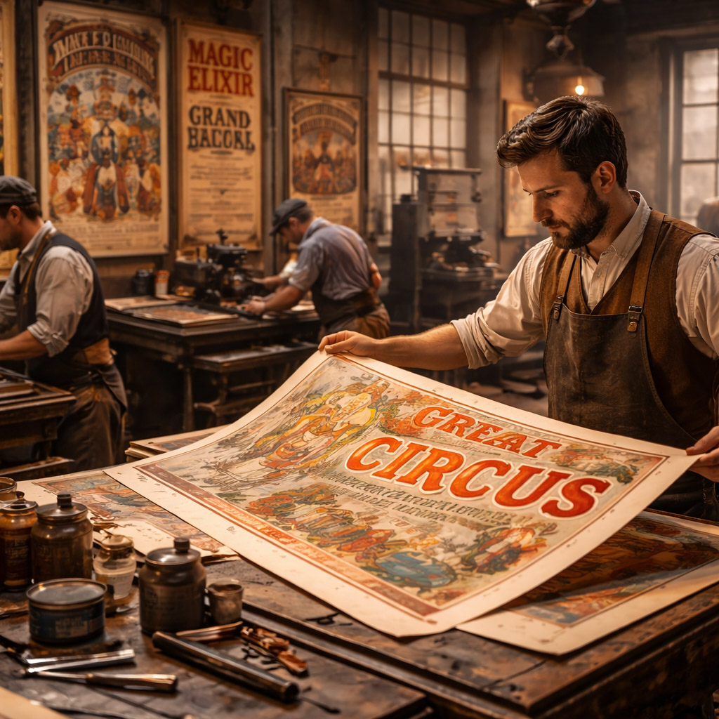
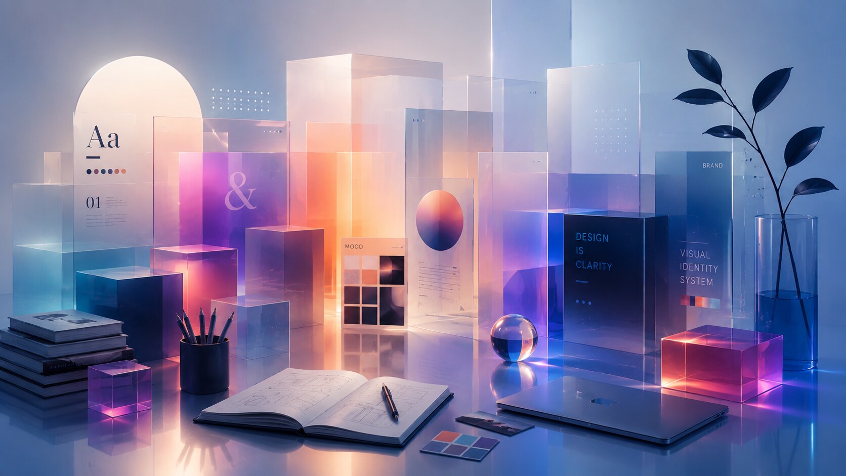
Designers have always borrowed. Long before Pinterest boards, Behance case studies, or Dribbble shots, studios kept scrapbooks, tearsheets, archive drawers, and shelves full of printed references. Looking at other work is not the scandal. It is part of the profession.
What changed is the speed, volume, and visibility of influence.
Today, almost everything can be collected, saved, tagged, re-posted, and re-seen within minutes. Pinterest describes Pins as bookmarks people save to boards. Behance describes itself as a creative network with more than 50 million members. Dribbble grew from a small invite-only sharing space into a platform where millions of designers discover work, trends, and opportunities. That means inspiration is no longer occasional. It is continuous.
This creates a real tension.
On one side, exposure to more work can sharpen taste, expand references, and help younger designers learn faster. On the other side, endless reference browsing can flatten decisions until everything starts speaking in the same accent. The result is familiar to anyone who has spent too much time in design feeds: polished work, competent work, trendy work, and work that is strangely hard to remember five minutes later.
This article sits naturally beside Where Do Designers Find Inspiration? and Workflow for Complex Branding Design, Print and Digital if you want the process side of the same question.
“Looking at references is normal. Letting references make your decisions for you is where the trouble starts.”
The old version of influence was slower. You had to buy the magazine, visit the bookstore, photograph the poster, ask someone for the annual report, or physically notice the package on the shelf. There was friction. Friction is not always bad. It filters impulse.
Now the entire process is friction-light:
The danger is subtle. Designers do not usually think, “I am going to copy this.” They think, “This is a good reference,” then “This solves the problem,” then “This is what people expect,” and finally “This is what looks right.” By the end, the project can inherit someone else’s choices without anyone noticing when that transfer happened.
Platforms encourage this by design. Pinterest is built around saving. Behance is built around showcasing finished projects attractively. Dribbble historically rewarded compressed, instantly legible “shots” that perform well in a grid. None of those systems are evil, but all of them reward work that is easy to recognize fast. That often means work that already resembles what people understand as good-looking.
There is also a psychological effect here: when you see the same pattern many times in a short period, it stops feeling like one option and starts feeling like the obvious option.
One underappreciated reason design trends spread so fast online is that reference platforms reduce the distance between observing a pattern and reusing it. The gap between taste and imitation becomes dangerously short.

It would be too simple to say that originality is always good and similarity is always bad. In interface design, that is often false.
NNGroup’s consistency-and-standards heuristic points to a basic truth: users should not have to guess whether the same kind of action behaves differently in each product. Apple’s Human Interface Guidelines make the same case from another angle: adopt platform conventions and use familiar components so people understand interfaces quickly.
This is the real logic behind uniformity in UI/UX. Familiarity lowers cognitive load.
If a search icon looks like search, if a cart behaves like a cart, if a tab bar switches top-level sections in the expected way, and if a toggle clearly communicates on/off state, users move with less hesitation. That is not aesthetic surrender. That is respect for time and attention.
Useful uniformity often includes:
A banking app, a food-delivery app, and a calendar app do not need to invent a revolutionary way to save a setting. Reinventing obvious things usually does not make a product feel premium. It makes it feel annoying.
If you want the historical version of this convergence, continue with UX&UI Webdesign After the Millennium and The Evolution of Facebook Design.
“In interfaces, originality is expensive when it interrupts comprehension. The user should notice your product, not struggle to decode it.”

Uniformity helps when it protects usability. It becomes a problem when it spreads into every visual decision, every tone decision, and every brand decision.
This is where design gets boring.
You can see it in:
None of these decisions are individually catastrophic. The issue is cumulative. When too many designers borrow from the same narrow pool, visual variety collapses. Then a whole category begins to look like one long family of cousins wearing the same outfit.
This flattening does two kinds of damage at once.
First, it weakens memory. If everything looks broadly correct, little stays distinct. Second, it weakens judgment. Designers start confusing “commonly seen” with “objectively good.” Those are not the same thing.
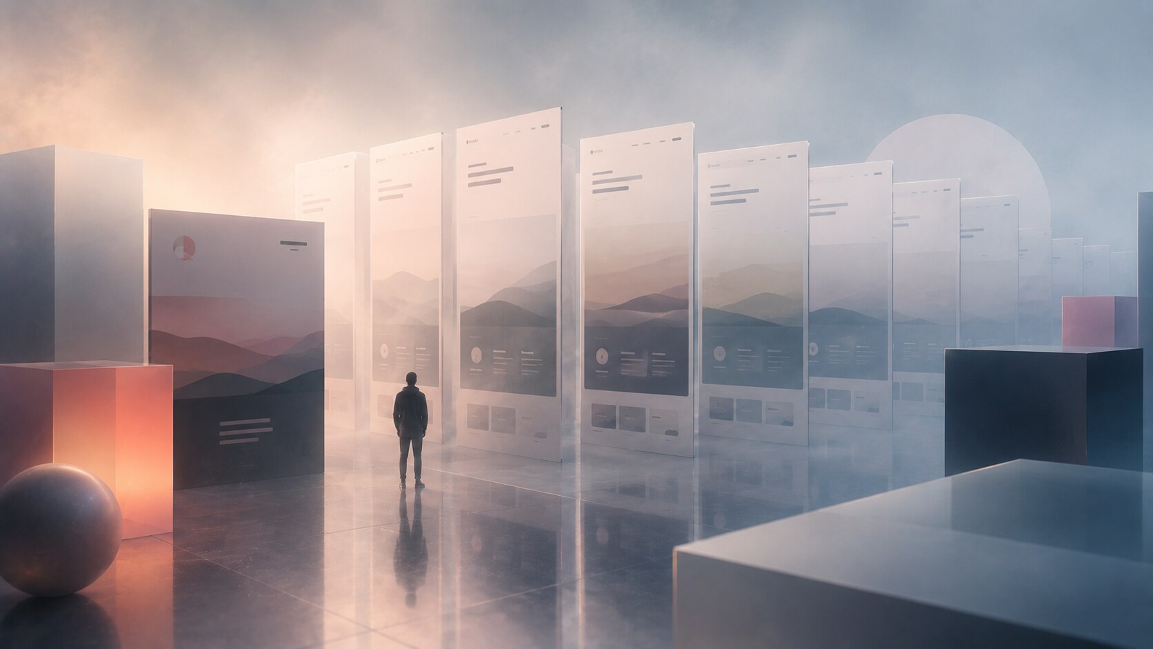
Online feeds make this worse because they compress context. A Dribbble tile can make a surface look finished without revealing whether the system works in the real world. A Behance project can tell a neat visual story without showing what was edited out. A Pinterest board can create a mood so persuasive that it hides how repetitive the mood actually is.
The most copied things in design are often not the strongest solutions. They are simply the easiest solutions to recognize and reproduce.
Print design is useful here because it exposes the difference between structure and style more clearly than digital feeds often do.
Many print situations benefit from standardization:
Nobody wants a medicine label redesigned as an artistic puzzle. Nobody wants a metro map that is expressive but unreadable. Nobody wants a contract that performs creativity by hiding where to sign.
But print also proves that consistency does not have to mean deadness.
The grid can stay stable while the imagery changes. The information system can remain clear while the campaign typography becomes louder. A magazine can preserve its column logic but still reinvent pace, tension, cropping, and scale from issue to issue. This is one reason older editorial design often feels more intelligent than current moodboard-heavy work: it knew how to separate the part that must stay reliable from the part that is allowed to surprise.
That distinction matters in digital too. Navigation does not need to be original in the same way a launch illustration, a brand tone, a motion concept, or a campaign microsite might need to be.
For a parallel argument about durability, this pairs well with Stay Normal: Why Consistency Beats Trends in Graphic Design and When Being Trendy Backfires.
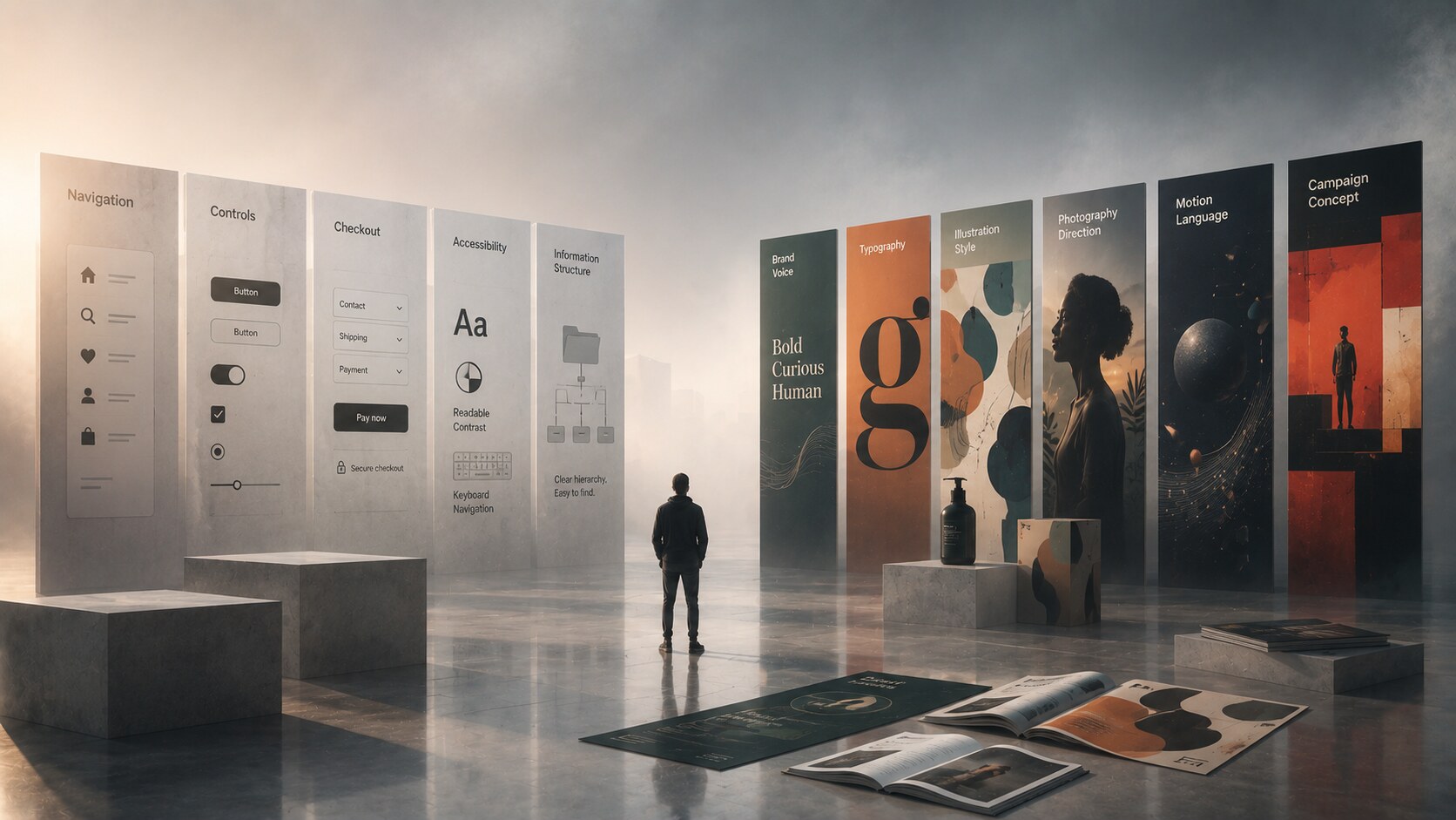
A lot of confusion disappears once you stop asking whether a project should be uniform or original and start asking which layer is doing which job.
Some layers should be conventional because they support understanding:
Other layers are where difference becomes valuable:
This is why some of the best work feels both familiar and fresh at the same time. The user knows how to use it immediately, but still remembers who made it.
Think about a strong e-commerce brand. The product grid, cart logic, filters, and account patterns should probably not behave like an art experiment. But the photography, copy tone, icon accenting, spacing rhythm, color behavior, and overall atmosphere can still become highly distinctive.
The same is true in print. A poster, album cover, or exhibition identity is allowed to be more provocative because its purpose includes attraction and memorability, not only operational clarity. In those areas, standing out is not a decorative luxury. It is often the entire point.
“The mature question is not “Should design be original?” The mature question is “Where does originality help, and where does it get in the way?””
The useful way to study other work is not to ask, “How do I make mine look like this?” but rather:
That is the difference between influence and theft, but also the difference between real learning and shallow imitation.
If you study a packaging system and notice how hierarchy is staged across sizes, that is useful. If you study an editorial layout and understand how white space controls rhythm, that is useful. If you notice that a product page keeps one dominant action visible and secondary actions quiet, that is useful. These are transferable principles.
What is not very useful is dragging the same textures, same gradients, same 3D icons, same generic mockup lighting, and same slogan energy into every project and calling it inspiration.
A practical method helps:
This last step matters. Good design often comes from controlled tension, not from complete obedience or complete rebellion.
Many designers think they need more inspiration when what they actually need is more digestion time between input and output.
Some of the most revealing facts around design copying are not moral at all. They are infrastructural.
One more quiet fact sits underneath all of this: the more public design becomes, the more tempting safe resemblance becomes. Public work gets judged faster. Fast judgment rewards immediate recognizability. Immediate recognizability often pulls toward existing formulas.
That is why the conversation is not really about whether copying exists. It always has. The real question is whether designers still know how to metabolize influence instead of merely forwarding it.
Copying is not automatically bad for graphic design. Blind copying is.
Uniformity is not automatically bad either. In UI, UX, signage, information design, and many parts of print, conventions are one of the reasons people can use things quickly and with less stress. Familiarity often serves clarity.
But once uniformity expands into every visual layer, every category starts losing character. Then feeds become smooth, competent, and forgettable. Design becomes easier to approve, but harder to remember.
So the right way to think about this phenomenon is simple:
When everything becomes uniform, that is often exactly the moment to ask where difference would actually be useful. Not random difference. Not rebellion for its own sake. The kind of difference that gives the work a pulse without making it harder to understand.
That is probably the healthiest standard a designer can hold now: be familiar where people need speed, and be distinct where the work needs a soul.
News, insights, case studies, and more from the rausr team — straight to your inbox.
Send us your brief, your wildest idea, or just a hello. We’ll season it with curiosity and serve back something fresh, cooked with care.