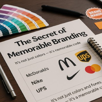
Why Color Psychology Is Nonsens (and Dangerous for Branding)
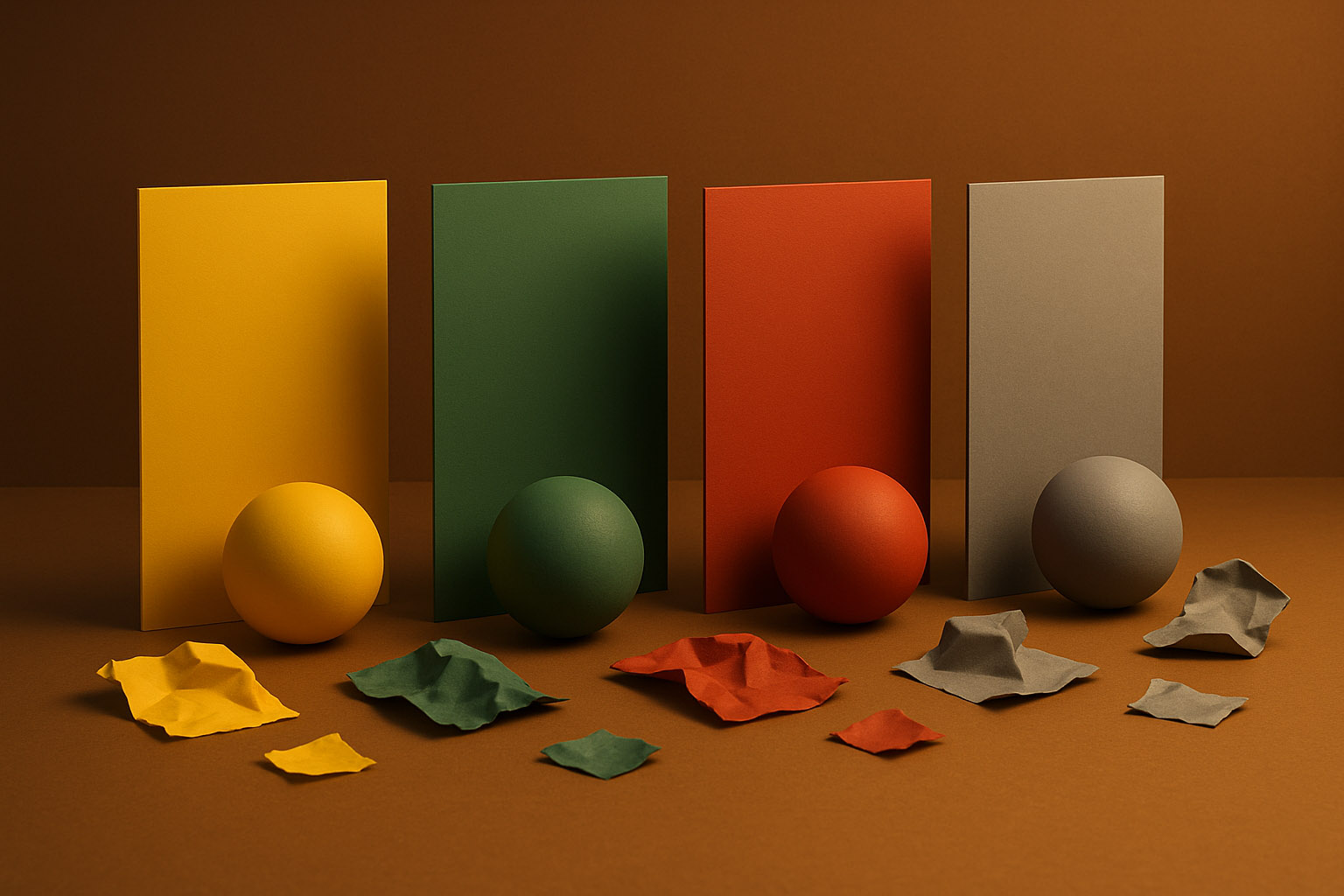
Blindly following color psychology in branding can lead to bad decisions, missed opportunities, and indistinguishable visual identities.

Blindly following color psychology in branding can lead to bad decisions, missed opportunities, and indistinguishable visual identities.
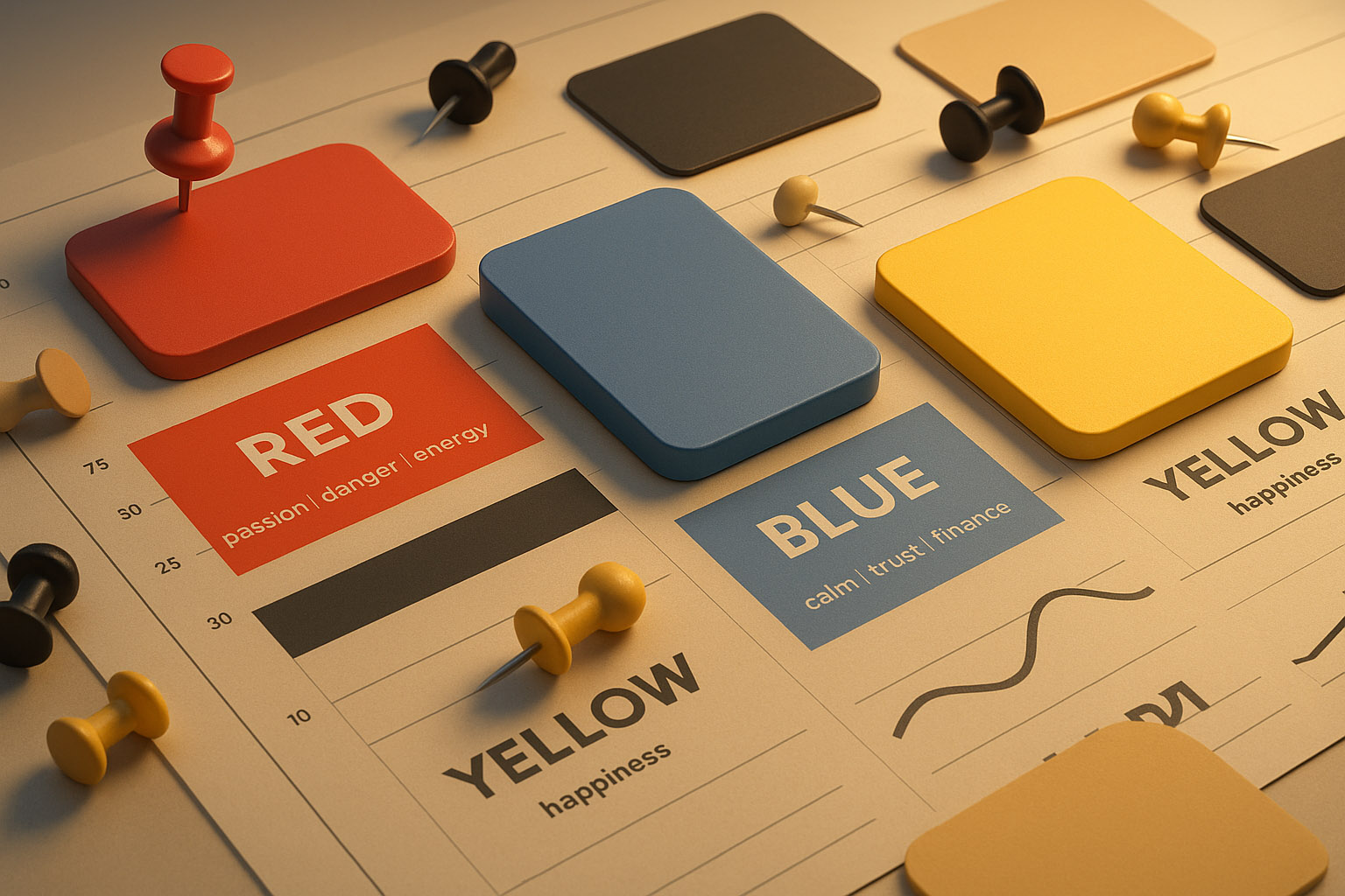
You’ve probably heard statements like:
These clichés are everywhere — in marketing decks, branding pitches, blog posts. But here’s the truth: color psychology as used in branding is mostly pseudoscience.
It’s not that color doesn’t matter. It’s that the way people interpret color is too complex, contextual, and culturally loaded to reduce to a simple emotional trigger chart.

Color psychology assumes:
But human perception isn’t a science experiment in a vacuum. Color meaning depends on:
Here’s the real branding problem: You want to launch a financial startup. A brand consultant tells you, “Don’t use red — it’s aggressive. Use blue — it’s trustworthy.”
Guess what? Everyone else did the same.
Now:
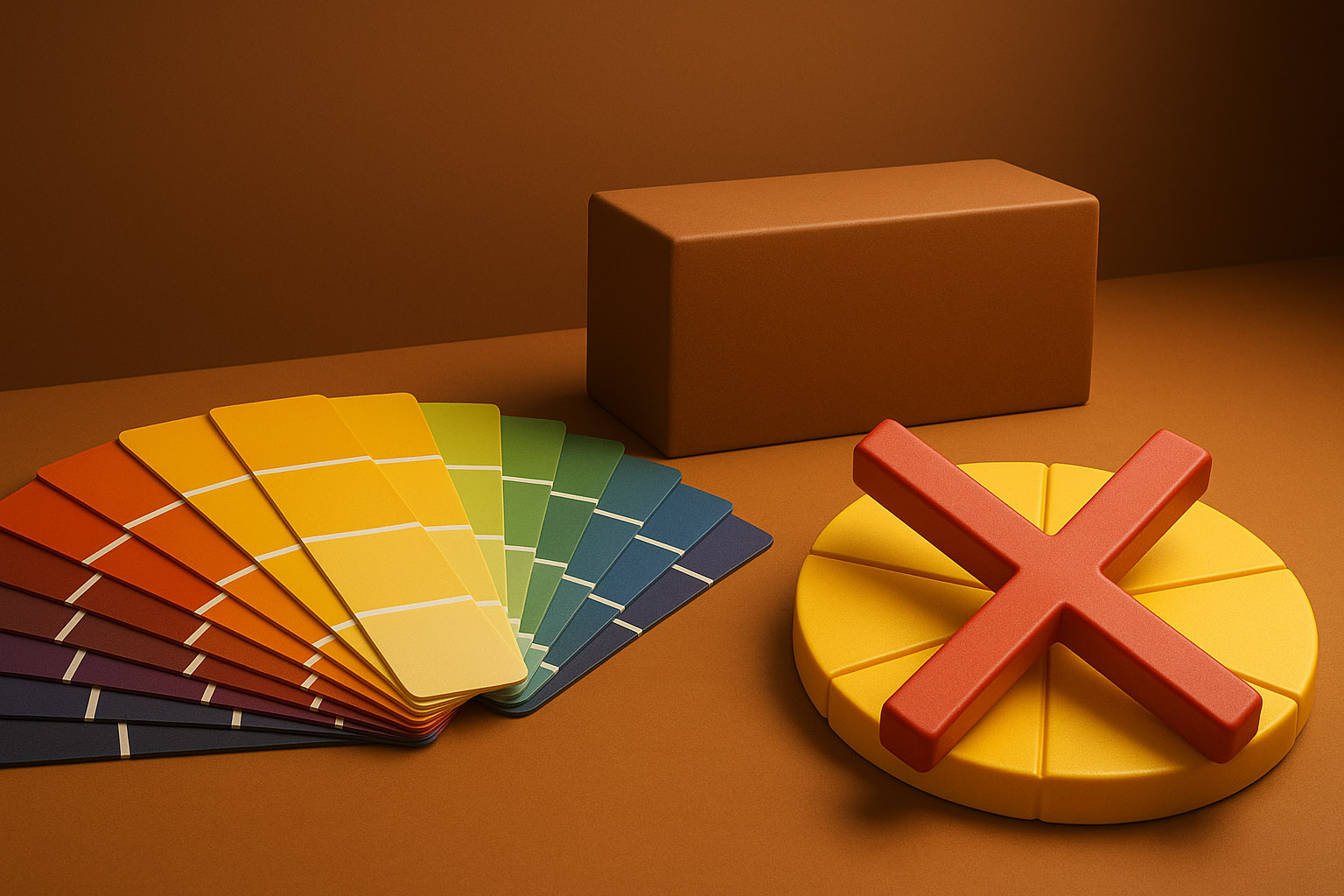
Brands shouldn’t avoid color because of superstition. They should use it strategically to stand out and tell their own story.
Some brands could have taken a bolder approach — but didn’t:
All because someone heard that a certain color “means something.”
Instead of asking “what color means trust?” ask:
Use color as part of your brand system, not as a universal law.
Yes, colors evoke feelings. But they don’t do it in isolation — and not consistently. Believing there’s a “right” color for every brand is like believing there’s a “right” font for every personality. It’s lazy thinking disguised as science.
You should:
Color psychology should inspire questions — not dictate answers.
Don’t forget: Our chefs at rausr are still here to help you with this.
Color psychology in branding isn’t real science — it’s vague advice built on broad generalizations. Designers and marketers should stop chasing “safe” colors and start creating bold, thoughtful, strategic visual identities.
“Don’t let a bad interpretation of color keep you from making something iconic. Your brand deserves better than blue-by-default.”

News, insights, case studies, and more from the rausr team — straight to your inbox.
Send us your brief, your wildest idea, or just a hello. We’ll season it with curiosity and serve back something fresh, cooked with care.