Winamp and the Evolution of Media Player Design
From pixelated skins to minimalist streams. How music players reflect our changing digital habits.

From pixelated skins to minimalist streams. How music players reflect our changing digital habits.
There was a time when your music player wasn’t just a tool—it was a visual identity. Think of Winamp, with its iconic, skinable interface. It didn’t just play MP3s; it made them yours. Now, fast-forward to today, and players have gone minimal, seamless, often invisible.
This article traces the evolution of music and media player design, from the playful UI freedom of the early 2000s to the clean, UX-first experiences of today’s streaming world.
Launched in 1997, Winamp was more than a media player—it was a platform for self-expression. You could:
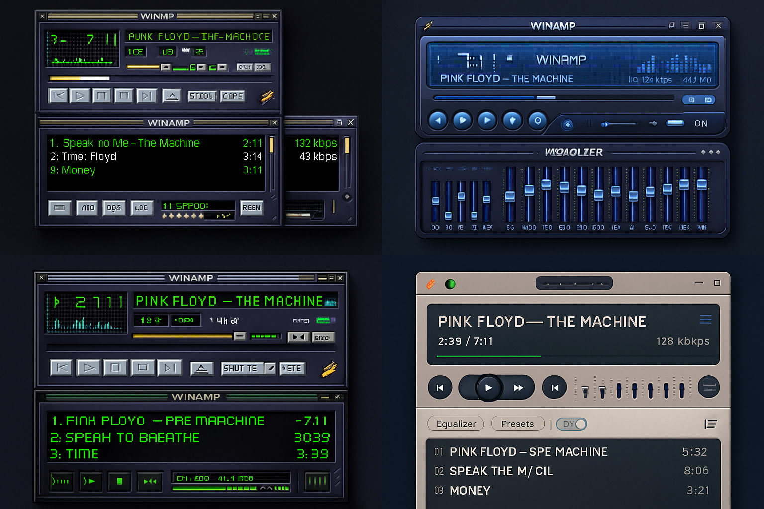
It became a design playground where visual experimentation met function. It didn’t care about consistency—it celebrated chaos and creativity.
Winamp was loud, nerdy, and beloved. And it paved the way for more visually expressive media software.
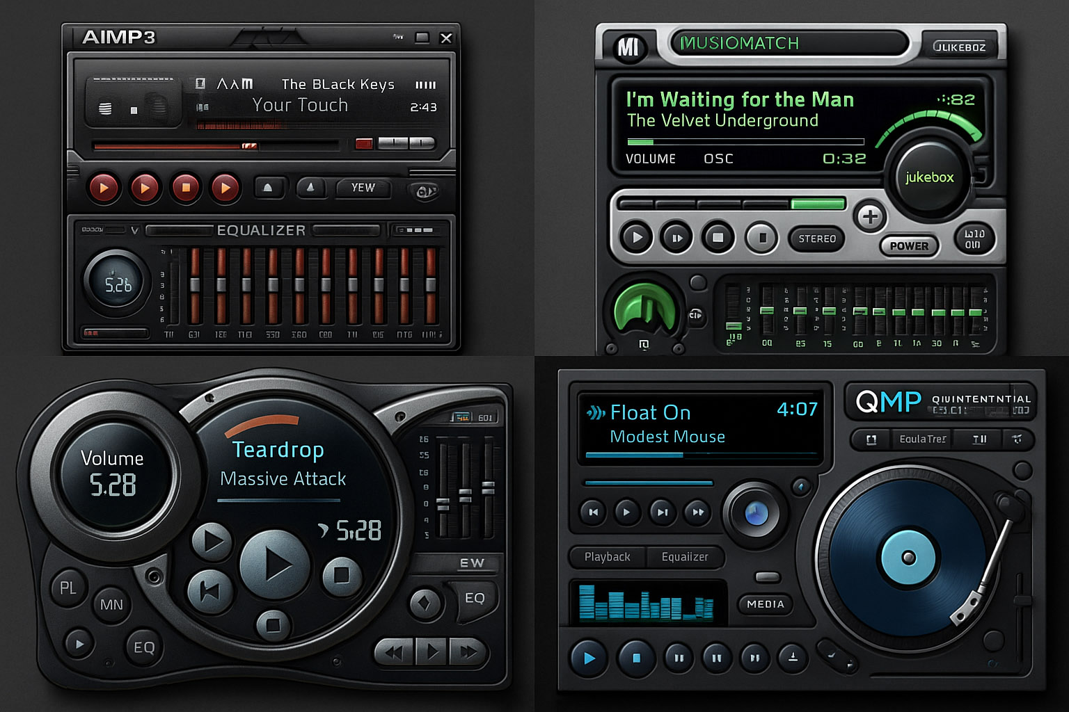
In the mid-2000s, players like iTunes and Windows Media Player introduced a more realistic, glassy aesthetic:
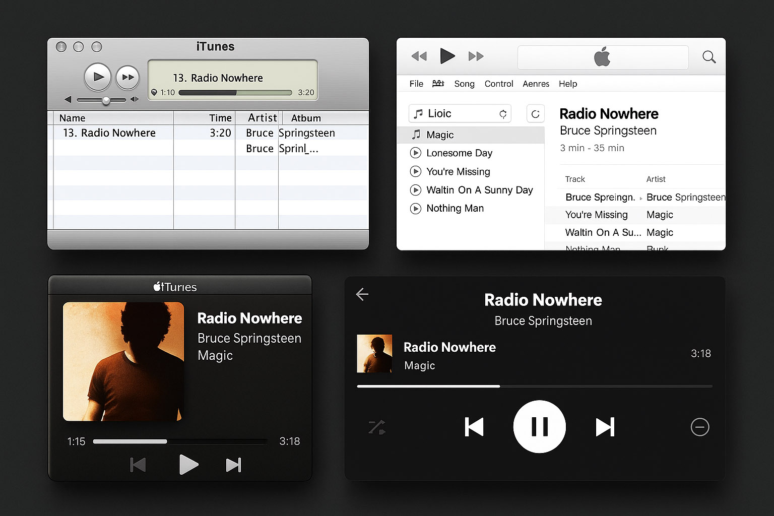
This design direction leaned toward mimicking physical media—players looked like stereos, shelves, or control panels.
“The goal, I think, was to help users transition into digital without losing familiarity.”
As smartphones emerged, especially with iOS and Android, media players had to simplify. Interfaces became:
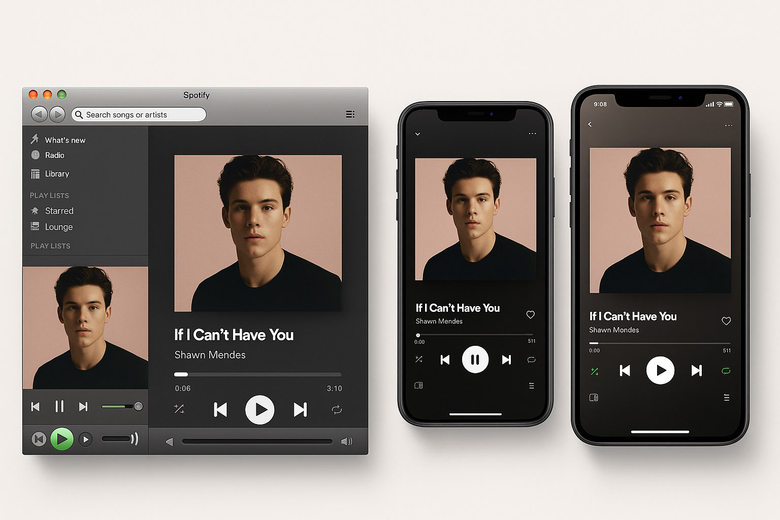
Spotify, Apple Music, and YouTube Music led this shift. Design focused on accessibility, scalability, and responsiveness. The player had to get out of the way.
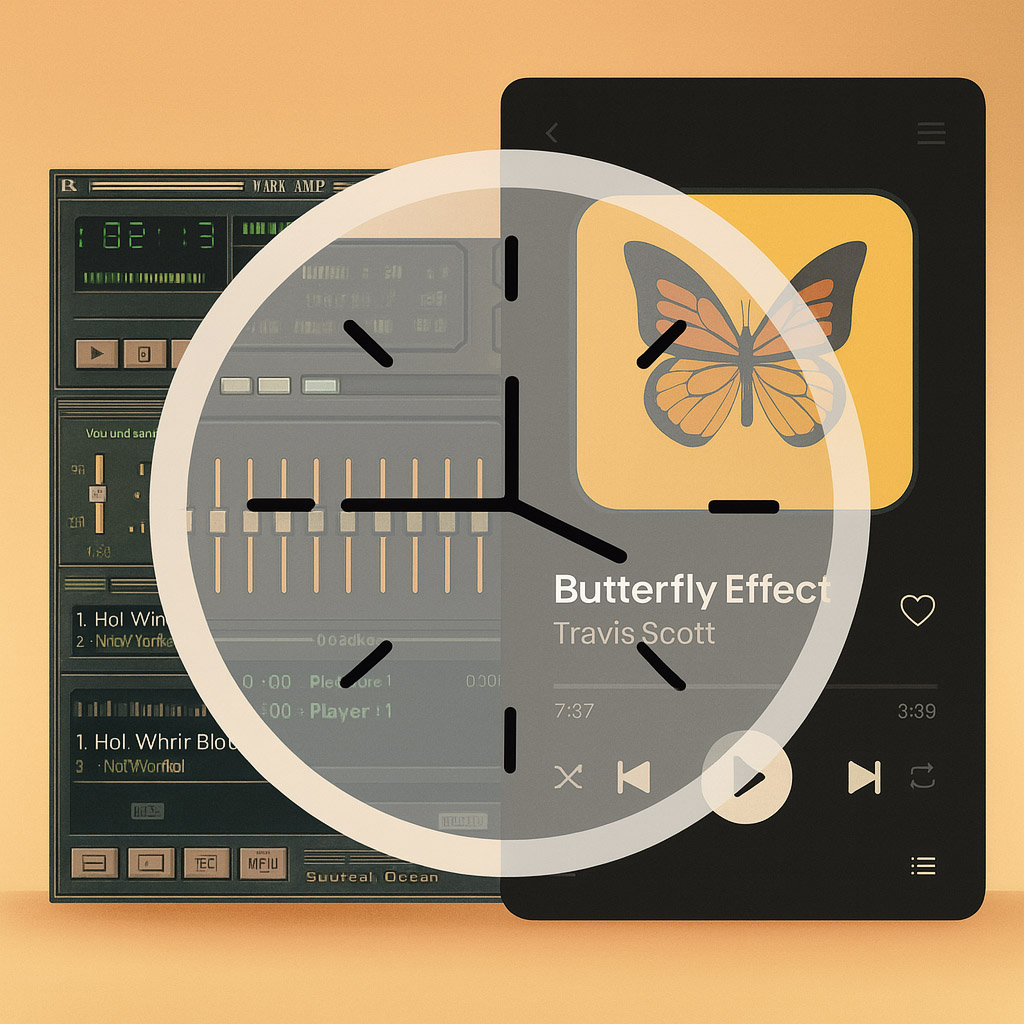
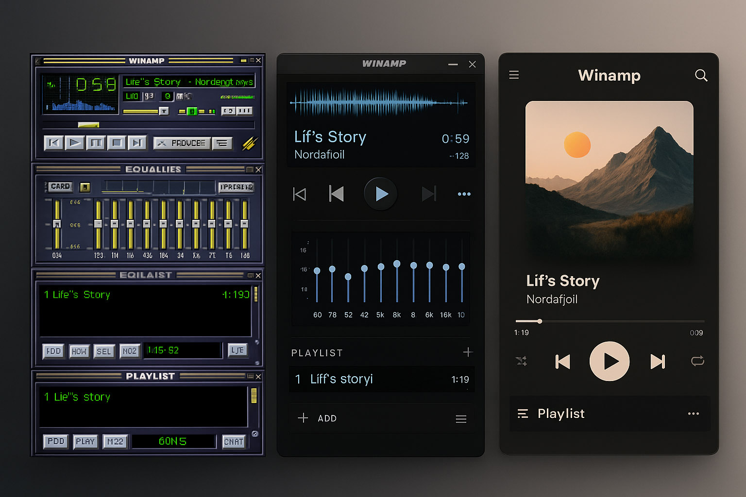
Today, Winamp is back (sort of), and with it, nostalgia.
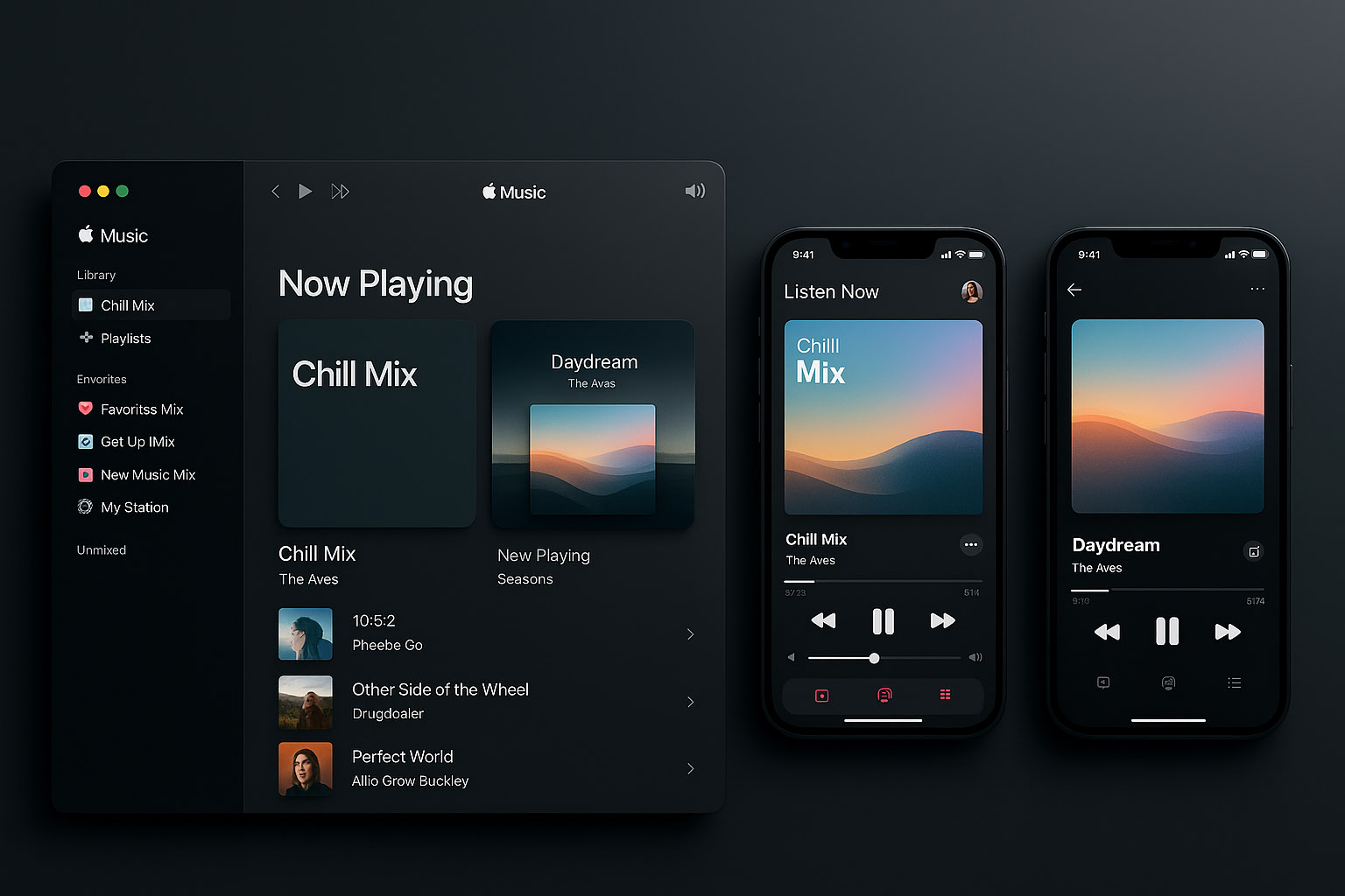
Even Spotify has introduced animated canvases, AI DJs, and looped visuals—reminding us that interface can still enhance experience, not just disappear.
| Era | Design Style | Examples |
|---|---|---|
| 1997–2004 | Skinnable, modular, chaotic | Winamp, XMMS |
| 2005–2012 | Skeuomorphic, glassy | iTunes, WMP, RealPlayer |
| 2013–2020 | Flat, minimalist, mobile-first | Spotify, Apple Music |
| 2021+ | Hybrid, ambient, nostalgic | Plexamp, Winamp reboot, Retro UIs |

News, insights, case studies, and more from the rausr team — straight to your inbox.
Send us your brief, your wildest idea, or just a hello. We’ll season it with curiosity and serve back something fresh, cooked with care.