Workflow for Complex Branding Design Across Print and Digital
How complex branding projects usually move from sketches and moodboards into logos, print systems, web design, mockups, templates, and final delivery

How complex branding projects usually move from sketches and moodboards into logos, print systems, web design, mockups, templates, and final delivery
When people outside the profession imagine branding work, they often picture the logo moment. One sketch, one reveal, one PDF, one happy client, done.
Real branding workflow is not like that.
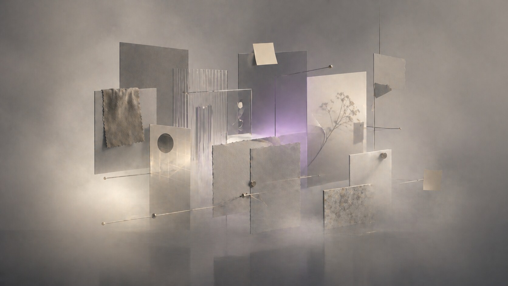
Once a brand has to live in both print and digital, the project stops being a single-symbol exercise and becomes a system job. The team has to think about moodboards, strategy, type, color, logos, grids, packaging, social templates, web components, mockups, catalogues, pitch decks, asset export rules, and the boring but decisive question of which file becomes the source of truth.
That is why complex branding almost always moves across multiple tools. Not because designers enjoy app-hopping, but because different software is built for different jobs.
This article sits naturally beside How to Rebrand, Illustrator vs InDesign, and Illustrator vs CorelDRAW vs Affinity Designer vs Canva.
“A serious brand system usually begins before the logo and ends long after it.”

The first phase is usually not drawing. It is clarification.
Before any polished brand system appears, designers need to answer questions that have nothing to do with Bézier curves:
This early phase often lives in documents, workshops, screenshots, sticky notes, whiteboards, and references. Some teams use Notion, Google Docs, or plain slides for strategy writing. Others use Miro or FigJam to cluster references, customer insights, and tone directions.
This matters because software sequence follows project reality. If a team skips this stage and jumps into logo sketching too fast, the work can become stylistically nice but structurally weak.
One hidden truth of branding work: a surprising amount of the project is spent naming folders, aligning stakeholders, and reducing ambiguity before any “design magic” appears.
Moodboarding is often misunderstood as a Pinterest hobby phase. In serious branding, it is closer to visual risk management.
At this stage, designers are not only collecting “nice images.” They are checking whether the brand should feel:
The tools here are usually lightweight and collaborative. Miro is strong when teams need workshops, clustering, comments, and stakeholder participation. FigJam is convenient when the same team already lives in the Figma ecosystem. Some studios still use Keynote, Slides, or PDFs because they want more control over sequence and presentation tone.
A useful practical split:
If you want the wider brand-code angle behind this stage, continue with Branding Codes That Stick.
The unknown part outsiders miss is that moodboards are often discarded completely. They are not sacred artworks. They are a testing space to discover what the brand should not become.
Once the project has enough clarity, the core identity work usually moves into a vector environment. For most studios, that still means Adobe Illustrator.
The reason is simple. Illustrator remains extremely strong for:
Adobe’s own Illustrator pages still present it as the standard tool for logos, illustrations, packaging, and even certain mockup tasks. That is a clue in itself: Illustrator sits at the center of the identity core, even when other tools handle the rollout.
This does not mean every designer begins inside Illustrator. Some begin with paper thumbnails, others with iPad sketching, and some with type experiments in Figma or even InDesign. But the final logo drill usually lands in vector software because the brand mark has to scale, export, and survive many outputs.
Paula Scher’s publicly described process is a strong example of sketch-first thinking. In her 2023 interview with Creative Bloq, she explains that ideas can come during the first meeting, then she sketches, puts the idea away, returns to it later, and develops thumbnails with the team. That is a useful reminder: the logo often starts in the hand before it is stabilized on screen.
“Complex branding often begins analog and becomes precise only when the vector stage starts to lock decisions.”
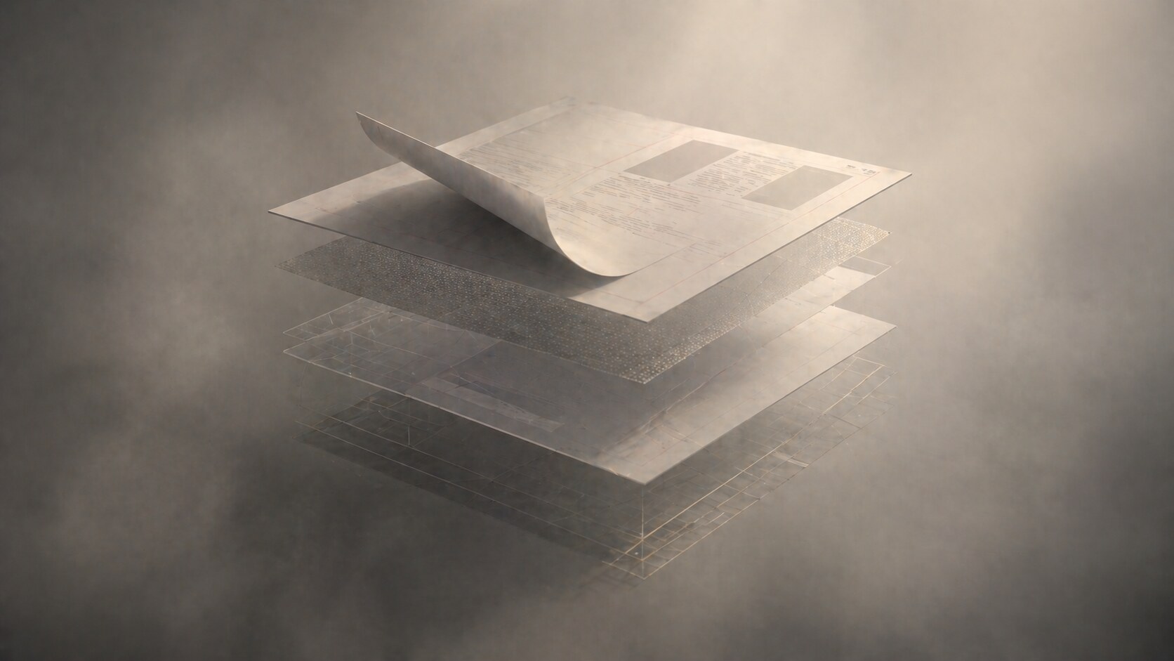
The moment a branding project expands into multi-page print, the workflow changes again. A logo file is not enough. A catalogue, brochure, annual report, stationery kit, or brand manual needs page logic, paragraph styles, image handling, grids, master pages, and export control.
That is where Adobe InDesign remains the practical standard.
InDesign is still favored because it handles:
Some younger designers try to keep everything in Figma because it feels faster. That can work for short decks or social templates. But once the document becomes typographically heavy, print-sensitive, or long, InDesign usually becomes the calmer choice.
For the deeper difference between these roles, continue with Illustrator vs InDesign.
One hidden time sink here is not design itself but versioning. Multi-page brand documents generate rounds, footnote changes, copy changes, page renumbering, and export QA. That is where layout software earns its keep.
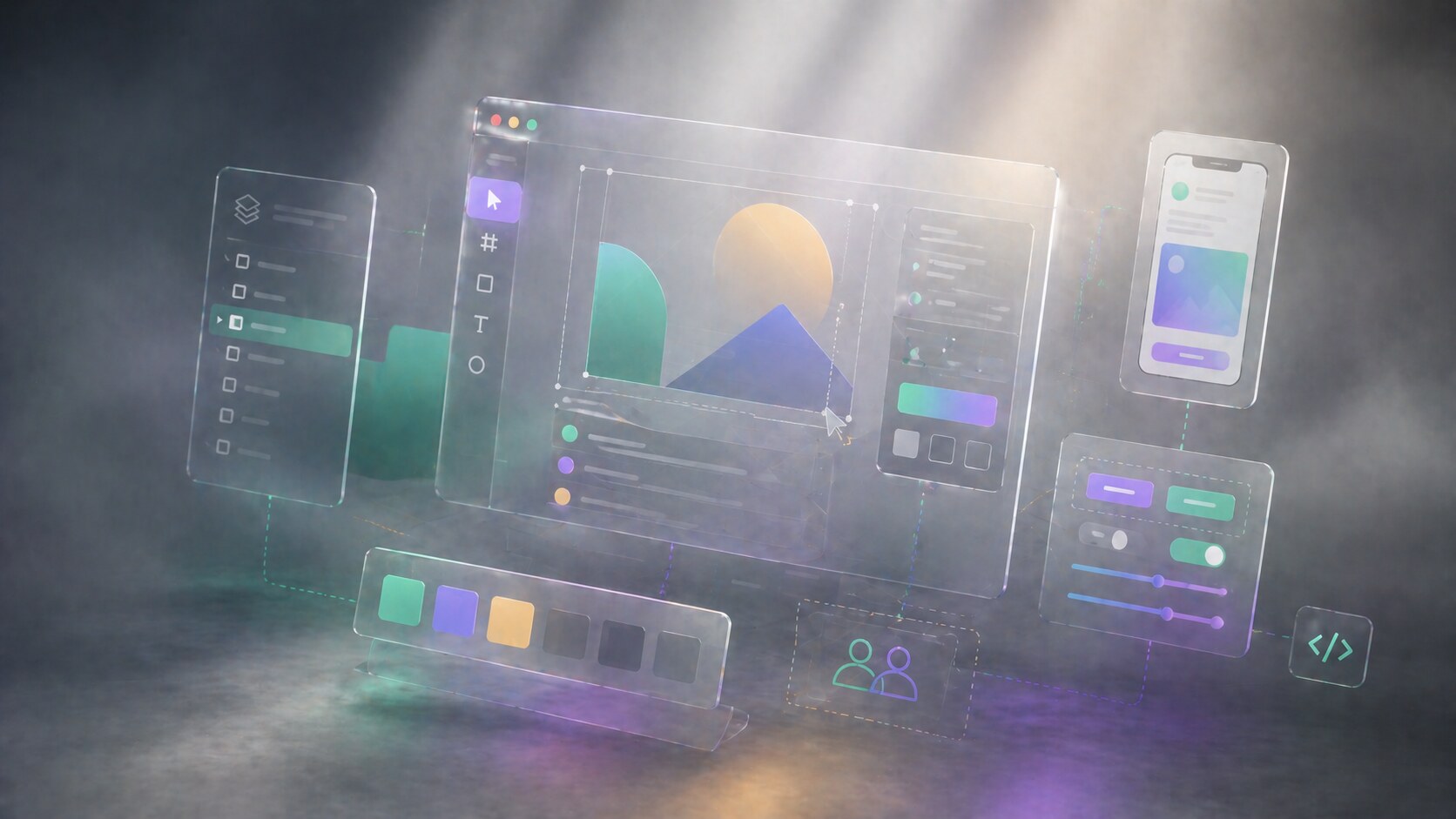
Once the brand reaches screens, teams often move from Illustrator and InDesign into Figma.
That does not mean Figma replaces branding software. It means Figma becomes the place where brand logic meets interface logic.
Figma is strong when the project needs:
This is why many branding projects now have two cores:
Figma’s pricing and feature structure also reveals how it sees itself: not only as a drawing tool, but as a team system with libraries, branching, and cross-functional access. That is why product-led brand work often ends up there, especially when the brand has to live inside marketing sites, dashboards, apps, and campaign landing pages.
For a process view of this kind of collaborative design work, continue with The Design Process Inside Big Tech.
The fun part is that digital branding has made some brand books effectively obsolete. Many teams now treat the Figma library, not the PDF guidelines, as the real brand handbook.
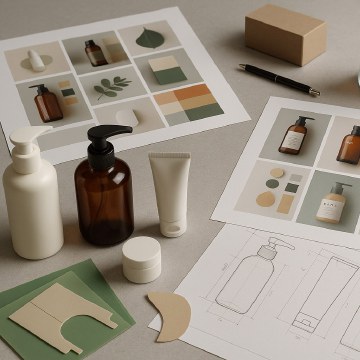
A serious branding project nearly always needs simulation. Clients want to see the brand on packaging, signage, websites, social posts, labels, presentations, merch, maybe even on product bodies or environments.
This stage can involve several tools:
Blender is especially important now because it is free and open source, yet powerful enough for serious product and scene visualization. Rhino remains relevant when form accuracy matters, especially in packaging structures, objects, retail fixtures, or industrial surfaces.
This is also the phase where designers discover whether the identity is truly flexible. A logo can look great in isolation and fail badly on an embossed box, glossy bottle, responsive header, or dark-mode card.
Mockups are often treated as presentation decoration, but in good studios they function more like stress tests for the system.
There is no perfectly universal split, but a typical complex branding project often resembles this:
That is a workflow estimate, not a law. A packaging-heavy job will spend more time in Illustrator, Photoshop, and 3D. A digital-first rebrand will spend more time in Figma. A corporate identity with long manuals and catalogues will spend more time in InDesign.
In practical tool terms, a very common stack still looks like this:
The unknown detail is that a large share of professional time is spent on non-glamorous transitions between tools: relinking assets, exporting SVGs, preparing PDFs, renaming files, flattening colors, and checking whether the same brand red looks consistent across print and screen contexts.
It is useful to stop imagining one ideal workflow. Great designers often work very differently.
Paula Scher is the classic sketch-first identity thinker. Her described process shows how quickly a strong concept can appear, but also how much value she places on stepping away, letting the subconscious work, then returning with thumbnails and team development.
Michael Bierut represents another pattern. Pentagram’s description of his book How To emphasizes projects that span identity, logos, branding, packaging, books, and websites, often within the same challenge. That is a system-builder workflow: less fetish around one mark, more emphasis on the whole ecosystem.
&Walsh represents a more contemporary multidisciplinary model. Their case-study credits make this visible. A modern branding job can involve brand strategy, copywriting, design, typography, 3D and animation, photography, production, and website development inside one identity program. That is not a one-designer software stack. It is a coordinated studio workflow.
So the differentiation often looks like this:
If you want the team-structure side of this, continue with Hiring a Graphic Designer or Visual Designer.
For a small identity, yes. A designer can create a logo, stationery, simple mockups, and even basic social templates inside one ecosystem, especially in Illustrator, Figma, or the Affinity suite.
Affinity is particularly interesting here because its StudioLink concept is one of the rare serious attempts to reduce app switching. Designer, Photo, and Publisher can act more like parts of one environment than separate islands.
But for a genuinely complex branding job that includes:
…a single-tool workflow usually becomes more painful than elegant.
The better question is not “Can I force this into one app?” The better question is “Where should each part live so the system stays stable?”
Canva is useful here as a warning and a tool. It can absolutely help distribute templates after the identity is built, especially for non-design teams. But it is usually not where the deepest identity work should begin if the project is complex and quality-sensitive.
“One-software branding is possible. It is just rarely the calmest or most scalable path.”

As of April 27, 2026, using U.S. list pricing from official product pages, the common tools roughly look like this:
Those numbers change with promotions, taxes, regions, team plans, and educational discounts. Adobe in particular often shows temporary discounts next to regular pricing, so the regular price matters more if you are budgeting seriously.
The workflow itself is also shifting:
For the software-market side of this, continue with Adobe Illustrator Beyond Print and Illustrator vs CorelDRAW vs Affinity Designer vs Canva.
The fact is that the “industry standard” is not one app. It is the ability to move cleanly between apps without damaging the system.
That is where the next few years are heading too. The winners will not be the tools that claim to do everything. They will be the tools, and the designers, that make transitions less painful while keeping quality high.
News, insights, case studies, and more from the rausr team — straight to your inbox.
Send us your brief, your wildest idea, or just a hello. We’ll season it with curiosity and serve back something fresh, cooked with care.