Xbox Branding and Design Evolution: From Green X to a Platform Everywhere
The people, studios and decisions behind Xbox's visual identity, from the original console and Xbox 360 to Series X|S and its cross-device future.


The people, studios and decisions behind Xbox's visual identity, from the original console and Xbox 360 to Series X|S and its cross-device future.
The first Xbox was a black, muscular box trying to prove Microsoft belonged in the living room. The Xbox 360 looked lighter and more welcoming. Xbox One tried to be the center of all home entertainment. Today, Xbox also appears on PCs, handhelds and screens that are not Xbox consoles.
The visual design changed with each promise, but the cut X, green accent and familiar controller kept the family recognizable. That continuity is the interesting part of Xbox branding: a mark born for one machine is being asked to identify an entire way to play.
This story belongs beside our articles on PlayStation branding and console design and Nintendo's visual evolution. All three brands have kept small, recognizable cues while their hardware and audiences changed.
“Xbox’s strongest asset is the X players can recognize before they read the name. Its hardest task is explaining what that X means now.”
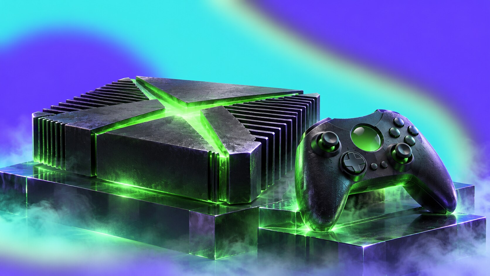
Xbox grew out of Microsoft’s DirectX work, and the X made that technical origin easy to remember. When the console launched in North America on November 15, 2001, its black casing, green central mark and energetic graphics presented it as a challenger to Sony and Nintendo, not as another beige PC accessory.
The credit is broader than a single logo designer. Contemporary reporting in Design Week attributes the initial identity to BBH, following positioning work by Happy Dog. Microsoft designed the console in-house, while The Farm produced material for a press launch. Xbox was a coordinated brand effort from the start.
The huge original controller, later nicknamed the Duke, was memorable but difficult for some hands. Microsoft followed it with the smaller Controller S. This early correction says something important: a visual statement can attract attention, while the part people touch has to earn repeat use.
Hidden brand lesson: The name’s X came from DirectX, but it soon became independent of the technology. Twenty-five years later, people recognize the cut X even when they have no idea what DirectX is.
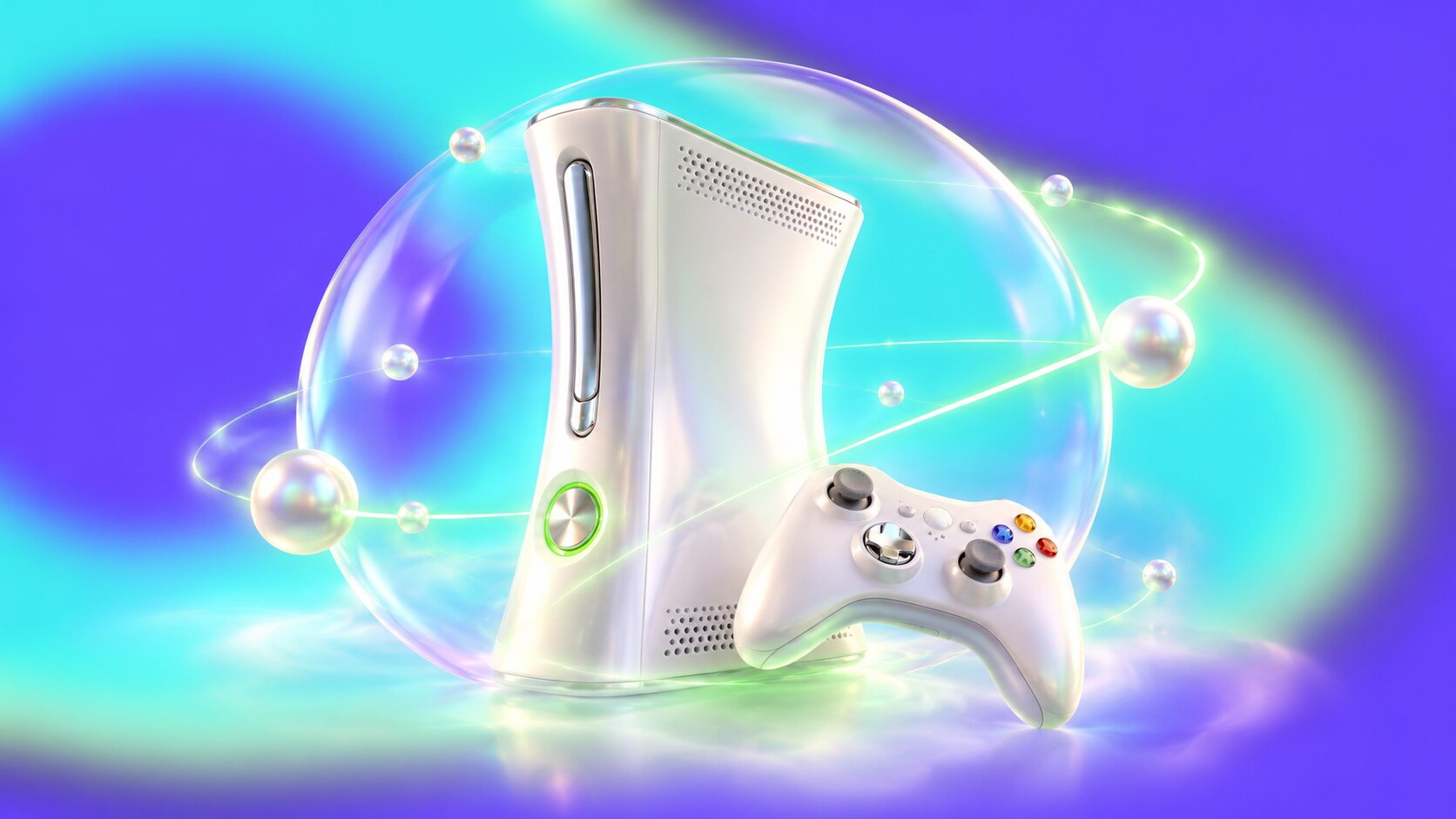
The 2005 Xbox 360 replaced the original’s heavy black presence with a curved white console, wireless controller and green X inside a sphere. Astro Studios worked with Microsoft on the console and controller. For the brand system, designer Michael Dabbs credits Jager Di Paola Kemp Design and other partners with work across logo, packaging, retail, events, graphics and web.
The design goal was to make Xbox feel less like equipment for a closed group of enthusiasts. Lighter colors and more approachable type opened the door, while a small backward extension on the wordmark’s B preserved a link to the first identity. Xbox Live, friends and Achievements then gave that identity a social life beyond the box.
The Xbox 360 was a success in cultural reach, but hardware nearly turned its most recognizable graphic feature against it. The three red lights of the “Red Ring of Death” came to stand for failure. In 2007, Microsoft expanded the warranty to three years and estimated a $1.05 billion to $1.15 billion pretax charge. No campaign can repair a product promise that the hardware cannot keep.

Xbox One’s black rectangular form, Kinect sensor and tiled interface tried to make one coherent living-room system. Microsoft named Carl Ledbetter as industrial design lead and Ramiro Torres as a design director. The team made more than 200 controller models and over 100 Kinect versions while refining hardware, software and packaging together.
The result was carefully made, but the launch conversation centered on television, connectivity and limits on game sharing. Players heard a different message from the one they wanted: a game console should first let them own and play games easily. Microsoft reversed its proposed online and disc policies in June 2013, before launch.
This was a branding failure as much as a policy failure. “All-in-one entertainment” was a clear phrase, but it gave Xbox’s core audience a less clear reason to choose the machine. The lesson is not to avoid ambitious design; it is to make the product promise match the audience’s most important job.
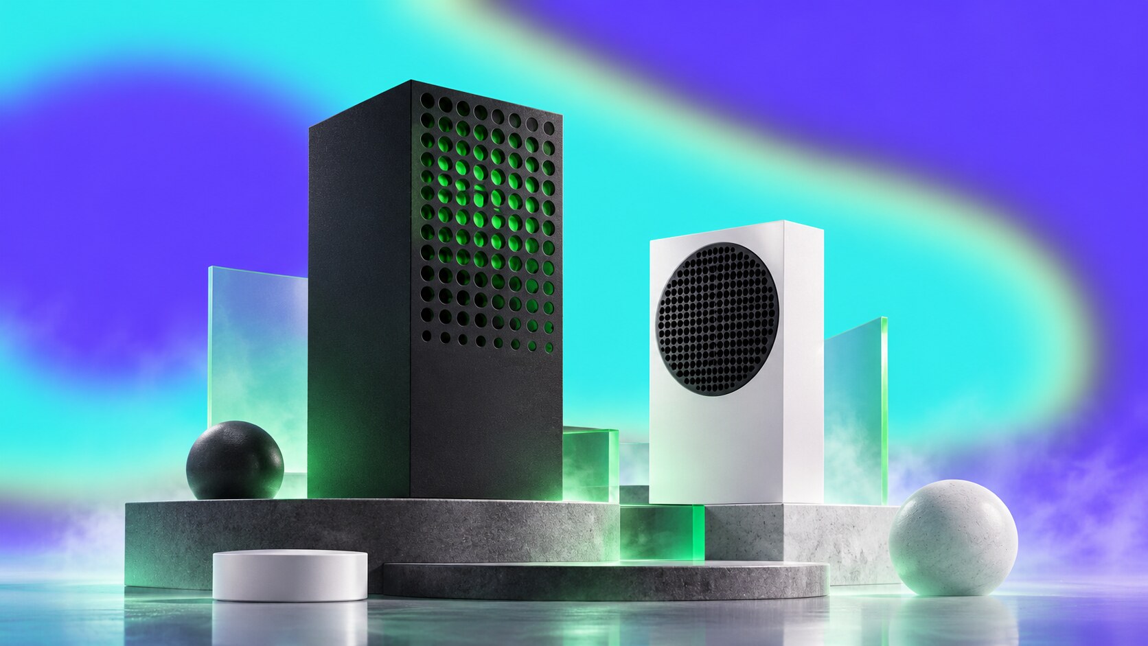
The 2020 generation moved away from the entertainment-center theater of Xbox One. Series X is a dark tower; Series S is a small white box with a large black vent. Microsoft’s hardware team, including Ledbetter, Chris Kujawski, Nicolas Denhez, Ryan Whitaker and Erika Kelter, described the approach as “Intelligent Geometry.”
They began with cooling, components and placement in real homes, then made those constraints into simple forms. On Series X, the green visible inside the top vent is a colored layer beneath sculpted openings. It creates a changing optical effect as you approach; the console does not need a loud green exterior to carry the brand.
That quieter hardware lets the X mark, controller and game art do more of the expressive work. It also makes sense for an identity that must now fit on a TV screen, phone, storefront and Windows app.
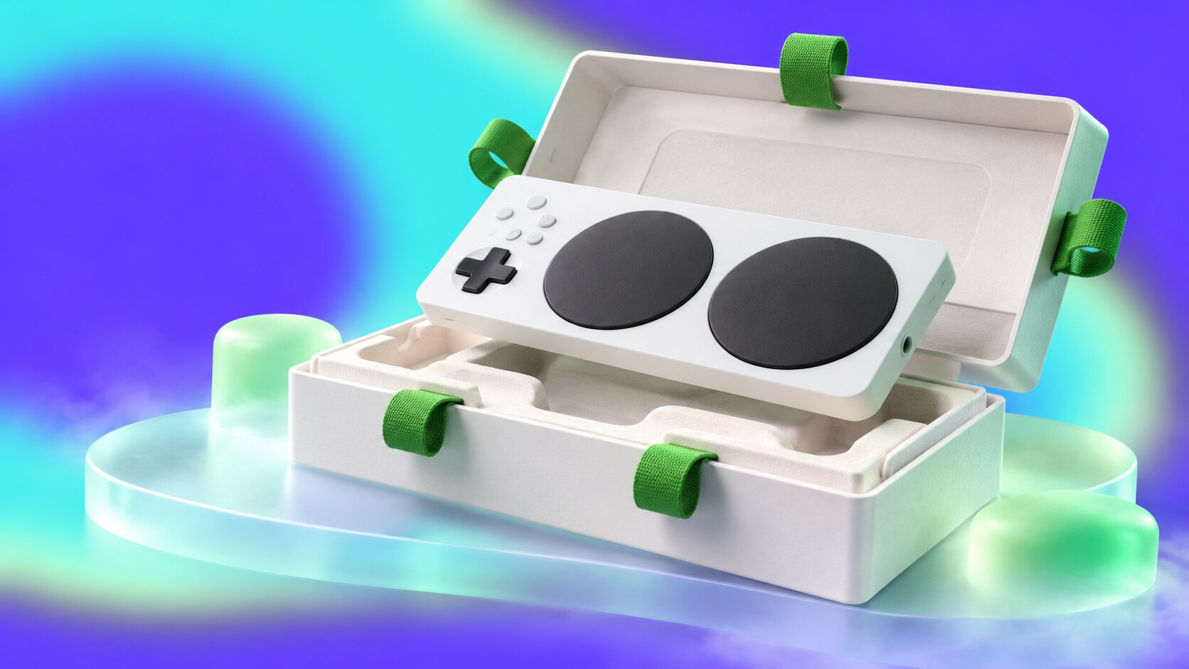
The 2018 Xbox Adaptive Controller made “gaming for everyone” tangible. Microsoft developed it with players with limited mobility and disability organizations, then applied the same thinking to the box. Testers helped the team remove awkward ties and sharp opening steps; five loops guide the unboxing from shipper to controller.
One internal rule was called “no teeth”: nobody should need to use their teeth to open the product. The package still looked like part of the Xbox family. That detail matters because inclusive design worked as product design and brand design at the same time, without visually separating its users from everyone else.
The broader reason familiar symbols and physical details accumulate value is explored in Branding Codes That Stick.

The 2024 “This Is an Xbox” campaign put the brand on more than consoles. In April 2026, leadership renamed the broader Microsoft Gaming organization “XBOX” and described a future linking console, PC, mobile and cloud. That is an ambitious brand extension, though it may also make the word “Xbox” less precise to someone shopping for a console.
The numbers show both opportunity and tension. Xbox said in March 2026 that Play Anywhere covered more than 1,500 games across console and Windows. Microsoft’s fiscal 2026 report also recorded a 29% decline in Xbox hardware revenue from lower console volume. These figures measure different things; together they show why the brand is expanding beyond one device while still needing a strong console experience.
Project Helix, Microsoft’s announced next console, is intended to play Xbox console and PC games. Its final design and market effect remain unknown. For the 25th anniversary, Microsoft has already returned to translucent “OG Green” hardware, a reminder that older physical cues can still make a broad digital platform feel specific.
Xbox’s best decisions made the brand easier to recognize or easier to use: the enduring X, the more inviting 360, the refined Series hardware and accessible controls. Its wrong turns appeared when the product or message got ahead of what players actually wanted. The future identity will succeed if the green X means a consistent experience wherever it appears.
Send us your brief, your wildest idea, or just a hello. We’ll season it with curiosity and serve back something fresh, cooked with care.