In brief
Interaction design defines the conversation between a person and a product. Good interactions make causes, consequences, and next steps understandable.
Common tools
- Figma
- Browser tools
Skills in play
- Research
- Accessibility
- User testing
What it is
Interaction design specifies what happens when someone does something in a product. It covers the action, the system’s response, the change in state, and the path forward. A control may look clear in a static mock-up yet feel uncertain in use if it responds late, hides progress, or gives no way back.
The work includes small moments such as opening a menu and larger sequences such as completing a purchase or editing a document. User interface design shapes what people see and operate; interaction design makes the behaviour behind those visible parts coherent. User experience design examines the broader journey and whether it meets a real need.
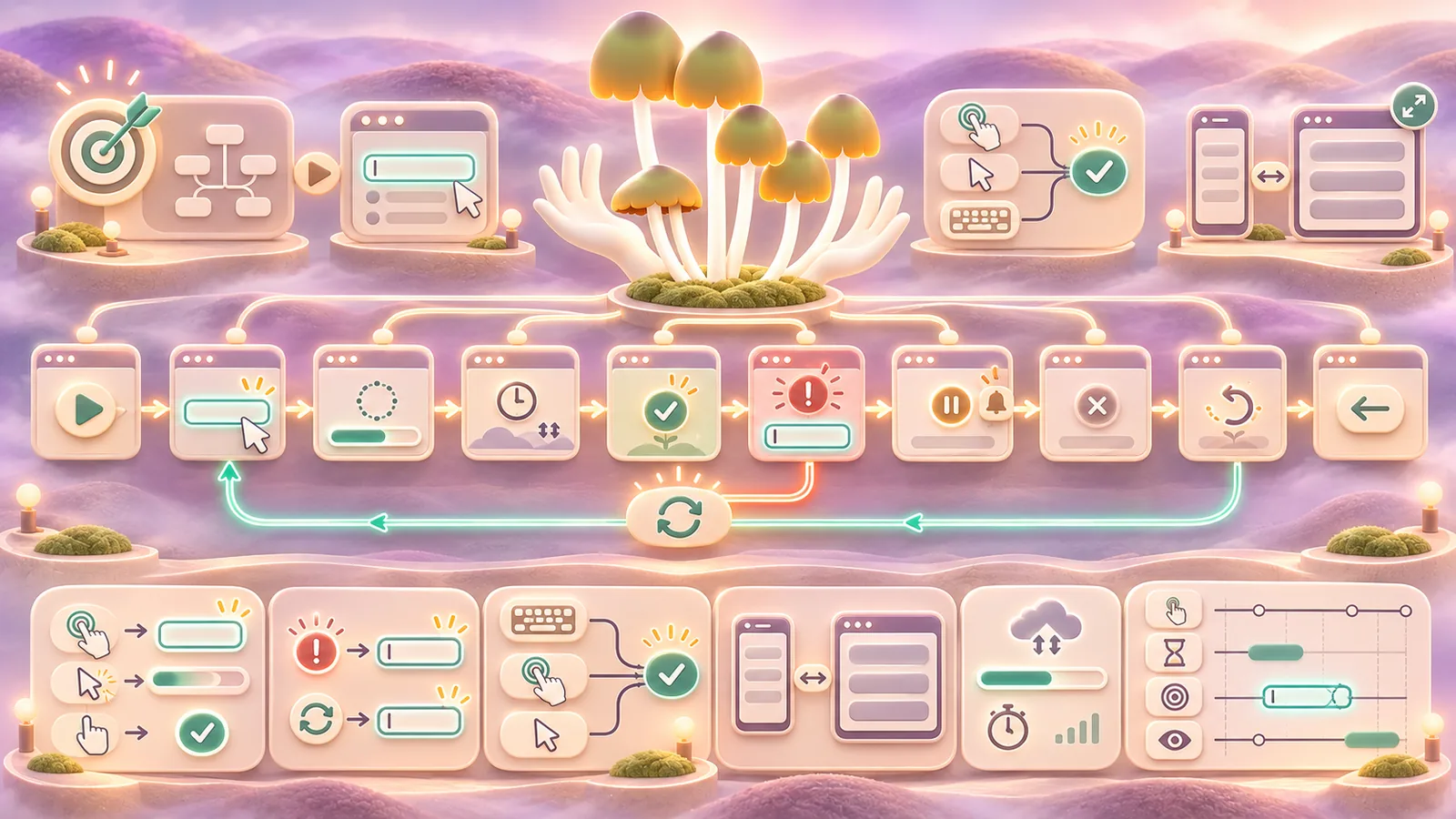
Model the task as a sequence of states
Write the user’s goal and the starting condition. Then map the important states: ready, action in progress, success, error, interruption, and return. Do not stop at the ideal route. What if a connection drops, a field is invalid, a permission is missing, or the person changes their mind?
For each transition, ask what the person expects to happen and what the system can honestly promise. If an action takes time, show that it started and whether it can be cancelled. If a save is automatic, indicate when the change is safely stored. If a destructive action cannot be undone, make its consequence clear before the person commits.
Make cause and effect visible
Feedback should connect to the action that caused it. A button changing state, a nearby validation message, or a persistent confirmation can all help. Choose the form according to the importance and duration of the result. A transient notification may be fine for a minor preference; it is weak evidence for a completed payment or a submitted application.
Jakob Nielsen’s usability heuristics include visibility of system status and user control. They are useful review prompts, not a substitute for watching people use a prototype. Jef Raskin’s early work on approachable personal computing is a historical reminder to judge an interface by how easily a person can operate it, not by the novelty of its machinery.
Give people control and recovery
Provide a sensible way to back out, edit, or undo where the task allows. Keep entered information after a recoverable error. Point to the field or step that needs attention and explain how to fix it. A vague red banner at the top of a long form makes the person search for the problem twice.
Design keyboard and touch paths together. A hover-only explanation does not exist for many touch users. A control that can be reached by pointer but not by keyboard is incomplete. Follow established keyboard patterns where applicable, and check that focus movement matches the visible interaction.
Prototype timing and content
Build a prototype with realistic delays, validation, empty results, and long content. Test it with people who have not been told the intended path. Ask them to complete a goal and narrate only when they naturally want to. Record where they hesitate, repeat an action, or think the product has frozen.
Check the interaction on a narrow device and with text enlarged. Space, scrolling, and the appearance of a keyboard can change the sequence. A modal that works on a laptop may trap someone on a phone. A design system can standardise recurring behaviour, but it should describe when a pattern suits the task and how exceptions are reviewed.
Document the behaviour for implementation
Specify triggers, states, response timing, error messages, focus behaviour, and the conditions for disabling or hiding a control. Include examples of a successful and unsuccessful path. Review the implemented product with the same tasks; animation, network behaviour, and browser defaults may differ from the prototype.
Practical checks
- Does each important action produce understandable feedback?
- Can the person recover from a mistake without starting over unnecessarily?
- Do keyboard, touch, and pointer users reach the same outcome?
- Have delays and error states been tested with real content?
Common mistake
Designing only the transition that looks good in a demo. People experience the wait, the error, and the return path too. Give each of those moments a clear purpose and response.
People and practice