In brief
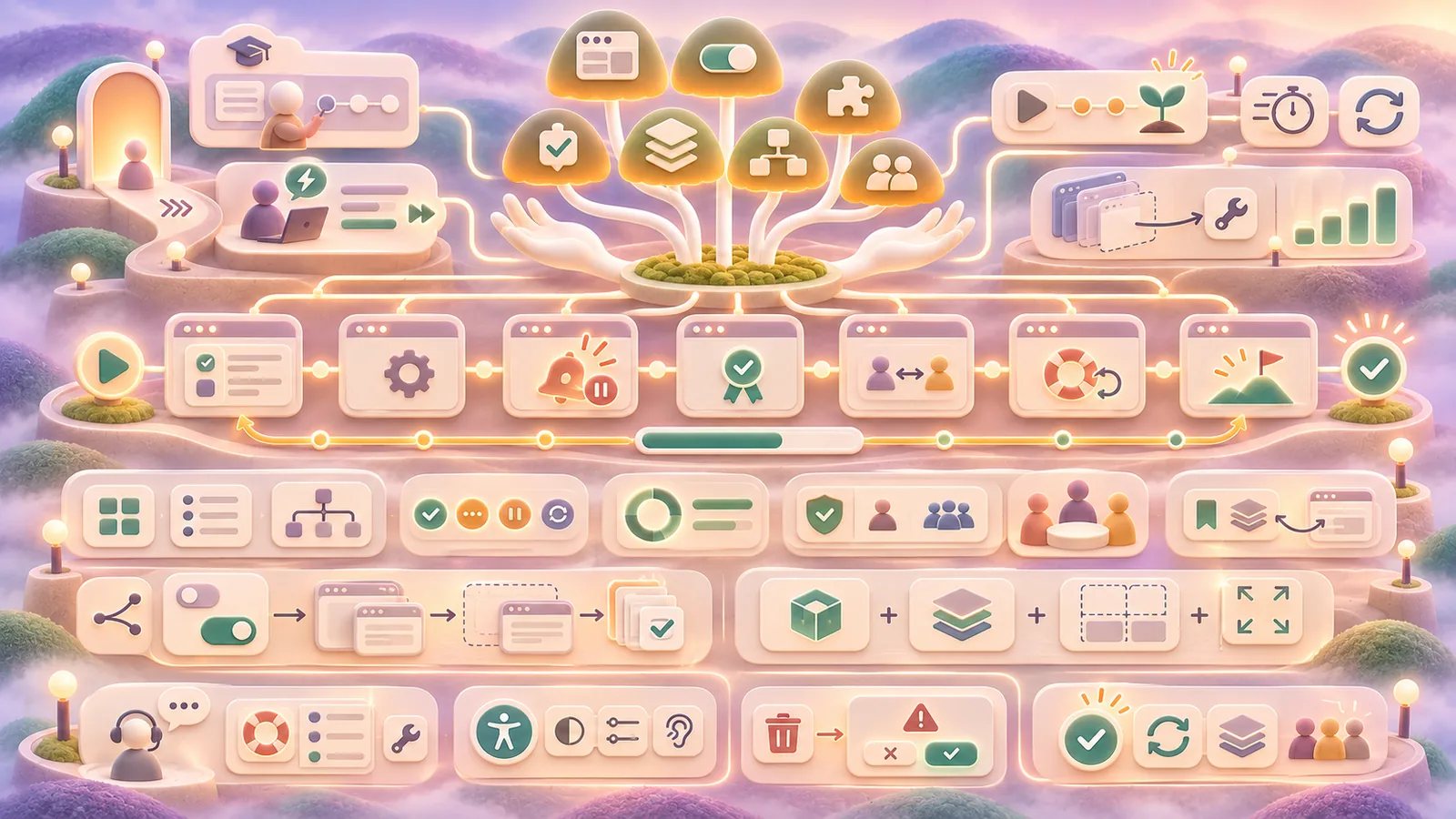
A digital product is a continuing relationship, not a launch screen. SaaS design must help people learn, accomplish work, and recover as features and teams grow.
Common tools
- Figma
- Browser tools
- Spreadsheet
Skills in play
- Research
- Systems thinking
- User testing
What it is
Software as a service (SaaS) is software people reach through an ongoing service relationship, often through a browser or app. Its design spans first use, daily work, collaboration, permissions, notifications, billing, support, and product change. Digital products also include other software experiences with similar ongoing demands. The design must be understandable when a person returns after a week, not only during a guided first session.
The challenge is continuity. Features, teams, and customer needs grow. A product may be easy to demonstrate while still being hard to use at scale. Good design helps people know where they are, what changed, what is safe to do, and how to complete a real task.
Map the work, not just the screens
Research the jobs people are trying to complete, the information they bring, and the people they work with. Observe a full task from entry to outcome. Include interruptions, approval steps, hand-offs, and recovery after errors. The main journey may be less glamorous than the dashboard, but it is where the product earns trust.
Separate novice and experienced needs without creating two incompatible products. A new user may need examples and explanation; a returning user may value saved context and efficient controls. Use progressive disclosure to reveal complexity when it is relevant, while keeping essential status and consequences visible.
Design a reliable first-use path
Onboarding should help someone reach a meaningful first result. Ask only for information needed at that point. Show what the product will do with the information and how to change it later. Empty states can explain the next useful action, but they should not cover missing functionality with cheerful copy.
Test the journey with people unfamiliar with the team’s terminology. Watch whether they can set up the product, understand permissions, complete an initial task, and return to their work. The user experience design process provides methods for finding where assumptions break down.
Keep complex work legible
Build a consistent interface system for navigation, status, actions, and feedback. Make primary actions clear and destructive actions harder to do by accident. When work takes time, show progress and whether it is safe to leave. When an action fails, explain the consequence and provide a recovery route.
Design permissions and collaboration as part of the experience. People need to know who can see or change something, whether a draft is shared, and what happens when ownership changes. Do not hide these questions behind administration screens until a mistake occurs.
Bill Flora’s work leading design across Microsoft products such as Encarta, Media Center, and Zune is a useful historical example of the need to coordinate visual design, motion, and product content. Microsoft’s account describes a move toward more coherent experiences through collaboration between those disciplines. Study the systems challenge rather than treating one screen style as a formula for current SaaS products.
Prepare for growth and change
Set component and content rules that survive new features. Define naming, layout, patterns, accessibility states, and when teams may make exceptions. A design system is useful when it records decisions and behaviour, not merely a collection of polished components.
Plan how the product announces changes. A new control, pricing model, or permission rule may affect existing work. Provide context where the change matters, preserve user data, and offer a way back when possible. Document migration and support needs before release.
Evaluate the complete product
Measure successful tasks, time to first value, repeat use, support issues, and where people abandon or reverse an action. Pair metrics with observation: a fast completion time can hide confusion if people simply skip a feature. Review accessibility across keyboard, zoom, assistive technology, and narrow screens.
Revisit the product with long-term users as well as newcomers. Ask what they have learned to work around. These workarounds often reveal gaps in navigation, information model, or permissions that a launch usability test misses.
Practical checks
- Can a new person reach a meaningful outcome without a tour of every feature?
- Can a returning person find work, understand status, and recover after interruption?
- Are permissions, changes, and destructive actions explained at the point of use?
- Do the design and content systems support growth without multiplying exceptions?
Common mistake
Optimising the first impression while leaving repeated work difficult. The product’s real quality appears after people have accumulated data, collaborators, and habits.
People and practice