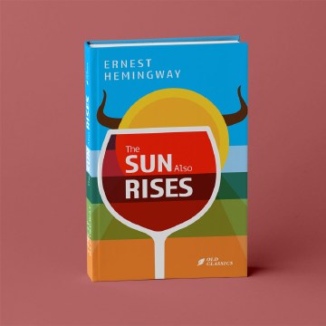
In brief
Book design is the coordination of content, typography, sequence, format, and physical production into a sustained reading experience. A series adds a shared logic that makes different volumes recognisably related.

Common tools
- Adobe InDesign
- Adobe Photoshop
- Adobe Illustrator
Skills in play
- Typography
- Systems thinking
- Technical accuracy
What it is
A book is a sequence, not a collection of isolated page designs. Its structure has to guide someone from cover to contents, through chapters and supporting material, and back again after a pause. The designer works with an editor, author, publisher, printer, and sometimes an illustrator or photographer. The result must feel coherent at shelf distance and remain comfortable after many pages of reading.
A series introduces a second task: each volume needs an identity of its own while belonging to a recognisable family. That family can be carried by format, typography, spine logic, composition, materials, or image treatment. Repeating one cover template without room for distinct content may make the books look uniform but not useful.
Define the reading experience
Begin with the manuscript and the reader. Is the book read continuously, consulted in short visits, or browsed visually? How much content is image-led, and how much is long-form text? Note chapters, notes, references, captions, tables, indexes, and any multilingual material. The right format for a novel may be wrong for a field guide, even when both have the same page count.
Create a content map before polishing a spread. Identify recurring page types and unusual material. The outliers—long titles, footnotes, dense tables, full-bleed images—often determine whether the system is robust. Estimate extent, paper choice, and binding with production partners early; those decisions affect cost, weight, opening behaviour, and the space available near the gutter.
Build the interior system
Measure the page with real text
Choose a body typeface and size by reading several complete pages, not a few specimen words. Test line length, leading, paragraph treatment, and the relationship between text block and margins. Page numbers, running heads, notes, and captions should be easy to find without competing with the main text. Long-form typography provides a deeper look at this reading rhythm.
Set a hierarchy for parts, chapters, sections, captions, pull quotes, and reference material. Use enough contrast to orient the reader, but avoid introducing a new style for every editorial exception. A consistent grid can absorb different content types if its rules allow purposeful variation.
Design sequence, not only templates
Pacing matters. A chapter opener, an image sequence, a quiet text spread, and a dense reference page create different reading speeds. Mock up a complete chapter in order to see whether transitions feel natural. Make sure a reader can return after closing the book: headings, running information, and contents should support navigation rather than merely decorate it.
For books with many images, establish caption proximity and credit placement. Keep references unambiguous when an image spans pages or a caption refers to several figures. In a digital edition, preserve a logical reading order when the layout reflows.
Make a series recognisable
Choose a small number of stable signals across volumes, such as trim size, spine typography, a common grid, or a repeated position for author and title. Decide which elements may vary: colour, image, illustration, motif, or typographic emphasis. Sketch at least three different volumes at once; a system that works for one title may fail with a longer title or different genre.
Test covers as thumbnails, at actual size, and spine-first on a shelf. The front cover must invite a closer look, while the spine should remain useful when it is the only visible surface. Check how jackets, hard covers, and digital storefront crops affect recognition.
Prototype and hand off
Print a small dummy at final size. Check the feel of the page, line length, paper opacity, opening angle, and the relationship between cover and interior. Review a print proof for image reproduction, trapping, bleed, and colour rather than trusting a monitor alone. Confirm final specifications with the printer, including binding, paper, finishes, and file delivery.
Package fonts, linked images, editable layouts, and a clear version record. A series guide should document both invariant rules and examples of permitted variation, so a later designer can add a volume without reverse-engineering the first one.
Common mistake
Designing the cover as the entire project. A compelling cover can earn attention, but the book succeeds through hundreds of small, consistent reading decisions. Test the interior and the physical object with the same care as the first impression.
People and practice