In brief
A zine is a publication made with direct editorial control. Its constraints can become a strong voice when content, format, production, and distribution are designed together.
Common tools
- Adobe InDesign
- Adobe Illustrator
- Adobe Photoshop
Skills in play
- Visual storytelling
- Typography
- Technical accuracy
What it is
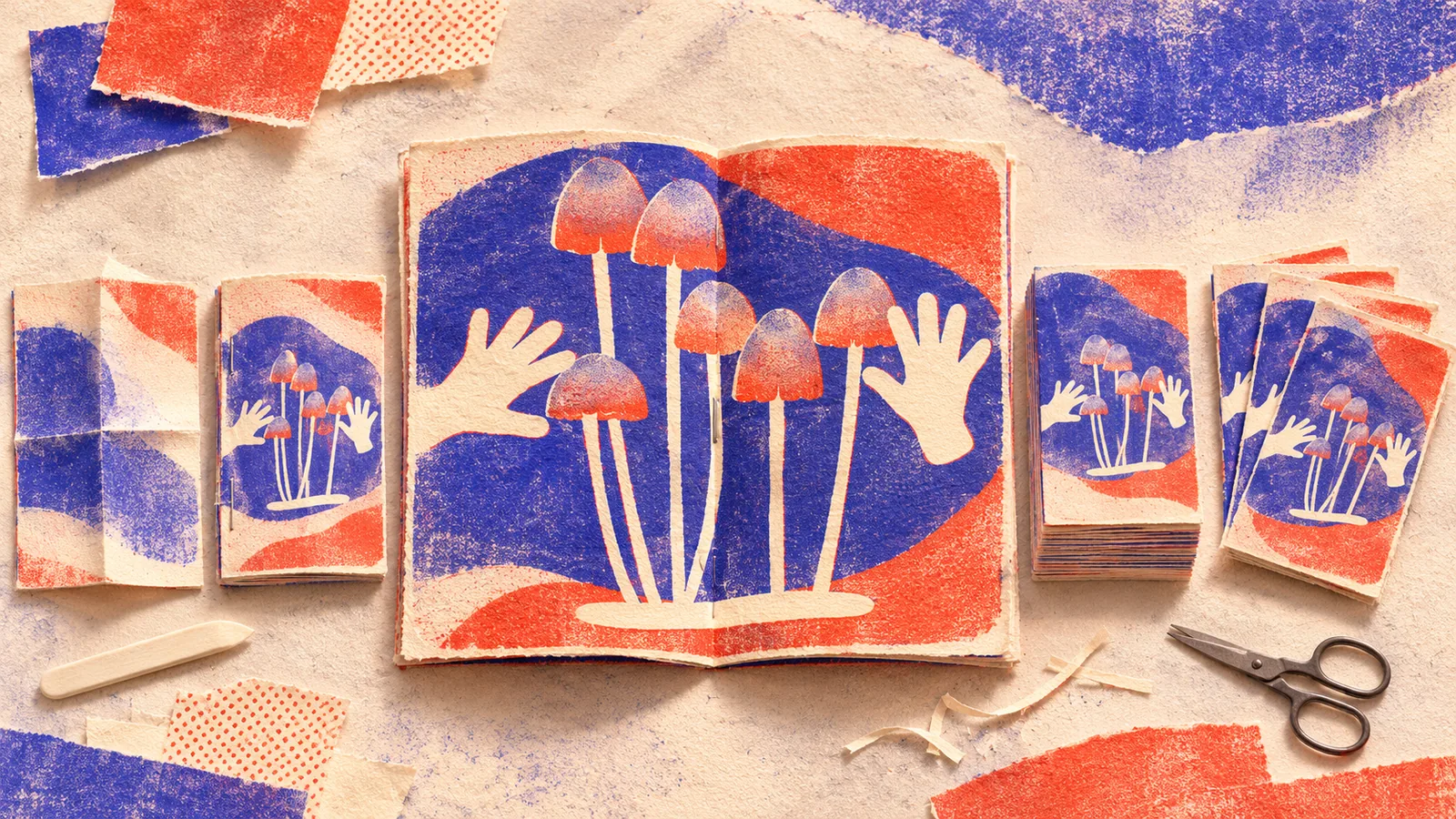
A zine is a small, self-directed publication. It may be photocopied, printed digitally, made with a stencil process, or distributed as a downloadable file. Its defining feature is editorial control: the makers decide what belongs, how it is voiced, and who should receive it. A small print run does not excuse weak editing. It makes every page and copy more consequential.
Independent publishing can hold experimental type, personal stories, niche research, or a community’s own record. Neville Brody and Jon Wozencroft’s FUSE is a useful historical reference for publication as a place to test ideas about typography. The point is not to imitate its look. It is to see how the format and subject were conceived together.
Define the editorial proposition
Write one sentence describing what the publication gives its reader. “A zine about design” is too broad; “a field guide to the hand-painted signs disappearing from one neighbourhood” tells you what to collect and what to leave out. Identify the intended audience, the scope of one issue, and the material you can obtain with permission.
Build a content list before selecting a paper colour. Separate essentials from experiments: interviews, images, captions, credits, contextual notes, and a way to find sources. Decide whether the publication is a one-off argument or the first of a series. If it is a series, establish a few repeating elements so the next issue can evolve without starting at zero.
Let the format serve the story
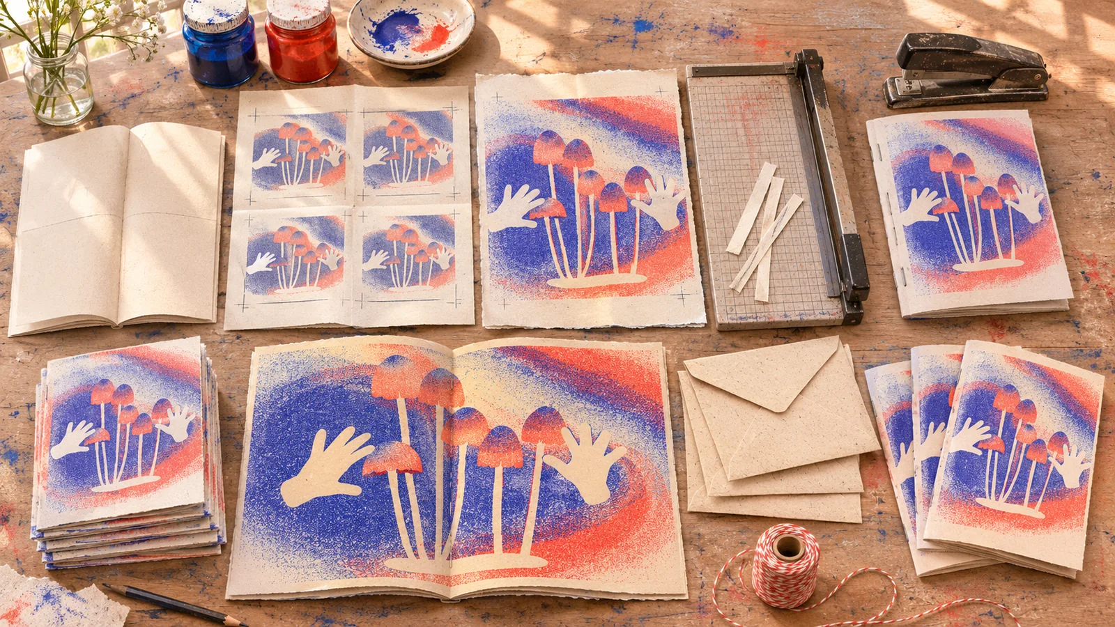
Choose size, page count, binding, and print process together. A folded single sheet is cheap and immediate but limits long reading. A stitched booklet can hold a sequence of voices and images but needs imposition and proofing. A digital edition may reach more people, though its reading order and screen typography deserve their own design.
Map the reading sequence
Make a paper dummy with blank pages. Place the opening promise, main pieces, pauses, and ending. Check what happens at each turn: does an image introduce the next idea, or merely fill a gap? Are credits and sources findable? A publication system can be very light, but even an expressive zine benefits from dependable page numbers, caption logic, and a clear hierarchy.
Balance expression with access
Independent work can break conventions deliberately. Distorted type or abrupt scale changes may support a subject and audience. Still, test important information with someone who has not seen the layout. Can they find the beginning of an interview, distinguish a quotation from the maker’s own voice, and read body text in the intended light? If a page is difficult, make sure the difficulty is a meaningful choice.
Produce a real proof
Print a rough copy at actual size, even if the final process is different. Fold and trim it. Look for text lost in the gutter, images that become muddy, page counts that do not divide correctly for the binding, and fine rules that disappear. Ask the printer about bleed, colour limits, safe margins, file delivery, and turnaround before committing to a design that relies on an uncertain production effect.
For a low-budget run, control the variables that matter most: paper, ink coverage, and binding. A limited palette can be a deliberate visual language. Reproduce a sample spread on the exact stock if possible. Note that screen colour is a poor substitute for an ink proof, particularly with translucent inks or uncoated paper.
Plan how copies reach readers
Distribution is part of the editorial design. Decide whether copies go to a local event, independent shops, collaborators, mail subscribers, or a digital archive. Include the information a reader needs to find the maker or future issues. Record print quantity, unit cost, contributor copies, and the permissions attached to images and texts. A clear credit line respects collaborators and makes later reprints easier.
If you publish online, give the work a searchable title, description, readable text alternative, and stable link. A photographed spread is useful as a visual record, but it should not be the only way to access the writing.
Practical checks
- Can a reader state the zine’s point of view after the first two pages?
- Does the page sequence work in a folded dummy and the final binding?
- Are contributors credited and reproduction rights clear?
- Is there a realistic route from finished copies to the intended readers?
Common mistake
Making the pages look spontaneous while leaving the editorial choice vague. Roughness can be compelling, but the strongest small publications are selective: they know what to say, what to cut, and how their physical form helps the story travel.
People and practice