In brief
A public information system connects language, hierarchy, placement, and updates. Its job is to make essential information dependable in the conditions where people need it.

Common tools
- Adobe Illustrator
- Adobe InDesign
- Spreadsheet
Skills in play
- Research
- Systems thinking
- Accessibility
What it is
A public information system helps people understand a place, service, or procedure shared by many users. It can include entrance signs, queue information, opening hours, maps, temporary notices, printed leaflets, and digital displays. These pieces may be made by different departments, but to the visitor they are one conversation.
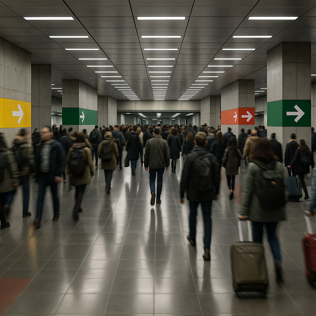
The information is often needed under imperfect conditions: a crowded hall, unfamiliar language, time pressure, poor light, or stress. A visually elegant sign cannot compensate for a missing instruction or an ambiguous destination name. The first design decision is what a person needs to know at that point.
Map tasks and decision points
Observe how people enter, orient themselves, complete a task, and leave. Note where they stop, ask staff, take a wrong turn, or reread a notice. Interview staff who answer repeated questions; those questions are evidence of a communication gap. Include people with different mobility, language, reading, and sensory needs in the research.
Write the main user questions in order: Am I in the right place? Where do I go? What should I prepare? What happens next? Where can I get help? The answers can then be assigned to the right medium and location. A wayfinding system handles movement through space; a public information system may also explain eligibility, procedure, cost, waiting, and changes.
Establish a shared vocabulary
Agree on names for destinations, services, queues, and documents. Use the same terms on a sign, website, form, and staff script. If a visitor is told to find “Customer Services” online and “Information Desk” in the building, the visual design has to work around a language failure. Test labels with people unfamiliar with internal terminology.
Jean-François Porchez’s Parisine for the RATP shows one part of this problem at scale: type had to support different modes and media, from physical signs to electronic displays. A typeface alone does not make the full system, but its consistent letterforms help repeated information feel related.
Match hierarchy to urgency
Separate routine guidance from urgent instructions. Give each a predictable visual role. Use plain language, short headings, and a clear next action. Colour can classify information, but pair it with words or symbols that still work for people who do not see the colour difference. For safety-critical content, use the responsible authority’s approved wording and sign standards; do not improvise a decorative alternative.
Plan multilingual content from the beginning. Decide which information must appear in every language, what can move to a QR-linked page, and what must remain available without a phone. Do not reduce the type below a useful size merely to fit another translation. A larger panel or another location may be the better design.
Design placement and maintenance together
Prototype signs in their physical setting. Check approach distance, viewing angle, glare, obstructions, and what else competes for attention. Compare the path from the entrance to the service point. One correct sign is not enough if the next decision offers no reassurance.
Information changes. Assign an owner, approval route, and expiry date to each content type. Provide a template for temporary notices that is as clear as permanent signs. A taped announcement in a different voice can be missed or mistaken for unofficial information. Record where signs are installed and how updates reach both digital and physical channels.
Test with real journeys
Give participants a realistic task without explaining the system. Watch what they do and ask afterward what each message meant. Include return journeys, exceptions, and a service disruption. Measure wrong turns, requests for help, missed steps, and time spent looking for an answer. Fix the language or placement before polishing the graphic detail.
Practical checks
- Do signs, forms, websites, and staff use the same names for the same service?
- Can users recover when they miss a decision or a destination changes?
- Is essential information available without relying on colour or a smartphone?
- Does every temporary notice have an owner and removal date?
Common mistake
Designing a visual template before deciding who owns the information. A public system is only reliable when people know which wording is current, where it must appear, and who updates it.
People and practice