In brief
Transit graphics connect routes, signs, maps, displays, and reassurance into one navigable experience. Their success is measured at decisions, not on a presentation board.
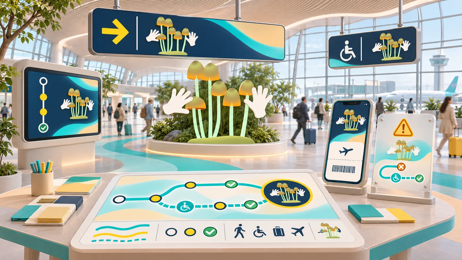
Common tools
- Adobe Illustrator
- Adobe InDesign
- SketchUp
Skills in play
- Spatial reasoning
- Typography
- Accessibility
What it is
Transit graphics help someone complete a journey through a complex place. They include routes and line names, entrance and exit signs, platform information, transfer diagrams, gate displays, maps, and temporary disruption messages. These parts must agree about names and directions even when the building, service, and technology change.
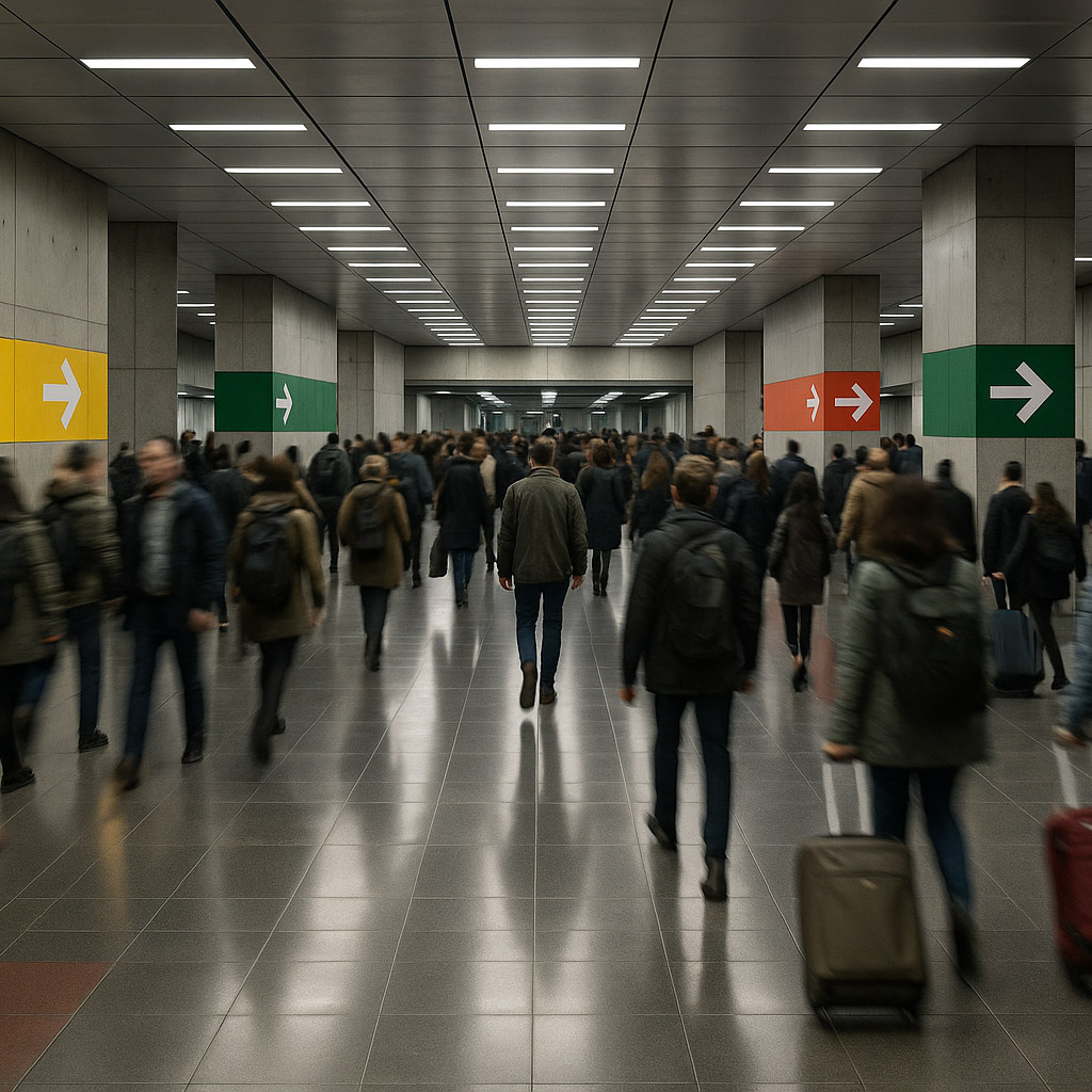
An airport or station is not read like a brochure. People move, carry bags, watch time, face noise, and often use a language other than the local one. A sign may be seen from a distance while walking, then again at a closer decision point. The design task is to supply the next useful answer at the right moment.
Map the journey before drawing signs
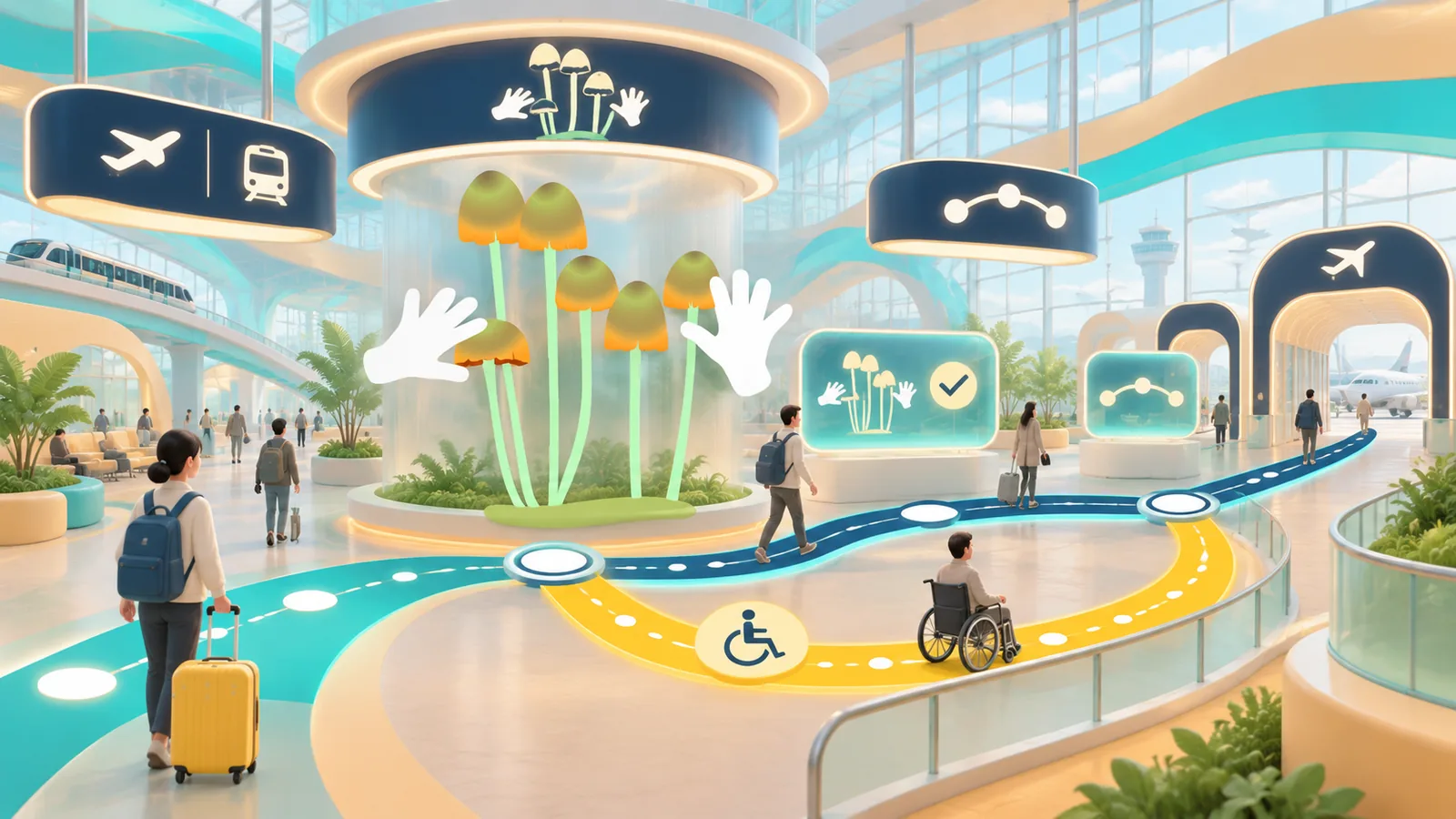
List major user journeys: arriving from the street, transferring between services, finding a platform or gate, collecting baggage, and leaving the building. Include the awkward ones: a late gate change, a closed lift, a missed connection, or a traveller who needs step-free access. Walk the routes and record where a person must choose, where they should confirm that choice, and where they may recover from a mistake.
Create an information map for each decision point. What does a traveller know on approach? What name will they search for? How soon can they see the next sign? This keeps a wayfinding system focused on user decisions rather than the number of sign panels in a procurement list.
Establish one naming logic
Agree on official names for destinations, lines, terminals, gates, and facilities. Decide how abbreviations, translated names, and transport modes appear. A route map and a directional sign that use different names for the same destination create doubt even when both are individually legible.
Build a hierarchy: destination first when people are finding a place; service or time first when they are comparing departures. Keep arrows attached to the correct information group. Use pictograms for familiar facilities, but test local interpretations and pair unfamiliar symbols with words. Colour can identify lines or zones, yet it should never be the only way to tell them apart.
Design type for viewing conditions
Test letterforms, size, weight, spacing, and contrast at the actual viewing distance and angle. Adrian Frutiger’s typeface was created for the Charles de Gaulle airport context; it is a useful reminder that public type must work in movement, not just as a static specimen. The correct size depends on the site, mounting height, lighting, and expected approach speed. Make full-size mock-ups rather than relying on a universal formula.
Multilingual destinations need an explicit priority and line-breaking rule. Check long names, accented characters, and scripts with different spacing needs. Do not shrink every line until it fits a sign box; redesign the grouping or panel size when necessary.
Coordinate physical and live information
Static signs are good for stable decisions. Screens are useful where platforms, gates, and times change. Define which system is authoritative when information differs, how updates propagate, and what the fallback is if a display fails. A boarding pass, app, overhead sign, and gate screen should use compatible terminology and route logic.
Plan temporary notices before the first disruption. They need a hierarchy, accessible placement, and a route back into the permanent system. A taped paper sign with a new name can undo years of careful wayfinding if it appears exactly where a traveller must choose.
Test in place and revise
Observe people using a prototype route without coaching them. Record hesitations, wrong turns, unnecessary questions to staff, and places where they stop to confirm a choice. Test with travellers unfamiliar with the site, including people using mobility aids and those reading another language. Review from both directions; a transfer can be easy outbound and unclear on return.
Document sign locations, content ownership, replacement rules, and the process for adding a new destination. Transit systems live for years and change often. The maintenance plan is part of the graphic system.
Practical checks
- Can a first-time traveller identify the next action at every major decision point?
- Do maps, signs, screens, and apps use the same destination names?
- Are temporary changes as clear and accessible as permanent routes?
- Has the system been tested at real distance, in motion, and under actual lighting?
Common mistake
Polishing individual signs before agreeing on the journey and naming system. A beautiful sign cannot repair an inconsistent route. Start with the decision sequence and make every medium support it.
People and practice