In brief
A colour and type system turns a palette and a font choice into usable relationships: hierarchy, contrast, roles, fallback choices, and production guidance.

Common tools
- Figma
- Adobe Illustrator
- Adobe InDesign
Skills in play
- Systems thinking
- Typography
- Accessibility
What it is
A colour and type system is the set of decisions that makes an identity work after its first polished presentation. It defines what colours do, which text roles the type family supports, and how the two behave together in common and difficult conditions. A palette sheet and a type specimen are ingredients, not the system.
In a visual identity system, the same message may become a phone notification, a presentation slide, a printed invitation, or a large sign. Those formats do not need identical layouts. They do need recognisable relationships and legible information. The useful question is not “Which brand colour is this?” but “What job is this colour doing here, beside this size and weight of type?”
Start with communication roles
Collect actual material: a headline, a paragraph, a form label, a warning, a chart, a caption, and a piece with a long title. Include both a quiet informational page and a loud campaign application. Mark which information must be noticed immediately, which must be read carefully, and which only helps orientation.
Assign colour roles before adding more swatches. A primary field may carry recognition; a secondary field may separate content; a functional colour may indicate an error, confirmation, or link. Do not rely on colour alone to signal a status. Pair it with words, shape, position, or another cue so the meaning survives different displays and colour perception.
Build a working type hierarchy
Specify roles such as display title, section heading, body, caption, label, and data. For each, record the family, weight, size range, line spacing, and intended measure. The relationships matter more than a perfect isolated number: a section heading must be distinct from the paragraph that follows, and a caption must remain attached to its image.
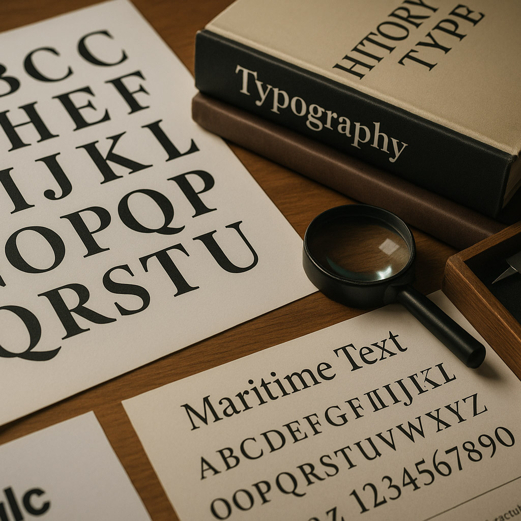
Test real copy early. Long names, multiple languages, numerals, punctuation, and all-caps labels expose gaps that a short English headline can hide. Adrian Frutiger’s coordinated Univers family is one historical reference for maintaining a consistent voice through different widths and weights; the source below explains that principle. A modern brand may need a separate fallback for unsupported scripts or operating systems. Document that choice explicitly.
Pair colour and type in context
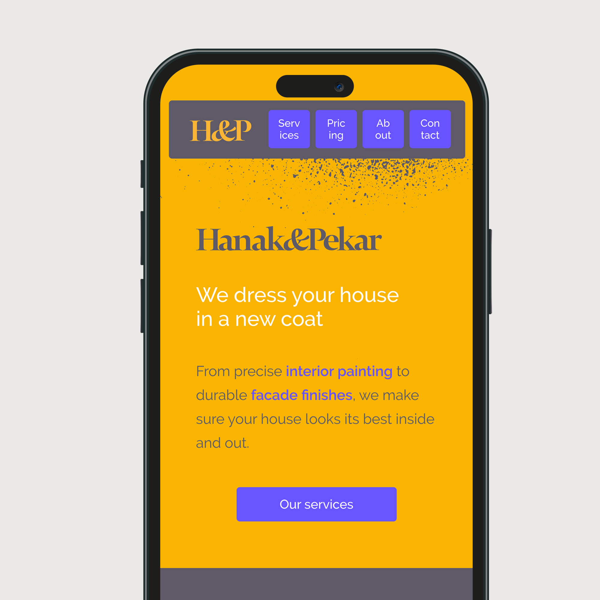
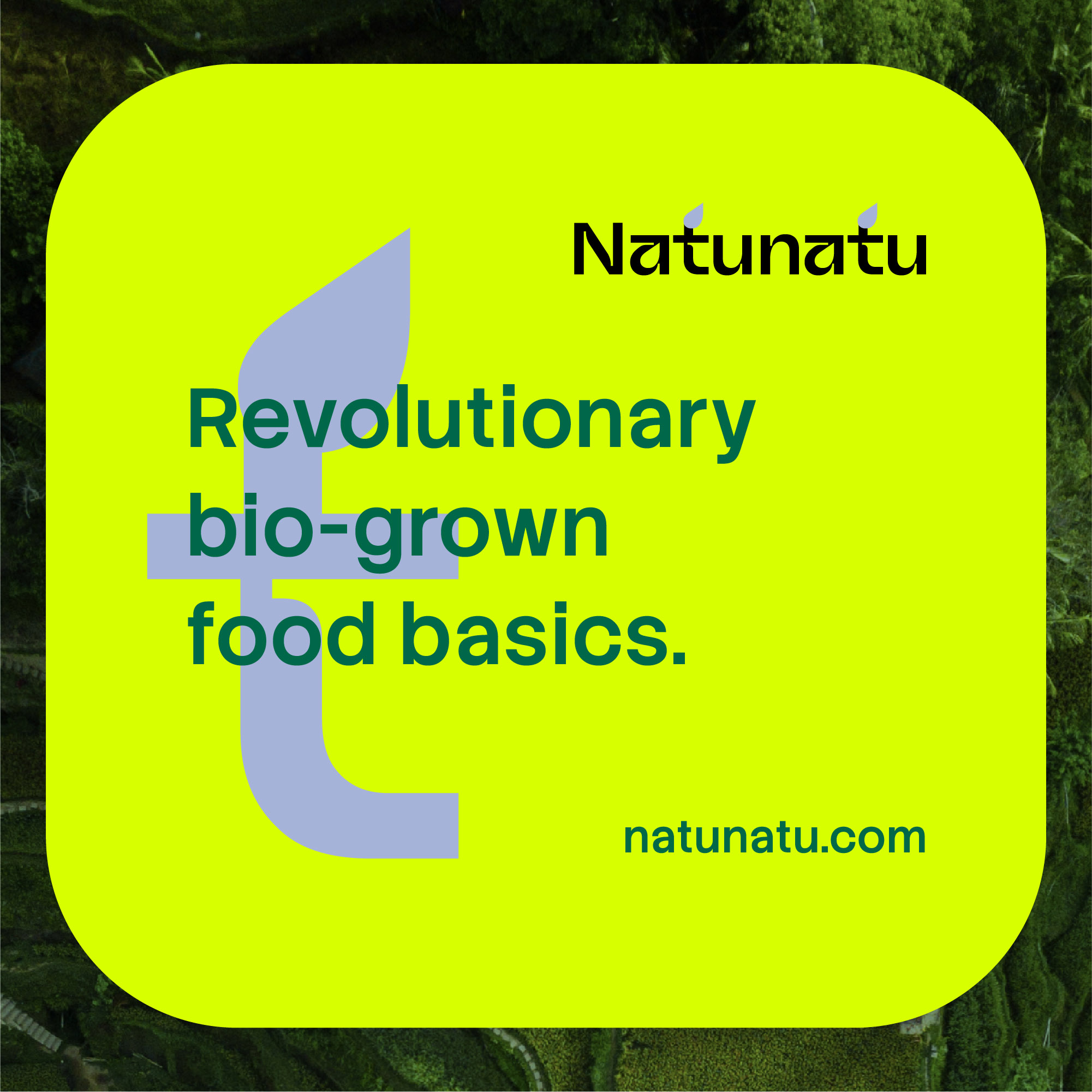
Create approved pairs for common jobs: body text on light and dark fields, links, buttons, captions over images, and selected navigation. Test the pair at its intended size. A vivid colour that works for a large title may fail as small body text. A photograph makes the local contrast change from one crop to another, so a fixed overlay or separate text panel may be safer than placing letters directly over it.
Use a contrast checker for digital text and then review the actual interface. WCAG contrast guidance gives a measurable starting point, but it does not replace checking thin letterforms, motion, display brightness, and focus states. Print needs its own proofs: spot colour, process colour, paper stock, and lighting can change the result substantially.
Prototype a small system, not one hero
Build a short set of realistic applications: a reading page, a compact mobile card, a form, a social tile, and a printed piece. Apply the same content roles to each. If every application needs a new colour rule, the palette may be decorative rather than systematic. If every headline needs manual letter spacing to fit, the type roles need another size, width, or editing rule.
Ask another designer to make a new application using the draft system. Note every decision that still depends on your verbal explanation. Put those answers into brand guidelines with examples of both good use and likely failure.
Deliver the rules people need
Provide named colour tokens and production values, licensed font files or access instructions, type styles, fallback rules, and examples of approved combinations. Keep one source of truth for current values. Explain how to add a new role, who checks accessibility, and what to do when a supplier cannot reproduce a colour or typeface.
Practical checks
- Can a teammate choose a readable text-and-background pair without guessing?
- Does the hierarchy still work with a long title and unfamiliar language?
- Are link, focus, error, and success states distinguishable without colour alone?
- Have screen and print versions been reviewed in their actual contexts?
Common mistake
Treating a striking brand colour as the default for every piece of text. Recognition is valuable, but reading and navigation are the work the system must perform. Give vivid colours appropriate roles and provide quieter combinations for sustained reading.
People and practice