In brief
Logo design creates a compact identifier for an organisation, product, place, or initiative. A logo does not contain the whole brand; it gives the wider identity system a consistent point of recognition.

Common tools
- Adobe Illustrator
- Figma
Skills in play
- Concept development
- Systems thinking
- Technical accuracy
What it is
A logo is a repeatable visual identifier. It may be a wordmark, lettermark, symbol, emblem, or a combination of these forms. Its main job is recognition: helping an audience connect many encounters with the same source. The mark is one part of an identity, alongside language, typography, colour, imagery, behaviour, and the experience of dealing with the organisation.
A symbol becomes useful through consistent use and accumulated meaning. A beautiful drawing cannot carry a weak product or unclear positioning on its own. Equally, a modest mark can become powerful when it is distinctive, applied consistently, and supported by a coherent system.
Core design questions
- Distinctiveness: does the mark have a recognisable structure among the alternatives people will see nearby?
- Legibility: can people read or identify it at the sizes, distances, and speeds that matter?
- Reproducibility: does it survive one colour, small screens, embroidery, signage, and imperfect printing?
- Appropriateness: does its character fit the organisation and audience without defaulting to a category cliché?
- System fit: can it work with type, colour, imagery, motion, and layout rather than competing with them?
These questions are connected. A clever symbol may lose its idea when reduced to a favicon. A restrained wordmark may perform beautifully on a package but disappear in a crowded app grid. Evaluate the identity in the places it must actually live.
Typical process
Define the recognition problem
Clarify the name, audience, positioning, competitive environment, and required applications. Distinguish what the organisation wants to say from what an audience needs to recognise. Audit neighbouring marks to find visual conventions, crowded territory, and opportunities to take a different route.
A useful brief records practical constraints early: long or short names, multiple languages, co-branding, legal names, existing equity, and the smallest likely application. It also defines what success would look like after the launch, not just at a presentation.
Explore concepts before polish
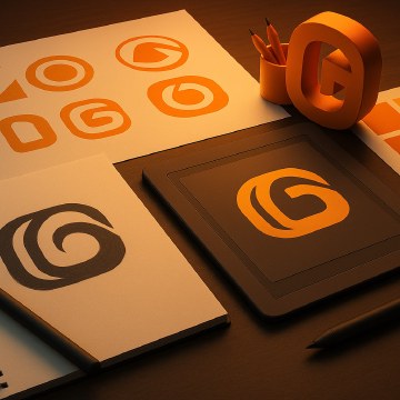
Develop several distinct conceptual routes in simple form. Early sketches should test structure and meaning, not gradients or mock-up effects. Draw wordmarks as carefully as symbols; letter spacing and custom letterforms can be the most recognisable part of an identity.
Select routes for a reason that can be explained without the designer standing beside them. Refinement then becomes a matter of proportion, spacing, curve quality, and optical balance. Geometric neatness is useful, but the eye judges the final shape.
Test in context
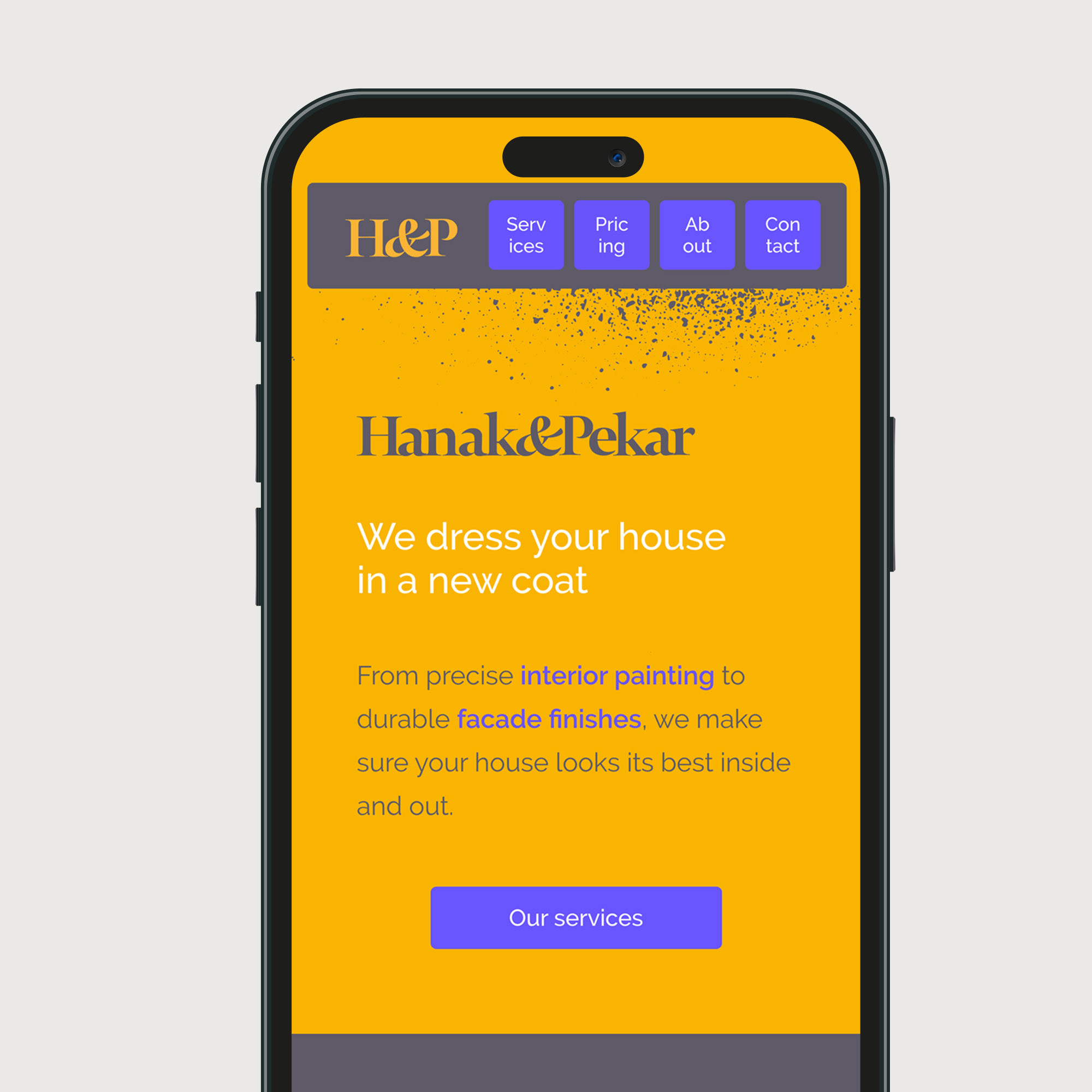
A mark that looks convincing in isolation may fail on a phone header, building sign, document footer, social avatar, or product label. Test the smallest and most difficult uses early. Compare it beside competitors, over photographs, on light and dark backgrounds, and without colour.
Ask people what they can identify after a brief encounter. Do not expect them to decode an internal concept. The stronger test is whether they can recognise the same source again in a different context.
Build the asset family
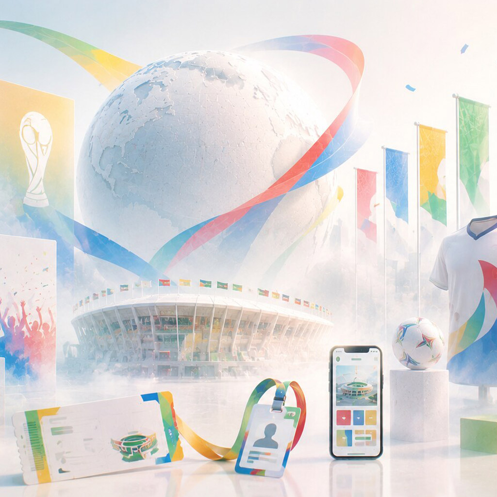
Prepare the versions that real teams need: primary lock-up, compact arrangement, symbol-only form where appropriate, monochrome artwork, reversed artwork, and files for print and screen. Specify clear space, minimum sizes, colour use, and examples of backgrounds that cause problems.
The guidelines should show decisions in use, not only a page of prohibitions. Include common templates, partner-logo arrangements, and a sensible process for requesting new versions so that the mark does not quietly fragment over time.
How to judge the result
Put the proposed mark through a small application set before approval: website navigation, social avatar, a narrow document header, a physical surface, and a one-colour production sample. Compare all routes at the same size and without polished presentation effects. Record which failures can be fixed through refinement and which reveal a weak underlying idea.
Handoff that protects the mark
Give the next team assets they can actually use: vector originals, screen exports, one-colour and reversed versions, and a compact guide showing minimum size, safe space, and unsuitable backgrounds. Include examples of how the mark sits beside a headline, partner logo, or photograph. This turns “use it consistently” into a practical decision rather than a vague instruction.
After launch, inspect a few real applications. If teams repeatedly stretch the mark or invent new lock-ups, the problem may be missing assets or unrealistic rules. Update the asset family while keeping the core recognition structure stable. A logo earns value through repeated, dependable use.
Common mistake
Trying to make the logo explain everything usually produces a complicated illustration. A useful mark can be simple enough to recognise quickly while the rest of the identity carries detail, tone, and storytelling. Simplicity is not the goal by itself; recognisable, usable character is.
People and practice