In brief
Place branding coordinates many voices and experiences around a real location. It works when people can recognise the place in its signs, services, stories, and daily use.

Common tools
- Adobe Illustrator
- Adobe InDesign
- Figma
Skills in play
- Research
- Systems thinking
- Spatial reasoning
What it is
A place brand is a shared visual and verbal way to identify a city, neighbourhood, region, or destination. It may appear on a website, transit map, cultural programme, street sign, visitor guide, and business partnership. The identity has to make sense to people who live there as well as people seeing it for the first time. It should support the place rather than pretending to invent it.
The challenge is governance. A company can usually decide how its mark is used. A place includes public agencies, cultural institutions, businesses, residents, and visitors with different priorities. The design therefore needs rules people can use without making every organisation look identical.
Begin with the place people experience
Research the location before writing a promise. Walk routes, observe arrival points, read local histories, inspect public information, and speak with different communities. Compare the image promoted to visitors with the experience of residents. If a city promises ease of movement while its signs are confusing, a polished campaign cannot repair that mismatch.
Identify what the identity must do. Is the job to help visitors navigate, bring independent venues into a programme, make a public service easier to recognise, or connect a region’s businesses? These are related but different briefs. Define who will use each touchpoint and what they need to understand or do.
Find shared ground without flattening difference
A useful concept can be rooted in a characteristic that genuinely recurs: geography, civic life, cultural exchange, a material language, or a pattern of movement. Avoid treating one landmark, food, or historical period as the whole place. Test early ideas with people who see the city differently. Ask what each concept leaves out and whether it feels believable when applied to ordinary services, not only tourism posters.
Write a short positioning statement and a practical set of design principles. The first gives the system direction; the second helps teams decide what to do when a new venue, language, or format appears.
Design a system that can be shared
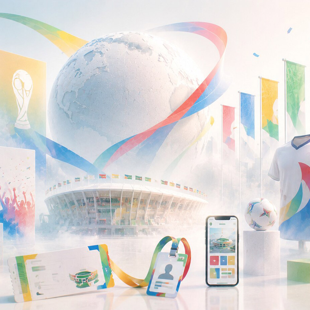
Build recognisable elements beyond the logo: typography, colour, image direction, grids, maps, icon rules, and tone of voice. Some should be fixed for recognition; others should allow local authorship. An identity for a city’s cultural programme may need flexible templates for many independent organisers. A transit identity needs stricter rules where consistency affects orientation.
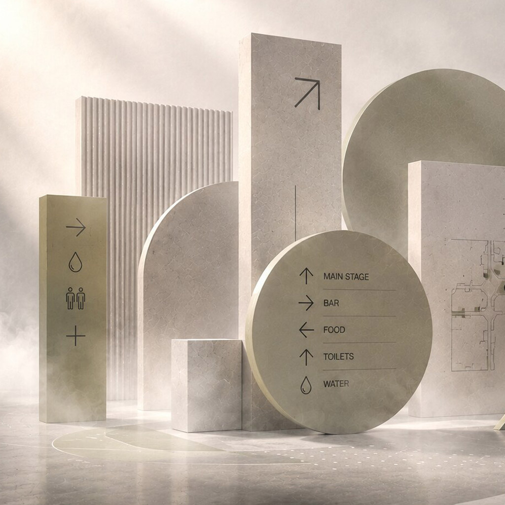
Erik Spiekermann’s work on information systems for Berlin Transit and Düsseldorf Airport offers a useful distinction: place identity is also encountered while people try to find their way. Study how typography, naming, and hierarchy support an actual decision, then connect that thinking to signage systems and wayfinding.
Pentagram’s Culture Mile identity is another useful case: its visual idea links several cultural partners through the public spaces between them. Compare how that shared language accommodates different institutions with how a transit system must prioritise consistent instructions. Both operate in a place, but their rules need different degrees of flexibility.
Test the unglamorous applications
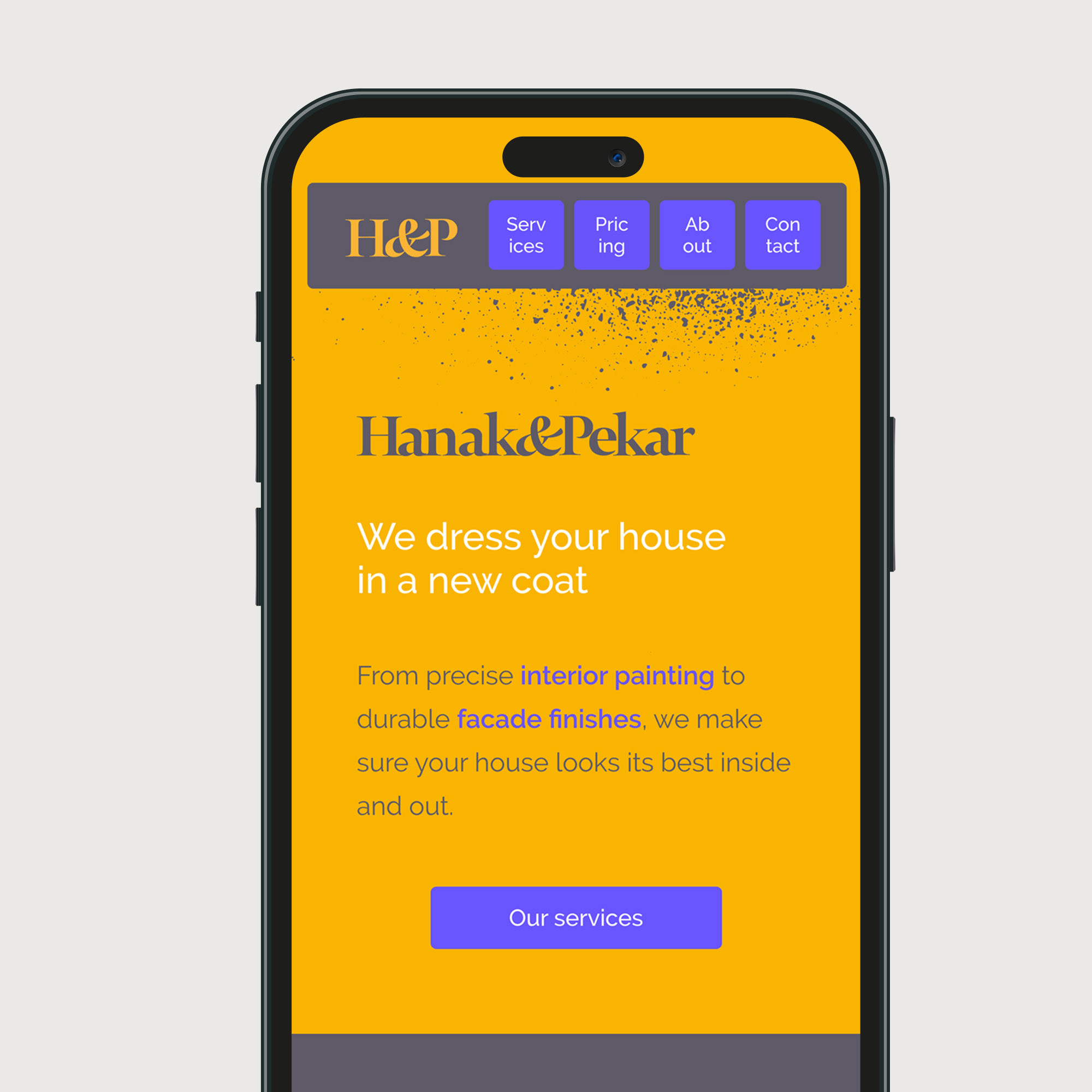
Apply the system to an accessible web page, a long bilingual notice, a temporary construction sign, a partner logo lock-up, and a low-cost print template. Test at phone size and from a distance. Make room for translation and different scripts before approving the core typography. A dramatic mock-up is weak evidence if the identity collapses on public information.
Document who owns assets, who can adapt them, and which uses require approval. Provide templates, examples of good variation, source files, and an update path. If local groups cannot use the identity, they will work around it.
Roll out with the people who will use it
Pilot the system in a limited setting and collect reactions from residents, frontline staff, visitors, and partner organisations. Look for practical failures: a route that remains unclear, a notice that is hard to translate, or a small organisation that cannot afford the prescribed production method. Revise the rules before wide release.
Measure useful outcomes, not just recognition. Can someone identify a public service, find a venue, understand which sites belong to the same programme, and locate a current source of information? Branding does not substitute for maintaining services, but it can make good services easier to find and trust.
Practical checks
- Does the concept reflect people who live in the place, including those outside the most promoted district?
- Can the system accommodate different languages, organisations, budgets, and accessibility needs?
- Do signs, maps, digital services, and campaign pieces share enough cues to feel connected?
- Is there a clear process for partners to use and improve the system?
Common mistake
Making a destination poster and calling it a place identity. A lasting system has to work when someone needs a timetable, a public notice, or directions on an ordinary day.
People and practice