In brief
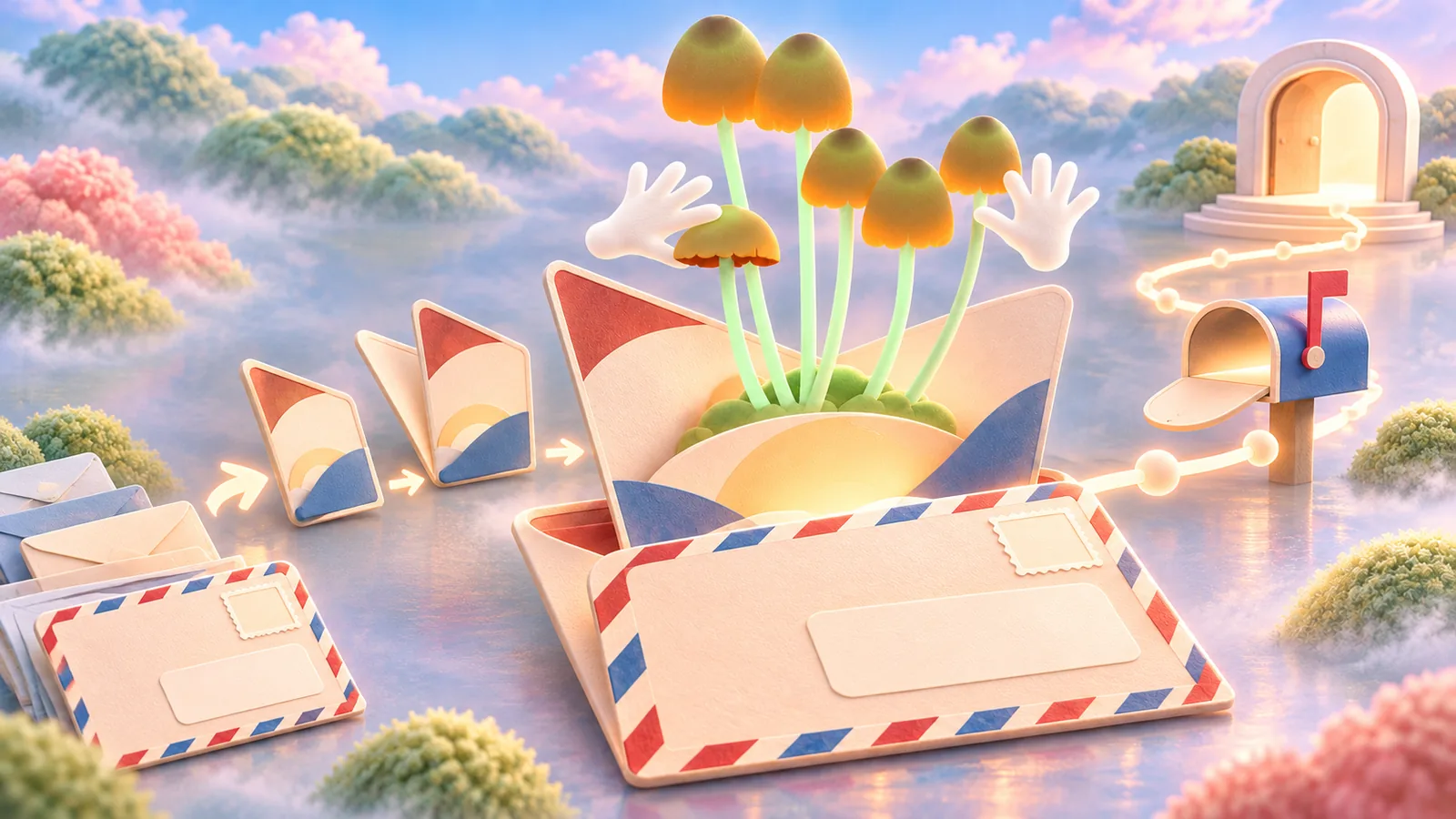
Direct mail is addressed or route-delivered communication sent to people in physical form. Its design joins audience, offer, format, reading sequence, and mailing rules.
Common tools
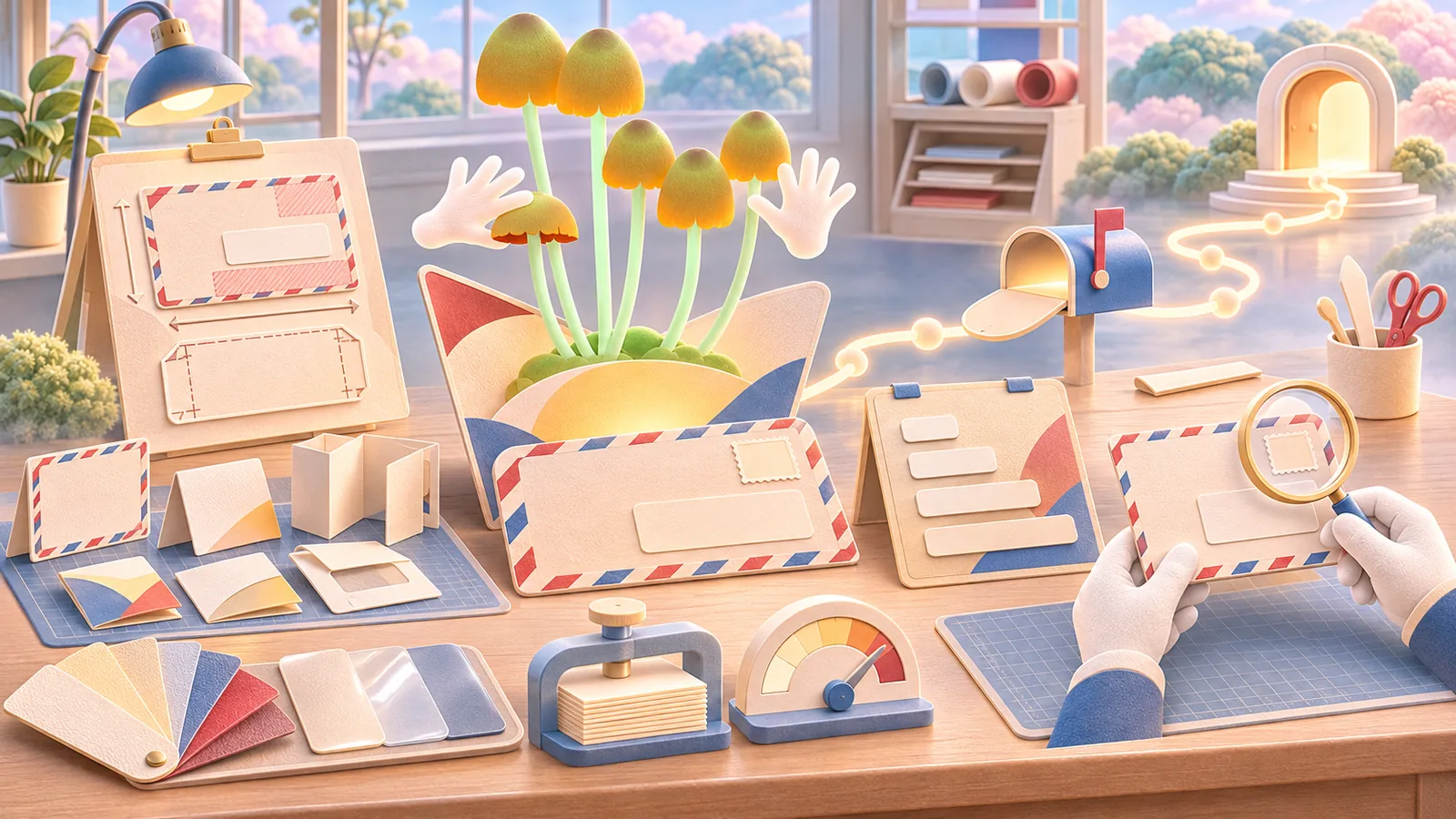
- Adobe InDesign
- Adobe Illustrator
- Adobe Photoshop
Skills in play
- Concept development
- Typography
- Technical accuracy
What it is
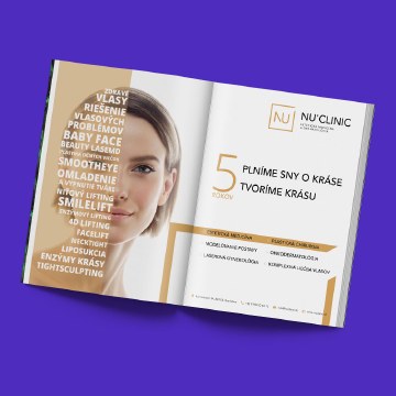
Direct mail is a printed message delivered to a selected address or postal route. It may be a postcard, folded self-mailer, letter, catalogue, invitation, or sample. Unlike an outdoor poster, it reaches a person in a private setting where the piece can be turned over, kept, compared, or discarded. The design must earn a reason to stay in someone’s hands.
A mailpiece is a complete small experience. The outer surface creates an expectation; the inside or reverse explains why the recipient should care; the next step must be easy to find. Format, print, postage, list quality, and delivery timing all affect that experience. An attractive layout cannot repair an irrelevant offer or a piece that the postal service cannot process.
Begin with audience and value
Define who should receive the piece and what makes it useful to them. A local event invitation, a product sample, a service reminder, and a fundraising appeal have different reasons to exist. Write the offer in one plain sentence. Include the conditions a recipient needs before acting: date, place, price, eligibility, and how to respond.
Choose the distribution method early. An addressed list can support a more specific message; route-based delivery reaches a geographic area without identifying each household. The USPS Every Door Direct Mail programme is one example of a route-based option in the United States, with its own format and preparation rules. Other postal services and jurisdictions use different requirements, so confirm the actual carrier and market before approving the design.
Design the first encounter
Imagine the piece among ordinary mail. What is visible before it is opened or turned? Give the recipient a clear reason to continue, but do not disguise advertising as a personal or official notice. Respect a brand’s voice and make the sender identifiable. An intriguing visual can help, provided the offer becomes clear quickly.
Establish a reading path from primary promise to supporting proof to next step. A strong image or short headline should not force critical details into tiny print. A call to action may be a memorable URL, booking link, phone number, store visit, or reply mechanism. Test the destination and make sure it repeats the same offer.
Match the format to the message
A postcard can communicate one proposition efficiently. A folded piece can reveal a sequence. A letter may be better when trust, detail, or a personal explanation matters. Choose the structure after deciding what the recipient needs to understand, not because a fold or finish looks impressive in a mock-up.
Connect the design to the wider campaign concept and promotional materials. Keep enough visual continuity to be recognisable, but adapt the copy and hierarchy to the physical medium. A design made for a social card may fail when an address panel and postal markings consume part of the surface.
Make production constraints visible early
Ask the printer and postal partner for current size, thickness, address, clear-zone, fold, and postage specifications. Leave these zones in the artwork before exploring decorative layouts. Prototype at final size and weight. Check paper stiffness, fold sequence, coating, ink coverage, and whether a finish changes machine handling. Do not assume a digital proof shows how small text or colour will reproduce on the selected stock.
Verify any personalised fields and privacy-sensitive data separately. A misaligned name or wrong offer can make a piece feel careless. Set up proofs that show realistic long names, addresses, and codes, then inspect a physical sample before the full run.
Test the response and learn
Give the piece to people unfamiliar with the campaign. After a few seconds, ask what it offers, who sent it, and what they would do next. Then ask them to find the conditions and complete the response path. Their behaviour will reveal whether the first read and the detailed read work together.
Measure response against the original objective and distribution method. A dedicated URL or code can help, but people may respond through search or later visits. Include timing, placement, list quality, and the strength of the offer in your interpretation. Record what the next edition should change rather than attributing all outcomes to the visual design.
Practical checks
- Is the sender, offer, audience, and next step clear without opening another channel?
- Does the design work with the actual address and postage area?
- Have the postal format and print proofs been checked for the destination market?
- Are personalisation fields and response links tested with realistic data?
Common mistake
Treating direct mail as a poster with an address added at the end. The postal format and the recipient’s reading sequence must shape the design from the beginning.
People and practice