In brief
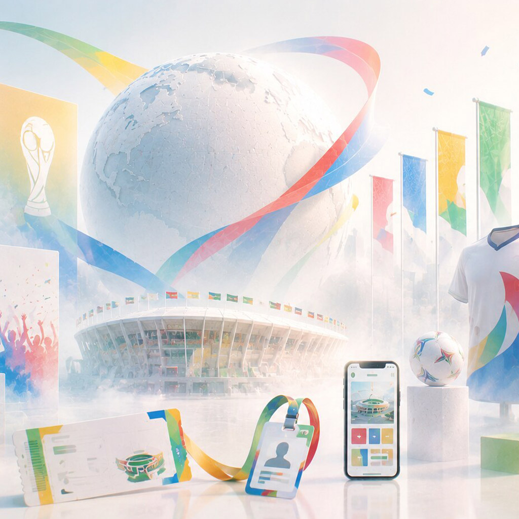
Promotional materials turn a campaign idea into objects people can notice, keep, share, or act on. Their value comes from a precise message and a format that suits the moment.

Common tools
- Adobe Illustrator
- Adobe InDesign
- Adobe Photoshop
Skills in play
- Concept development
- Typography
- Technical accuracy
What it is
Promotional materials are the designed pieces that help a particular offer, event, product, or initiative travel through the world. A flyer, invitation, digital banner, sample card, handout, or campaign email may all belong to the same family. Their purpose is more specific than general brand recognition: someone should understand what is being offered and what to do next.
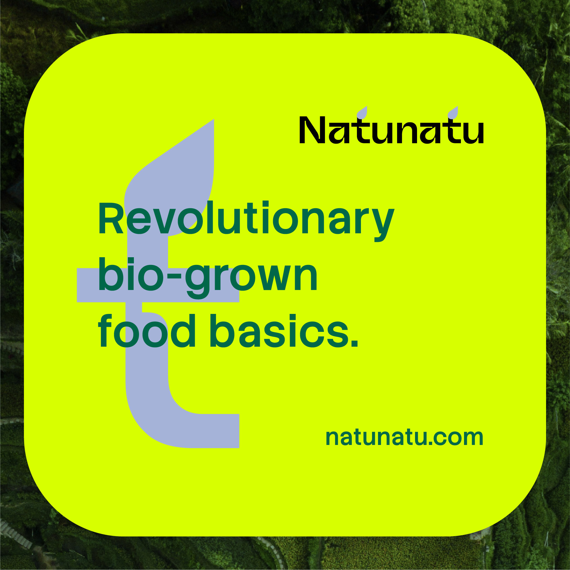
The format matters as much as the artwork. A postcard kept for a week, a poster seen for two seconds, and a social image viewed on a small phone demand different amounts of information. A coherent campaign can adapt to those conditions without repeating the same layout at every size.
Define the action before the asset
Write the audience, offer, deadline, location, price or eligibility, and desired action in plain words. Ask what would prevent someone from responding. A beautiful piece that hides the date or requires a search for the sign-up link is not finished. If the offer changes between channels, settle the facts before designing the materials.
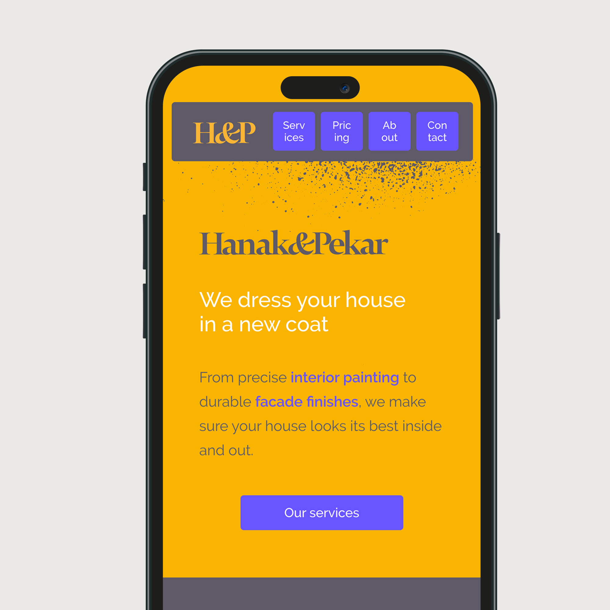
Decide where the piece will appear and how long it has to work. A window poster needs a strong distance read; a handout needs a reason to be kept; a landing-page visual should support the page’s actual task. Make an asset list from the audience journey instead of ordering every possible format by habit.
Build one visual proposition
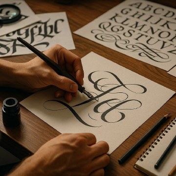
Find a simple relationship between message and form. Lettering, photography, illustration, colour, or material can carry the idea, but each should have a job. Martina Flor’s commercial lettering is a useful reference: expressive type can turn the words themselves into the main image. The lesson is to test whether that expressiveness makes the message more memorable and still legible at the required size.
Create a small campaign grammar: a hierarchy for the offer, a consistent call to action, a set of visual anchors, and rules for using imagery. Connect it to the wider advertising system so every asset is recognisable without being identical.
Design for production and distribution
Start from the most demanding format. A large outdoor piece tests instant recognition; a narrow mobile placement tests whether the message can be compressed. Check how the identity survives both. Establish safe areas and cropping rules for partner channels. Export formats should be named and sized for the actual distribution plan.
For print, specify stock, finish, fold, trim, bleed, and colour expectations early. A special ink or die cut may add impact, but it must earn its cost and survive the production schedule. For digital, check loading weight, legibility, colour contrast, and how animation behaves when motion is reduced. Do not rely on a QR code as the sole route to important information.
Keep the next step visible
The call to action can be a URL, date, venue, contact, booking control, or instruction. It needs enough context to make sense on its own. Test the link destination and make sure it repeats the promise in the promotional piece. An attractive invitation followed by an unrelated or broken page loses trust immediately.
Consider how materials age. Some can remain useful for months; others need a version or expiry date. Remove obsolete pricing and dates from shared asset libraries so teams do not redistribute old information.
Review in context
Print a rough proof at final size and place it where the audience will meet it. Show a phone-sized digital version in a busy feed. Ask people what they think the offer is, who it is for, and what they would do next. The answer reveals more than asking whether they like the design.
After release, compare outcomes with the brief. Track the response route separately for each format when possible, but interpret numbers carefully: distribution, placement, timing, and the offer itself affect performance. Use the findings to improve the next campaign rather than declaring one image a universal winner.
Practical checks
- Is the offer understandable without prior knowledge of the campaign?
- Does the asset show a clear and working next step?
- Are dates, prices, links, usage rights, and production specifications current?
- Does the system remain legible in the smallest and busiest placements?
Common mistake
Treating every format as a crop of the hero artwork. Adapt the hierarchy to what a person can actually see and do in each setting.
People and practice