In brief
Kinetic typography gives written language a timed visual performance. Motion can clarify sequence and tone, but the words still need enough time, contrast, and structure to be read.
Common tools
- Adobe After Effects
- Adobe Illustrator
Skills in play
- Motion design
- Typography
- Visual storytelling
What it is
Kinetic typography is type designed to change over time. Words can enter, pause, shift, fragment, or respond to sound. Those changes can create emphasis and character, show a relationship between ideas, or guide attention through a sequence. The movement is part of the communication, not simply an effect applied after typesetting.
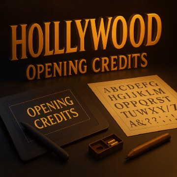
It appears in title sequences, social videos, explainers, event screens, and digital interfaces. Each setting changes the reading problem. A cinema audience can follow a longer sequence; someone scrolling on a phone may see only a few seconds without sound. In both cases, typography must remain recognisably written language even as it moves.
Write the sequence before animating
Start with the exact words and the intended takeaway. Divide copy into meaningful beats: what must be noticed first, what can be revealed later, and what deserves a pause? Read the sequence aloud and mark natural stresses. An animation cannot rescue a sentence that is too long or poorly ordered for the available duration.
Storyboard key frames before refining transitions. Include the first frame, each important reveal, and the final reading state. Ask whether a viewer who misses the opening can still understand the message. If the meaning depends on a complex trick seen only once, simplify the structure or provide a stable end frame.
Design type for time
Keep letters readable
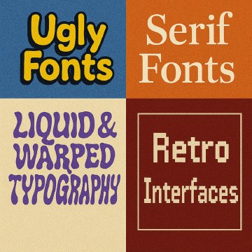
Choose type with clear forms at the target size. Consider how stroke weight, counter shapes, spacing, and contrast change during movement and compression. Distortion can express an idea, but it should not obscure critical words. Test on the actual screen and at the likely viewing distance, especially for small mobile placements.
Maintain a logical grouping of words. Motion may temporarily separate them, yet the final composition should preserve the intended reading order. Use colour and scale to support emphasis, not as the only way to distinguish essential information.
Make timing meaningful
Timing is a hierarchy tool. A quick entrance can create energy; a longer hold gives a complex phrase time to settle. Duration should respond to word length, reading difficulty, and what else the viewer is processing. Easing determines character: a crisp stop feels different from a soft drift. Define a limited motion vocabulary rather than giving every word a new behaviour.
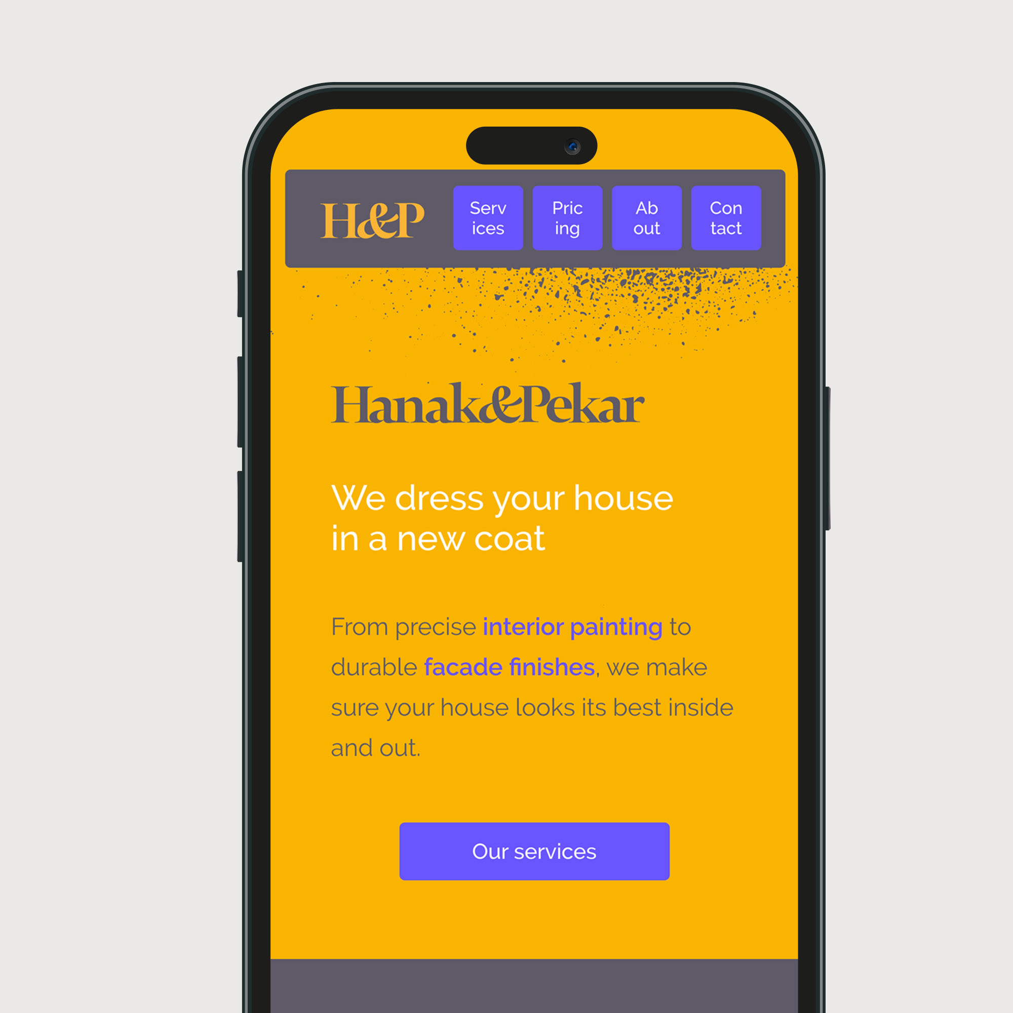
Sound can reinforce rhythm, but the message should remain understandable when muted. Create captions or a stable text equivalent where appropriate. In interfaces, avoid making a user wait through decorative transitions before they can act. Motion identity shows how timing principles can become a repeatable system.
Prototype and test comprehension
Build a rough animatic with plain type and simple blocks. Show it once, at normal speed, to someone who has not seen the script. Ask which words they remember and what they think happened. Repeated replay by the design team can hide a timing problem because everyone already knows the copy.
Test sound-off viewing, small screens, slower reading speeds, and a paused frame. Check whether the text remains legible over changing imagery and whether any flashing or large movement could cause discomfort. For interactive use, respect reduced-motion settings and provide a way to access essential information without the animation.
Deliver a maintainable motion system
When a campaign uses many lines, build templates for line length, timing range, safe areas, and export ratios. Supply editable text layers, type licences or substitutions, fonts, and clear naming. Include examples of both a short and a difficult phrase so later producers understand how the rules stretch.
Review after publication. If viewers miss the intended phrase, adjust the copy or hold time before adding more effects. The strongest kinetic type often feels inevitable: every movement helps the words arrive at the right moment.
Common mistake
Animating every letter because the tools allow it. Constant movement can flatten emphasis and make the message harder to read. Give motion a job, then leave enough stillness for meaning to land.
People and practice