In brief
Social video graphics make a message understandable in a short moving format. They need a strong first frame, readable sequencing, and meaning that survives sound-off viewing.

Common tools
- Adobe After Effects
- Adobe Illustrator
- Adobe Photoshop
Skills in play
- Visual storytelling
- Motion design
- Accessibility
What it is
Social video graphics are the typographic, illustrated, composited, and animated elements that help a short video communicate in a feed or story. They can introduce a subject, identify a speaker, explain a change, show a sequence, or make a call to action memorable. They work alongside footage and sound, but should not depend on either to carry essential facts.
The viewing conditions are unusually variable. Someone may see the first seconds without sound, on a small screen, partly covered by interface controls, or after joining midway. A strong design respects those conditions without making every frame shout.
Give the video one communicative job
Write the message in one sentence. Decide what a viewer should know or do after seeing it. A product demonstration, event reminder, public explanation, and brand story need different structures. Choose a primary outcome and make secondary details available in the post text or linked page.
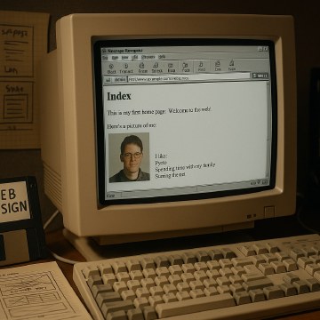
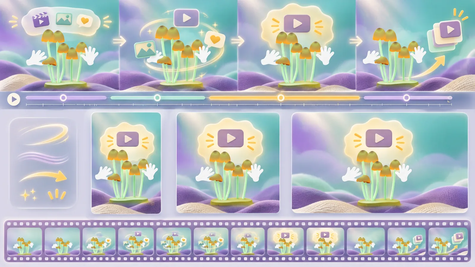
Sketch the sequence before animating. A useful short arc might be a question, a visual answer, and a next step. Another might show a before state, a transformation, and the result. Hillman Curtis’s transition from expressive web motion to filmmaking is a useful historical reference for treating motion as storytelling rather than decoration. His work predates today’s social formats, so borrow the principle, not the old platform conventions.
Make the first frame informative
The opening should identify the topic quickly. An attractive but unrelated reveal wastes the moment when people decide whether to stay. Put the strongest idea, object, or question early, then let the pacing breathe. Avoid using a tiny logo as the only contextual cue.
Design the first frame and a mid-sequence frame as stills. If neither communicates anything without playback, revise the hierarchy. Connect the graphic language to the motion identity where a series needs recognisable continuity.
Build for small screens and changing formats
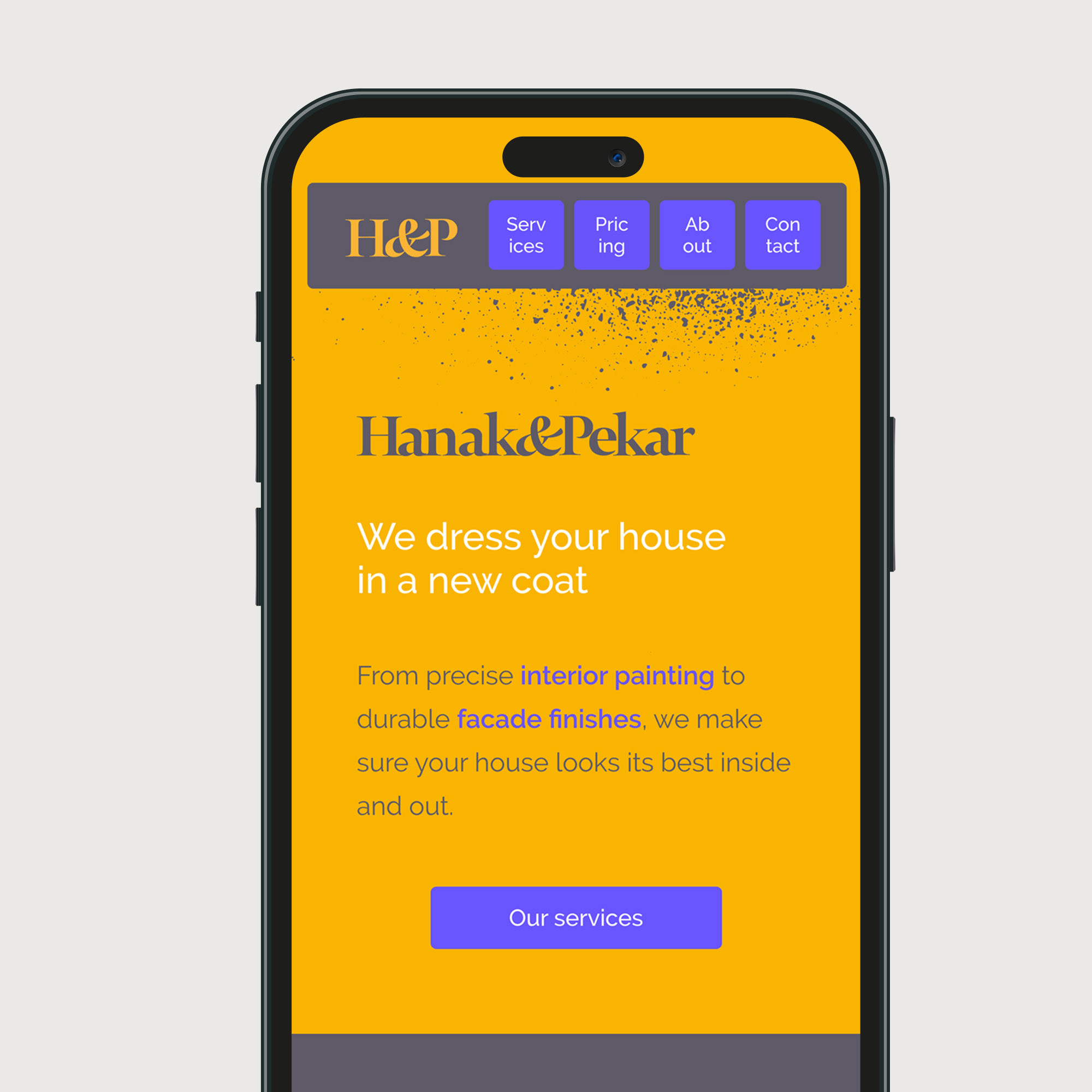
Use a clear type hierarchy, generous safe areas, and concise copy. Test actual phone playback at normal size. Words that look comfortable on a wide editing monitor may become illegible once platform controls, captions, and a moving background compete for space. Keep critical information away from the edges and from known interface overlays, but check the current export context rather than assuming one universal template.
Plan vertical, square, and landscape adaptations from the storyboard. A crop should preserve the subject and reading order. Sometimes a separate composition is necessary. Keep editable source files and a naming system for versions, languages, and release dates.
Design a sound-off path
Captions make spoken information accessible and useful in silent viewing. Provide accurate, timed captions rather than turning every spoken word into decorative kinetic type. When a visual detail matters, describe it in spoken audio or accompanying text. Check contrast over each background and avoid fast flashes or motion that makes text difficult to follow.
Motion should signal relationships: entering, grouping, changing, or completing. Give each movement enough time to be perceived. Offer a reduced-motion route when the video appears within an interactive product, and avoid making a single fleeting animation the only source of an important fact.
Test and refine the sequence
Show a rough cut without sound and without an explanation. Ask viewers what the video is about, which fact they remember, and what action they expect. Then test with captions and sound. Watch where comprehension drops. A fast cut may look energetic to the team while hiding the key claim.
Review exports on the devices and surfaces where the piece will appear. Check compression, typography, colour, cover frame, captions, and linked destination. Measure whether people understood or acted, not only whether the video played. Use feedback to improve the story and timing of the next version.
Practical checks
- Can someone understand the subject from the opening and a representative middle frame?
- Are essential facts available when sound is off?
- Do captions, type, and interface overlays remain readable on a phone?
- Are alternate aspect ratios composed rather than carelessly cropped?
Common mistake
Treating speed as proof of engagement. Fast motion can hide the message. Let the most important information hold long enough to be understood.
People and practice