In brief
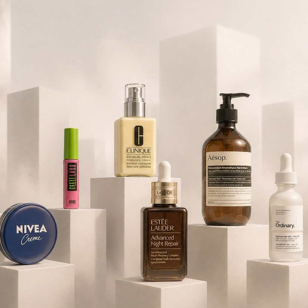
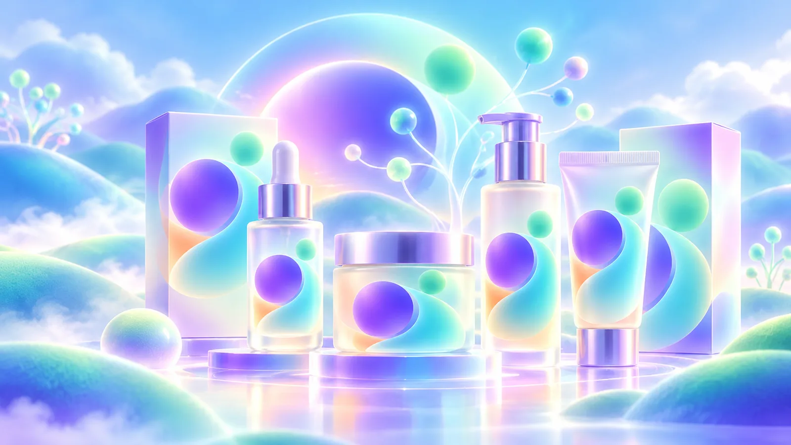
Beauty packaging creates a first impression, but it also helps people identify a product, distinguish variants, find directions and ingredients, and use the container. Design the whole object, not only the front label.
Common tools
- Adobe Illustrator
- Adobe Photoshop
- Adobe InDesign
Skills in play
- Systems thinking
- Typography
- Technical accuracy
What it is
Beauty and cosmetics packaging joins identity, product information, structure, and daily use. A person may discover a product as a tiny online image, compare it on a shelf, inspect the carton, then reach for the container with wet hands. The graphics should help at each point: recognise the range, identify the exact product, understand its purpose, and find instructions and safety information.
The category often trades in aspiration, but clarity is part of trust. A visually quiet pack can still explain what it is; an expressive one should not obscure the distinction between a cleanser, serum, treatment, and shade. The best design respects the product, its audience, and the regulatory review that belongs to the market where it will be sold.
Start with the product architecture
List every item before designing the hero pack: formats, sizes, shades, strengths, languages, sample sizes, refill options, and future extensions. Decide what stays constant across the family and what communicates the difference. A colour alone is a fragile variant code; pair it with a clear name, number, shape, position, or image cue.
Map what people need to know at different distances. The front usually carries the brand, product identity, and most relevant distinction. The side or back supports fuller directions and product information. Test the hierarchy with realistic names: a long ingredient-led name and a short shade code may stress the same layout in different ways.
Design the object, not a flat label
Match graphics to structure
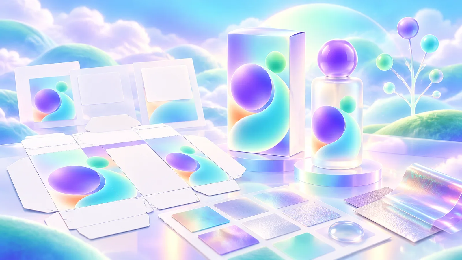
Confirm the container, closure, dispensing method, carton, and dieline early. A wrap label behaves differently from a flat box; a tube is squeezed and turned; a small jar lid may be the first surface a person sees. Keep essential type away from curves, seams, crimp areas, and places hidden by an outer sleeve.
Handle the pack. Can the user find the opening, read directions after the carton is discarded, and distinguish similar products in a bathroom cabinet? These are interface questions. Food and beverage packaging faces related range and shelf problems, though its information needs and use conditions differ.
Let materials support the message
Glass, plastic, paperboard, foils, coatings, and labels each alter colour, contrast, weight, and perceived value. Frosted material may soften a photograph but weaken small type. A metallic finish can make a wordmark disappear under store lighting. Review physical samples under likely retail and home conditions rather than trusting a rendered mock-up.
Ask the production partner about tolerances, print method, adhesion, durability, and whether the chosen decoration works on the final container. Document any finish that must remain consistent across suppliers. Claims about recyclability or refills need product and materials evidence, not merely a green visual language.
Reserve space for accurate information
Create an approved content sheet before the layout is locked. It should identify the product name and use, directions, ingredients, quantity, warnings, traceability information, and any market-specific statements the responsible team requires. Rules vary by product classification and jurisdiction. Regulatory and legal owners must confirm final wording, placement, legibility, and claims for each market; the designer should make that review possible early.
Keep information readable and findable. Small packs may need a leaflet, tag, or carton strategy agreed with the regulatory and production teams. Avoid treating the back panel as leftover space. If a product is sold in several languages, test the longest text and the smallest container before signing off the range.
Prototype a full buying and use journey
Put the range together on a shelf and in an online product grid. Ask someone unfamiliar with it to identify the type, choose the correct variant, and find directions. Then open and use a physical sample. Do the colours, names, material feel, and dispensing method tell the same story?
Build one production proof with final text and material. Check small type, barcode and batch areas, overprint, colour shifts, and label alignment. Track revisions with an approved artwork version; a changed formula, claim, or destination market may require the information to be rechecked even if the visual design appears untouched.
Practical checks
- Compare every planned product and variant at shelf distance and thumbnail size.
- Test the longest names, shade identifiers, languages, and smallest format.
- Confirm required information and claims with the responsible market specialists.
- Inspect a physical proof on the intended container and under real lighting.
Common mistake
Making the pack look premium in a render while leaving the user to decode the product. Beauty packaging succeeds when expression, information, and handling feel like one considered experience.
People and practice