In brief
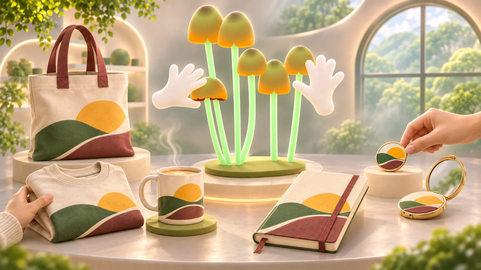
Merchandise and promotional objects move a visual identity onto useful physical things. The best examples work as objects first and brand carriers second.
Common tools
- Adobe Illustrator
- Adobe Photoshop
- Adobe InDesign
Skills in play
- Concept development
- Systems thinking
- Technical accuracy
What it is
Merchandise is a product that people buy or keep partly because of its connection to a brand, event, team, or cultural idea. Promotional objects are often distributed to make that connection visible. Both might include clothing, stationery, bags, drinkware, pins, or other usable items. Graphic design gives the object its visual language, but the object also has a material, shape, cost, life span, and reason to exist.
The useful question is not “Where can the logo go?” It is “Why would someone want this object after the campaign is over?” A carefully designed notebook or garment can feel like an extension of an idea. A fragile giveaway with a large mark may become waste quickly, even if the mock-up looks convincing.
Choose the object for its role
Start with the audience and setting. A conference attendee, customer, employee, and fan will value different things. Decide whether the object should help someone during an event, become a collectible, serve an everyday task, or support a sale. Define the budget, expected quantity, distribution, and what happens to unsold or unused stock.
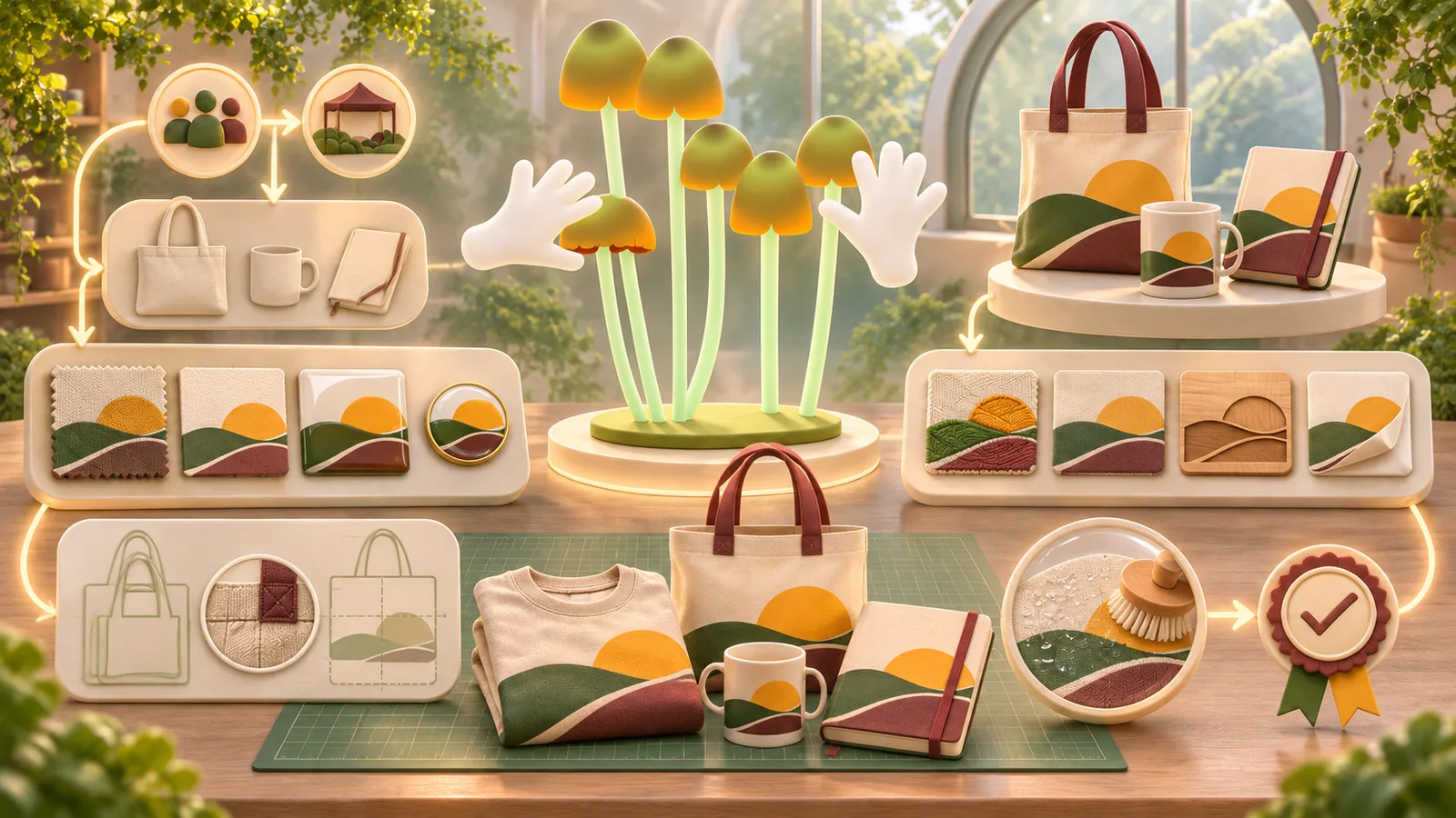
Consider the object before decoration. Check ergonomics, material quality, washing or cleaning, size range, storage, and packaging. If the item is unpleasant or difficult to use, better artwork will not fix it. Order samples and handle them. A design team should see the actual surface, not only the supplier’s digital template.
Translate the identity rather than paste it
Choose visual elements that suit the object: a symbol, pattern, phrase, colour relationship, type treatment, or material finish. A visual identity system should provide room for adaptation. The same mark may need different scale and placement on a pin, shirt, and notebook. Design from the object’s form and viewing distance instead of forcing a flat campaign layout onto every surface.
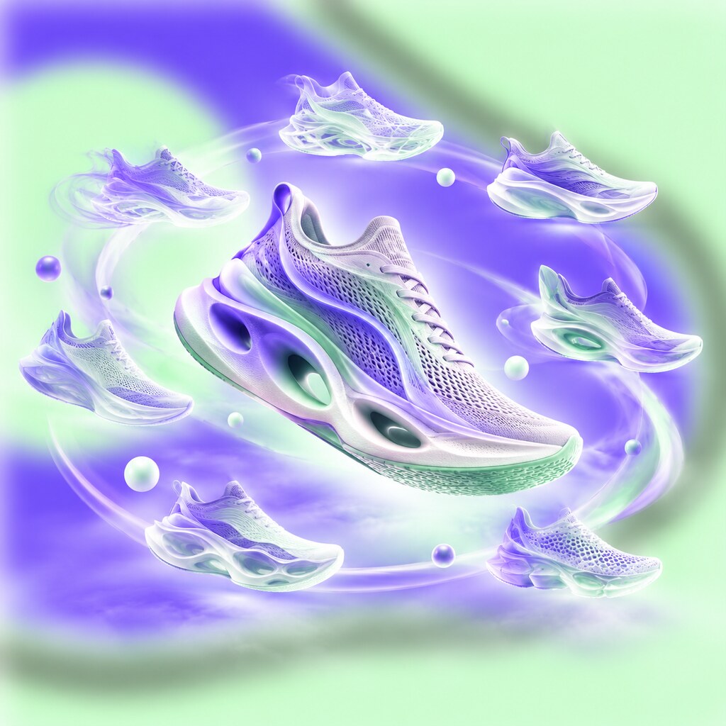
Nike’s coordinated college-colour programme is a useful historical example of products working as a family across footwear, apparel, and bags. The company’s account names Peter Moore as part of the internal creative team. Study the shared colour logic rather than attributing the entire programme to one person.
Make a small, coherent range
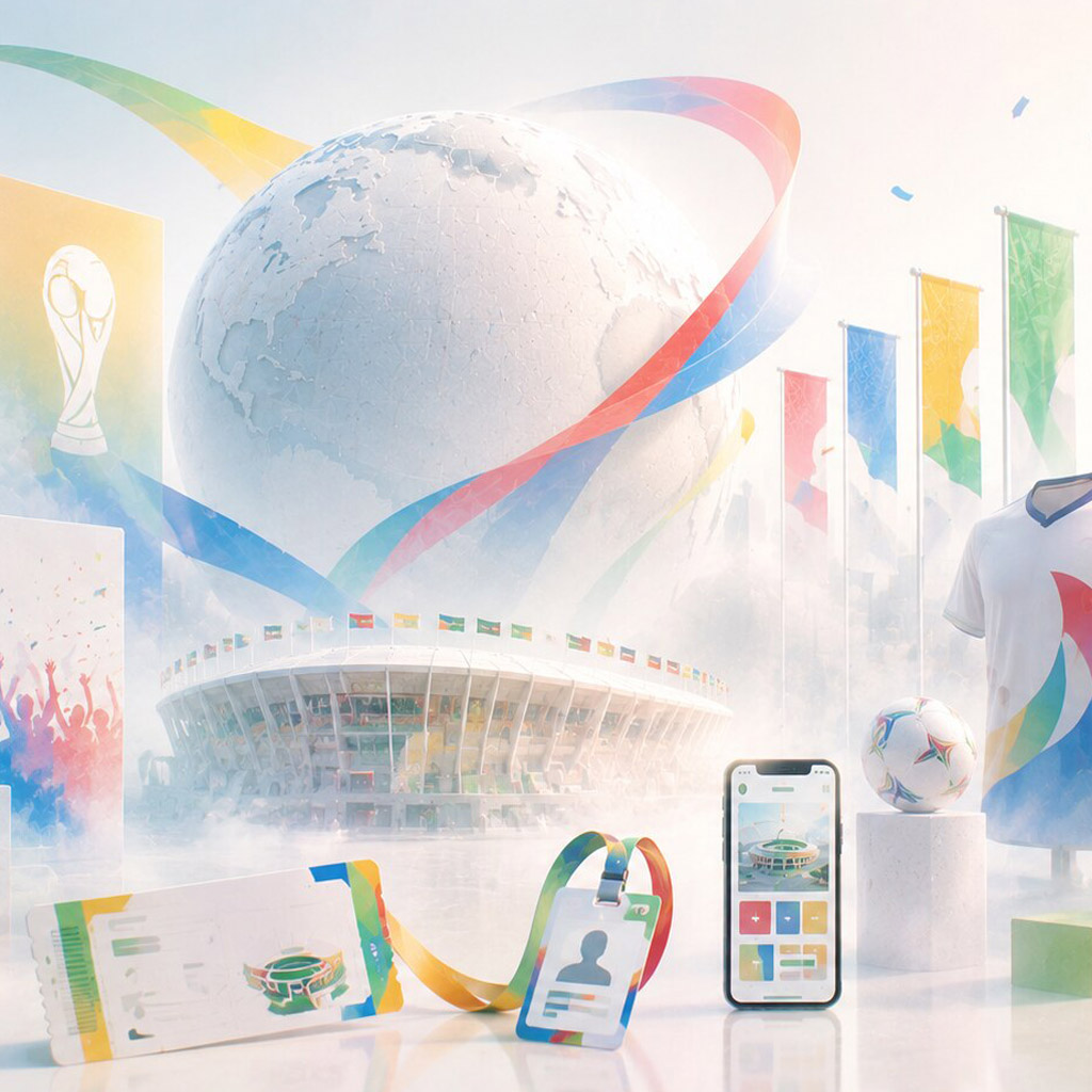
If there are several products, decide what links them and what makes each worth choosing. A recurring graphic device can give the range family resemblance. Size, colour, or a small change in composition can provide variety without making the set feel accidental. Use the principles of packaging families and range systems when objects are sold together or displayed as one collection.
Ikko Tanaka’s early art direction for MUJI is a useful counterexample to the assumption that more branding always means more value. MUJI describes a philosophy of reducing excess in materials, process, and packaging. For merchandise, this suggests asking whether a quieter mark, better material, or clearer function would communicate more than a busy surface.
Respect production and rights
Ask the maker about print areas, colour limits, minimum line weights, seams, grain, shrinkage, tolerances, and available finishes. Test a physical sample for alignment and durability. Screen print, embroidery, engraving, and transfer each change what detail survives. Supply vector artwork, colour references, placement dimensions, and approved variants rather than a single picture of the desired result.
Confirm permission for any artwork, photograph, collaborator name, or cultural symbol used on the object. Credits and licensing should match the way the item will be sold or distributed. Plan any label, care information, or product-specific requirement with the production partner and relevant market; avoid treating decorative packaging as a substitute for necessary information.
Evaluate use, not only launch reaction
Show prototypes to the intended audience and ask which they would actually keep or use. Observe the object in context: how it is worn, carried, stored, or displayed. Review the delivery and unboxing experience without creating unnecessary layers of packaging. After release, look at repeat use, returns, unwanted stock, and feedback about quality as well as initial excitement.
Practical checks
- Would the object still be useful or desirable without the largest logo?
- Does the artwork suit the material, shape, and production method?
- Is the range coherent without making every item identical?
- Have rights, credits, samples, and final production files been checked?
- Is the amount of packaging justified by the object’s protection and presentation needs?
Common mistake
Using low-cost objects as disposable billboards. Begin with an item people genuinely want to use, then let the identity make it recognisably part of the project.
People and practice