In brief
Healthcare packaging must help people identify the right product and find approved instructions quickly. Its visual hierarchy is tested against real containers, languages, and use conditions.
Common tools
- Adobe Illustrator
- Adobe InDesign
Skills in play
- Systems thinking
- Accessibility
- Technical accuracy
- User testing
What it is
Pharmaceutical and healthcare packaging is the visual organisation of information on a medicine or health-product container, its outer carton, and any leaflet or supporting material. The designer helps people recognise the product, distinguish variants, and find instructions. The approved product information and the rules for the relevant market set the boundaries; an attractive concept cannot override them.
This is a broad field. A prescription medicine, a non-prescription product, and a general wellness item may have different legal and practical requirements. The European Medicines Agency’s QRD templates, for example, structure product information for centrally authorised human medicines in the EU. The FDA’s guidance addresses ways container labels and cartons for prescription drugs and biological products can reduce medication errors in the United States. Neither document is a universal packaging template. Confirm the product category and markets with the regulatory team before designing.
Start with the approved information
Collect the current approved product name, strength, form, route, warnings, storage details, identifiers, and leaflet copy as applicable. Ask which wording is fixed, which elements are required on each physical component, and who signs off each version. Record the approval state of the source files. A beautiful mock-up based on old copy is already a failed starting point.
Map the whole pack
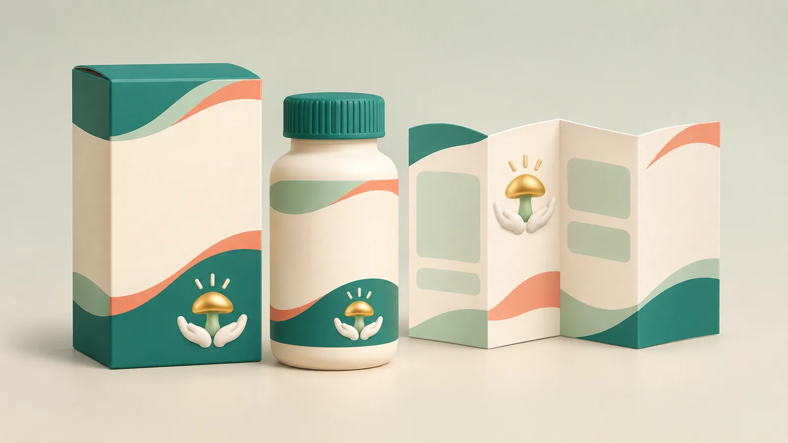
Design the carton, primary container, blister or sachet, and leaflet as one system. A person may see a side panel on a pharmacy shelf, a small bottle without its box at home, or a single blister strip in a clinical workflow. Each encounter needs enough information to identify the product correctly. A colour scheme alone should never carry the distinction between strengths or forms.
Build a content inventory for every surface. Note the minimum print area, folds, seams, reflective material, and any label applied later in production. Keep the hierarchy stable across a product family while making differences visible where a mix-up would matter.
Make the critical information findable
Test the name and other approved differentiators at the size and distance of actual use. Avoid allowing a brand flourish, large decorative illustration, or background pattern to compete with them. Group related information and create consistent locations for recurring facts; do not rely on a reader to rotate a carton several times to piece together one instruction.
The product naming and information guide covers product content hierarchy. Labels and sleeves covers the physical constraints of small and curved surfaces. Healthcare packaging demands an additional check: does the arrangement make it easy to confuse two similar products or strengths?
Treat the leaflet as a reading task
A package leaflet is not a miniature poster. Use clear heading levels, comfortable type, sufficient contrast, and a reading order that survives folding. If a diagram explains a step, pair it with the approved words and make sure both versions agree. For a digital version, W3C guidance on complex images calls for a short identification and a fuller text equivalent when the figure carries essential detail.
Prototype and verify
Print at final size and build a physical mock-up with the intended substrate and finishing. Compare variants side by side under ordinary lighting, not only on a calibrated monitor. Ask people in the actual workflow to locate information and distinguish packs without coaching. Invite regulatory, medical, production, and accessibility reviewers to check different failure modes. Record each correction against the approved copy and production version.
Check translated versions early. A longer name or instruction can change hierarchy and folding. Reserve space rather than squeezing translated type at the end. Before release, compare final artwork to the approved source and verify all panels, barcodes, and print proofs through the required approval process.
Practical checks
- Is each packaging surface linked to current approved information?
- Can users distinguish the relevant variants without relying on colour alone?
- Are the main identifiers and instructions legible at real size?
- Has the assembled pack, not only a flat layout, been reviewed?
- Do translated and digital versions preserve the meaning and reading order?
Common mistake
Treating the outer carton as the whole project and discovering late that the smaller container or folded leaflet cannot carry the same clear information.
People and practice