BOLD Poster Made From Letter B
A typography poster collection built from a single letter B, exploring how one bold character can become the full visual structure of a poster series.
A typography poster collection built from a single letter B, exploring how one bold character can become the full visual structure of a poster series.
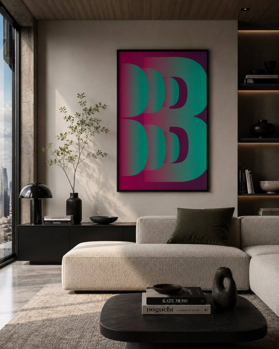
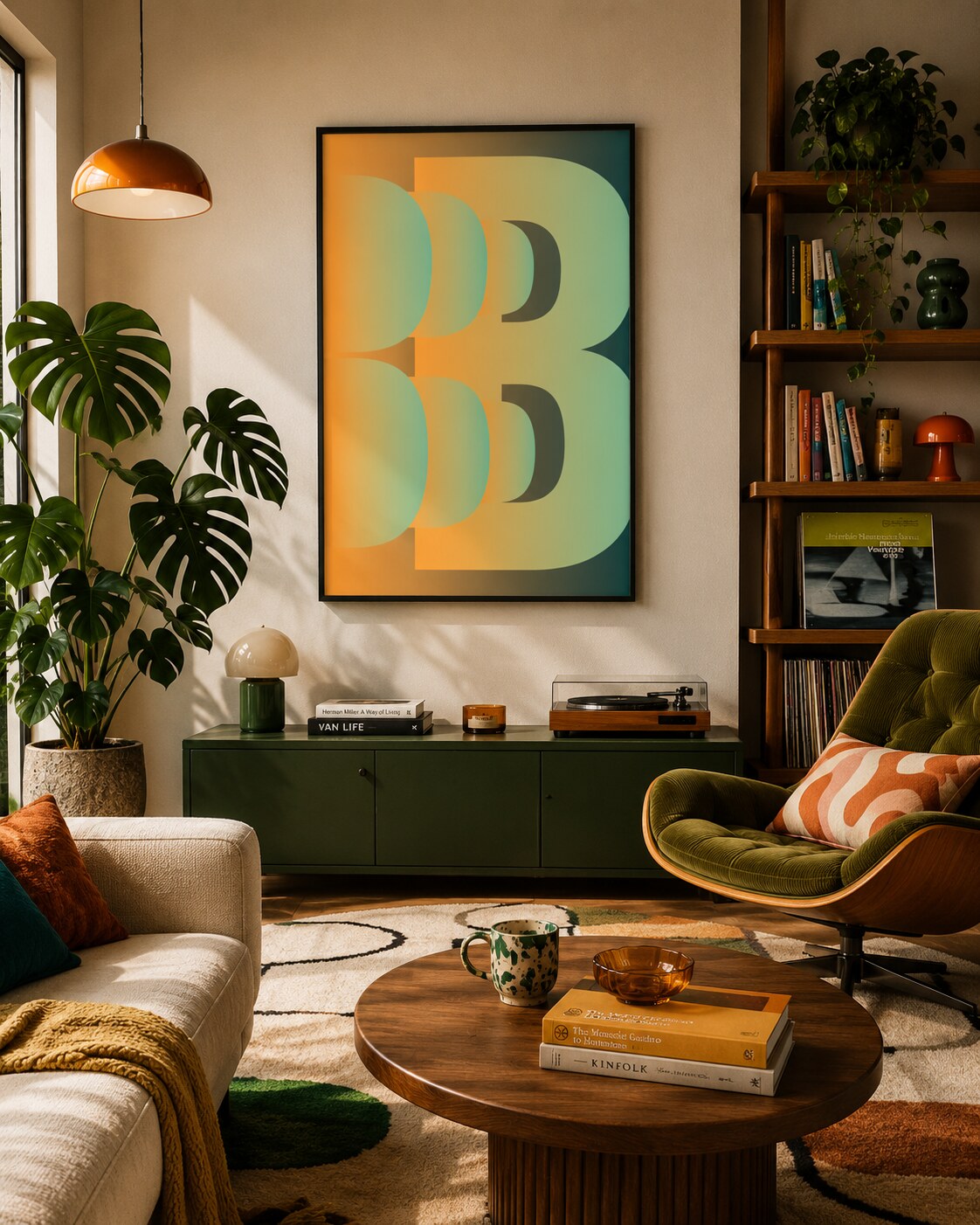
4. Green Interior Preview
5. Pink Interior Preview
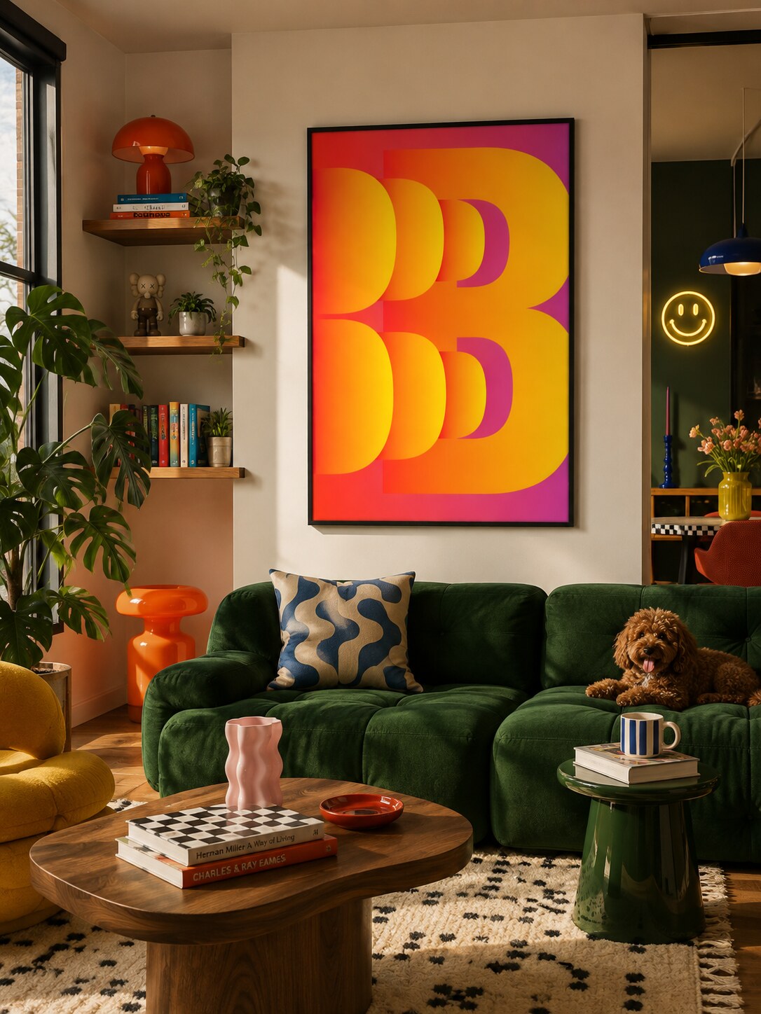
6. Yellow Interior Preview
BOLD is a typographic poster from a single-letter poster series. Each artwork in the series starts with one letter and pushes it until the character becomes the whole composition, not just a piece of written language.
The letter B is repeated, enlarged, cropped, and layered until it turns into a graphic structure. Instead of adding illustration around the typography, the poster lets the letter build the full visual field: rhythm, weight, depth, and movement all come from the same basic character.
“The idea is to make one letter carry the whole poster, so typography becomes image, structure, and topic at the same time.”
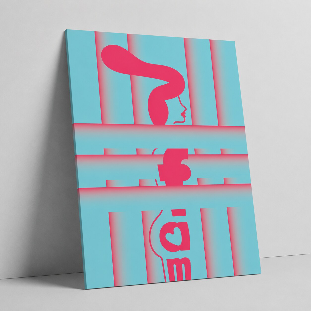
The series tests the same letter-based system across green, pink, and yellow color versions. The large B shape stays dominant, while gradients and layered transparency change the mood of each composition. Some variants feel more electric and sharp, others more warm, decorative, or interior-friendly.
This collection works as a compact funny experiment in constraint-based poster design. By limiting the visual language to one letter, the design becomes more focused: every curve, counter-shape, overlap, and edge has to do more work. The result is a poster series about typography as a subject, not only as a tool for writing.
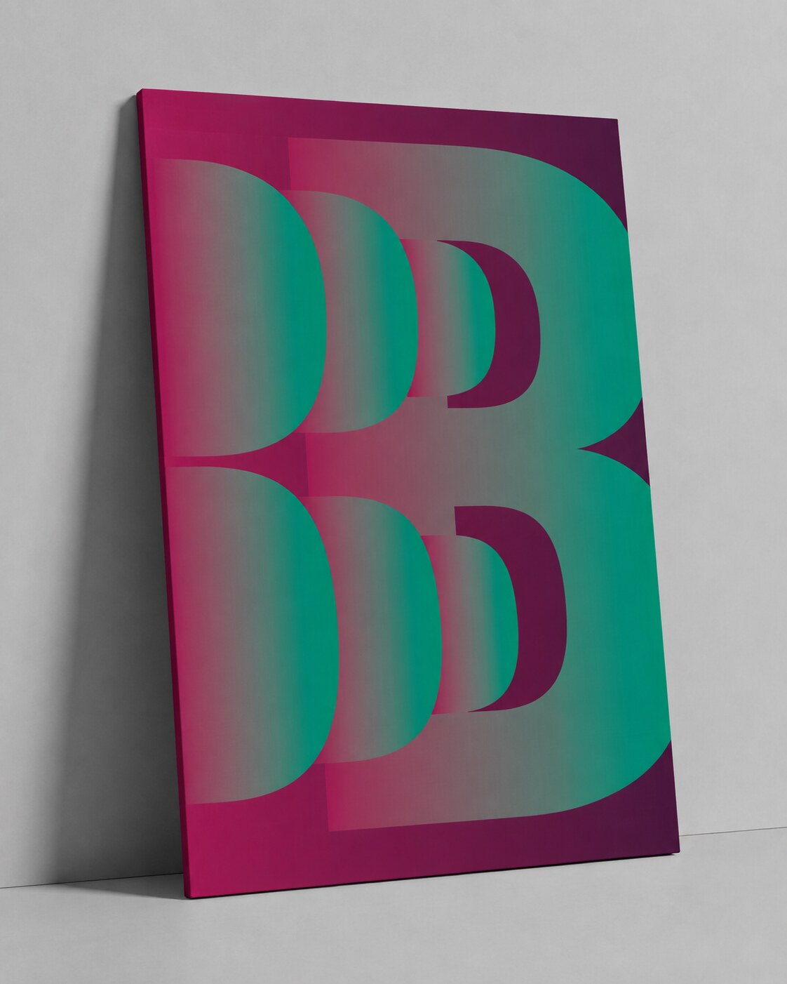
1. BOLD Poster Green Variant
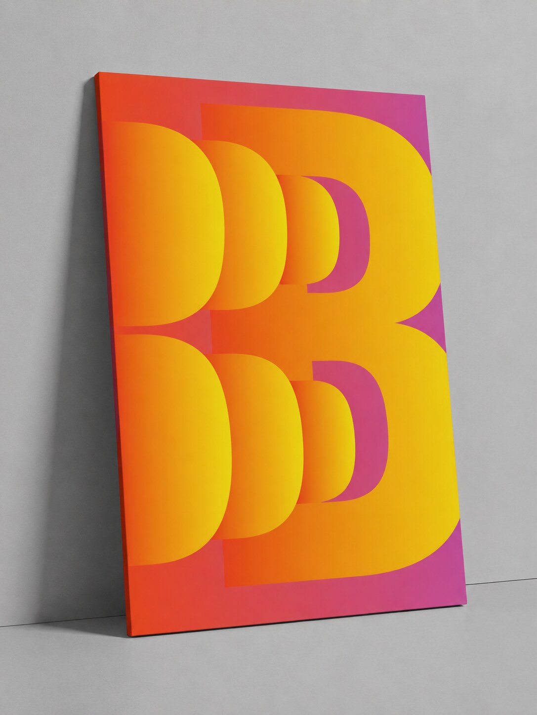
2. BOLD Poster Pink Variant
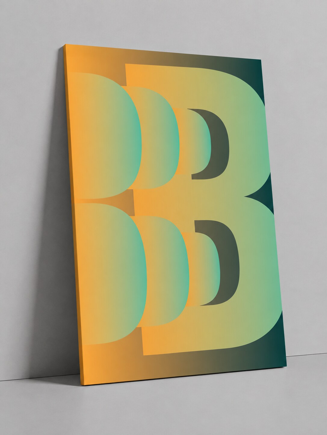
3. BOLD Poster Yellow Variant
News, insights, case studies, and more from the rausr team — straight to your inbox.
Send us your brief, your wildest idea, or just a hello. We’ll season it with curiosity and serve back something fresh, cooked with care.