DARKWOOD Poster Made From Letter D
A dark typographic poster from the single-letter series, built from the letter D and shaped into a moody interior-ready visual system.
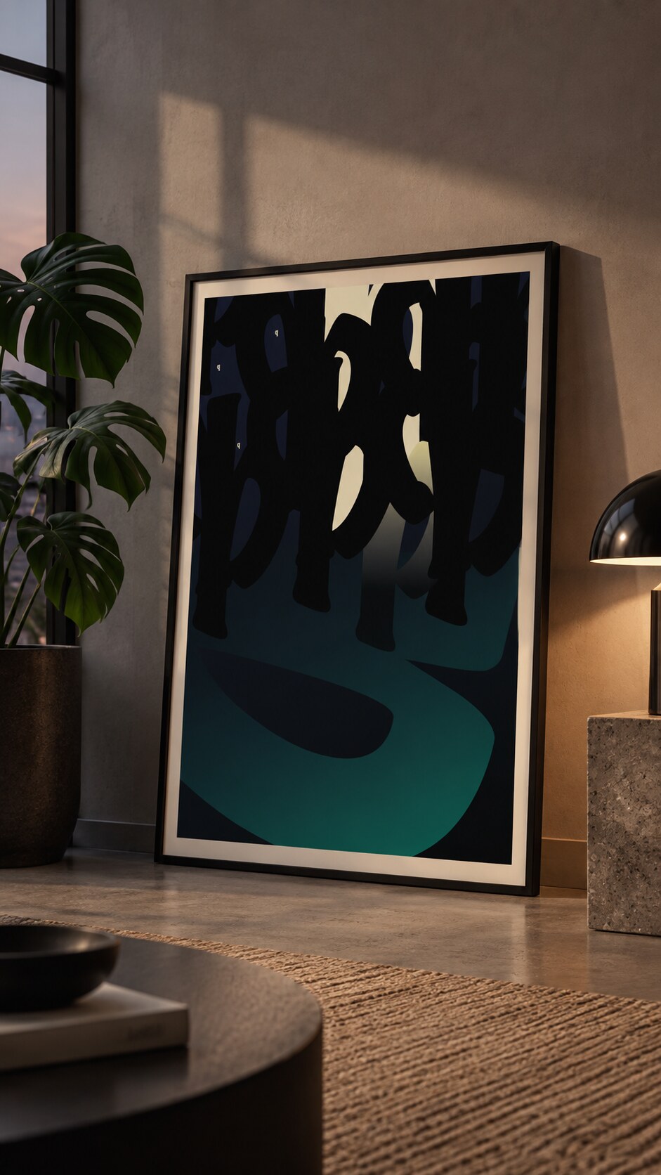
A dark typographic poster from the single-letter series, built from the letter D and shaped into a moody interior-ready visual system.
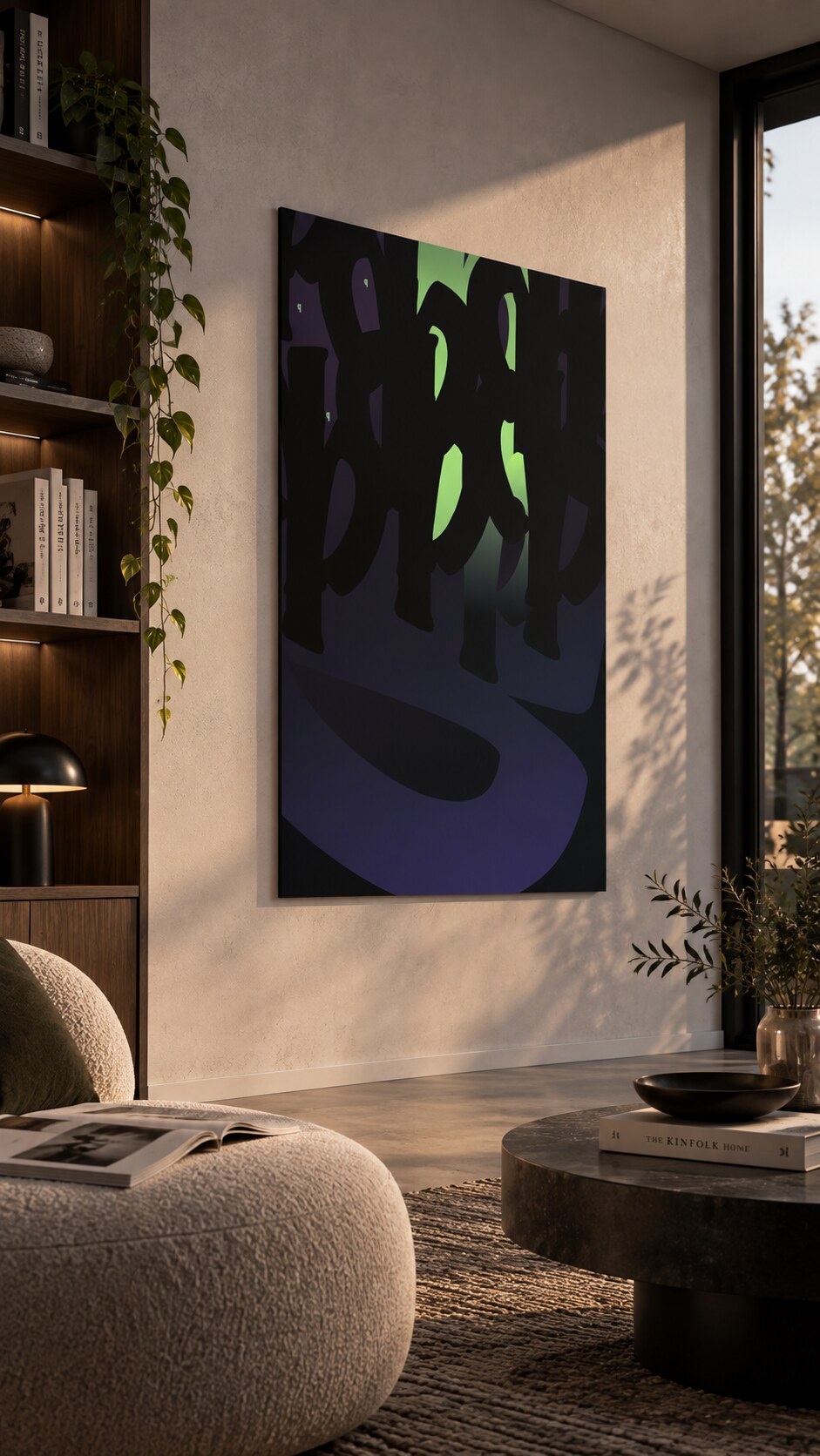
1. Darkwood Green Light Interior 1
2. Darkwood Yellow Light Interior on the Ground
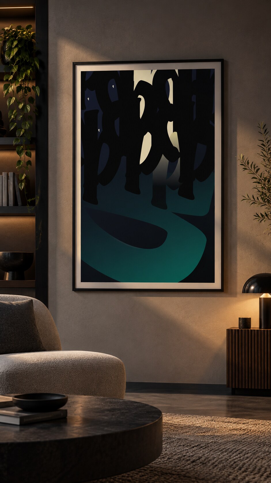
3. Darkwood Yellow Light Interior on the Wall
DARKWOOD is another piece from the single-letter poster series. This time the system is built around the letter D (as d version), using its heavy curve and vertical stem as the base for a dark, layered composition made for a quiet interior mood.
The letter D is repeated, enlarged, cropped, and pushed into the edges of the poster. Instead of treating typography as a caption, the letter becomes the main image. Its repeated forms create depth, rhythm, and a slightly hidden structure that only slowly reveals itself.
“The poster keeps one simple rule again: use a single letter until it becomes the full visual world.”
The palette works with black, deep blue, muted violet, and green light (or in second version with more natural yellow light). The result feels more interior, nocturnal, and wood-toned than the brighter parts of the series. Small bright openings inside the letterforms help the composition breathe while keeping the overall character calm and dense.
This case study shows how the same letter-series idea can shift into a different emotional register. DARKWOOD is less loud and more atmospheric, designed to sit naturally in darker rooms, warm wood settings, and interiors where the poster should feel bold without becoming noisy.
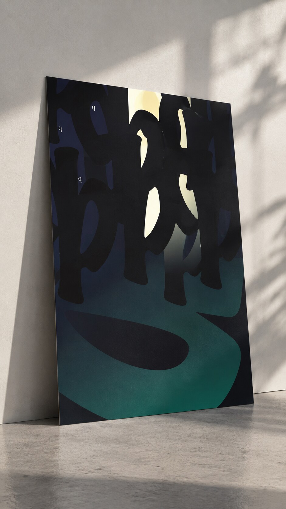
4. Darkwood Poster Yellow Light
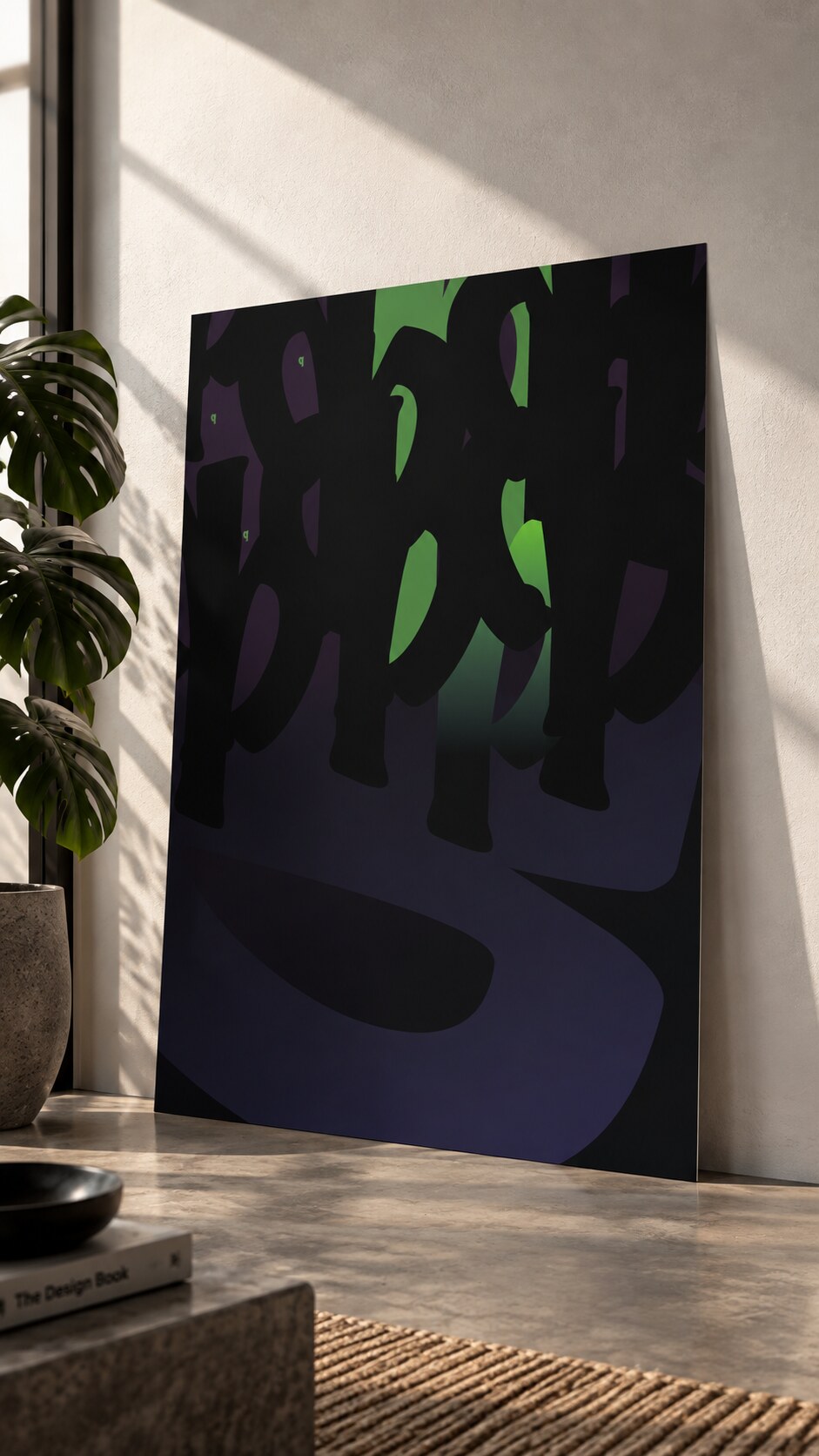
5. Darkwood Poster Green Light
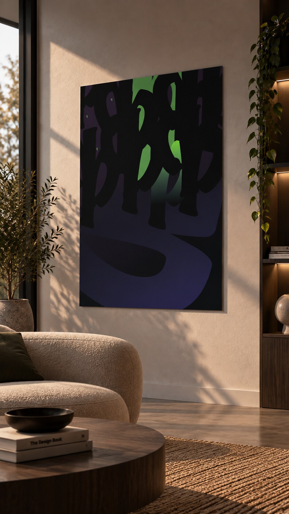
6. Darkwood Green Light Interior 2
News, insights, case studies, and more from the rausr team — straight to your inbox.
Send us your brief, your wildest idea, or just a hello. We’ll season it with curiosity and serve back something fresh, cooked with care.