Collection of Poster Madam Fam Pompa
An experimental poster collection combining bold typography with simple vector line illustration, exploring feminine body shape, beauty, vulnerability, and contrasting color palettes.
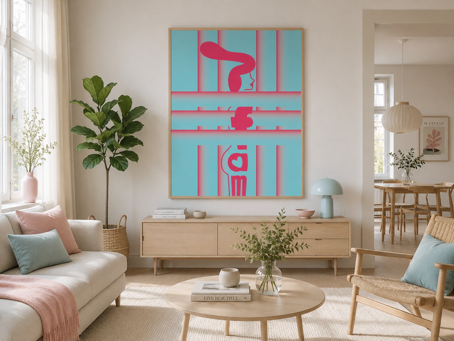
An experimental poster collection combining bold typography with simple vector line illustration, exploring feminine body shape, beauty, vulnerability, and contrasting color palettes.
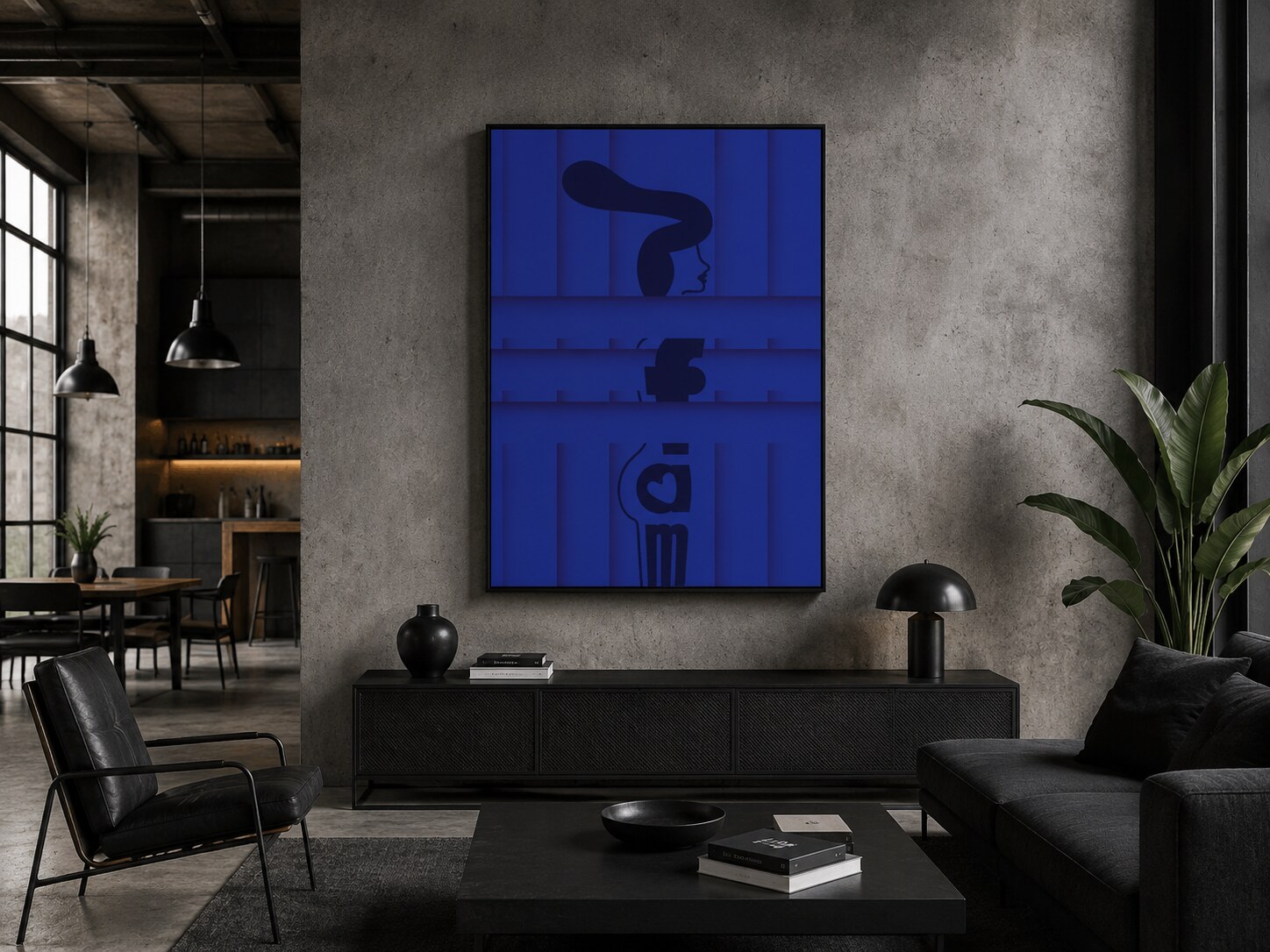
1. Blue Variant
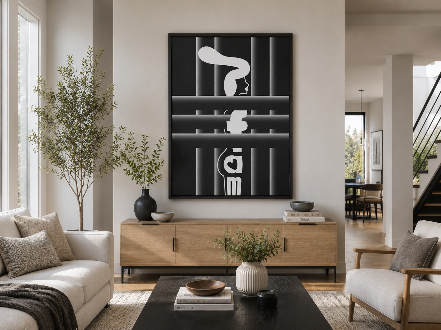
2. Black&White Variant
3. Aquamarine Variant
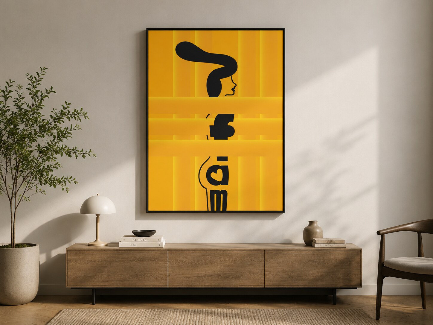
4. Yellow Variant
A collection of experimental posters built from expressive typography and minimal vector line drawing. The central motif reduces the female figure into simple contours, cropped forms, and bold letter shapes, placing attention on body rhythm, elegance, and the visual tension between beauty and modesty.
The series treats typography and illustration as one continuous structure. Letter fragments, facial profile, and body lines are composed together so the poster reads both as text and as figure. The drawing stays deliberately simple, almost sign-like, which gives more weight to silhouette, posture, and proportion.
“The goal was to say as much as possible with the fewest lines and shapes, then let color completely change the emotional tone.”
Each version of the poster was tested in a different color atmosphere, from sharper high-contrast treatments to softer or warmer palette shifts. The dark figure and typographic structure remain the anchor, while the surrounding tones change how the same body form is perceived: more intimate, more direct, more graphic, or more playful.
The posters are centered on the beauty of body shape and the way nudity can feel both confident and restrained at the same time. Rather than presenting the figure literally, the composition abstracts it through typography and vector linework, creating a balance between sensuality, shame, concealment, and visual clarity. Shown together, the variations function as a compact study in how one motif can shift through color, contrast, and composition while preserving the same core idea.
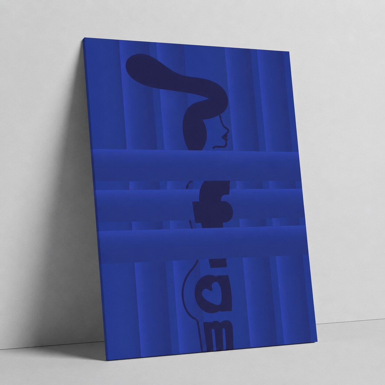
1. Blue Variant
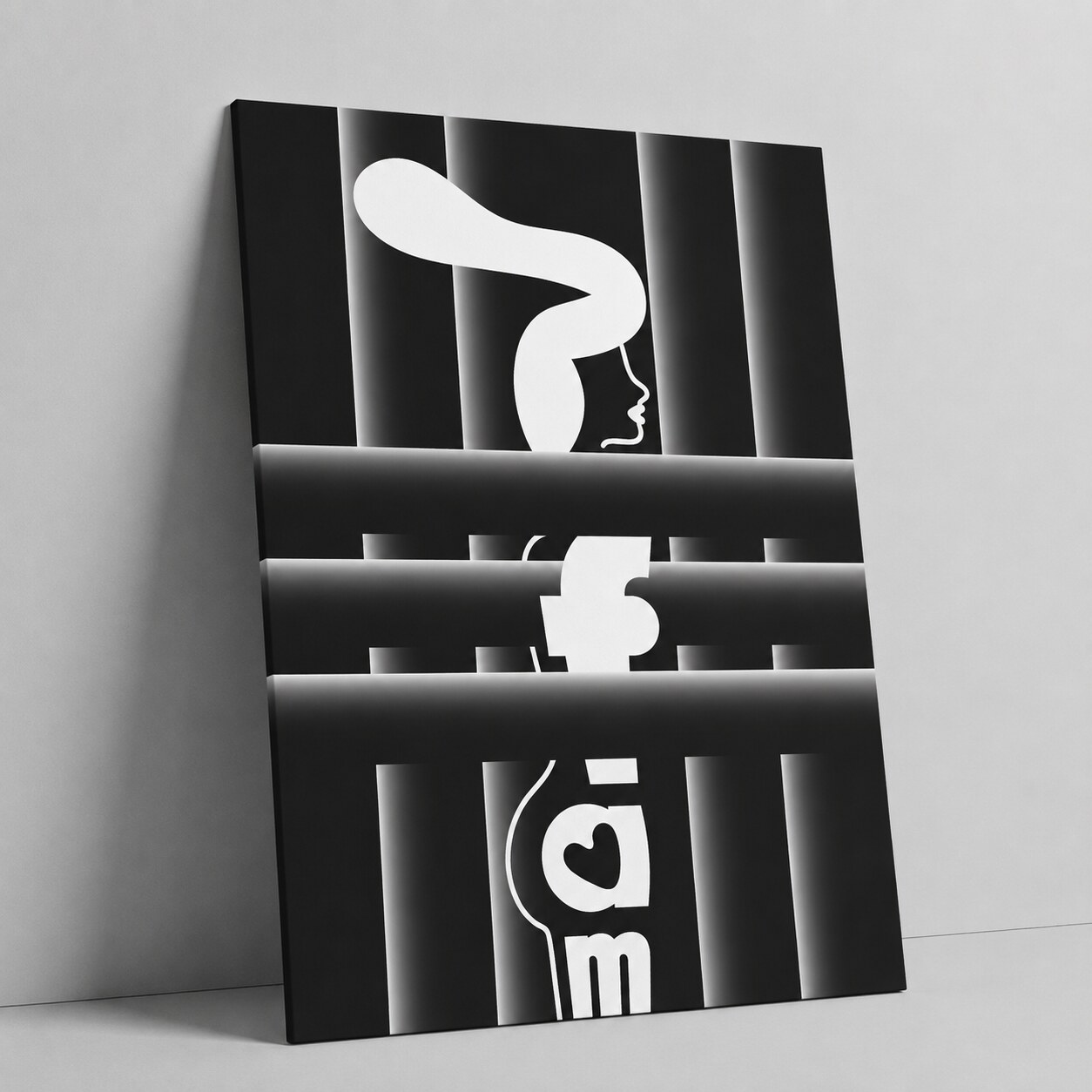
2. Black&White Variant
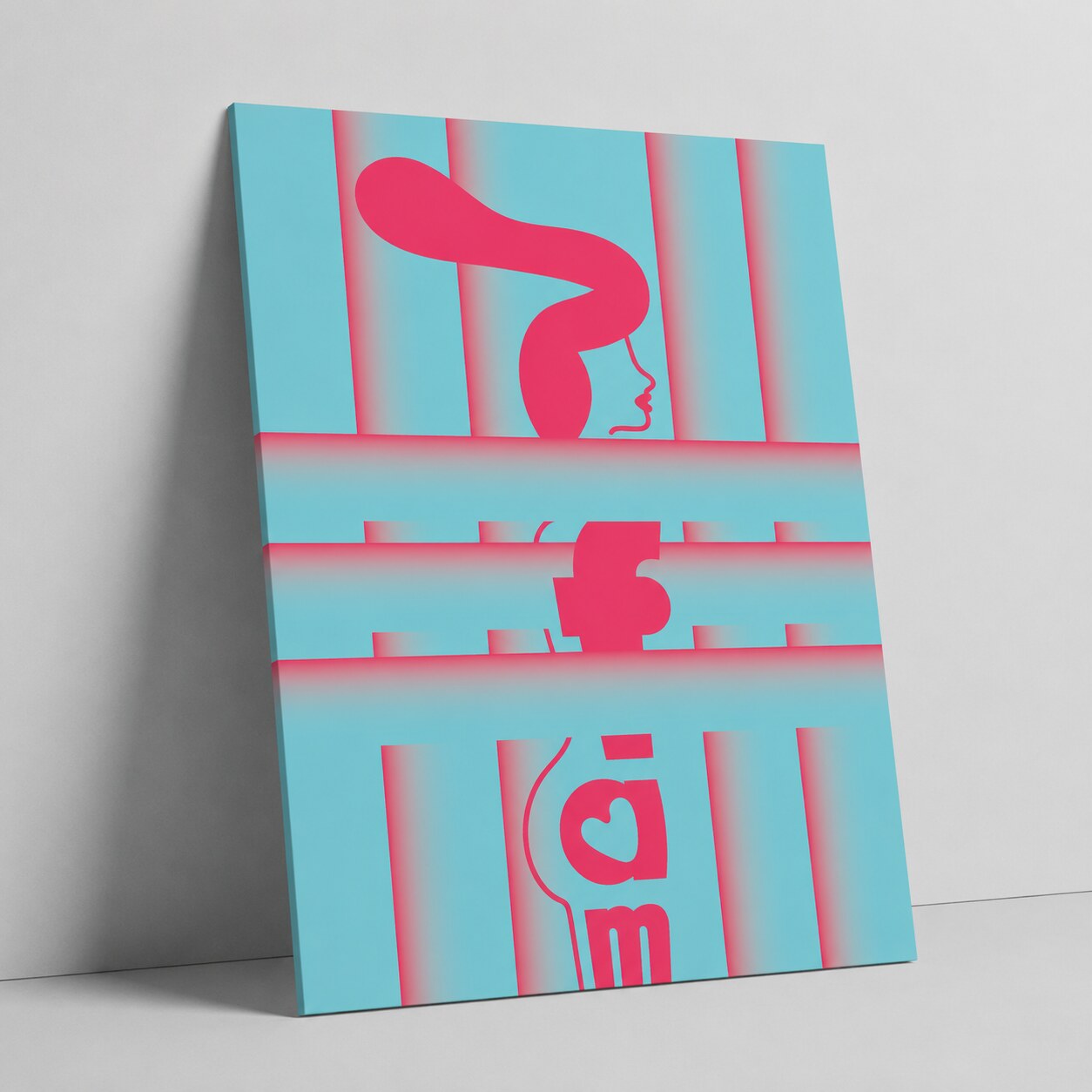
3. Aquamarine Variant
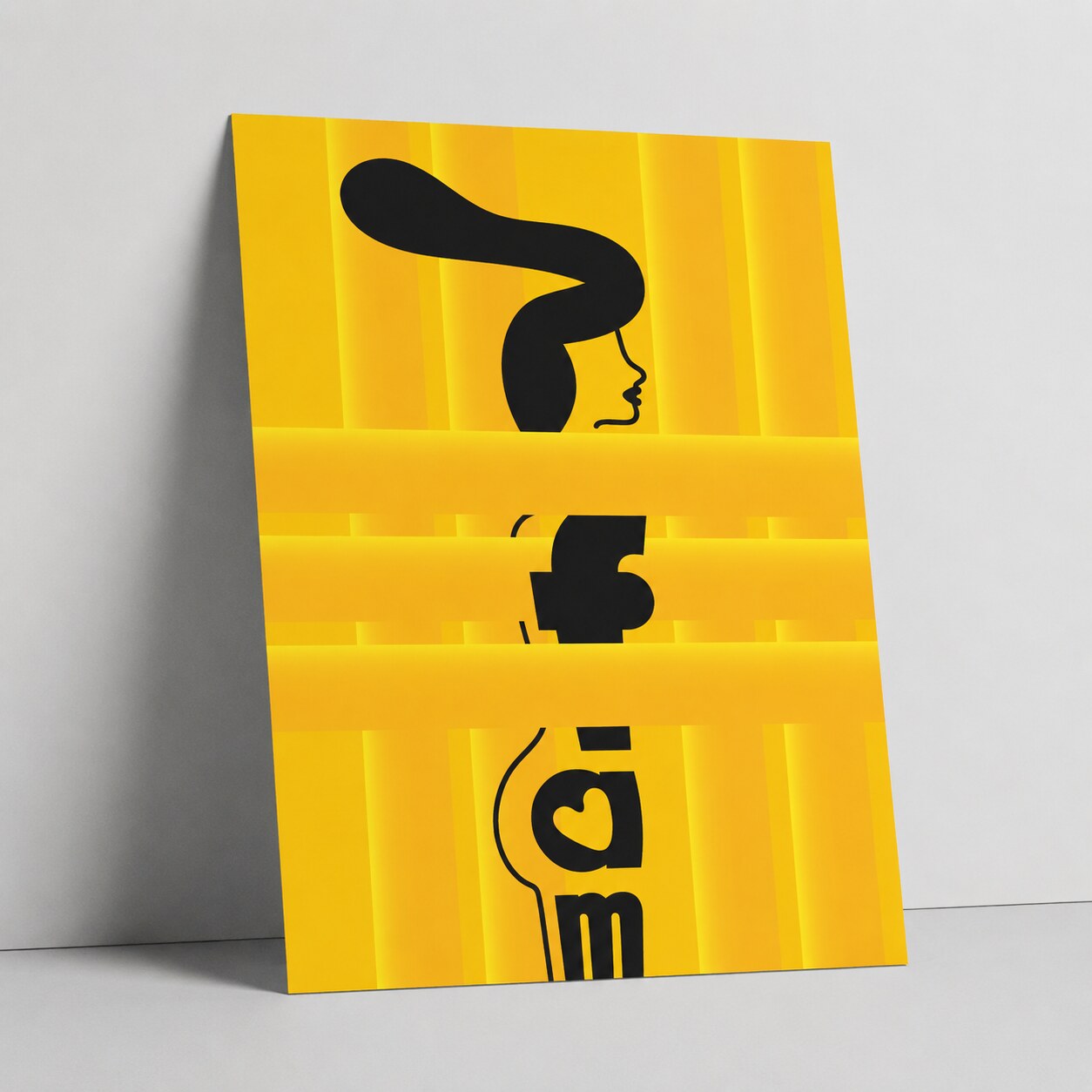
4. Yellow Variant
News, insights, case studies, and more from the rausr team — straight to your inbox.
Send us your brief, your wildest idea, or just a hello. We’ll season it with curiosity and serve back something fresh, cooked with care.