Collection of Various Logo Designs
A collection of various logos, created for the various brands and contests.
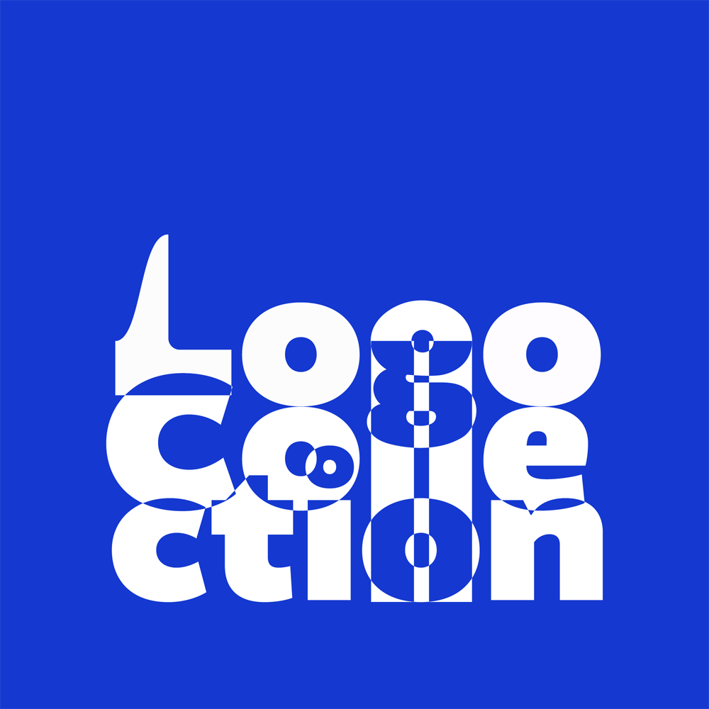
A collection of various logos, created for the various brands and contests.
1. Hokkaido
2. Mynd
3. Rezort Piešťany
4. Anomalia
5. Sunder
6. Turnmark
7. Paradox
8. BKIS
9. YSKD 2021
10. Luminus
11. CEE
12. Bohemia Sport
A curated collection of various logotypes and brand visuals designed over time for clients, competitions, and self-initiated concepts. The goal was to always reflect the nature of each brand while retaining visual clarity, originality, and versatility.
The HOKKAIDO logo merges clean, geometric typography with a minimalist circular graphic element replacing the “O,” evoking a cup of soup. The monochrome palette emphasizes clarity and precision, aligning with modern Japanese aesthetics.
The Mynd logo features a bold, modern wordmark where the “M” is stylized with dynamic cuts and mirrored angles, resembling wings or abstract neural connections—suggesting creativity, transformation, and intelligence. The rest of the typography remains clean and rounded, creating contrast and balance.
“This logo proposal combines elegance and simplicity to reflect the spa town’s identity.”
The icon, inspired by thermal water drops and stylized leaves, evokes nature, wellness, and healing—key themes of the Piešťany region. The use of clean lines and a modern sans-serif typeface positions the brand as both contemporary and rooted in tradition.
A custom logotype built from angular and experimental letterforms to reflect the brand’s core concept—creativity beyond convention. The letter “O” is stylized as a central dot within a circle, hinting at a lens or abstract eye, reinforcing the theme of observation, uniqueness, and vision.
“The entire identity evokes a strong, avant-garde aesthetic that fits well with cutting-edge or artistic fields.”
The Sunder logo uses bold uppercase typography paired with a stylized fruit splash symbol to communicate freshness and energy. The abstract drops above the wordmark resemble both juice splashes and leaves, reinforcing the natural, plant-based origin of the product.
“Simplicity and strong shape ensure recognizability across packaging and promotional materials.”
The Turnmark logo integrates directional symbolism directly into the typography by modifying the letter “T” into a stylized intersection with arrows. This visual cue clearly communicates the company’s industry—road signage and traffic direction. The italicized wordmark reinforces a sense of movement, progress, and directionality.
The Paradox logo plays with pronunciation and unexpected symbolism. At first glance, it’s a bold, bubbly wordmark with soft, playful curves. But listen to it aloud—“paradogs”—and suddenly the stylized “x” begins to resemble a leaping, abstract dog figure. This subtle twist is both humorous and memorable, evoking themes of rebellion, personality, and contradiction. Much like a parachute full of dogs—chaotic, curious, and full of character—the brand aims to break convention in the fashion space.
“Perfect for apparel that doesn’t take itself too seriously, yet makes a serious impression.”
“The BKIS logo was designed to balance institutional presence with approachability.”
The symbol resembles both a stylized letter “B” and a gateway or arched window—referencing Bratislava’s architecture and its cultural openness. The custom serif typography blends tradition with a contemporary touch, supporting the idea of a modern cultural hub rooted in local heritage. This identity was intended to function across signage, print materials, and digital channels with clarity and elegance.
A typographic concept that highlights the calendar year by visually integrating the number “1” into a vertical line that also functions as a graphic element.
“The minimalist layout allows the text to breathe while reinforcing the theme of time, progress, and national identity.”
The use of an all-caps sans-serif font emphasizes clarity and universality—suitable for a broad range of media promoting contemporary Slovak design.
“The Luminus logo draws inspiration from traditional lighthouse silhouettes and classical typography.”
The standout element—a stylized beacon beam extending from the “i”—suggests guidance, clarity, and illumination. This minimalist signal subtly communicates the company’s core offering without relying on literal imagery. The sharp serif typeface grounds the identity in trust and heritage, while the overall design remains modern and versatile for both print and digital applications.
“The redesigned CEE logo retains the core symbolism of infrastructure and nature while modernizing the composition.”
The circular mark fuses a stylized cityscape, road, and tree—reflecting the interdisciplinary focus of civil and environmental engineering. The large “C” doubles as a frame and an initial, creating a sense of openness and integration. Paired with bold, geometric lettering, the refreshed logo balances clarity, structure, and purpose—fitting for an academic and technical publication.
“This logo redesign was developed under tight time constraints, focusing on a quick yet impactful modernization.”
The abstract emblem, resembling mountain peaks or stylized ski tracks, directly connects to Bohemia Sport’s focus on winter gear and alpine activities. The use of bold, compact typography ensures high legibility in large formats, while the upward motion of the icon adds energy and forward momentum. Despite the rapid turnaround, the final result achieved clarity, distinctiveness, and thematic relevance for the exhibition environment.
News, insights, case studies, and more from the rausr team — straight to your inbox.
Send us your brief, your wildest idea, or just a hello. We’ll season it with curiosity and serve back something fresh, cooked with care.