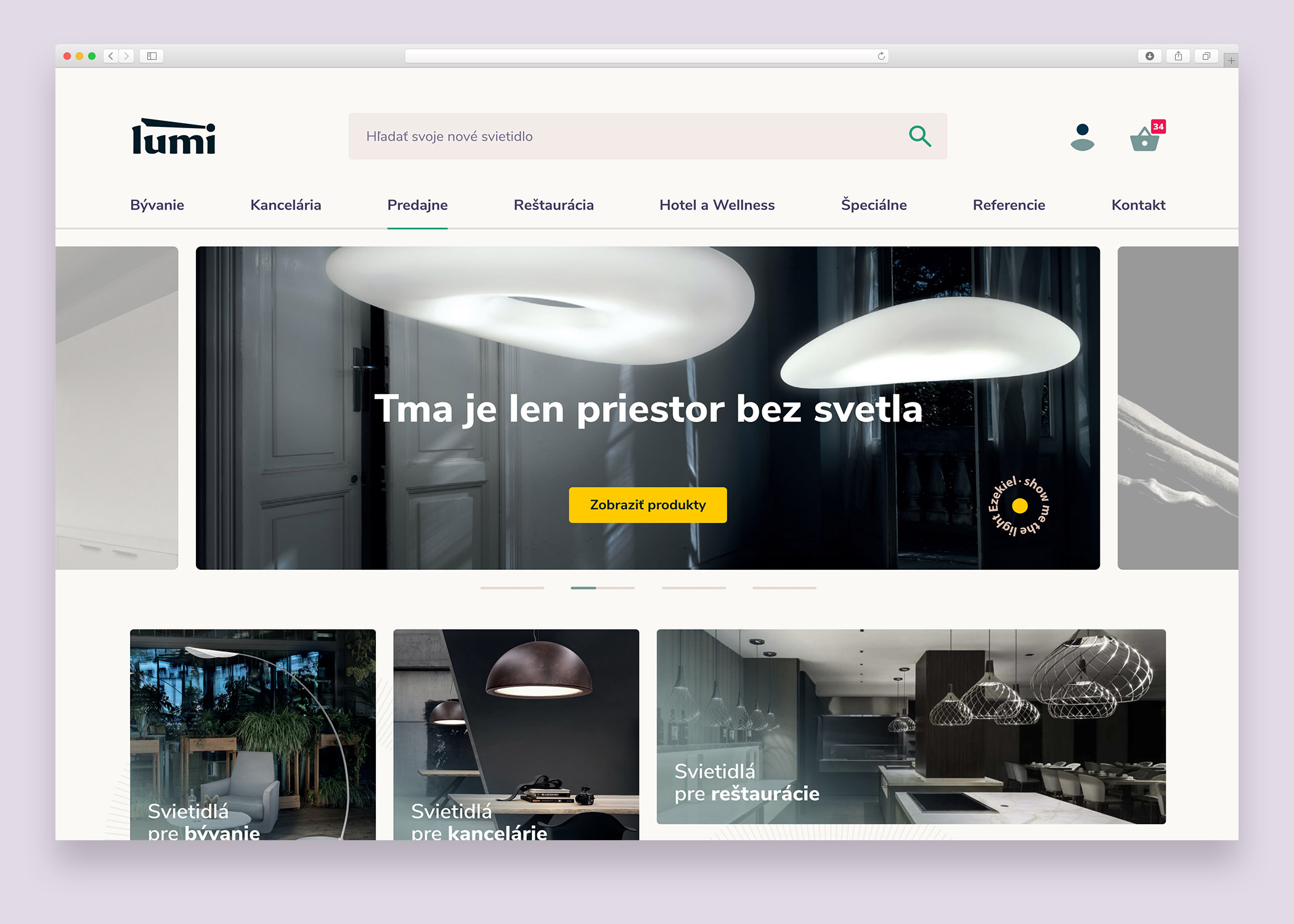
Lumi - Darkness is just space without light
Redesign of a 90's style e-commerce site into a modern shop with focus on UX and UI
Redesign of a 90's style e-commerce site into a modern shop with focus on UX and UI
Lumi - Search and The Header
Lumi - New Article part
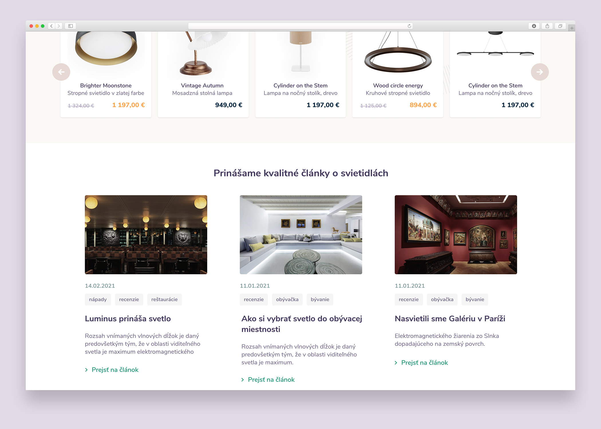
Lumi - Blog part
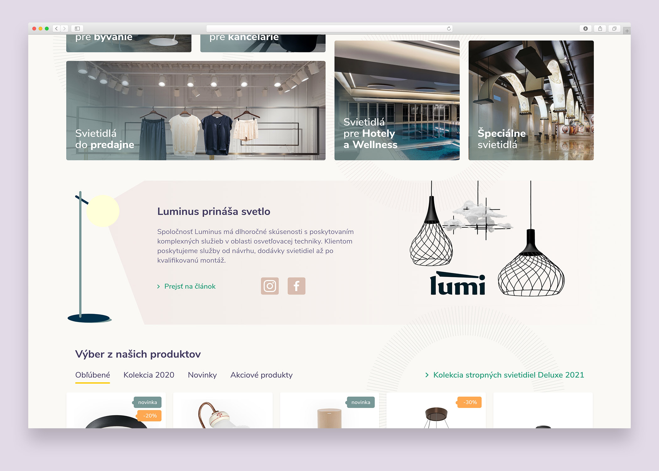
The project started as a redesign of a very old e-commerce site from the 90s. The client needed a modern solution with clear structure and intuitive navigation. We introduced a search bar that, once clicked, displays a full and reasonable offer. Every detail had to have its proper place. Unlike many projects, the logo impact was not the priority—UX and UI design of the shop were the most important goals.
In the early stages, we were searching for the right balance — the perfect color palette, the correct positioning of elements, and just the right amount of breathing space. Some choices felt uncertain at first, but as the design evolved, their purpose became evident. The system was rebuilt with a modern mindset, forming a reliable and scalable framework ready for future expansion.
The visual and graphic design followed a minimalistic and modern approach. Instead of obsessing over logo adjustments like ‘2px left’ or ‘2px top,’ the design emphasized usability, clarity, and the overall flow of the shopping experience.
“The shop interface was carefully structured so users could understand the offer at a glance and navigate through details without confusion.”
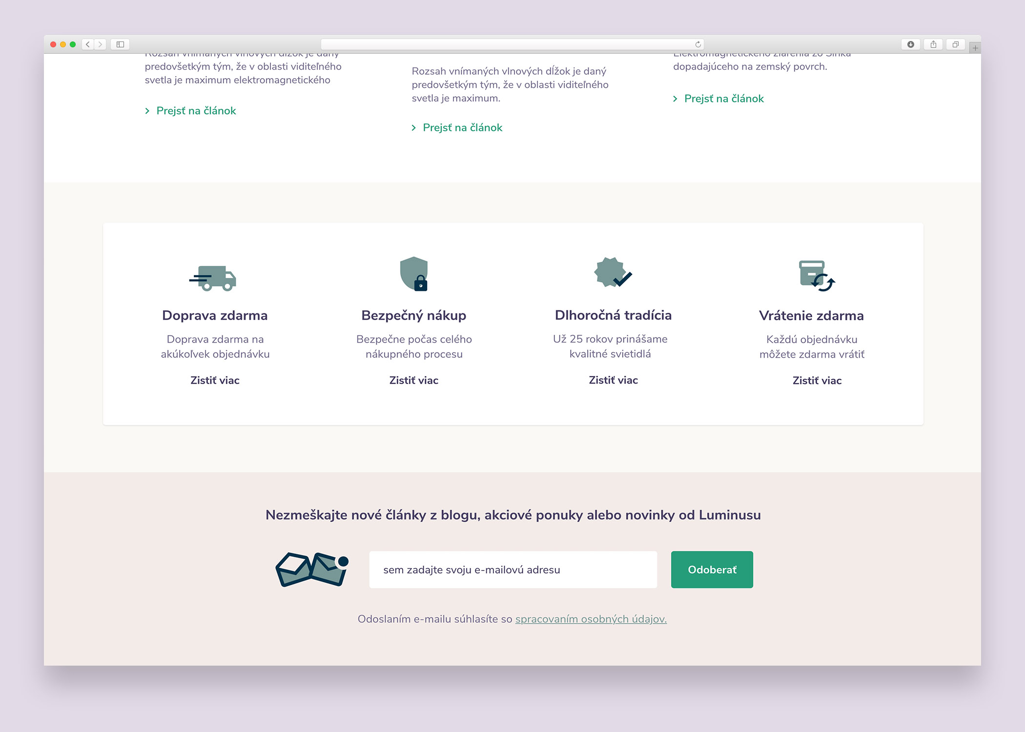
Lumi - Key strengths of the store
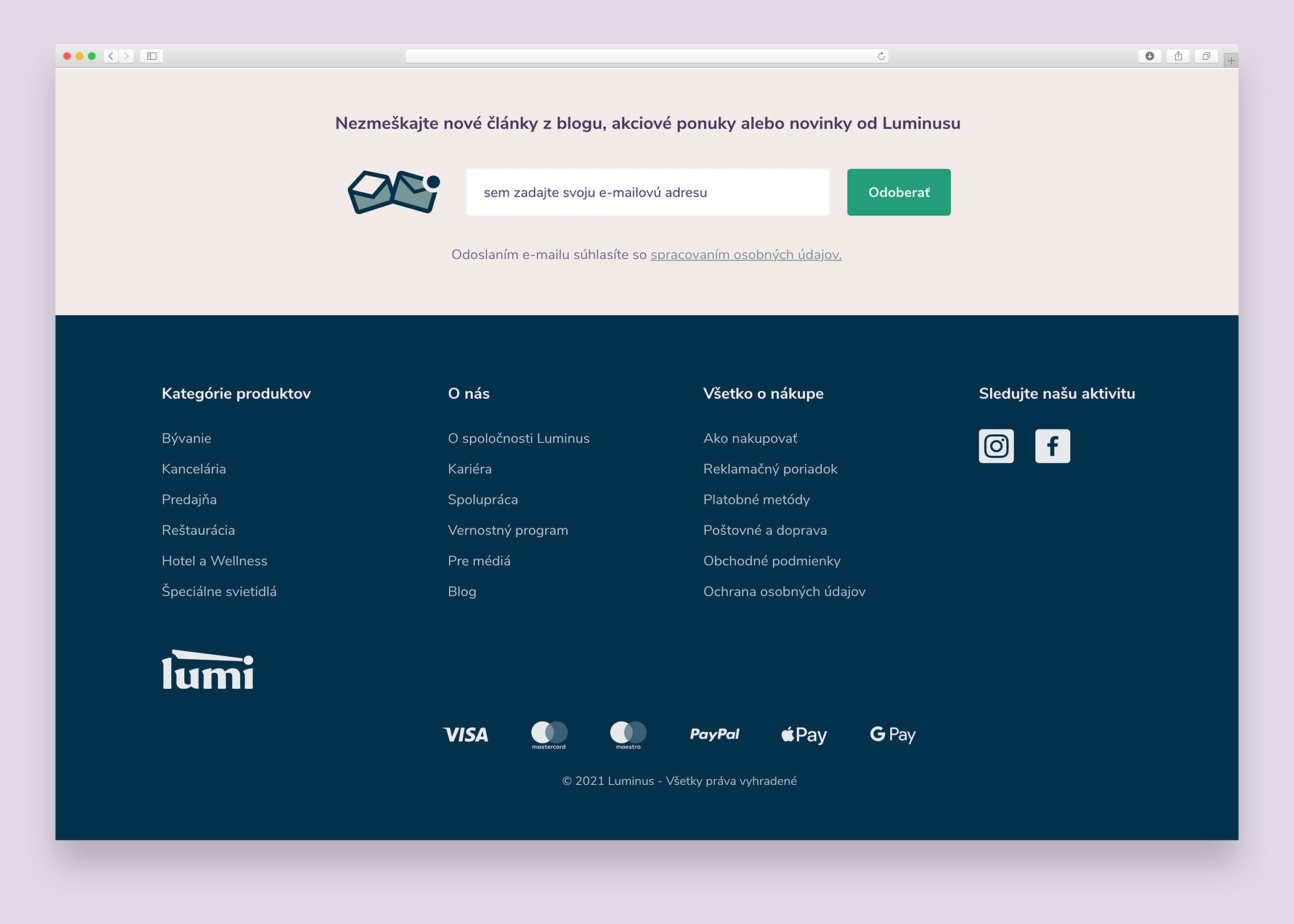
Lumi - Footer
News, insights, case studies, and more from the rausr team — straight to your inbox.
Send us your brief, your wildest idea, or just a hello. We’ll season it with curiosity and serve back something fresh, cooked with care.