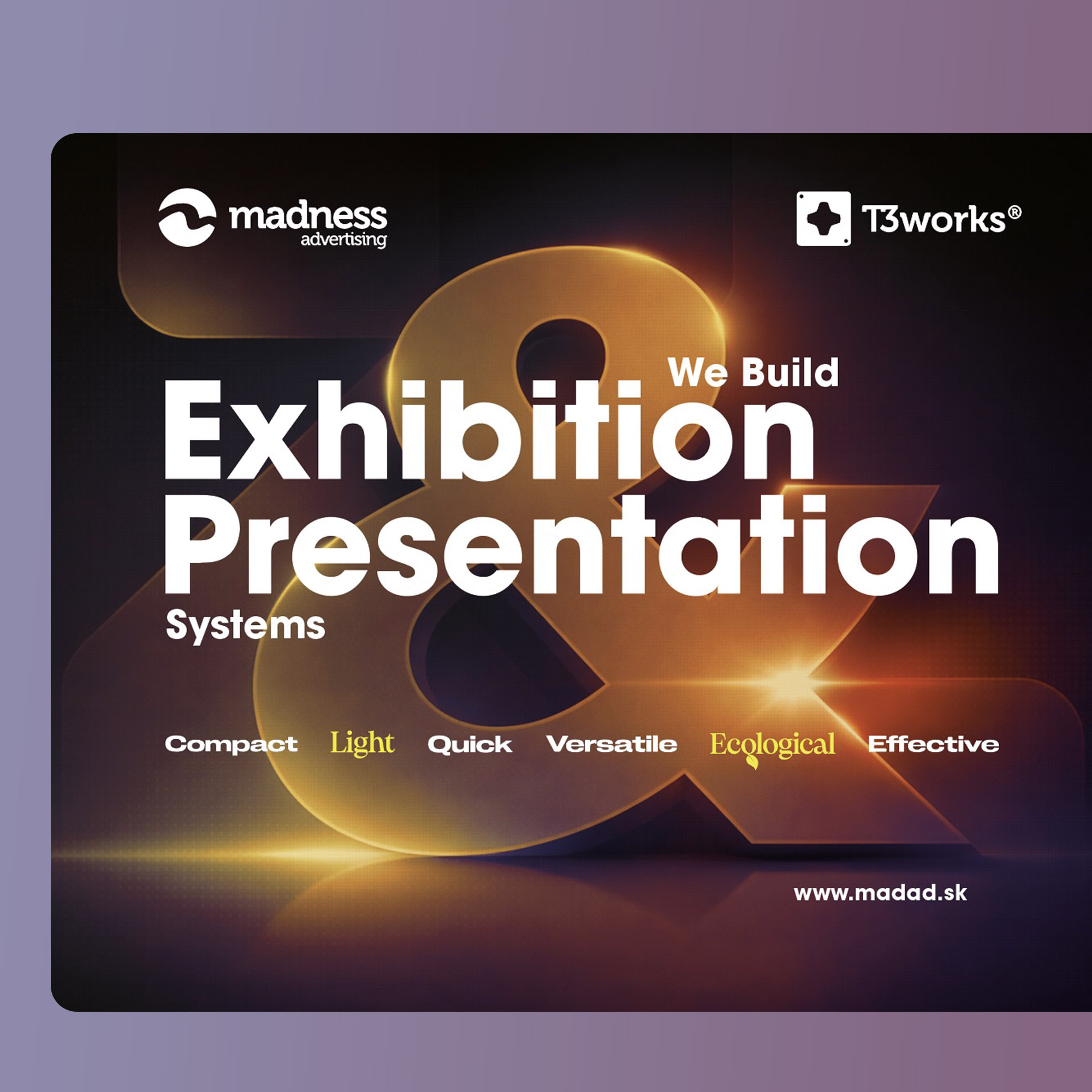
Madad Advert Company Visual 2021
Simple easy-to-edit design based on typography and colorful geometric shapes and patterns.
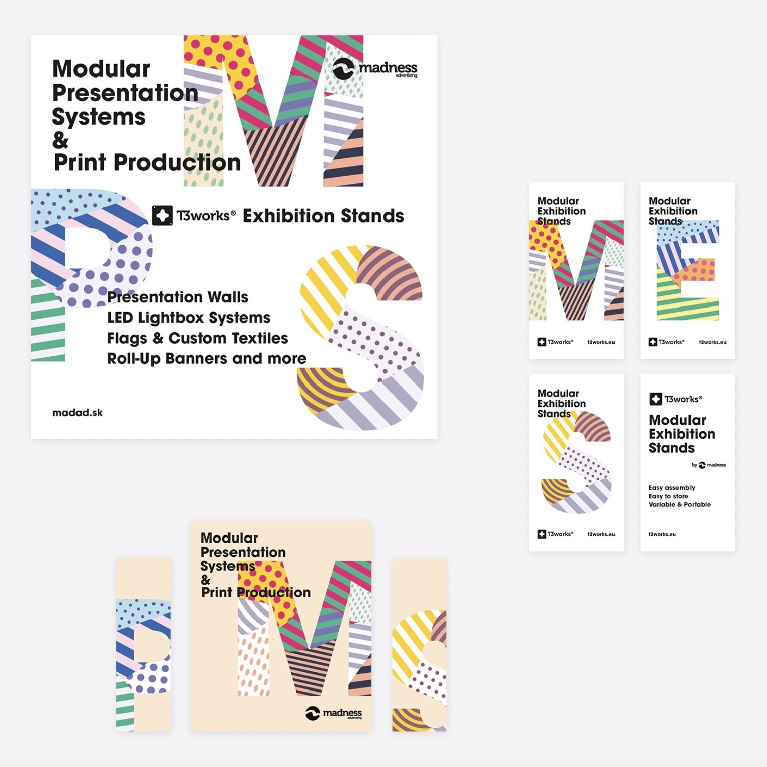
Simple easy-to-edit design based on typography and colorful geometric shapes and patterns.
2D - Complete view
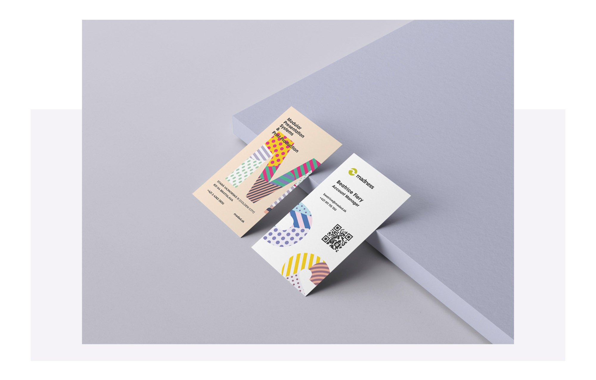
Print - Business card
Almost each year brings a new wave of product launches, exhibitions, and public-facing events—making it essential to update the visual identity with a fresh, relevant direction.
This year’s concept builds on the foundation of the existing design system, maintaining a sense of continuity while introducing refined elements and visual clarity. The updated approach needed to strike a balance between familiarity and innovation, working seamlessly across formats and scales.
The result is a cohesive visual language tailored for both offline and online communication, from print materials and exhibition graphics to digital platforms and social media.
The client requested a visual identity that was simple, flexible, and easy to maintain internally. Typography was to play a leading role, complemented by a vibrant system of geometric shapes and patterns to bring energy and character to the brand.
The solution needed to be adaptable for a wide variety of applications.
The final visual identity delivers a refreshed yet familiar look—one that respects the brand’s existing design while introducing a more vibrant and contemporary voice. Centered around clean typography and playful geometric compositions, the system is flexible enough to support a broad range of content across print and digital media.
“It allows for consistency without rigidity, giving the client the tools to maintain and evolve the identity in-house with ease.”
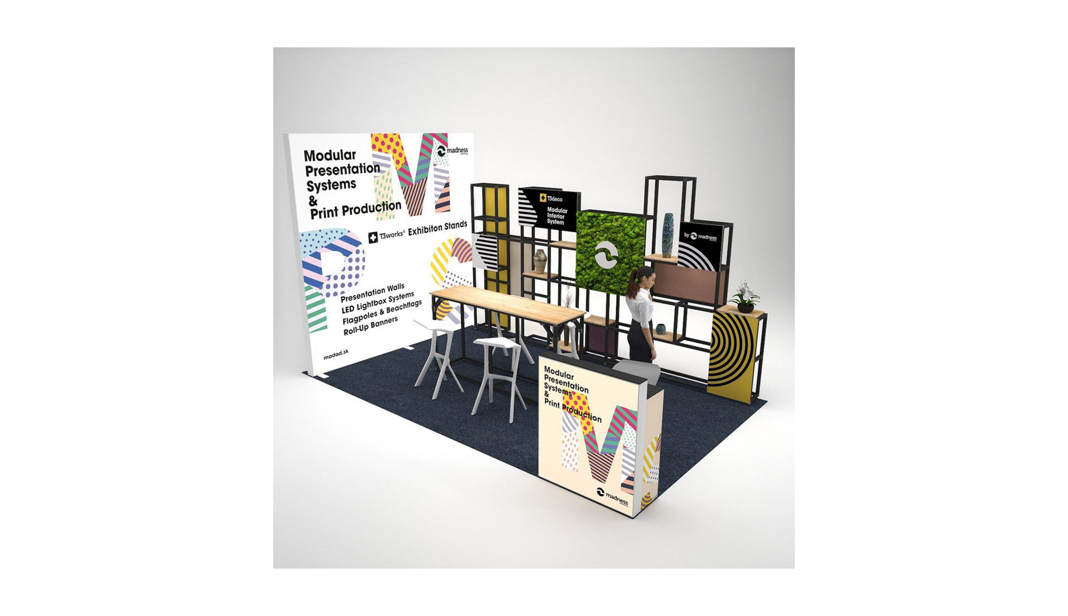
Render - Quick shot
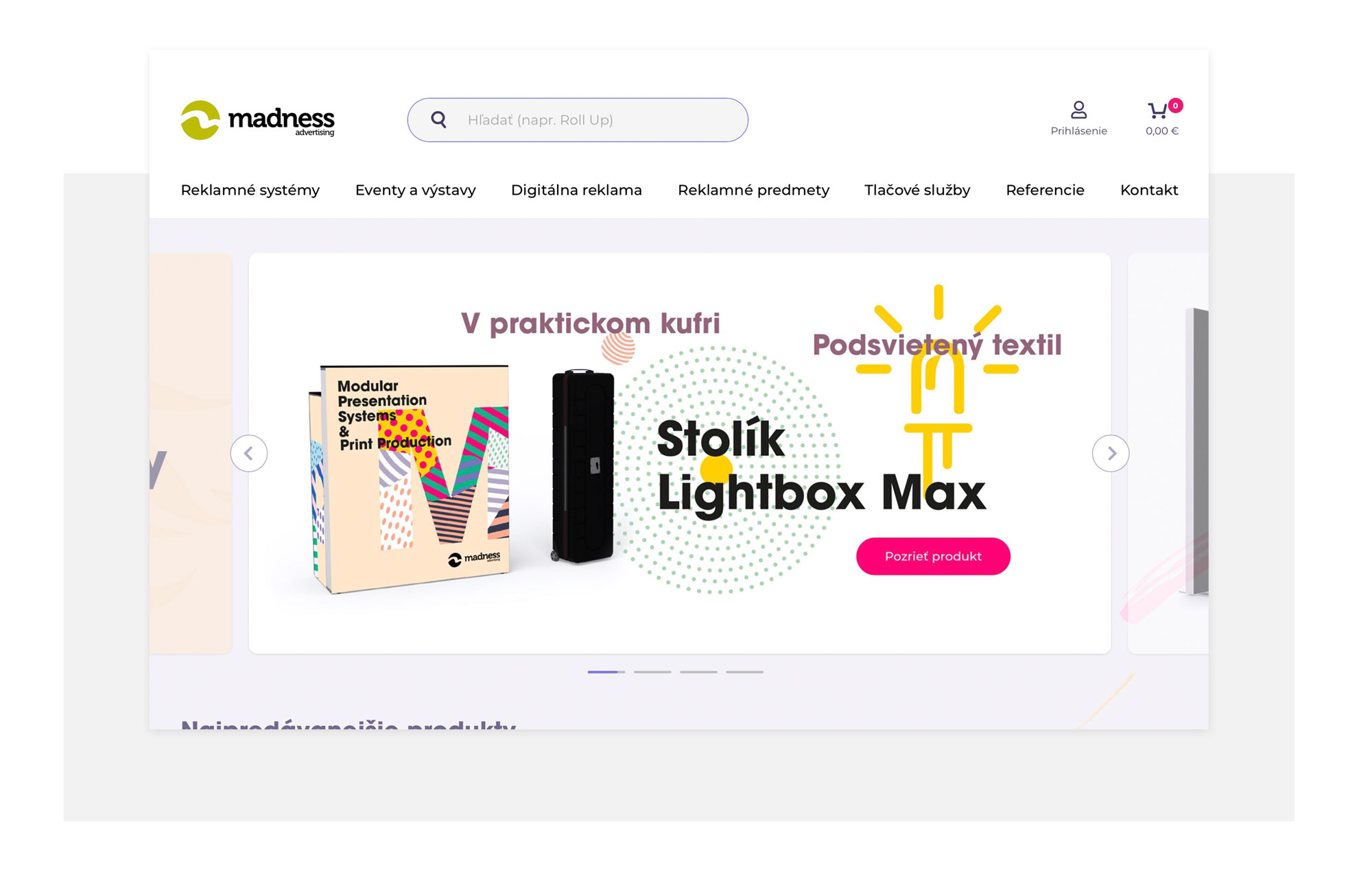
Digital - Banner example
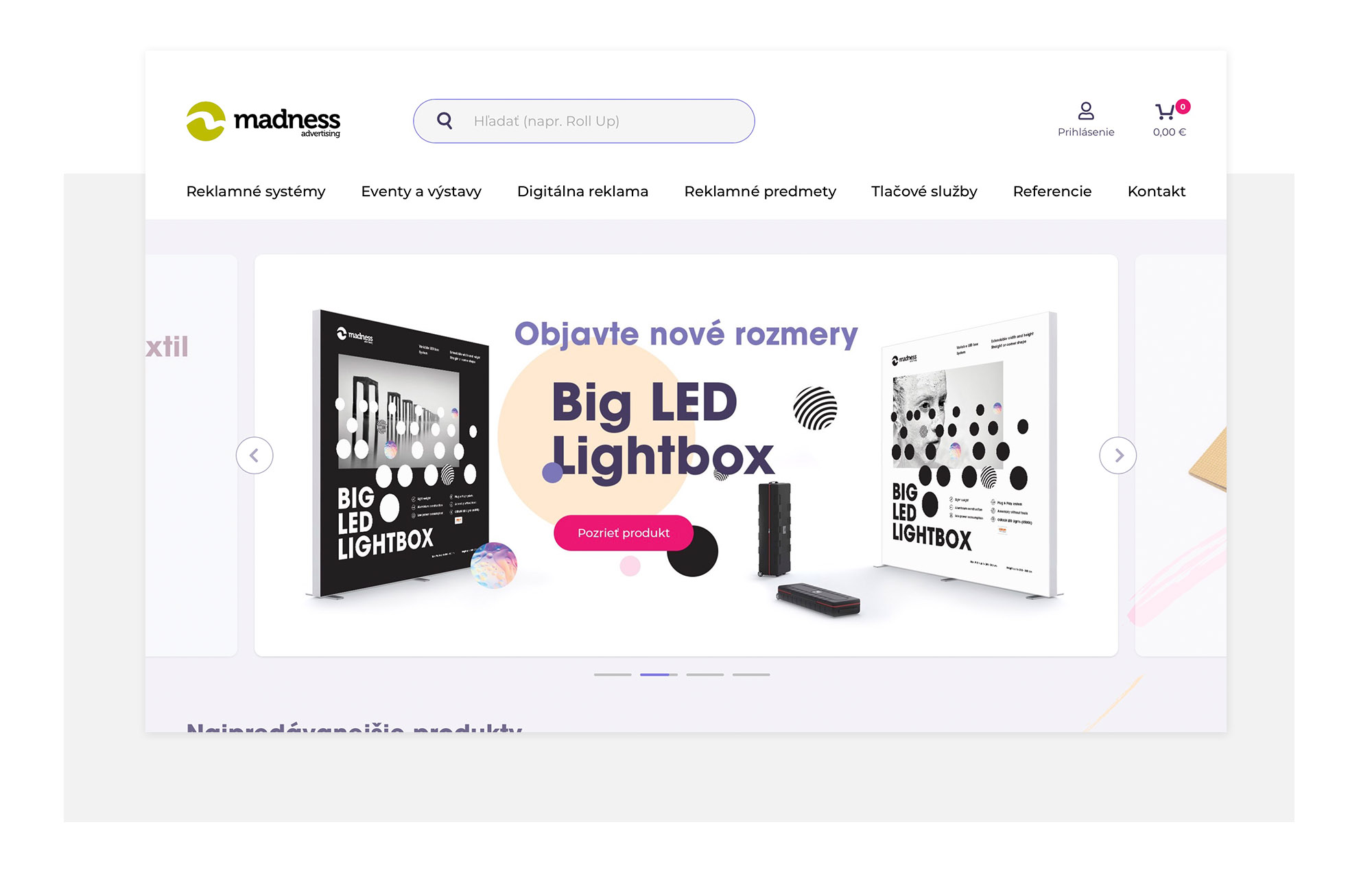
Digital - Banner example
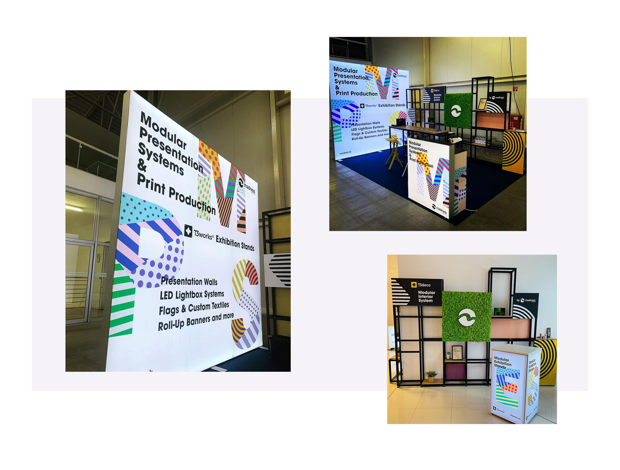
Photo - LED Wall
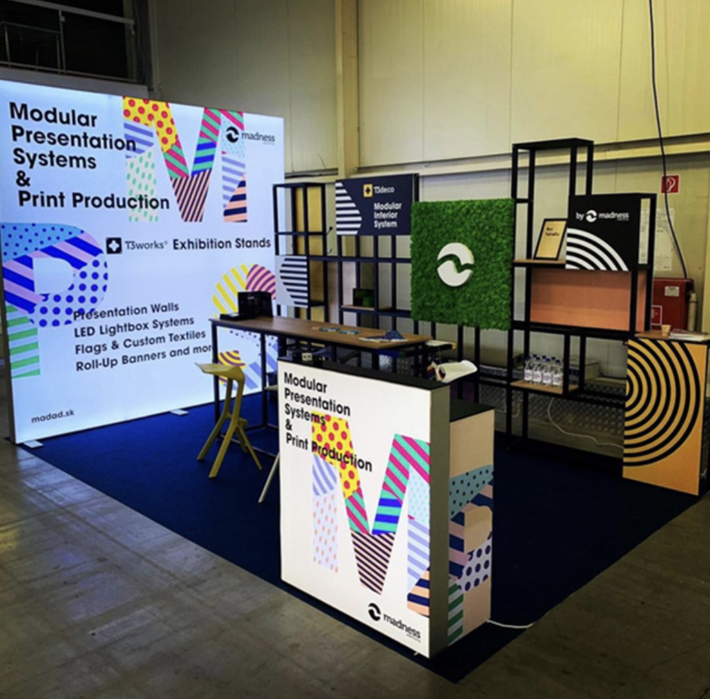
Photo - Exhibition
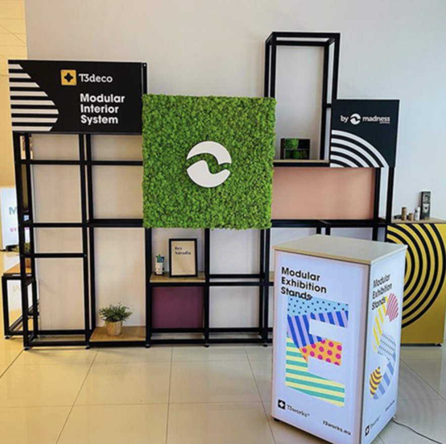
Photo - Showroom
News, insights, case studies, and more from the rausr team — straight to your inbox.
Send us your brief, your wildest idea, or just a hello. We’ll season it with curiosity and serve back something fresh, cooked with care.