Para Dogs are Paradox - Branding and E-commerce UX & UI
Naming, branding and ecommerce UX & UI design for the Paradox brand.
Naming, branding and ecommerce UX & UI design for the Paradox brand.
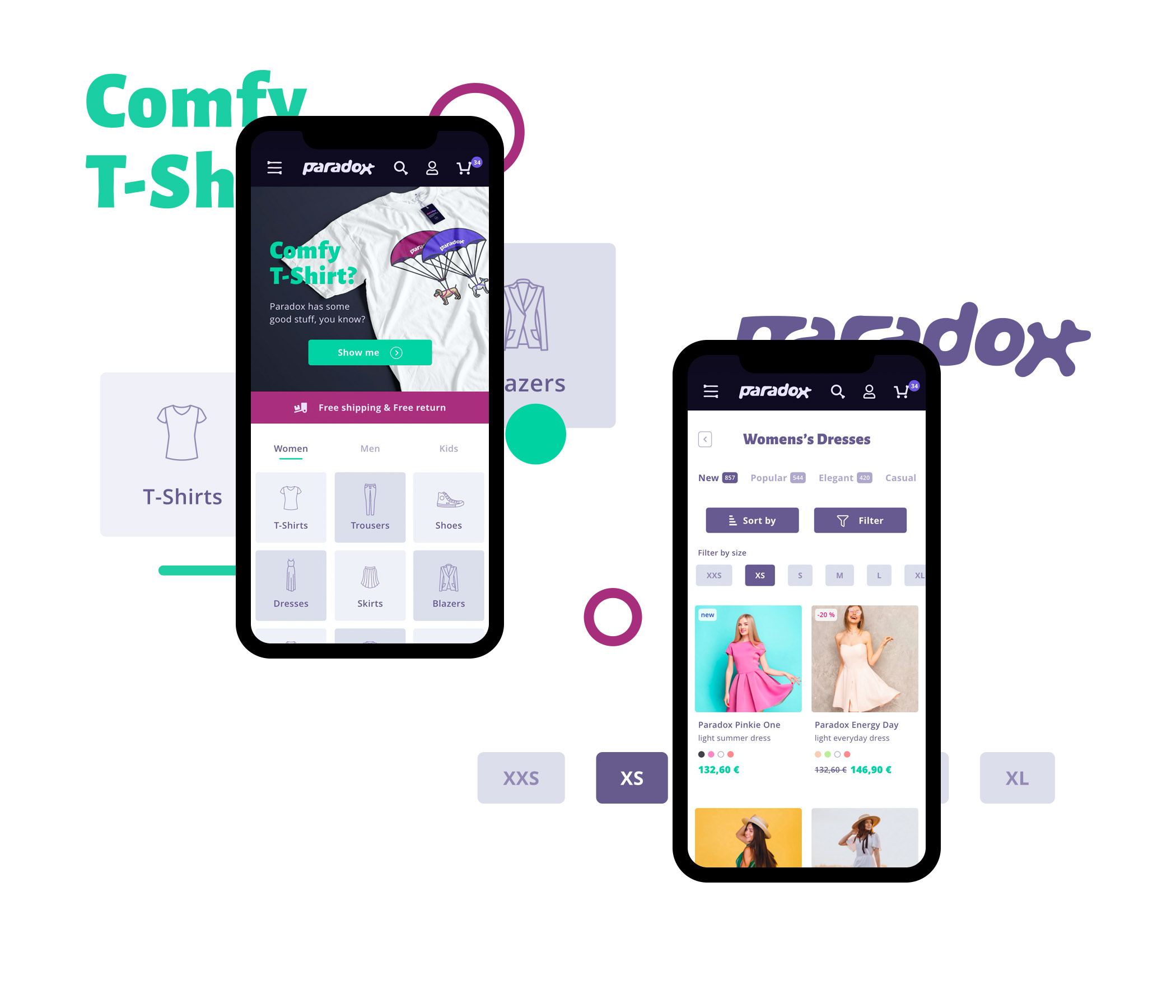
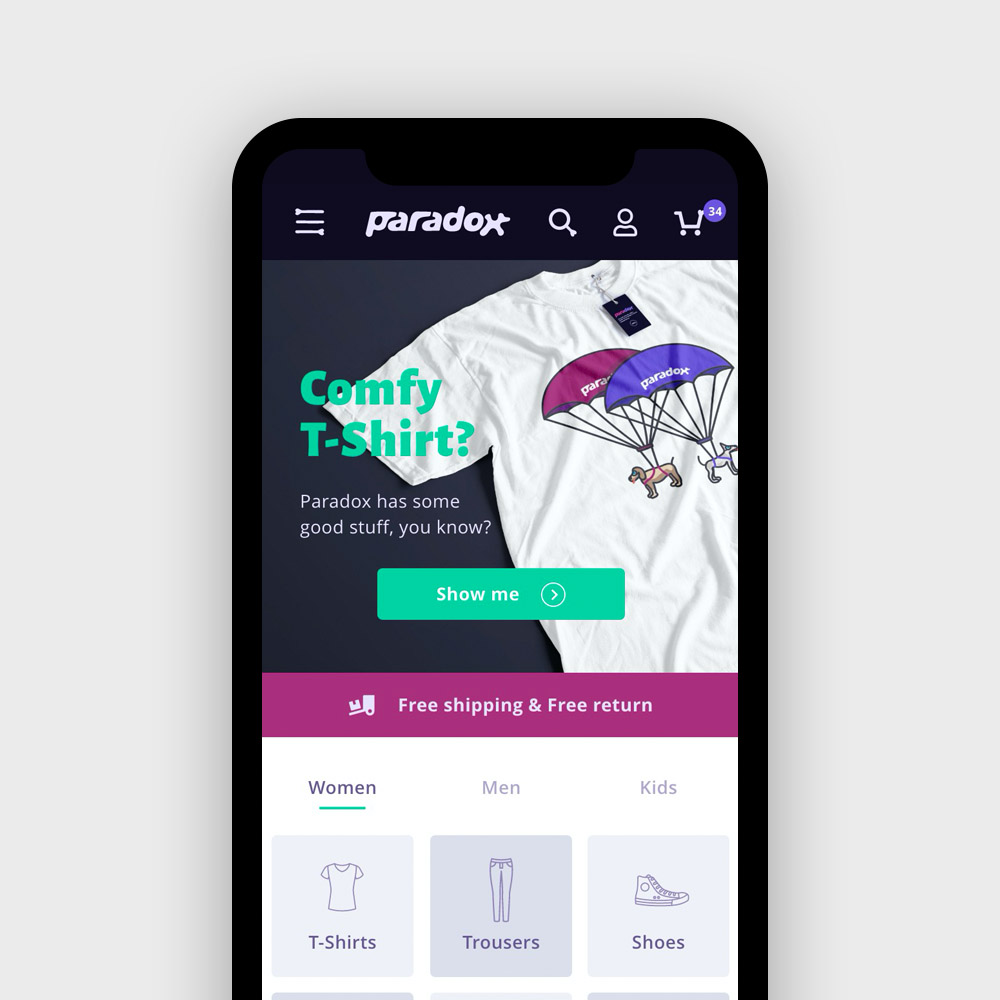
UX-UI website app
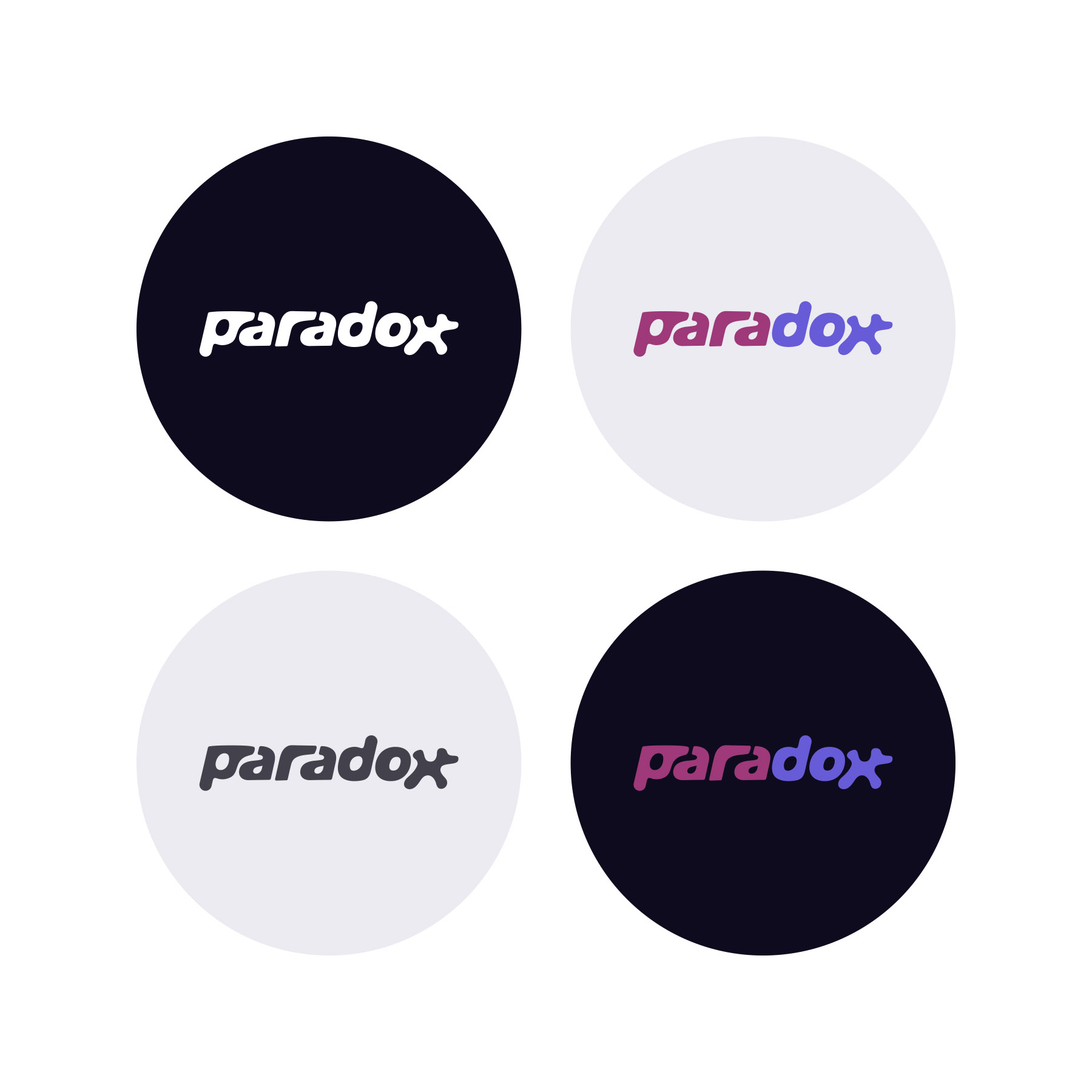
Logo variations
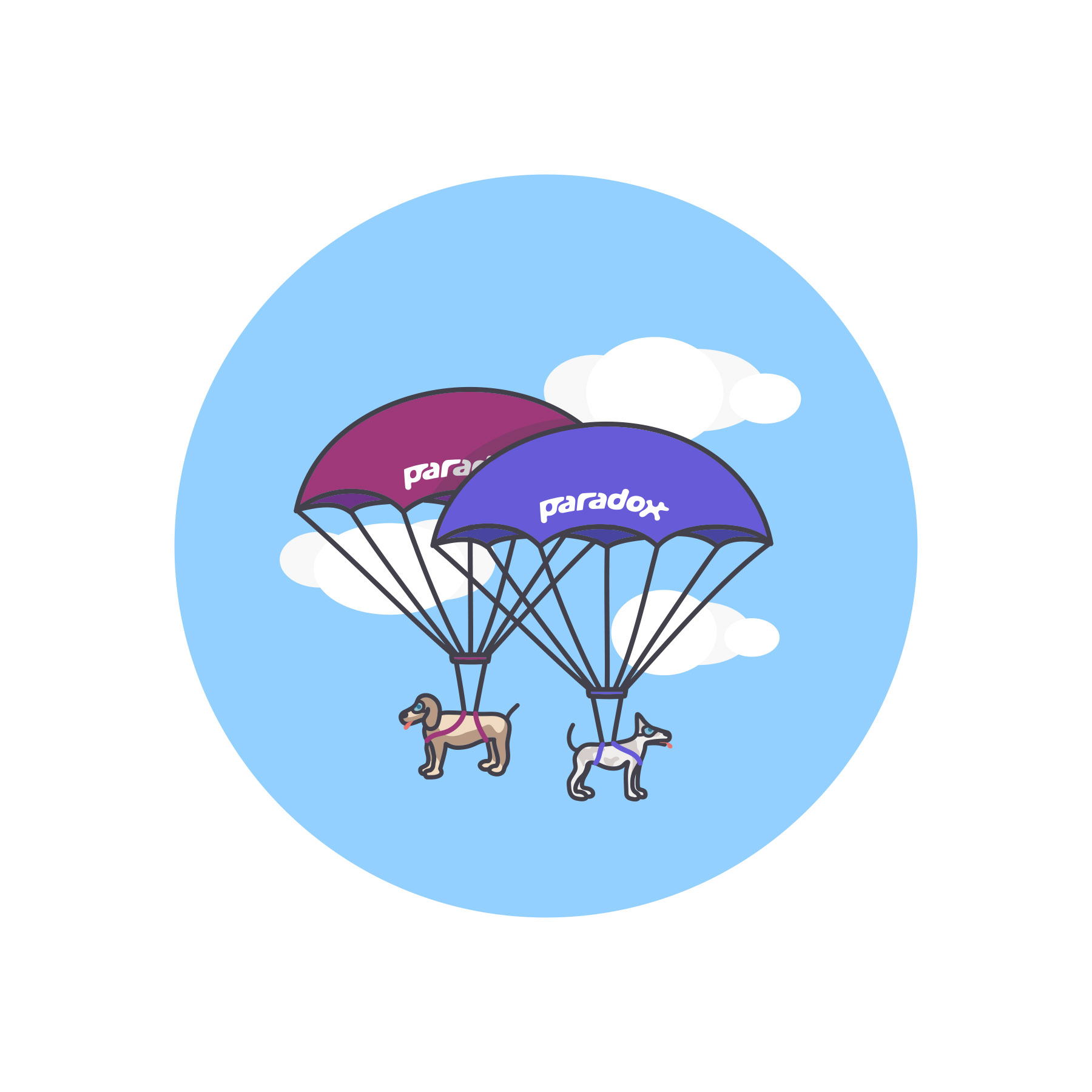
Some Illustrations
The project for Paradox began with a linguistic twist—an accidental slippage between the words “paradox” and “para-dogs.” This humorous and surreal collision became the foundation of a brand that doesn’t take itself too seriously, yet delivers a polished, stylish experience. The goal was to transform this unexpected name into a compelling digital brand identity that bridges the absurd and the aspirational. Drawing inspiration from streetwear culture, playful metaphors, and experimental design language, we crafted a bold ecosystem—from logotype to layout.
The brief was clear: capture the contradictory nature of the name while keeping the user journey smooth and purposeful. The client wanted a design that would feel alive, full of small surprises, without overwhelming functionality. The branding system needed to work across digital and physical formats—starting with the e-commerce experience and expanding into packaging, social media, and future merchandising.
Visually, the brand had to feel both iconic and irreverent. The typography mixes geometric precision with soft, balloon-like curves. Color choices leaned into stark contrasts: black and white, neon accents, and high-contrast imagery. The UX was designed to feel effortless, while the UI subtly winks at the user—sometimes literally, through animated icons and quirky hover states.
The final result is a cohesive, expressive identity that balances clarity with chaos. Every touchpoint—whether it’s the brand hero image, the mobile cart interaction, or the playful footer copy—contributes to a personality that is both strange and strangely lovable. Visitors experience a storefront that’s not only functional, but also fun.
As one of the team put it:
“If dogs could skydive and shop online, they’d probably land here.”
The Paradox identity has since served as a launchpad for product experiments, pop-up store visuals, and limited-edition apparel drops. It proves that with the right concept, even a brand born from a joke can land on all four feet.
News, insights, case studies, and more from the rausr team — straight to your inbox.
Send us your brief, your wildest idea, or just a hello. We’ll season it with curiosity and serve back something fresh, cooked with care.