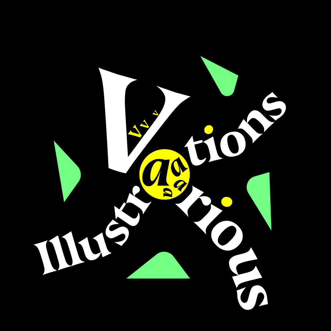
Collection of Various Illustrations
A collection of various illustrations in different styles and techniques.
A collection of various illustrations in different styles and techniques.
1. Botschaft
2. PF 2025
3. Forhand
4. Rausr
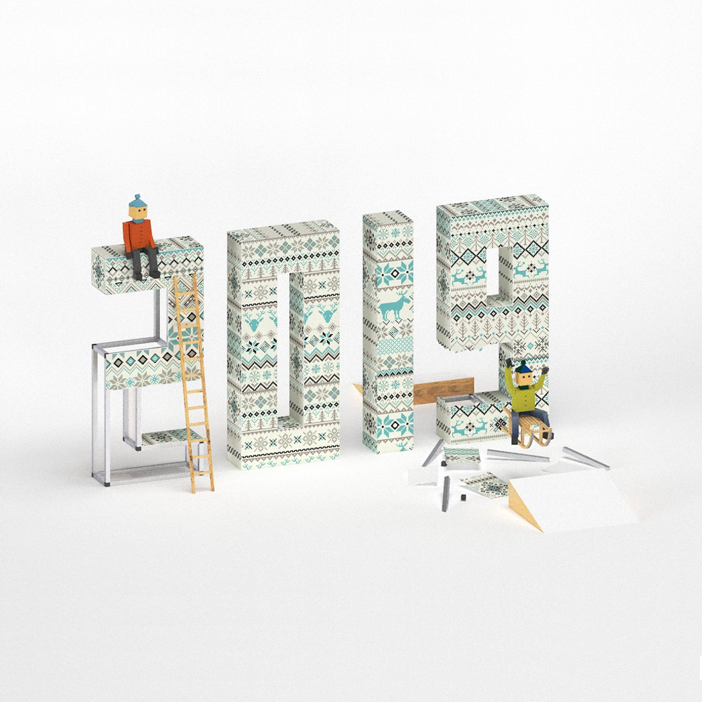
5. New Year Jump
6. Guitar Riffs
7. Histamaniac
8. Spotlight
A curated collection of illustration work exploring various visual styles and technical approaches—from 3D rendering to typographic compositions and humorous visual metaphors. Each piece stands on its own but collectively reveals an evolving exploration of form, meaning, and emotion.
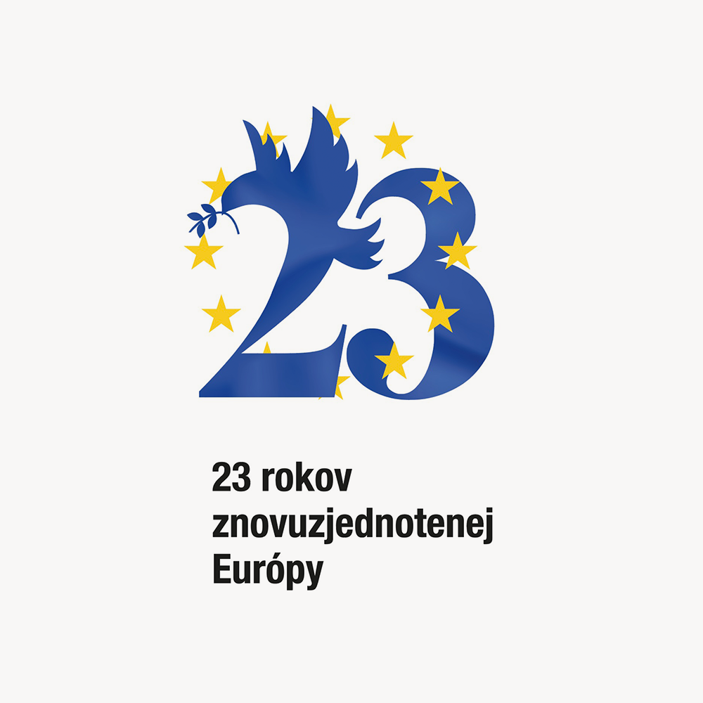
This piece was created to mark 23 years of a reunited Europe, blending symbolic elements from European iconography into a unified visual. The number 23 is shaped into a harmonious form where the figure of a dove—a classic emblem of peace—emerges naturally from the numeral itself, holding an olive branch in its beak. Surrounding the illustration are the iconic yellow stars representing the European Union, interwoven to emphasize unity and shared values.
“I wanted the design to feel both formal and hopeful—like a quiet celebration. The dove isn’t just a symbol here; it’s part of the number, part of the idea, inseparable from the message," the author notes.”
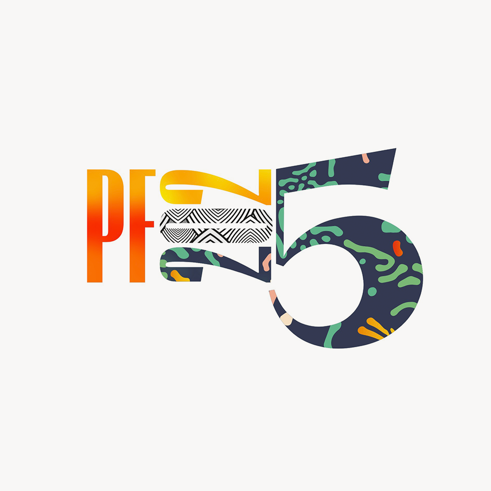
A layered typographic illustration created as a New Year greeting for Madness Advertising. The piece draws inspiration from the energy and eclectic interior of the client’s newly opened showroom. Custom textures, vibrant patterns, and playful type treatments come together in a single composition to express joy, identity, and visual experimentation.
“I wanted it to feel like a celebration you could almost hear—colorful, loud, but still well-composed.”
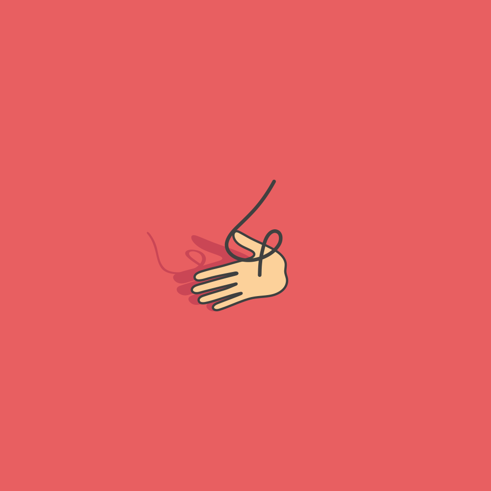
A minimal illustration exploring the expressive potential of light and shadow. The simple gesture of a hand is emphasized by its own cast shadow, which morphs and stretches to create visual rhythm and movement.
“It started as a basic line drawing, but once I added the shadow, it felt like the composition came alive—like it had depth and intention.”
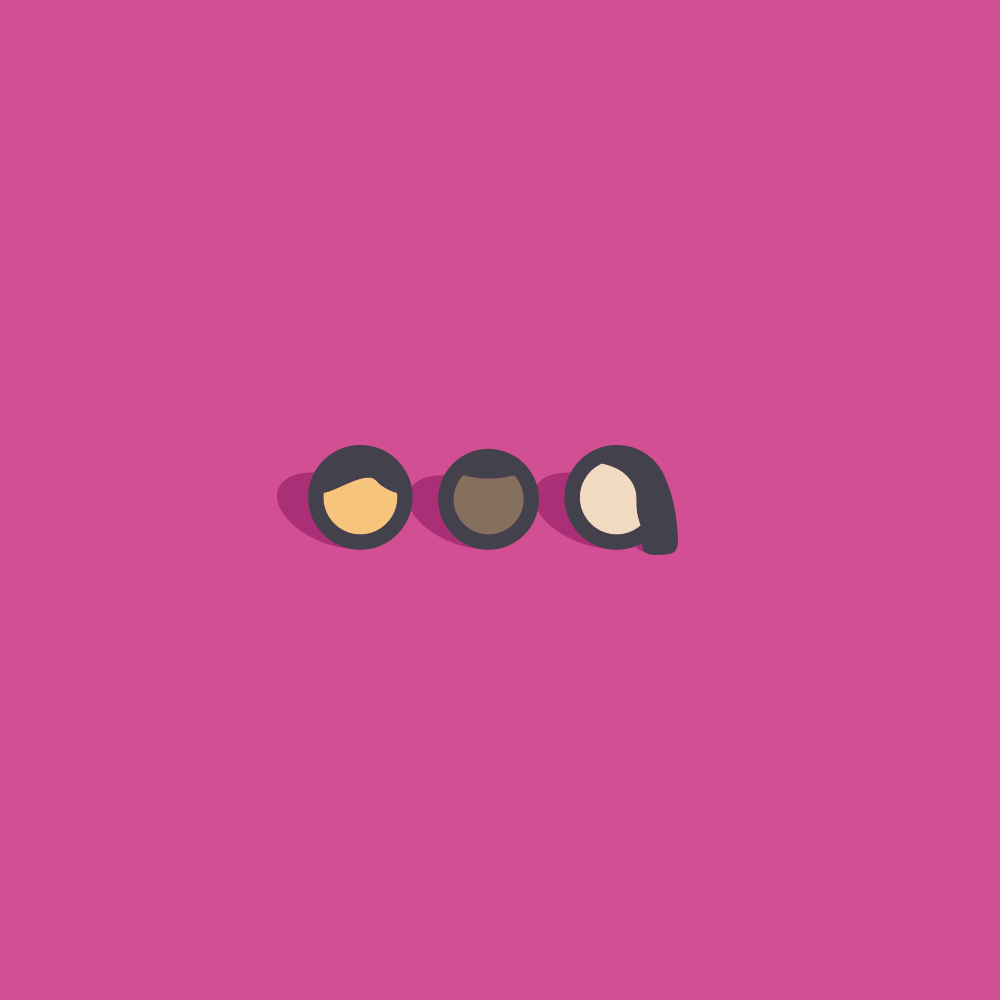
A friendly, graphic abstraction of user avatars—reduced to circular silhouettes with just enough shape to suggest diversity and character. Each icon is unique, yet they visually belong together, like a stylized crowd.
“I wanted them to feel human, but not specific—something between emoji and logo. Just enough to say: “someone’s here.””
A stylized New Year greeting built in 3D, where handcrafted charm meets digital precision. The numbers are treated as cozy architectural blocks, wrapped in knitted winter patterns and inhabited by miniature characters mid-celebration.
“I wanted it to feel like a tiny world paused mid-jump—like someone just stepped away from their snowball fight to strike a pose.”
Created in SketchUp, rendered in Twilight, and composited in Photoshop, this piece balances whimsy and structure, nostalgia and neatness. A light-hearted take on holiday spirit through modular, toy-like design.
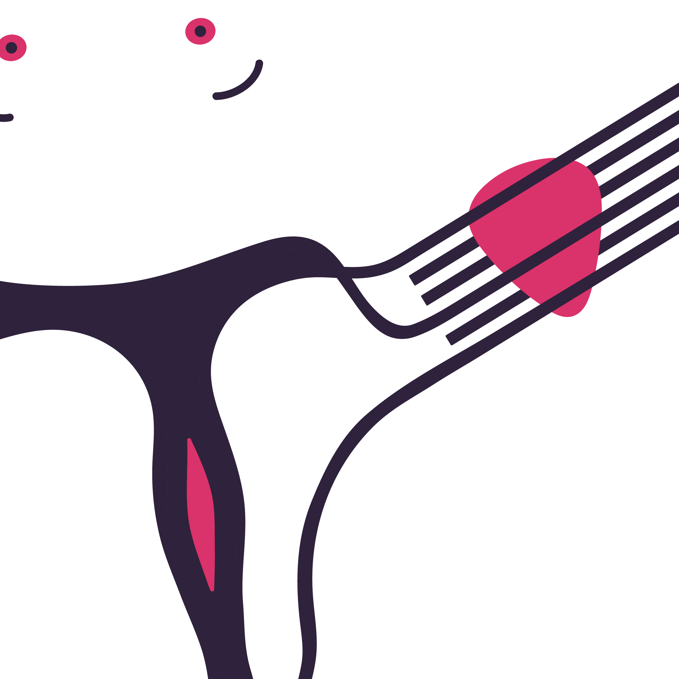
A playful vector illustration that merges human form and musical expression. The stylized figure doubles as a guitar neck, with a pink guitar pick suggesting both musical action and visual punctuation.
“It’s part anatomy, part rhythm—like a riff turned into a shape. I liked how abstract it could go without losing the guitar feel.”
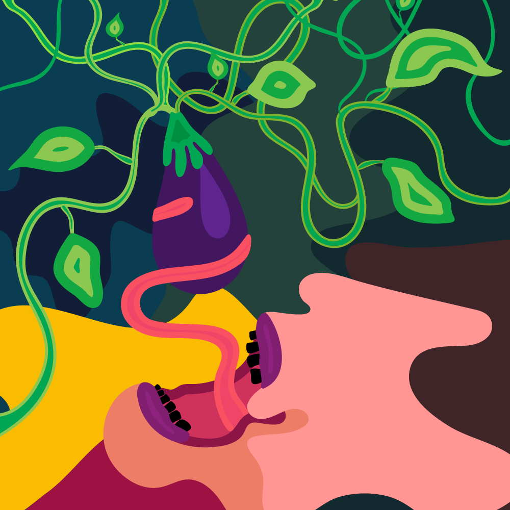
An expressive editorial illustration loosely inspired by a real allergic episode. The image exaggerates the biological response into something surreal: a glowing eggplant connected to tangled vines, feeding directly into a screaming mouth.
“I didn’t want to draw a literal allergy—I wanted it to feel like the feeling: weird, spiraling, uncomfortable, but kind of funny too.”
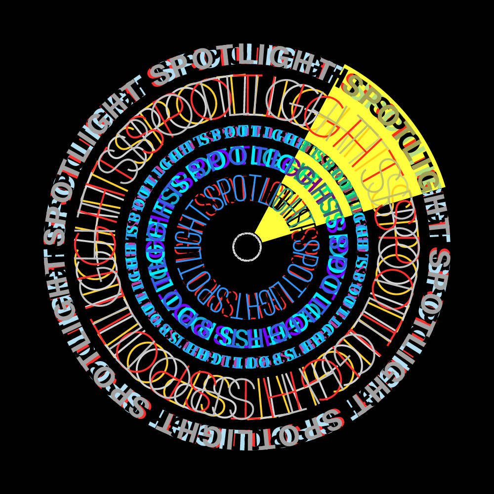
A radial typographic experiment built on repetition, distortion, and rhythm. The word spotlight forms concentric rings, each shifting in typeface, weight, and spacing to simulate the sensation of turning, vibrating, and overlapping.
“It’s like a typographic radar—picking up different voices as it spins. Each circle says the same thing but sounds completely different.”
News, insights, case studies, and more from the rausr team — straight to your inbox.
Send us your brief, your wildest idea, or just a hello. We’ll season it with curiosity and serve back something fresh, cooked with care.