Branding Codes That Stick: Usability Beats Perfection
Why successful brand codes go beyond color and typography manuals—and how to make yours truly memorable and practical.

Why successful brand codes go beyond color and typography manuals—and how to make yours truly memorable and practical.
Most designers know the textbook approach:
But is that really what makes your brand recognizable?
In the real world — in marketing campaigns, slide decks, digital banners, packaging mockups — it’s rarely that deep.
The truth?
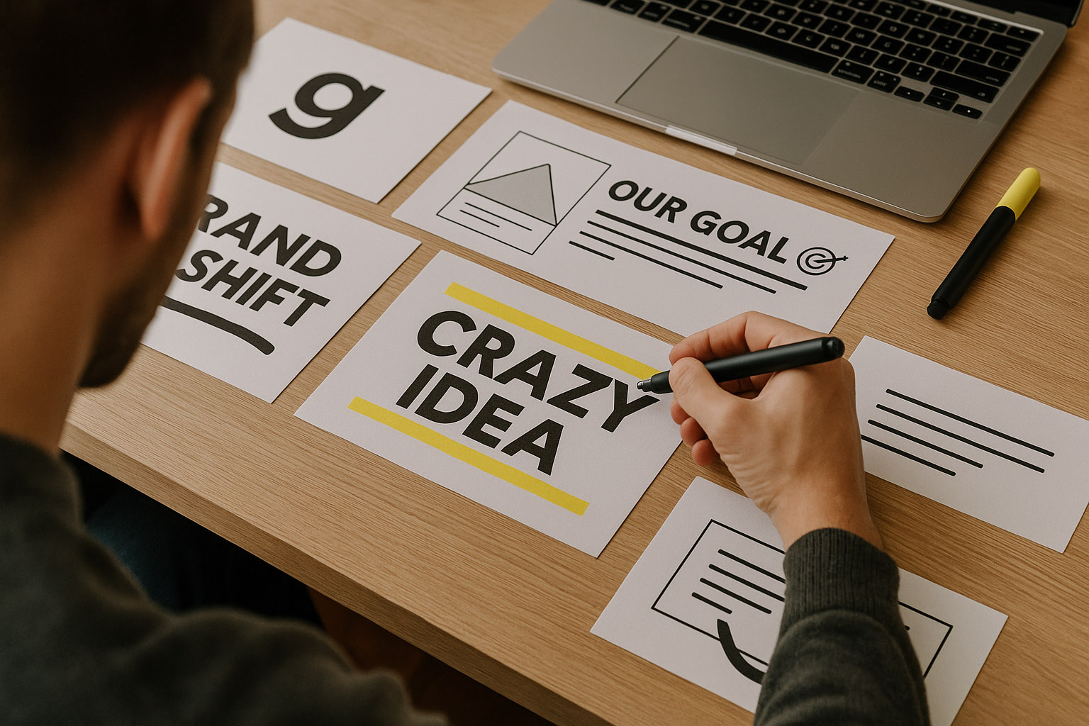
Memorable branding codes are simple, flexible, and often built on one slide, not one book.
We recognize brands not because we read their guidelines, but because we remember:
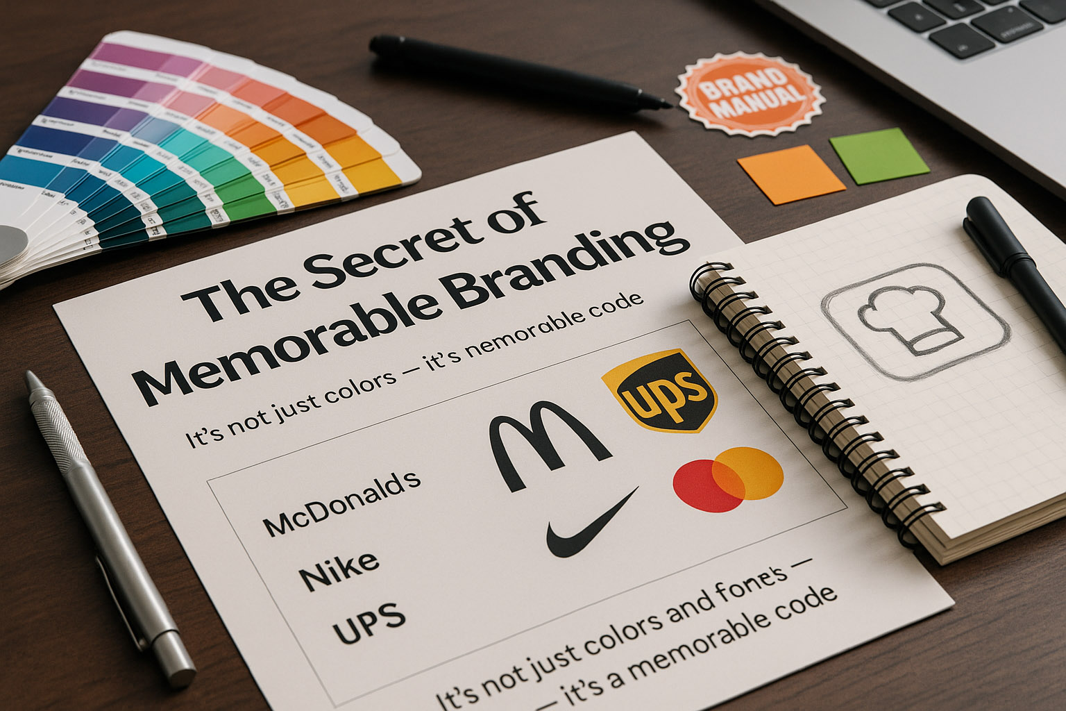
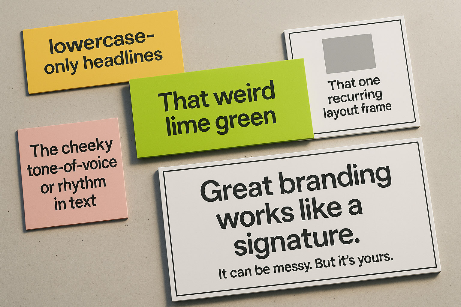
“Great branding works like a signature.
It can be messy. But it’s yours.”
And what makes it stick isn’t pixel-perfection. It’s distinctiveness + consistency over time.
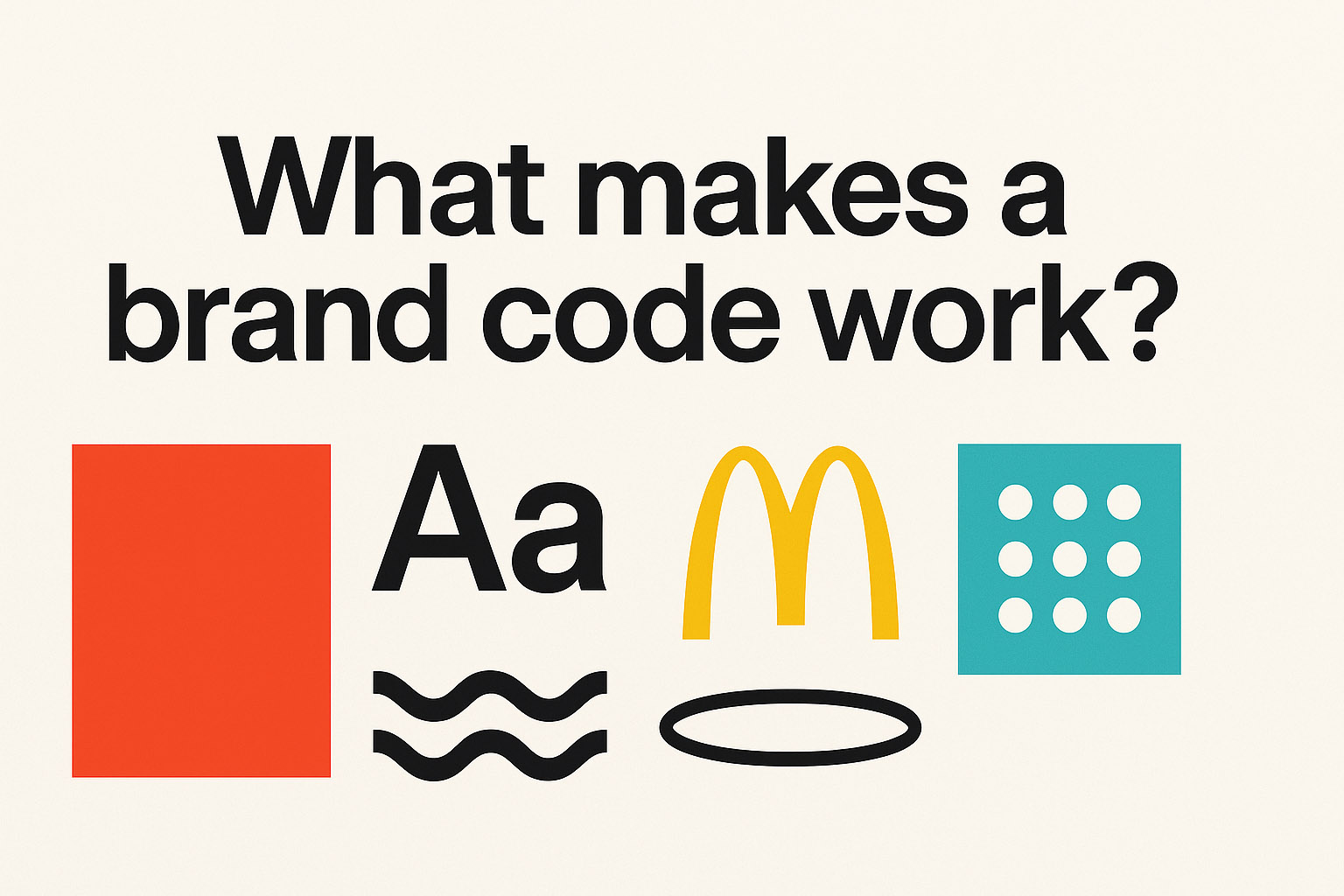
Research in cognitive psychology suggests that our brains latch onto anomalies — things that break the norm. That’s why something as simple as a quirky color combination or an unusual image crop can become deeply embedded in memory. When your branding taps into this, it doesn’t just look different — it becomes mentally sticky. This explains why so many strong brands don’t rely on “beautiful” design, but rather on familiar quirks that form lasting associations.
Good branding codes pass a simple test:
Can your junior designer apply it in 5 minutes, without opening a PDF?
If the answer is yes, you’re on to something.
That might be:
Real-world usability is what makes a branding code survive. When your marketing team is under a tight deadline or your junior designer is building last-minute slides, they need something intuitive. A complex system breaks under pressure. But a visual pattern that’s easy to copy? That spreads like wildfire across your company.
“The best codes aren’t complex—they’re portable.”
| Brand Manual (200 pages) | Brand Code (1 page) | |
|---|---|---|
| Typography | 4 weights, 6 sizes, 3 alternates | One bold + one clean font |
| Logo usage | 10 no-go zones + pixel padding | Simple lockup that always works |
| Color | 8 core + 12 secondary tones | 2 main + 1 accent |
| Examples | Studio-grade mockups | Everyday use cases (social, docs, slides) |
| File size | 150MB | 4MB |
| Execution rate | 15% | 90% |
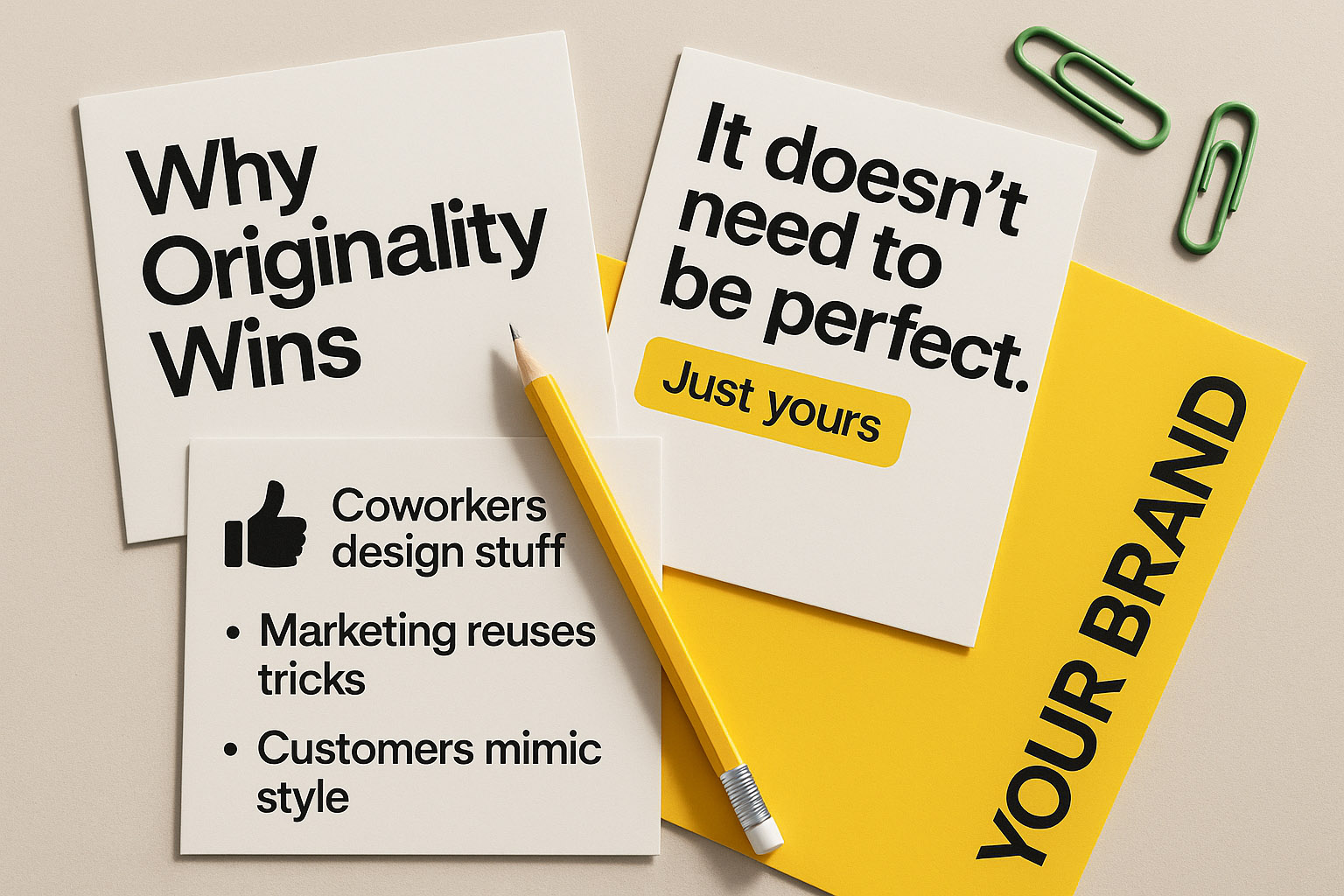
Original codes are more usable because they’re recognizable with less effort.
They can evolve. They can be playful. And they’ll still be yours.
And here’s something rarely said:
A branding system doesn’t need to be perfect — just consistent enough to be yours.
And this is where someone like our chefs comes in to help you.
You’ll know it’s working when:
That’s when your brand “clicks.”
So next time you start a branding project, try this:
Great branding codes grow organically. They adapt to new formats, team members, and technologies. The goal isn’t to freeze your identity in time — it’s to create a flexible framework that your team enjoys using and your audience recognizes instantly.
Design isn’t about sacred rules.
It’s about usable patterns that people repeat — and remember.
“Make it distinct.
Make it simple.
Make it stick.”

News, insights, case studies, and more from the rausr team — straight to your inbox.
Send us your brief, your wildest idea, or just a hello. We’ll season it with curiosity and serve back something fresh, cooked with care.