Graphic Design and Traffic Signs: Perfected System or Missed Opportunity?
An in-depth look at the evolution, psychology, and potential for innovation in the world of traffic sign design — from universal systems to local missteps.

An in-depth look at the evolution, psychology, and potential for innovation in the world of traffic sign design — from universal systems to local missteps.
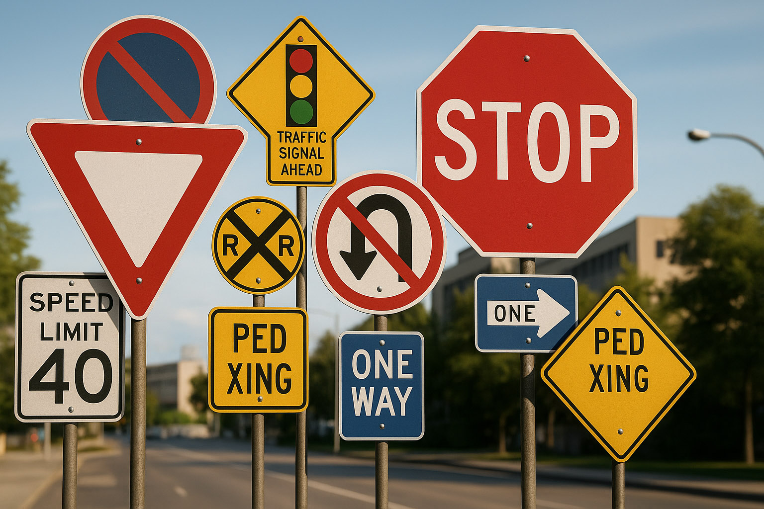
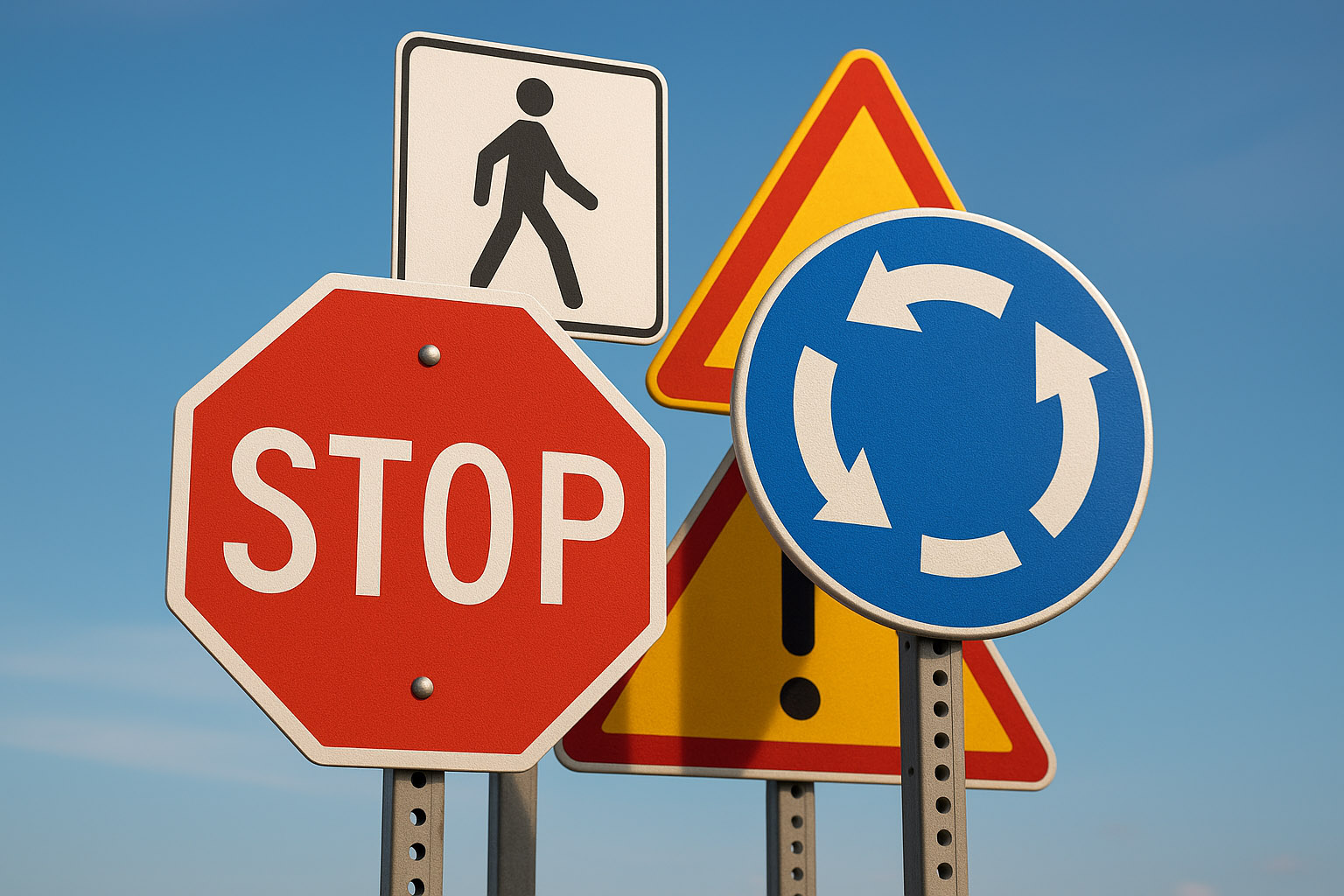
Traffic signs are one of the most globally standardized uses of graphic design — relied on every second by drivers, cyclists, and pedestrians across the planet.
But has this form of design reached its peak? Or is there still room for innovation?
Traffic sign design must do what few other disciplines demand: be instantly readable by nearly everyone — regardless of age, language, education, or vision ability.
Color, shape, iconography, and placement form a language that we’re trained to recognize through repetition — not through reading, but through perception.
The history of traffic signs is more than 100 years old.
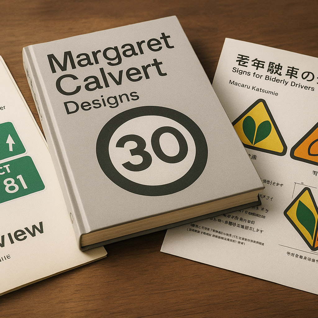
In 1961, the United Kingdom launched a revolutionary redesign of all road signs under Jock Kinneir and Margaret Calvert. Their goal? A consistent, legible, and modern system.
They designed the now-iconic Transport typeface and implemented a system of pictograms, visual hierarchy, and generous whitespace. It became a model for other countries.
Germany, Japan, and Scandinavia followed with similarly systematic approaches, focused on geometric clarity and minimal distraction.
Not all design refreshes go well.
In 2010, Italy controversially introduced more text-heavy signs — under the belief that verbal language was more precise than icons. The result? Confusion, slower recognition, and driver frustration.
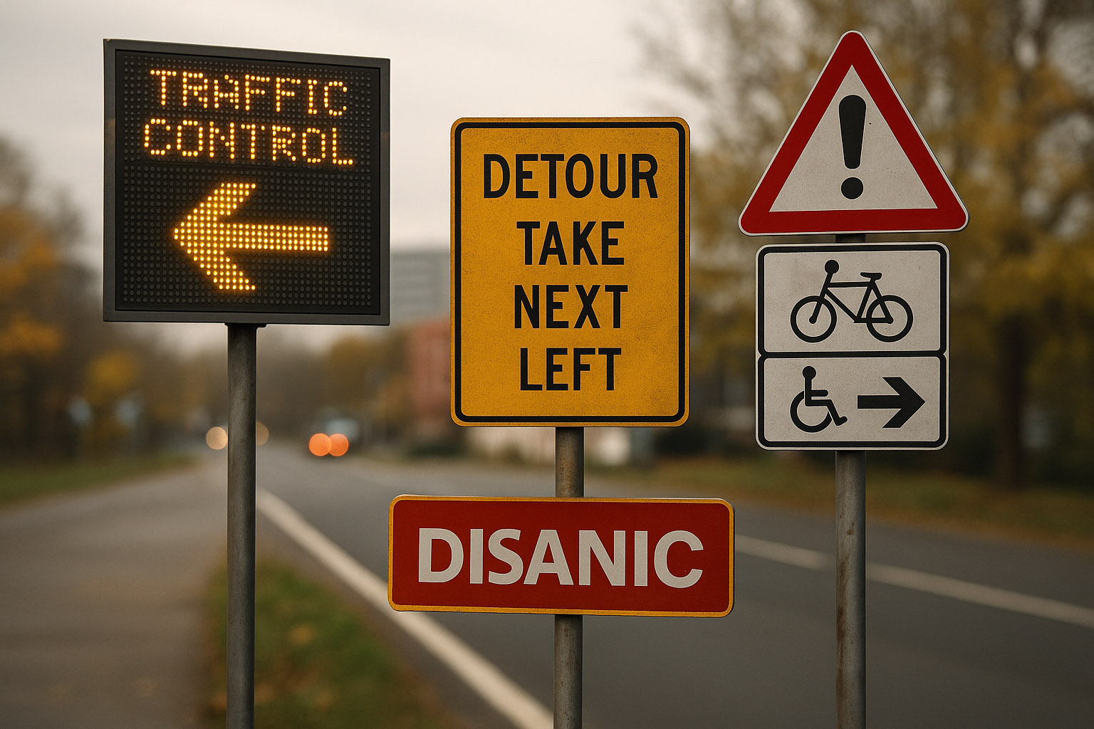
In the U.S., debates still flare over the MUTCD standard, which limits experimentation even in the face of accessibility research. For instance, attempts to add more intuitive symbols for cyclists or disabled access were blocked due to federal rigidity.
Some smart cities like Oslo and Singapore have tested digital dynamic signage — adapting visuals depending on the time of day or traffic level. These systems are promising, but struggle with visibility in sun, rain, or technical failure.
Margaret Calvert is perhaps the most iconic name in traffic sign design. Her work in the UK in the 60s defined modern highway communication.
Don Meeker, a U.S. designer, pushed for Clearview, a new highway typeface in the early 2000s to increase legibility — especially for aging drivers. Although it was briefly approved, it was rolled back due to bureaucratic issues.
In Japan, Masaru Katsumie helped develop symbols designed for elderly drivers, such as the “shoshinsha” and “koreisha” marks — indicating new or senior drivers respectively.
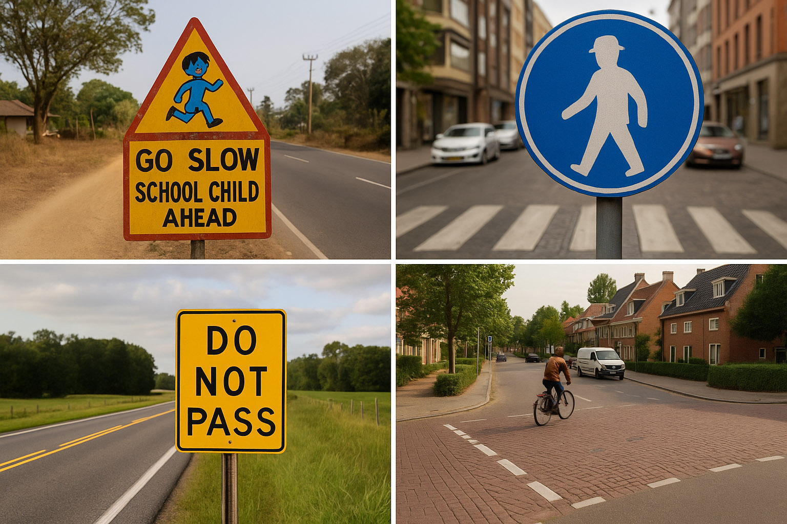
In rural India, signs are often hand-painted by local artists, leading to charming inconsistencies and sometimes hilarious icons that drift far from international standards.
Finland still uses older gendered pedestrian icons (a man with a hat), sparking design debates about modernizing pictograms.
Some U.S. states refused to adopt Clearview because officials felt “people were used to the old look” — despite proven safety gains.
In the Netherlands, designers experimented with no-sign intersections in small towns, removing all signage to encourage drivers to pay more attention. It actually worked — but only in very low-speed zones.
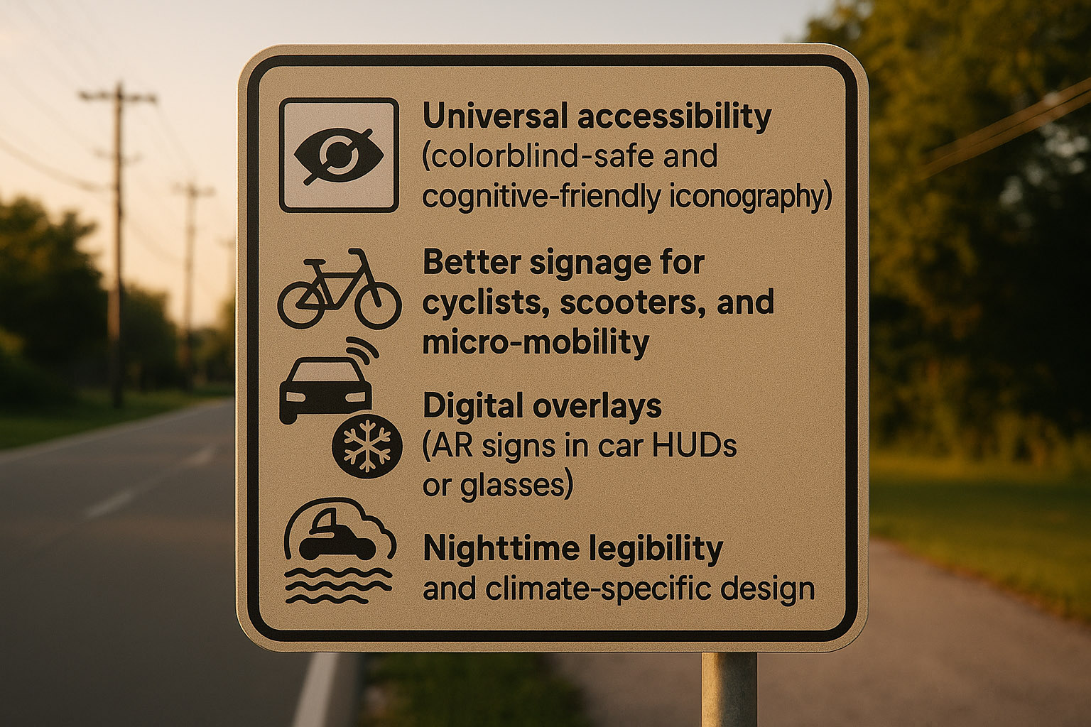
Possibly. Especially in:
Still, traffic signs may be one of the most perfected visual systems in history — because failure here isn’t about misclicks or bad aesthetics.
It’s about crashes.
Traffic sign design isn’t just design.
It’s wayfinding psychology, behavioral science, and visual engineering.
“Maybe that’s why we forget how well it works — because when it does, you barely notice it.”
News, insights, case studies, and more from the rausr team — straight to your inbox.
Send us your brief, your wildest idea, or just a hello. We’ll season it with curiosity and serve back something fresh, cooked with care.