TikTok Typography Trends: The Rise of Ugly Fonts, Serif Comebacks & Liquid Type
Discover how Gen Z is reshaping typography on TikTok with bold fonts, warped text, and nostalgic styles. A deep dive into 2024–2025’s most viral type trends.
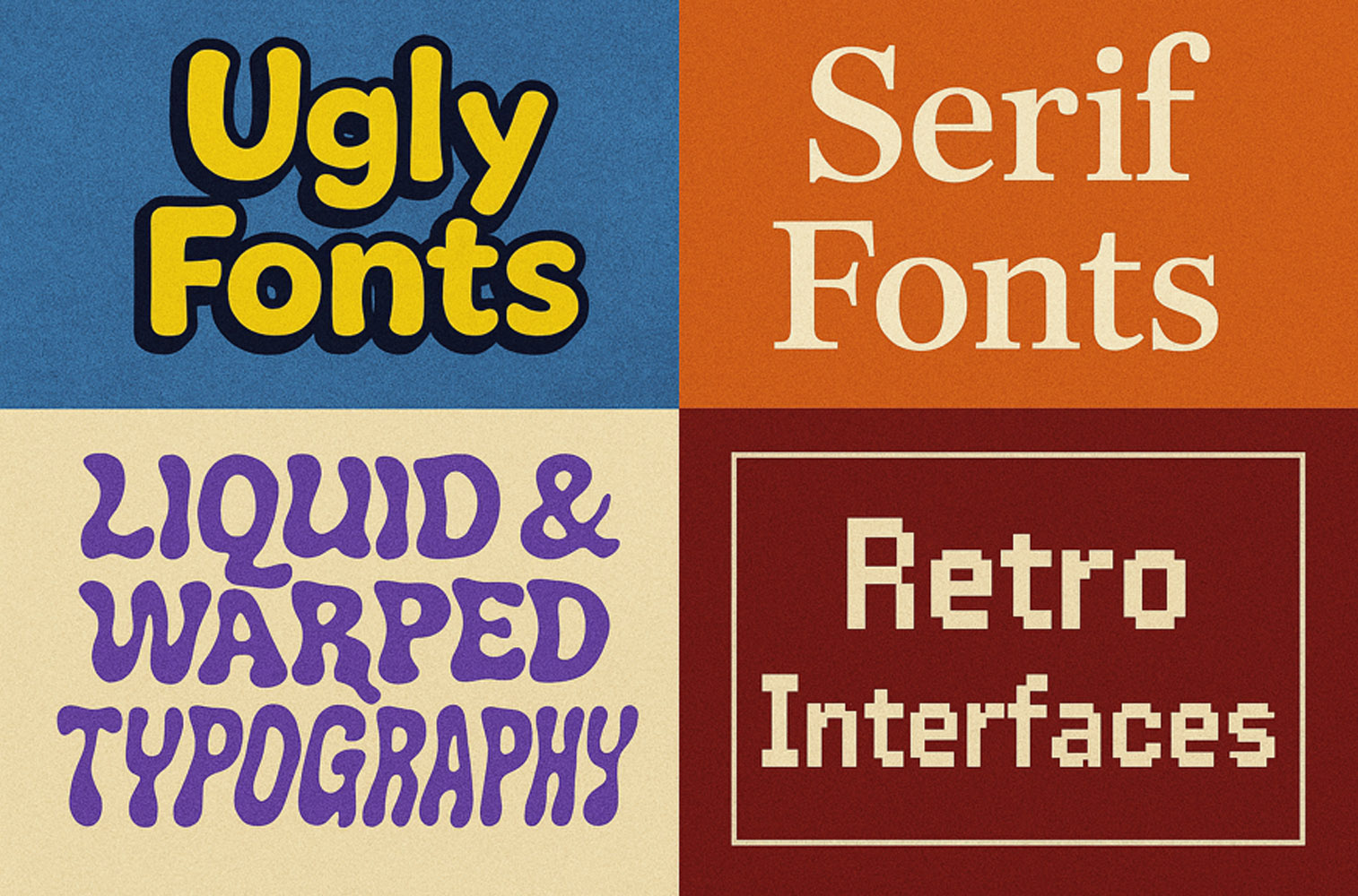
Discover how Gen Z is reshaping typography on TikTok with bold fonts, warped text, and nostalgic styles. A deep dive into 2024–2025’s most viral type trends.

How Gen Z is reinventing text design—one swipe at a time.
Forget Helvetica. On TikTok in 2024–2025, typography is loud, weird, nostalgic, and deeply emotional. From “ugly-pretty” fonts to melting letters and 90s system fonts, TikTok has become an unexpected playground for a new generation of design expression.
This report breaks down the typography trends dominating TikTok—and what they say about Gen Z’s evolving visual language.
Once dismissed as amateurish or dated, fonts like Comic Sans, Papyrus, Impact, and Brush Script are now deliberately chosen for ironic charm and emotional honesty.
“These fonts feel human, flawed, funny—and that’s the point. TikTok creator @texttension”
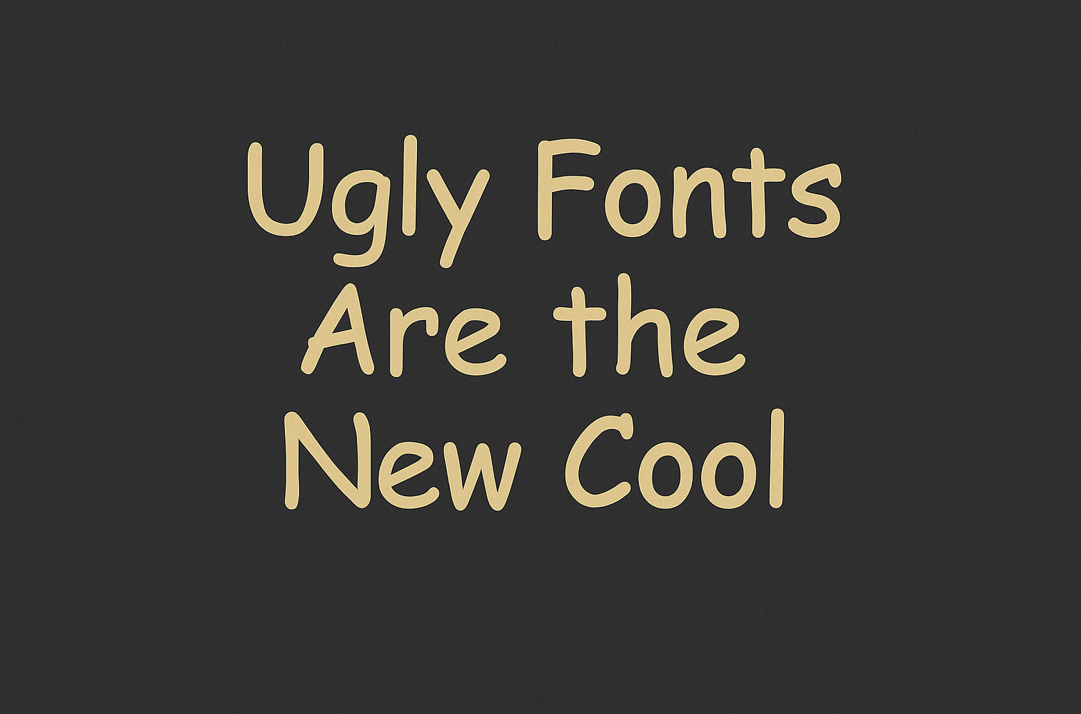
Bonus trend: MS Word-core → Using default WordArt styles, drop shadows, rainbow fills, etc.
Clean sans-serifs are out. TikTok edits, fashion brands, and moodboard reels are turning to elegant serif fonts like Garamond, Bodoni, and Times New Roman to evoke sophistication, irony, or vintage academia vibes.
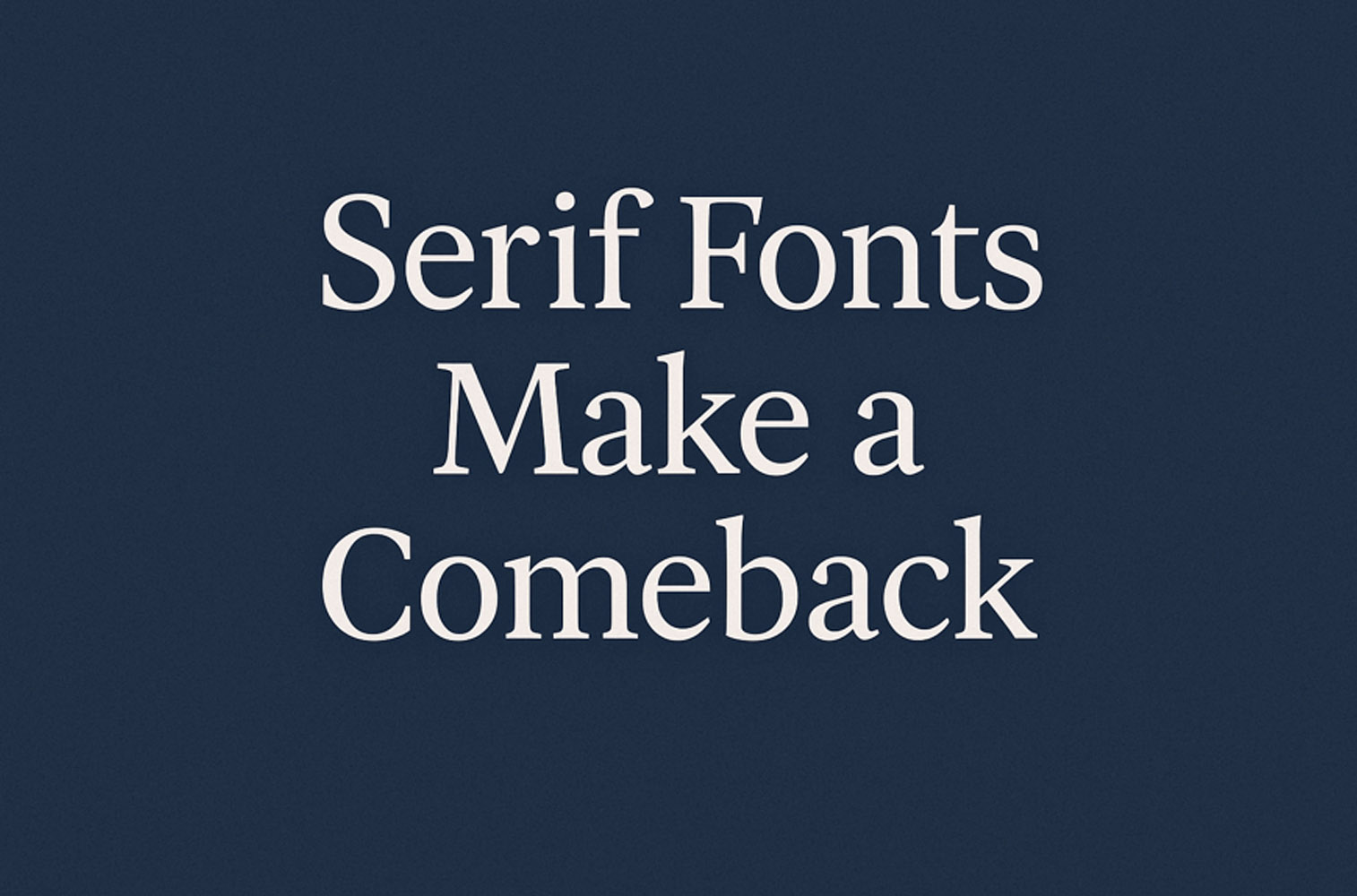
Serif fonts signal “authority” but feel subversive when used casually—Gen Z loves the contradiction.
Heavily distorted or animated text—wavy, melting, stretching, or shaking—is everywhere on TikTok. It adds movement, surrealism, and visual drama to otherwise static content.
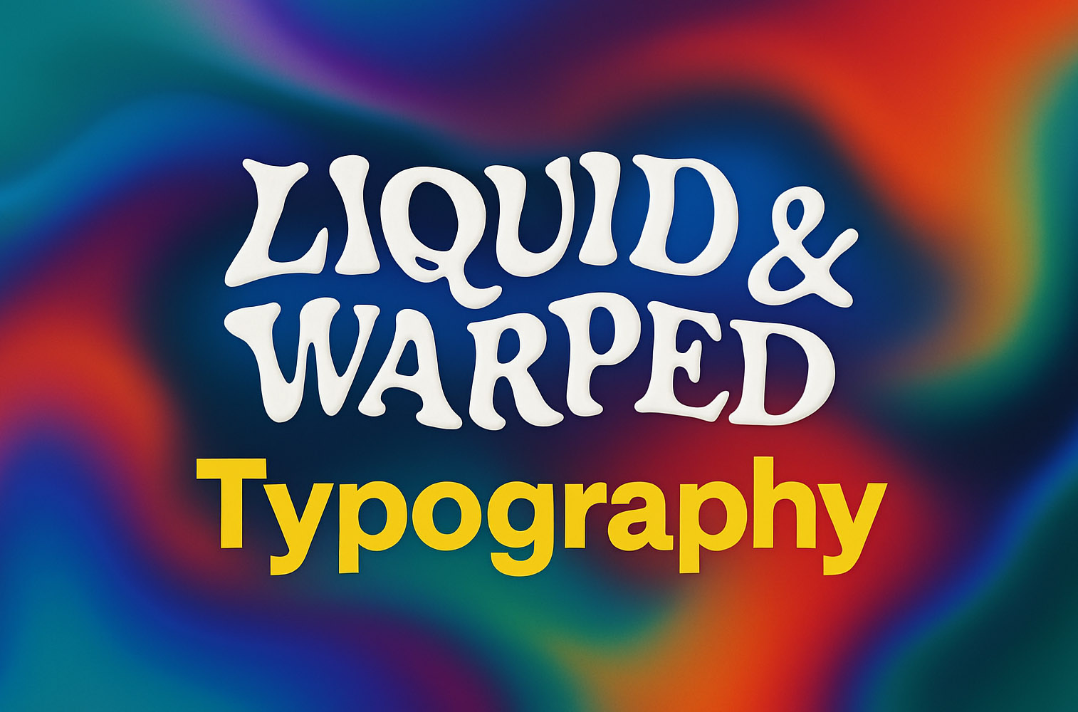
Font and color = instant aesthetic signal.
Inspired by Frutiger Aero, MS Paint, and early MySpace days, some creators are embracing system fonts and UI elements from old OS environments.
These edits feel raw and unfiltered—exactly what Gen Z wants in an era of algorithmic polish.
TikTok typography is more than just text—it’s identity, emotion, and rebellion in motion. Gen Z is bending type rules not for perfection, but to communicate authenticity, attitude, and irony. For designers, marketers, and content creators, the message is clear: Typography is no longer just about readability—it’s about personality.
“Ehm… yeah, personality. OK, maybe. But keep in mind—readability comes first, then a loooong pause… and only then, some personality expresion in the sentence of typography. You’ve got other ways to express your vibe anyway. 😉”
News, insights, case studies, and more from the rausr team — straight to your inbox.
Send us your brief, your wildest idea, or just a hello. We’ll season it with curiosity and serve back something fresh, cooked with care.